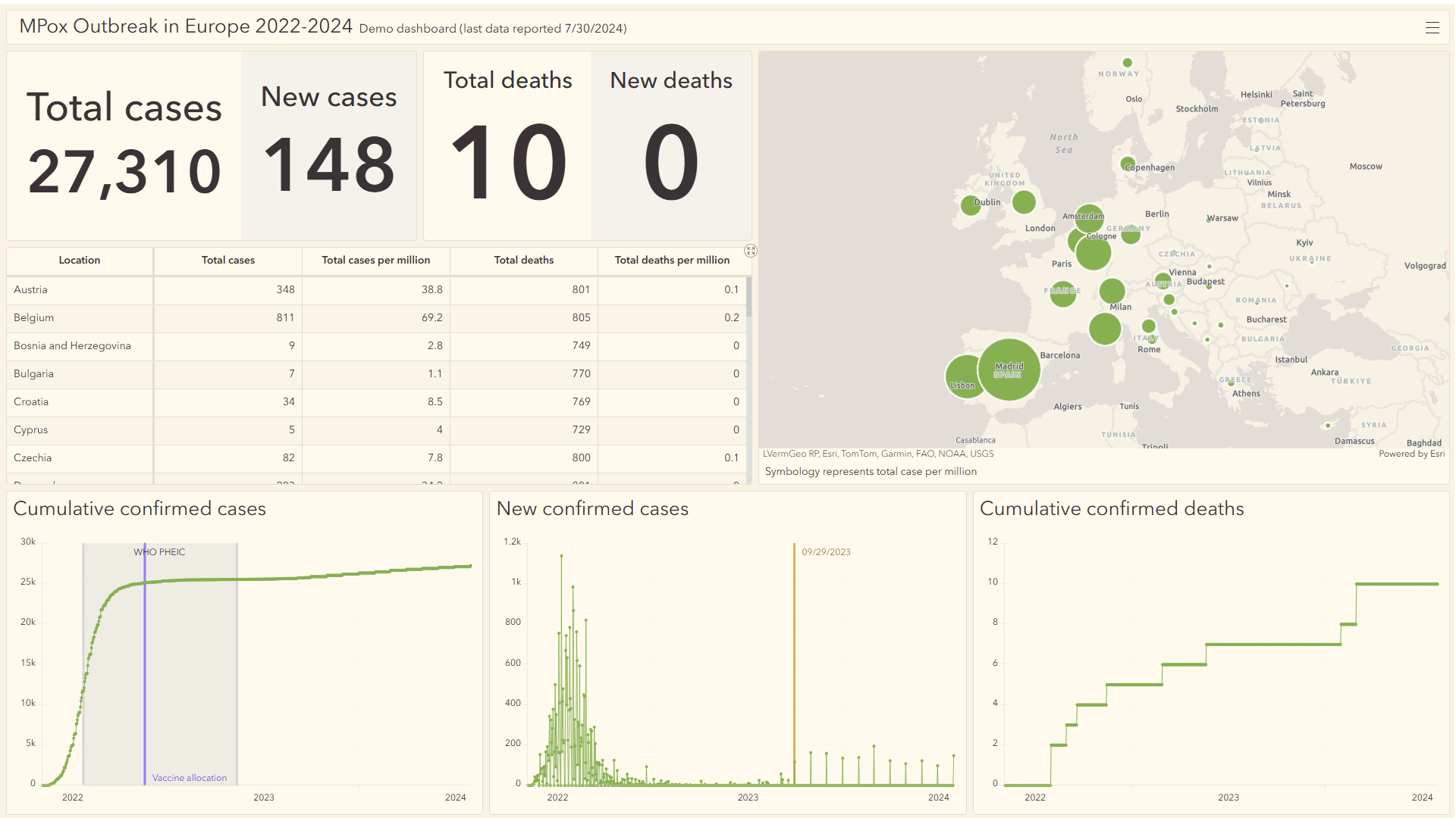
For many dashboards, the key to telling a compelling story lies in specific dates and events that shape the dataset. Whether it’s an important public health announcement, a milestone in a project, or a shift in reporting methods, these key moments in time often need to be communicated to viewers. With the November 2024 release of ArcGIS Dashboards, we can now add date axis guides to a serial chart in a dashboard. The new date axis guides feature allows you to highlight important dates or range of dates directly on your charts, adding extra context that helps viewers interpret the data quickly and effectively.
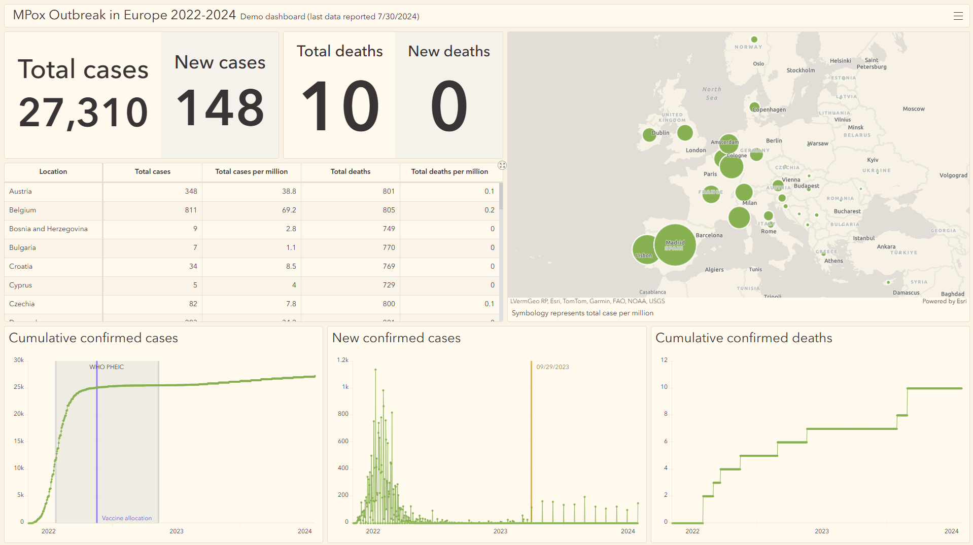
In previous releases, we introduced features like splash screens and info windows to help dashboard authors provide additional context without cluttering the interface. A key area of focus this release has been improving the visualization of important dates on a timeline. With the new date axis guides, authors can now highlight a specific date or range of dates directly on the serial chart, making it easier for viewers to understand the context of the data and the impact of events at a glance. These guides provide clear, visual markers that help pinpoint key dates without overwhelming the dashboard or taking up valuable screen real estate.
Configure date axis guides
Let’s explore how to set up date axis guides within a dashboard, using a real-world scenario. This example dashboard focuses on the Mpox outbreak in Europe over the past two years. Mpox (formerly known as Monkeypox) is a viral disease transmitted through close contact with infected animals or humans. This dashboard tracks the progression of the outbreak across Europe, visualizing key data such as total confirmed cases, deaths, new confirmed cases, and cumulative cases over time.
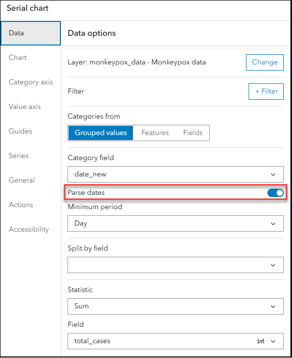
We want to add context about key dates related to the outbreak, such as when the World Health Organization (WHO) declared the Mpox outbreak a Public Health Emergency of International Concern (PHEIC). Instead of relying on sidebars or chart descriptions to communicate key dates, we can use date axis guides to display them directly on the charts. To do this, the first step is to ensure that the Parse Dates toggle is enabled in the serial chart settings. This ensures the chart correctly recognizes and displays date-based data, allowing us to add date axis guides.
Range date axis guide
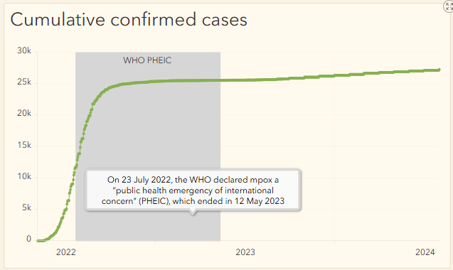
We can now configure a range date axis guide from July 23, 2022, when the WHO declared the outbreak a public health emergency, to May 12, 2023, when this status was reassessed. We can also add a label (e.g., “WHO PHEIC”) for clarity and hover text to give viewers more context on the significance of that period in the dataset.
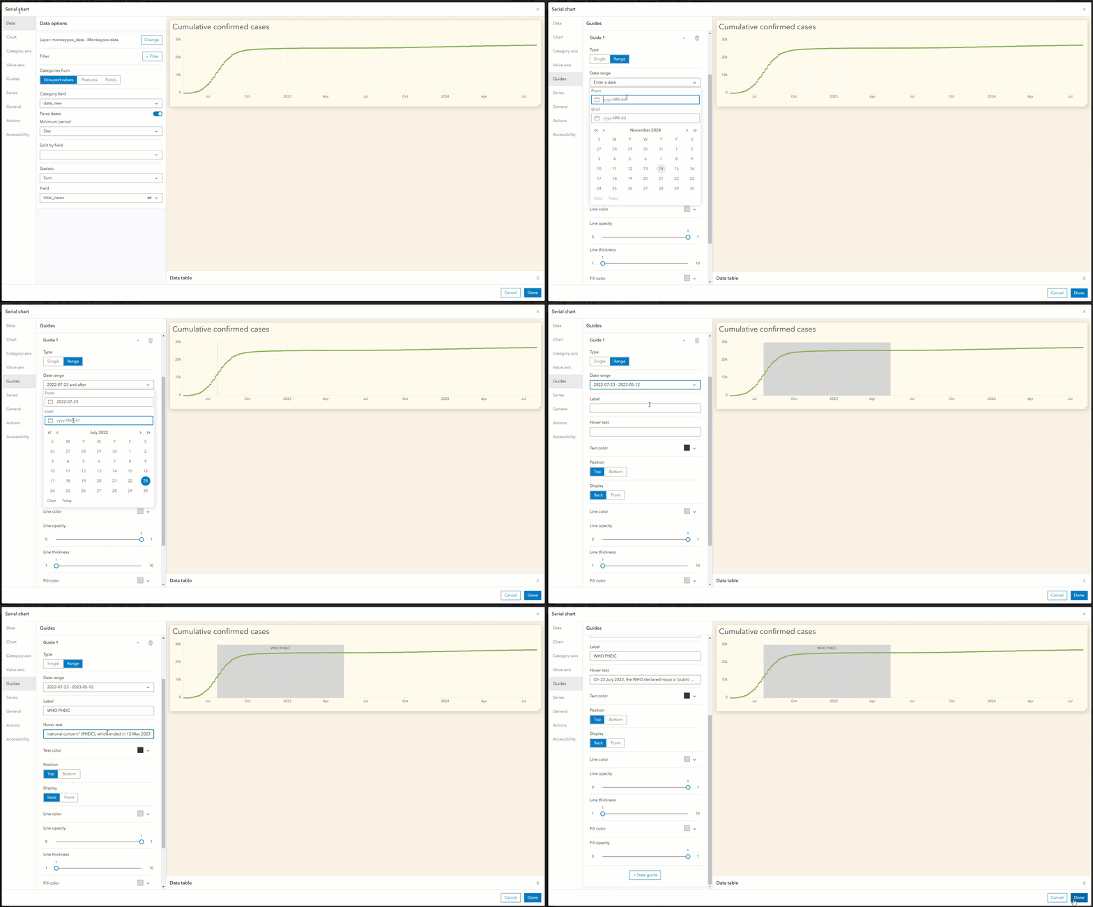
The chart immediately updates to highlight the selected date range, with the hover text providing additional details.
Single date axis guide
Another key date to highlight on the chart is November 17, 2022, when an additional 2 million doses of the Mpox vaccine were secured. We can add a single date axis guide with the label “Vaccine Allocation”, hover text and add a different color (e.g., purple) for easy distinction.
When labels overlap, we can easily adjust the positioning to ensure clarity—moving labels to the bottom or changing their color to make them easier to read.
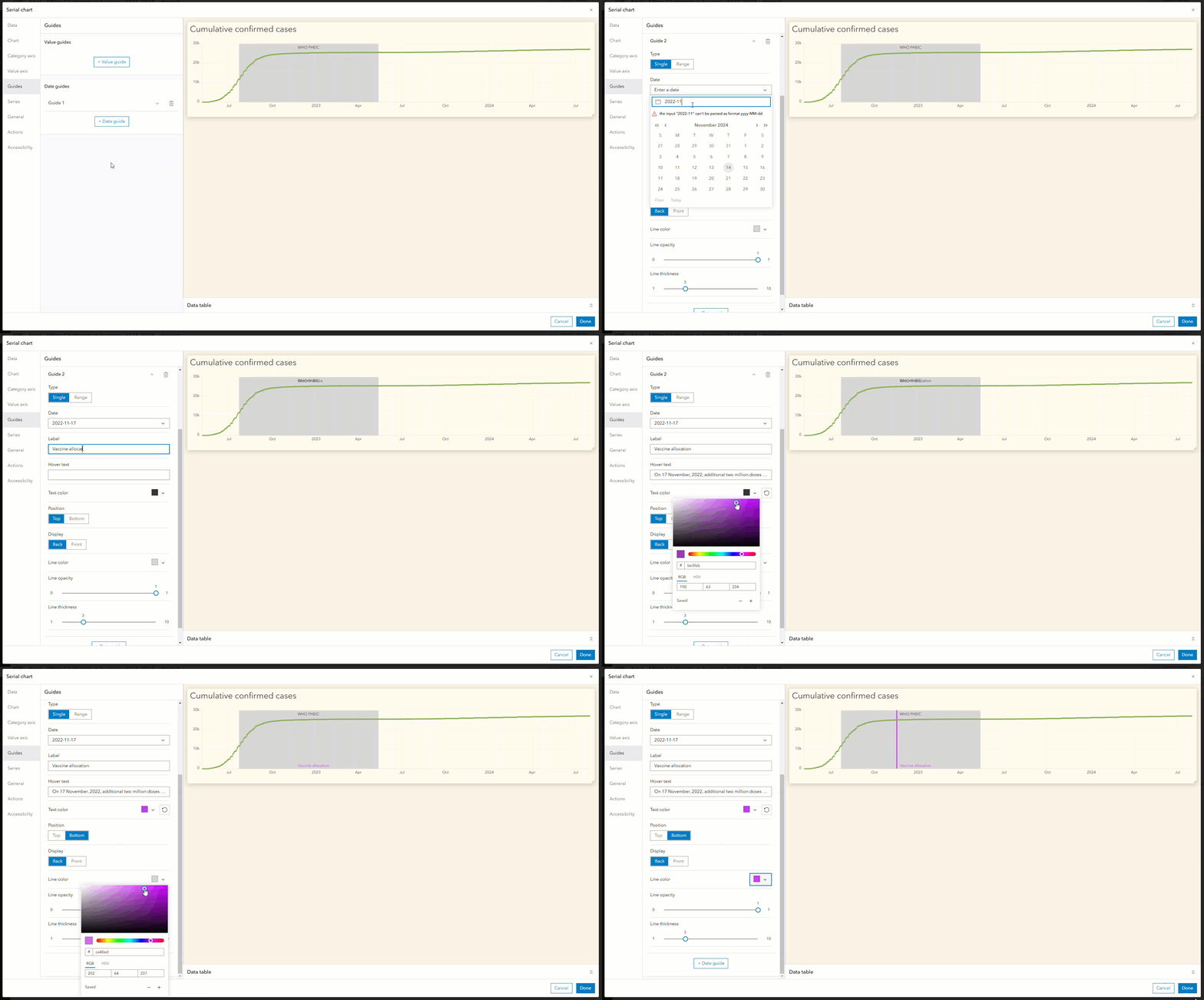
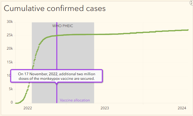
The chart instantly updates to show the single date axis guide along with the hover text.
Maximizing space and improving clarity
By adding these date axis guides, we’ve effectively reclaimed space on the dashboard that would otherwise be occupied by long text descriptions. The result is a much cleaner, more streamlined dashboard that provides the same level of information—only now, it’s easier for viewers to digest.
Authors can provide hover text over the date axis guide to offer additional context, eliminating the need to sift through walls of text and ensuring a more effortless and engaging experience.
Summary
Date axis guides are a simple yet powerful way to add valuable context to your serial charts. Whether you’re tracking trends over time or highlighting key events, these guides allow you to draw attention to important moments on the timeline—making your charts clearer and more informative.
We look forward to seeing how you’ll use this feature to bring your own data to life.


Article Discussion: