Real-time data ingestion and analysis workflows span across a variety of industries and often share a common trait — observational data can build up fast! Whether monitoring a fleet of transit vehicles, the locations of field workers, readings from stationary sensors, critical hazard-event alerts, or other Internet of Things (IoT) and real-time data feeds, the accumulation of data requiring storage is continuously growing.
This blog will explore the power of dynamic aggregation available with ArcGIS Velocity, showcasing how to effectively visualize large amounts of data.

The Challenge of Managing and Visualizing Real-Time Data
Consider a scenario where you are ingesting real-time vehicle location data for a fleet of 50 trucks, each sending its location and relevant attributes every 5 seconds. This results in 10 updates per second, 600 updates per minute, 36,000 updates per hour, and 864,000 updates per day! Managing this amount of ever-growing data is a challenge. Fortunately, ArcGIS Velocity allows users to write data to various outputs, including storage, streaming, or alerting.
A common use case involves creating an archive to store historical observations for a specified data period. This can be accommodated with Velocity feature layers backed by the spatiotemporal data store which is included with a Velocity subscription.
Continuing our scenario, you are only interested in the previous month of data and the observations are writing to a Velocity feature layer with a one-month data retention period before Velocity moves records over to the feature layer archive. Over one month, this would result in a buildup of 26,784,000 records.
When working with a large dataset of 26 million records, presenting this spatial data can be challenging. Opening a web map and zooming to your area of operation requires the mapping application to render 26 million records on the map. This rendering process can take some time and when it completes, you may not be happy with the result. Likely, the map will become overcrowded with many points, making it difficult to understand what you are seeing and analyze spatial distribution patterns. Now consider that not only do you want to see where the vehicles were, but you might also want to understand the average of a per-feature attribute value, such as speed, for those 26 million records.
To address these questions and goals, ArcGIS Velocity layers with dynamic aggregation are available and configurable by default and can be used to help your organization. Consider the below image which highlights dynamic aggregation in action.
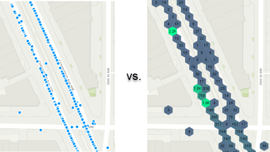
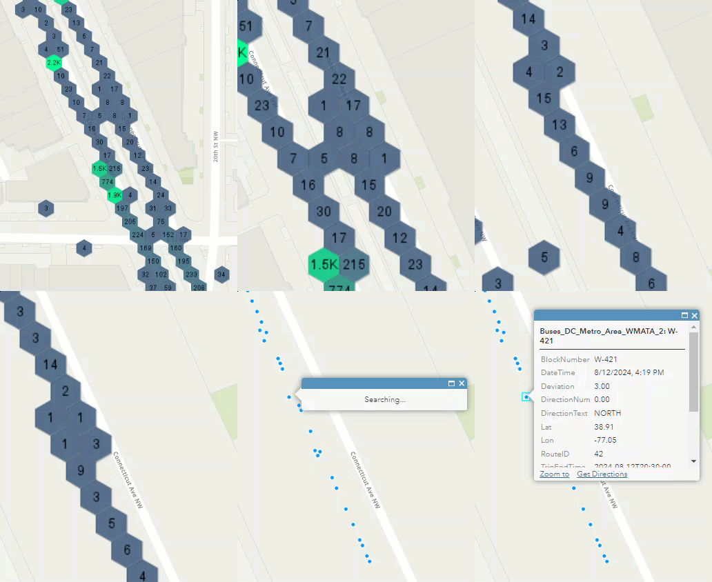
Not only can you view the aggregated features, but when you zoom in past your defined feature threshold, the map client intelligently switches to rendering discrete features. This enables viewers to see the entire picture of their data with dynamic aggregation, while also being able to drill down to individual features for a more detailed understanding.
Let’s work through some relevant questions for this workflow:
What is dynamic aggregation?
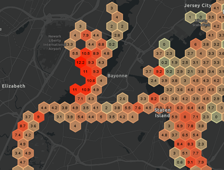
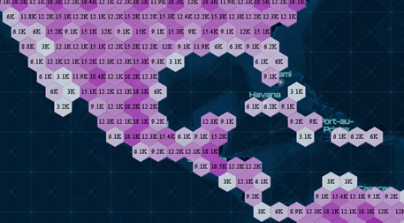
Dynamic aggregation is a data visualization technique available for Velocity layers. Instead of viewing individual point, line, or polygon features, you see bins containing your observations. Dynamic aggregation is especially useful when you want to visualize thousands of data points as clusters, making it easier to identify trends and patterns. You can control the shapes, sizes, and colors of these bins. Additionally, each bin can be labeled either with either the count of features contained within that bin, or a statistic that you configure such as minimum, maximum, average, or other user-specified attribute field.
How do I enable dynamic aggregation on my layers?
To use dynamic aggregation, you must first have data in a Velocity feature layer. This can be created by either a or a real-time or big data analytic. A real-time analytic ingests data through a feed and can write it to a new Feature Layer output. A big data analytic loads stored data from sources, can perform analysis, and can write data to a new Feature Layer output.
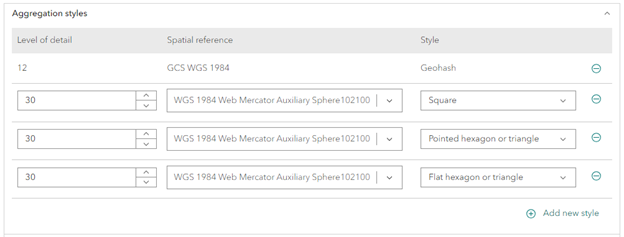
When configuring a new feature layer output in your Velocity analytic, you will see settings for aggregation styles. You can accept the defaults or use custom configurations for additional styles. In the example below, we added the flat hexagon or triangle aggregation styles to complement the default configurations. For instance, flat hexagons are useful for representing density and patterns in data, while triangles can provide a different perspective on relationships and distributions.
How do I adjust dynamic aggregation settings on my Velocity layer?
Within the ArcGIS Velocity application, you’ll notice the “Output: Layers” tab on the green pane on the left side. Select this layers page, and then find or search for your layer. If you create a Velocity feature layer in your analytic, you will see both a map image layer and a feature layer with the name of your layer.
Dynamic aggregation and visualization are available for Velocity map image layers. If you click to open this map image layer in the map viewer or add this layer from your web map or web application, it will render using dynamic aggregation according to the settings you change for your layer.
To edit the map image layer and aggregation settings, click the edit button for your map image layer on this layers page.

What aggregation settings can I change?
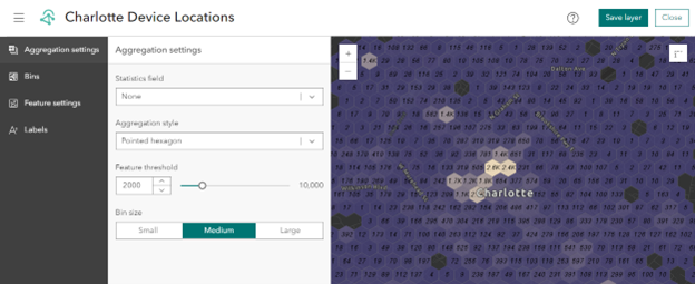
By clicking the edit button for the map image layer, this will open the Velocity interface to control aggregation settings. From this wizard, you can see four tabs on the left that enable editing of aggregation settings, bins, feature settings, and labels.
- Aggregation settings
- Decide whether to render just feature count within each bin, or to select a statistics field and type to represent
- Choose the aggregation style (bin shape) to render
- Adjust your feature threshold. The default is 2000 which means if there are fewer than 2000 features within the map extend, individual features will be rendered in place of binning. This is so that users can zoom in and understand individual feature details.
- Choose your bin size
- Bins
- Adjust the minimum to maximum bin color ranges which will be rendered on a ramp between these values
- Adjust the minimum to maximum bin outline color ranges which will be rendered on a ramp between these values
- Adjust the minimum to maximum bin outline width which will be rendered on a ramp between these values
- Optionally enable a custom range to remove features from rendering above your maximum value or below your minimum value
- Optionally normalize by bin area to normalize bin rendering based on geographic area (i.e. north pole vs equator)
- Feature settings
- Under aggregation settings you can adjust the default feature threshold of 2000 features. When there are fewer features than your feature threshold in a client map extent, the client will switch to rendering individual features. This page enables you to adjust the renderer and relevant settings for those individual features.
- Labels
- Control label settings (font, size, color, style, etc.) for your bins
When you’ve finished adjusting your map image layer, make sure to click “Save layer” on the upper right corner.
How do I use this dynamic aggregation layer in a map?
By simply adding the Velocity map image layer to a web map or web application, the dynamic aggregation binning will be utilized to render your features! This can be achieved by going to the Velocity layers page, searching for your map image layer, and then clicking Open in Map Viewer. Alternatively, you can click the action button to view the item details to see the item within an ArcGIS Online item page.
For more information, here are some helpful links:

Article Discussion: