The November 2024 update for ArcGIS Dashboards introduces several exciting enhancements, bug fixes, and performance improvements.
This blog post provides a detailed overview of the new features and enhancements available when creating or editing a dashboard in ArcGIS Online.
Let’s dive straight in!
____________
Font Options
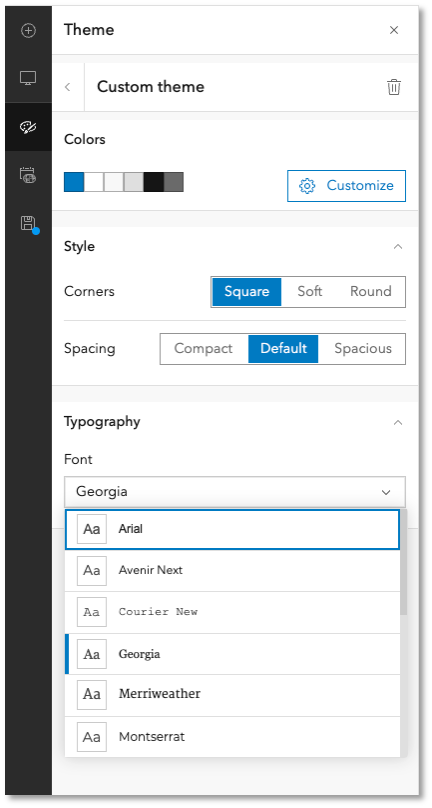
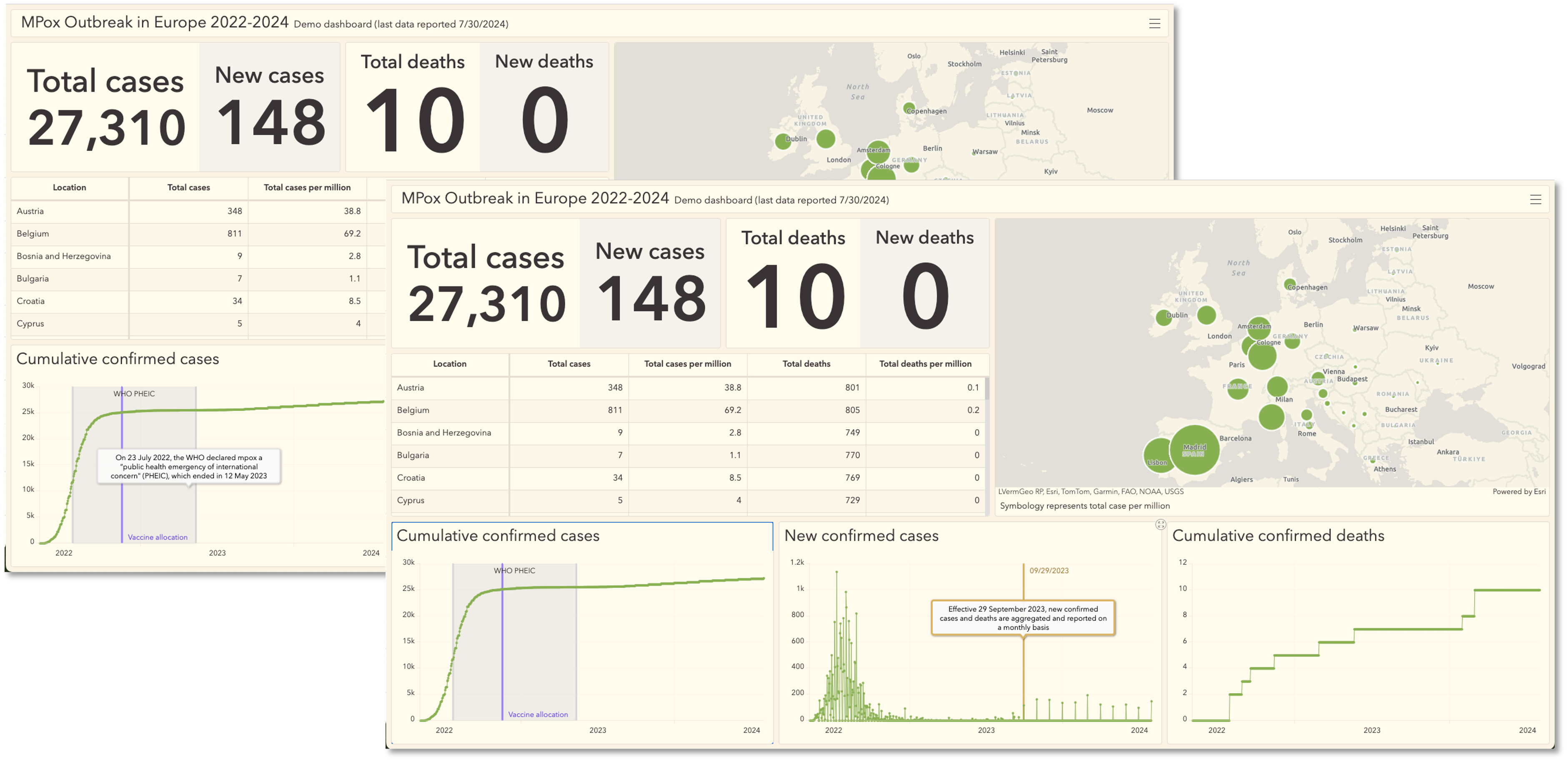
Authors now have the option to select a font for their dashboard within a custom theme.
Choosing the right font can significantly enhance data visualizations’ overall aesthetic and readability, especially when paired with theme colors and spacing options.
In the Custom Theme configuration, navigate to the Typography section and select a new font from the Font drop-down menu.
This selection will be applied to various dashboard areas, including headings, titles, and labels.

____________
New Map Tools
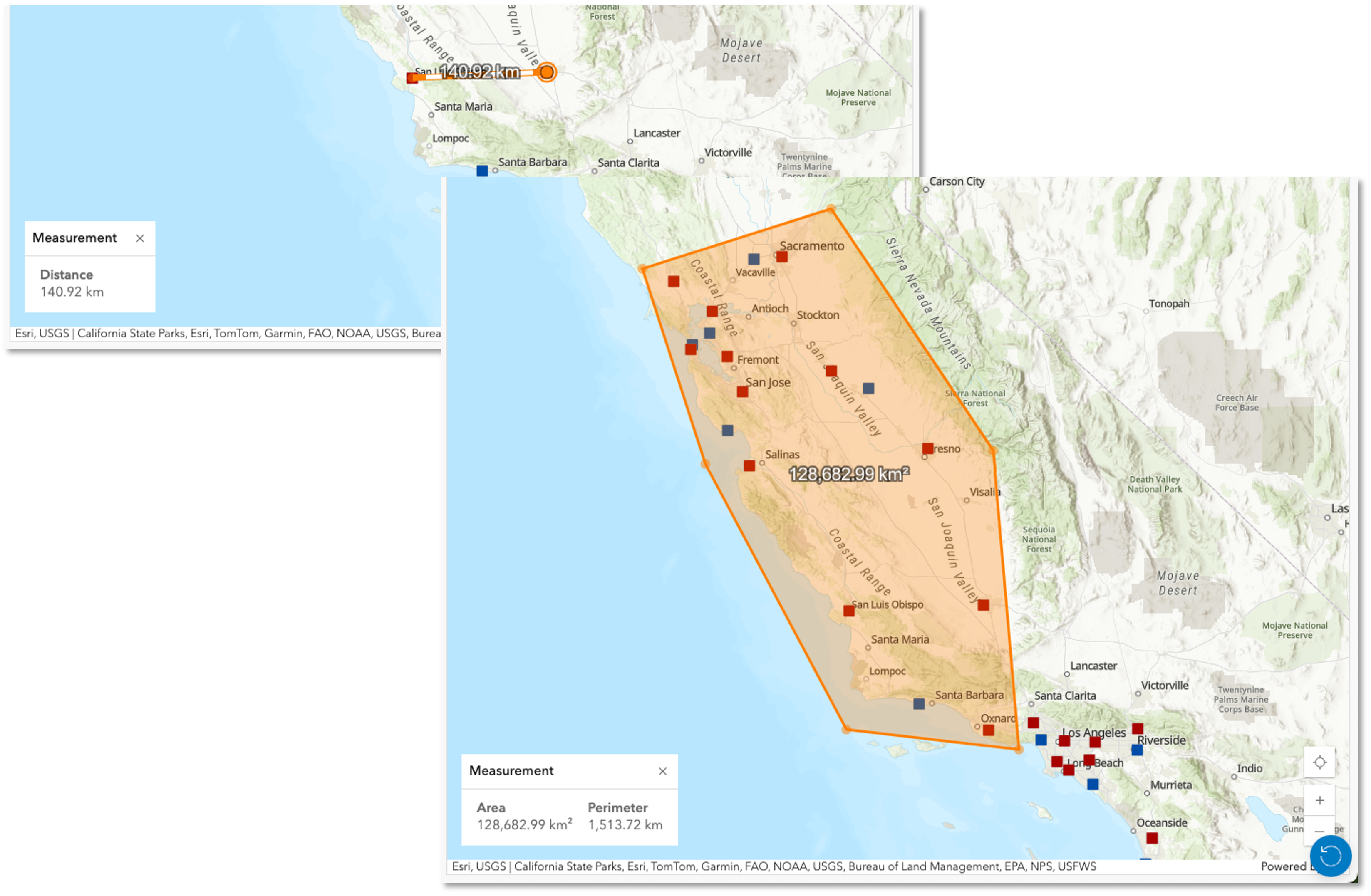
Map options now include an updated user experience and new measurement tools to calculate distance and area.
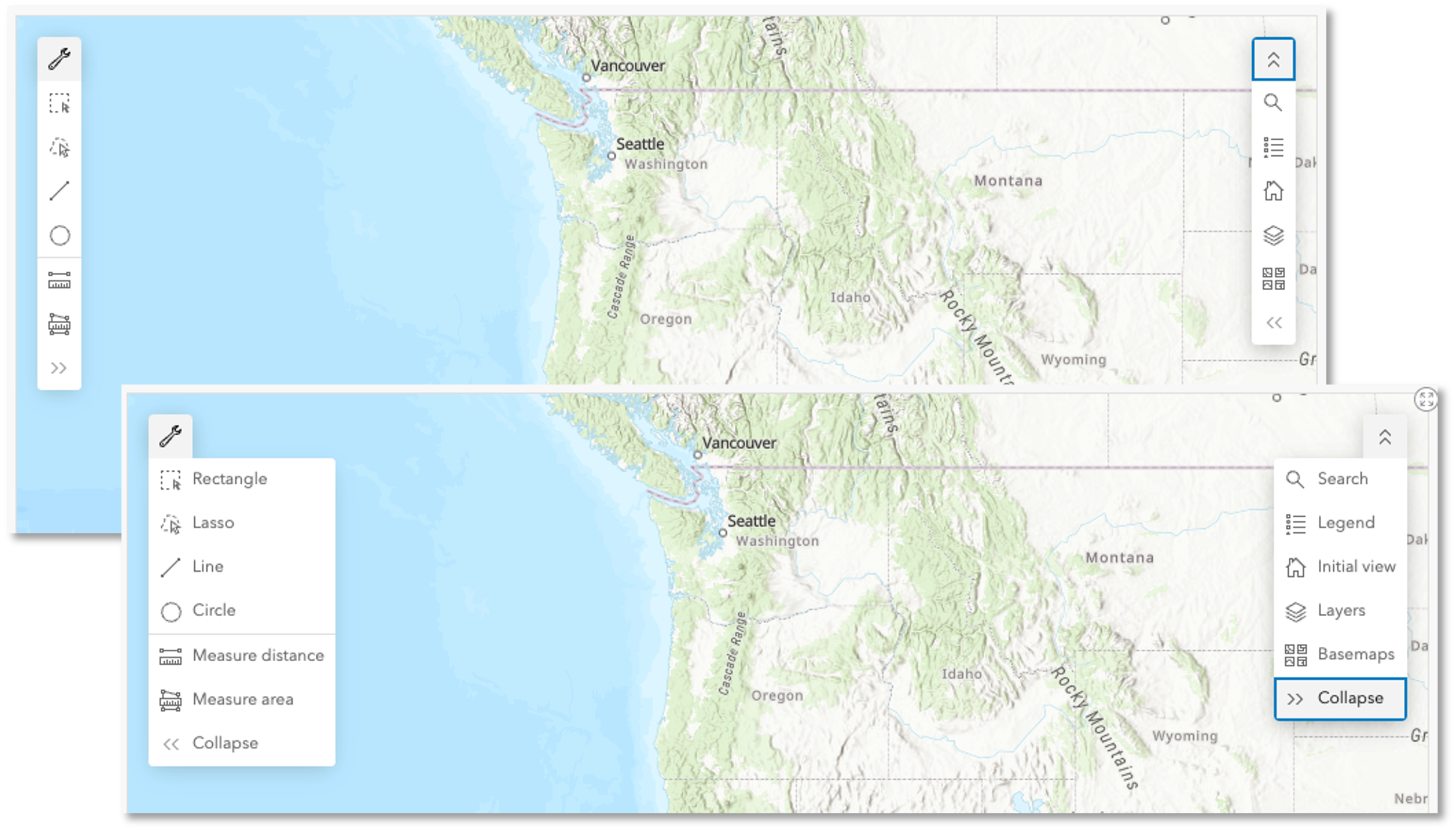
Updated User Experience
We introduced a simplified design that created space for the measurement tools and more.
When viewers aren’t using tools on the map, they can be fully collapsed, leaving the view of the map unobstructed.
Authors will find this new approach friendly in mobile and desktop views, where map elements occupy a compact space.

Measurement Tools
Enhance your dashboard experience with the new Measure tool in ArcGIS Dashboards, designed to meet the critical need for accurate measurements.
This tool empowers users to calculate both area and distance between points in dynamic 2D and 3D environments, ensuring precise spatial analysis and informed decision-making.

____________
Date Axis Guides
In Serial Charts, when “Parse Dates” is toggled on, authors can now set up date axis guides to represent a single date or a shaded area that represents a range of dates to provide additional context to the data.
Check out THIS BLOG to learn more.

____________
3D Improvements
Map extent filters are now supported for web scenes.
When the web scene is the source of an action, a change in the web scene’s extent can filter one or more elements on the dashboard, or change the extent of another map element.
____________
Dashboard Accessibility Improvements
In this release, Esri continues improving the A11Y capabilities in its software, around Screen Readers and Keyboard Navigation in dashboards.


Article Discussion: