At the 2023 Esri Developer Summit, I demonstrated various ways to visualize data as it changed over time in this technical session. The session covered common approaches for visualizing change including animations, composite multivariate symbology, and small multiples. Many of these examples used election data to illustrate the advantages and disadvantages of each technique.
After the session, an attendee approached me with an idea she had sketched on a piece of paper. The idea was to visualize the results of multiple elections using square symbols where each square represented the winner of an election using color. The sketch looked something like the following.

The sketch resembled a mini timeline for each election, similar to a sparkline map, but instead using categorical data. The thought was that we could create a bivariate symbol for each of the five previous elections. Intrigued, I knew we could accomplish a visual like this using CIM symbols, but I didn’t attempt it until early this year.
Prototyping the idea
With the next United States presidential election just around the corner, I felt it was worth sharing how my attempt at this idea turned out. There’s still more work to do in the app, but the core concept behind the symbology is in place. Check it out here!

This map shows the results of the previous five U.S. presidential elections (i.e. 2004, 2008, 2012, 2016, and 2020). Each square represents the election winner for the given area. The right-most square represents the result of most recent election in 2020. Each square represents the winner of a single election for the given area; its size is proportional to the margin of victory for the winner. Smaller squares indicate a close election while larger squares show a larger margin of victory.
Using size to represent margin of victory allows us to see areas with more consequential results than areas with smaller vote totals. This tends to result in areas with higher populations showing larger symbols than less populated areas. However, in rare scenarios a highly populated area can render with smalls symbols if the election results are very close.

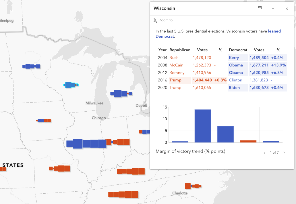
In the popup, I added a table along with several charts to give the user the ability to dive into specific election results.

Layout and app design
All thematic maps have their strengths and weaknesses. Multivariate thematic maps tend to take more effort and time to understand that single variable maps. Therefore, they typically require more information in the layout explaining how the reader should interpret map symbology.
I decided to use collapsible box components in a side panel to teach the audience how to read the map. The first component describes the symbology in detail and displays a custom legend.

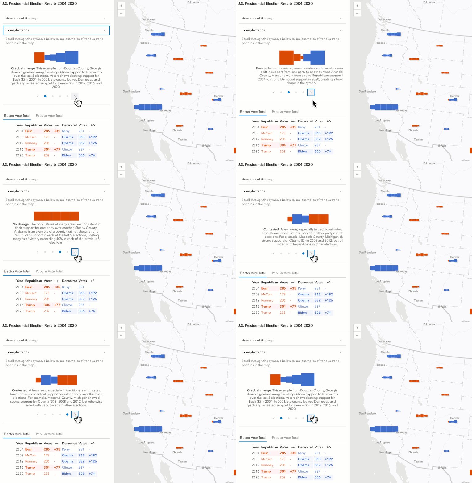
The second component describes and contrasts four different patterns of symbols. This helps the audience learn how to identify common trends and outliers based on variations in the symbology.

This visualization is complex and as a result inherits all the problems present in other multivariate visualizations. Anytime you map more than one variable, the audience’s cognitive load for understanding the map increases.
The margin of victory represented for each symbol is represented by variations in each marker’s area. It is more difficult for map audiences to understand variations in area than in length and height. So using some kind of a bar chart symbol might actually yield better comprehension of the map.
For that reason, I include bar charts in showing results for margins of victory and results from the major parties in each election.

Explore the data
The symbol sizes are scale driven. As the user zooms in, symbols grow to become more visible. As the user zooms out, they shrink as the screen’s real estate becomes scarce. Once a scale threshold is reached, data switches from displaying state results to county results. This provides more detail that allows the audience to explore nuances on a local scale.
Let’s explore voting trends in a few areas below.


How it’s made
Conceptually, creating this visualization involves a lot of trial and error. On a technical level, the symbology is created with CIMSymbols containing various primitive overrides to override the color and size of each square in the symbol using data values.
First, you must create a CIMSymbol with 5 square symbol layers of equal size. Each symbol layer must be given a primitive name to easily identify it when writing primitive overrides. I chose to name each symbol layer using the following pattern: election-{year}.

Each symbol layer must have the following offsetX values so the boxes evenly display alongside each other.
| primitiveName | offsetX |
|---|---|
| election-2004 | -2 * size |
| election-2008 | -1 * size |
| election-2012 | 0 |
| election-2016 | 1 * size |
| election-2020 | 2 * size |
Note the middle symbol layer has an offsetX value of zero to keep it centered on the feature. Symbol layers representing the election winner before that year are offset by a negative number (the size of the symbol layer multiplied by the number of elections prior to the middle election). Symbol layers representing election winners after the middle election are offset with a positive number using the same logic.
To make the symbols data-driven for each feature, you must create primitive override objects for each symbol layer targeting the following three properties:
Each of these primitive overrides must have an Arcade expression that controls the logic for overriding the respective symbol property.
Color
The expression overriding symbol layer color simply finds the party with the highest number of votes and returns its associated color value. Click here to view the function used to generate the following expression.
var rColor = "rgba(220, 75, 0, 1)";
var dColor = "rgba(60, 108, 204, 1)";
var oColor = "rgba(181, 166, 0, 1)";

var demVotes = $feature.SUM_dem_2016;
var repVotes = $feature.SUM_rep_2016;
var othVotes = $feature.SUM_oth_2016;

var allVotes = [demVotes, repVotes, othVotes];

Decode(
  Max(allVotes),
  demVotes, dColor,
  repVotes, rColor,
  oColor
);
This expression is then referenced inside a primitive override object within the CIMSymbol. Note the primitiveName points to a specific symbol layer, and the propertyName targets the color property.
const colorOverride = {
  type: "CIMPrimitiveOverride",
  primitiveName: "election-2016",
  propertyName: "Color",
  valueExpressionInfo: {
    type: "CIMExpressionInfo",
    title: "Winner",
    expression: colorOverrideExpression,
    returnType: "Default",
  },
};
Setting this override updates the symbol to look something like this.

Size
The expression controlling the size of each symbol layer is a bit more complicated. To start, you must control how sizes interpolate between critical data values. The expression gets more complicated when you account for scale, which is necessary in any web map intended to be viewed at multiple scales. In addition to setting multiple size stops at critical data points, I added a multiplication factor for each stop to grow and shrink symbols appropriately as the user zooms in and out.
Note the value in the snippet below represents the margin of victory. This is the key multiplier I used for representing the size of the candidate’s win in the county or state.
var demVotes = $feature.SUM_dem_2016;
var repVotes = $feature.SUM_rep_2016;
var othVotes = $feature.SUM_oth_2016;

var allVotes = Reverse(Sort([demVotes, repVotes, othVotes]));

var value = allVotes[0] - allVotes[1];

var sizeFactor = When(
  value >= 2000000, 32,
  value >= 500000, 16 + (0.000010666666666666667 * (value - 500000)),
  value >= 100000, 8 + (0.00002 * (value - 100000)),
  value >= 10000, 4 + (0.000044444444444444447 * (value - 10000)),
  value > 0, 2 + (0.0002 * value),
  0
);

var scaleFactorBase = (18489200 / $view.scale);
var scaleFactor = When(
  scaleFactorBase >= 1, 1,
  scaleFactorBase >= 0.5, scaleFactorBase * 0.6,
  scaleFactorBase >= 0.25, scaleFactorBase * 0.45,
  scaleFactorBase >= 0.125, scaleFactorBase * 0.3125,
  scaleFactorBase * 0.1875
);

var size = sizeFactor * scaleFactor;

return size;
Just like the color primitive override, the size override expression is referenced in an object pointing to a specific symbol layer and the size property.
const sizeOverride = {
  type: "CIMPrimitiveOverride",
  primitiveName: "election-2016",
  propertyName: "Size",
  valueExpressionInfo: {
    type: "CIMExpressionInfo",
    title: "Margin of Victory",
    expression: sizeOverrideExpression,
    returnType: "Default",
  },
};
Now the symbol looks like this.

You may reasonably ask, Why are the offsets so off? This is because the offsetX property still remains constant based on how we originally designed the symbol. Because each symbol layer’s size varies based on a data value and view scale, a constant offsetX value will no longer work. Overlaps and gaps will undoubtedly appear. Therefore, we must account for the computed size of all neighboring symbol layers when we offset a given symbol layer from the center. To do this, we must set up a primitive override on the offsetX property for each square.
OffsetX
To offset each symbol layer properly, we must offset based on the calculated size of the symbol layers relative to the center of the symbol. Therefore, each symbol layer must be offset from the center at different intervals as illustrated in the image below.

The table describing offsetX logic for each symbol layer now becomes the following:
| primitiveName | offsetX |
|---|---|
| election-2004 | -1 * ((0.5 * election2004size) + election2008size + (0.5 * election2012size)) |
| election-2008 | -1 * ((0.5 * election2008size) + (0.5 * election2012size)) |
| election-2012 | 0 |
| election-2016 | (0.5 * election2012size) + (0.5 * election2016size) |
| election-2020 | (0.5 * election2012size) + election2016size + (0.5 * election2020size) |
This is the expression that implements that logic. Note that it considers symbols of any number of symbol layers and is generically written for all symbol layers, so we can simply set the selectedYear variable when applying the override to each symbol layer.
function isEven(v) {
  return v % 2 == 0;
}

var interval = 4;
var years = [2004, 2008, 2012, 2016, 2020];
var selectedYear = 2016;

var numItems = Count(years);
var isEvenItems = isEven(numItems);
var middleIndex = Floor(numItems / 2);

if (isEvenItems) {
  middleIndex -= 0.5;
}

var index = IndexOf(years, selectedYear);

if (!isEvenItems && index == middleIndex) {
  return 0;
}

var direction = iif(index < middleIndex, -1, 1);

var yearStart = iif(direction < 0, selectedYear, years[middleIndex]);
var yearEnd = iif(direction < 0, years[middleIndex], selectedYear);

var sizes = [];

var offsetX = 0;

for (var year = yearStart; year <= yearEnd; year += interval) {
  var demVotes = $feature["SUM_dem_2016"];
  var repVotes = $feature["SUM_rep_2016"];
  var othVotes = $feature["SUM_oth_2016"];

  var allVotes = Reverse(Sort([demVotes, repVotes, othVotes]));

  var value = allVotes[0] - allVotes[1];

  var sizeFactor = When(
    value >= 2000000, 32,
    value >= 500000, 16 + (0.000010666666666666667 * (value - 500000)),
    value >= 100000, 8 + (0.00002 * (value - 100000)),
    value >= 10000, 4 + (0.000044444444444444447 * (value - 10000)),
    value > 0, 2 + (0.0002 * value),
    0
  );

  var scaleFactorBase = (18489200 / $view.scale);
  var scaleFactor = When(
    scaleFactorBase >= 1, 1,
    scaleFactorBase >= 0.5, scaleFactorBase * 0.6,
    scaleFactorBase >= 0.25, scaleFactorBase * 0.45,
    scaleFactorBase >= 0.125, scaleFactorBase * 0.3125,
    scaleFactorBase * 0.1875
  );

  var size = sizeFactor * scaleFactor;

  var factor = iif(
    (year == yearStart) || (year == yearEnd),
    0.5, 1
  );

  offsetX += (size * factor);
}

return offsetX * direction;
This expression must be referenced by pointing to a specific primitiveName and the offsetX property.
const offsetXOverride = {
  type: "CIMPrimitiveOverride",
  primitiveName: "election-2016",
  propertyName: "OffsetX",
  valueExpressionInfo: {
    type: "CIMExpressionInfo",
    title: "Margin of Victory",
    expression: offsetXOverrideExpression,
    returnType: "Default",
  },
};
I’m still not 100% happy with the symbol sizes and data ranges, so that portion of this project is still a work in progress.
I wrote utility modules for generating these expressions based on a config file to make the experimenting with various size ranges easier. If you’re interested in exploring the code, feel free to check it out in this GitHub repo.
Feedback and remaining work
A number of people have contributed the following feedback for improving this visualization:
- Use a more appropriate projection for the area (I was originally using Web Mercator). Thanks to Andy Skinner, I found an Albers Equal Area version of the Human Geography basemap in the Living Atlas that the app now uses.
- Add county boundaries for easy understanding of which areas are considered for each symbol.
- Add drop shadow to help distinguish overlapping symbols, especially at larger scales. I also added a slightly more prominent outline to help with this in addition to the drop shadow.
- Make Alaska and Hawaii easier to find. I haven’t addressed this yet, but plan to add insets for these. I also need to clean up the Alaska data as it isn’t properly located in the map.
- Consider labeling the symbols at larger scales. I’m not totally decided on this yet as the symbols already consume a lot of screen real estate. I still need to experiment with this.
The map is still very much unfinished, but I think it shows promise in visualizing trends in data that varies over time. I plan to update it when the 2024 election results become available.

Final thoughts
Overall, I think this map style provides a unique perspective in comparing historic election results without the use of sliders or animations. You can clearly see the areas that strongly support each party as well as areas that are more hotly contested from election to election. The map also subtly communicates areas that show growing or declining support for each party over time.
It’s also worth remembering that each visualization style is typically really good at communicating one aspect of a story at the expense of others. This style excels at communicating voter trends over time. However, it isn’t great at representing final results for a single election. Predominance maps, proportional symbols, and cartograms are better suited for that purpose.
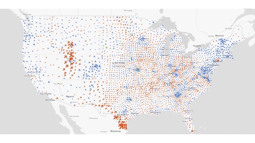
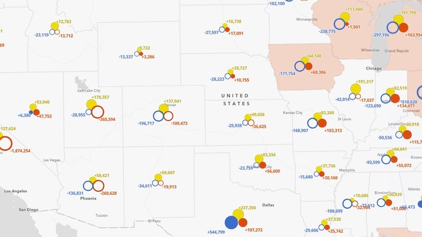
This style also doesn’t adequately communicate how patterns shift from year to year. For example, a decrease in support for one major party could be due to increased support in the rival party, lack of voter turnout, or increased support for a third party. Check out this article where I experiment with a mapping style that communicates how votes shifted from election to election.
At Esri, we experiment with innovative visualization techniques such as this one. If a visualization style shows value or promise, it has the potential to become part of the ArcGIS product as a mapping style so anyone can easily create these styles without needing any knowledge of JavaScript or CIM. Feel free to reach out and let me know what you think about this approach for visualizing trends.


Article Discussion: