Collections in ArcGIS StoryMaps have been around nearly as long as the product itself. From the beginning, we recognized the value of being able to share related content as one cohesive, easy-to-navigate package. Then, in August of 2024, another dimension was added to collections: place.
Simply by toggling a button in the Design panel for a collection, storytellers can build their collection around a map, allowing readers to navigate and browse the collection geographically instead of just linearly through a grid or list of items. This capability offers innovative ways to package spatially oriented content and create an effective and memorable reading experience.

Setting up a map-based collection
As the author of a collection, once you’ve turned on the map option in the Design panel, you can specify a location for each item, which will then be represented on the map by a pin (the map’s scale will automatically be determined by the spatial extent of the points). Readers can access any location-tagged collection item via a pop-up that expands when the pin is clicked. The traditional collection browsing mechanism — the collection title, description, and series of item thumbnails — will still be available to the side of the map.
You can customize the way location names appear in the collection, the color of the pins, and can also choose which side of the collection the map is on. (Note that adding a location for every item is not mandatory; items without a location specified will be labelled as “No location” and will only be accessible via their thumbnails in the side panel.)
The video below offers a quick visual demonstration of the basics for setting up a map-based collection.
When to use map-based collections
As fun as this feature is, not every collection needs to incorporate a map. Here are a few conditions that make it sensible to turn on the map option for a collection.
- When most items in the collection can be tied to a particular place. As mentioned above, not every item must have a location attached, but the more items there are that don’t show up on the map, the greater the risk of a less coherent exploring experience for the reader.
- When the order that readers proceed through the collection isn’t critical. Because there is currently not a way to number the pins, readers who approach the collection via the geographic points rather than the thumbnails may not end up following the author-specified order of items. This makes the map option less conducive to, say, a collection whose items represent the progression of chapters in a book.
- When it’s less crucial that readers make their way to every item in the collection. The map option lends itself to more of a “freestyle” browsing experience. While that kind of liberty can be nice for a reader, it also means that maybe not every point will receive a thorough read. For that reason, collections with fewer items that need to be mapped will likely work better with the map view.
For an example of a collection that checks all three of these boxes, take a look at Growing Green Cities. This collection profiles four cities that have used geospatial technology to aid sustainability in the face of various climate-related challenges.

At a quick glance, the collection map view provides a sense of where these cities are and thus the kinds of challenges that are likely to be facing them. Readers are also able to easily pick and choose the order in which they read about each city, perhaps aiming first for the city that’s nearest to them. And with only four items, the map view doesn’t make it less likely that readers would eventually take a look at all four cities.
More ways to tell geospatial stories
Simply putting the items in a collection on a map is a great way to share a bundle of content with a geographic element, but our hope is that this feature will inspire even more innovative geospatial storytelling techniques.
For one example of a different way to tell a story using the collection map view, check out The many faces of Superfund sites. In this collection, Esri’s StoryMaps team sets out to introduce readers to the Environmental Protection Agency’s list of high-priority toxic waste-contaminated sites around the United States — most commonly known as Superfund sites. But when that list contains over 1,300 entries, how do you even begin to tell that story?
Our solution was to research and select five sites that each represent a different cross-section of the EPA’s Superfund site data. Once we had the information and maps in hand, we settled on the collection map view as the ideal way to present these stories. We could have put everything into one story, but in this particular case, we felt a map-based collection would best fit the content, giving each case study ample space while reducing scroll fatigue.
And we didn’t stop at simply turning on the map view; we also used some additional tricks and strategies to really enhance the reading experience of the collection.
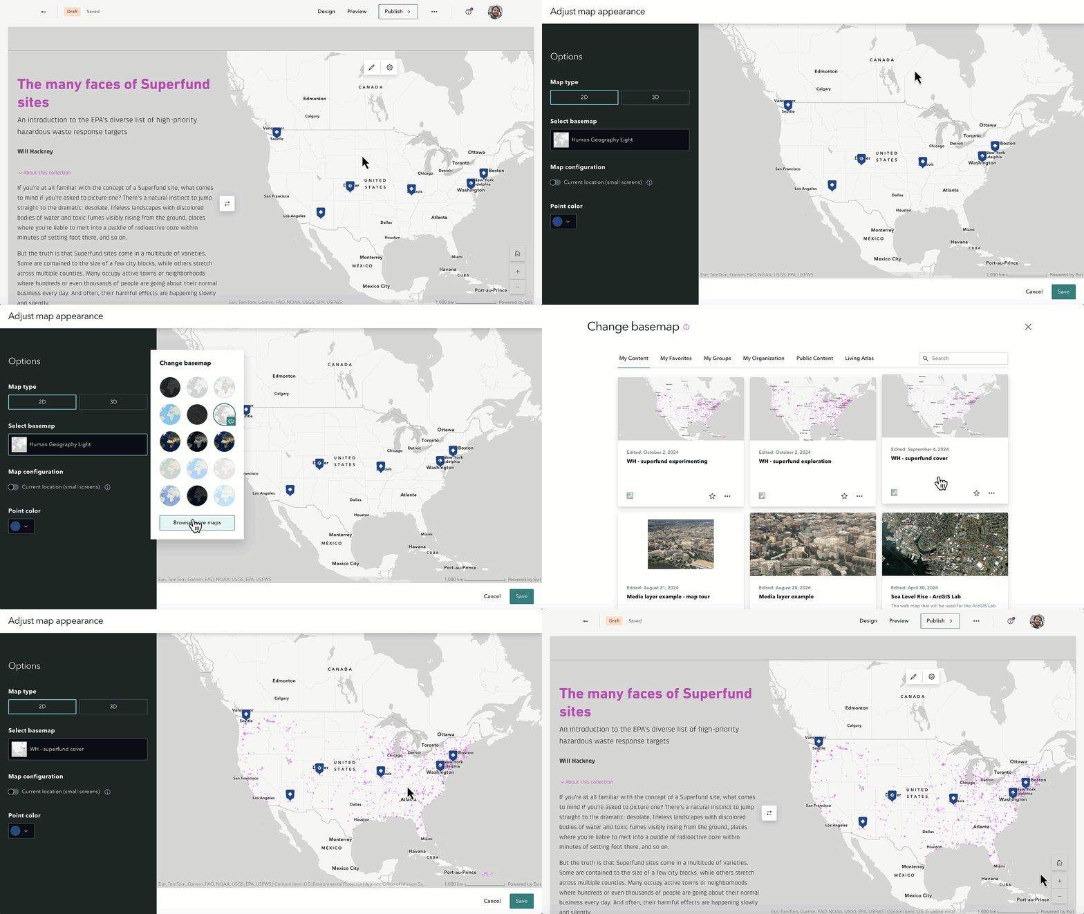
Using a web map as the collection basemap
For the map that would be displayed in the collection overview, we chose a version of the basemap that is used throughout the collection, containing the location of all active Superfund sites in the United States. This allows readers to immediately get a sense of the amount and spatial distribution of Superfund sites, and to see how the five case studies are positioned within that distribution.

(Note that you don’t have layer visibility control for a web map that’s being used as a basemap in a map-based collection; it will just appear as the saved view in Map Viewer, so keep that in mind as you’re selecting or putting together a web map to use in a collection.)
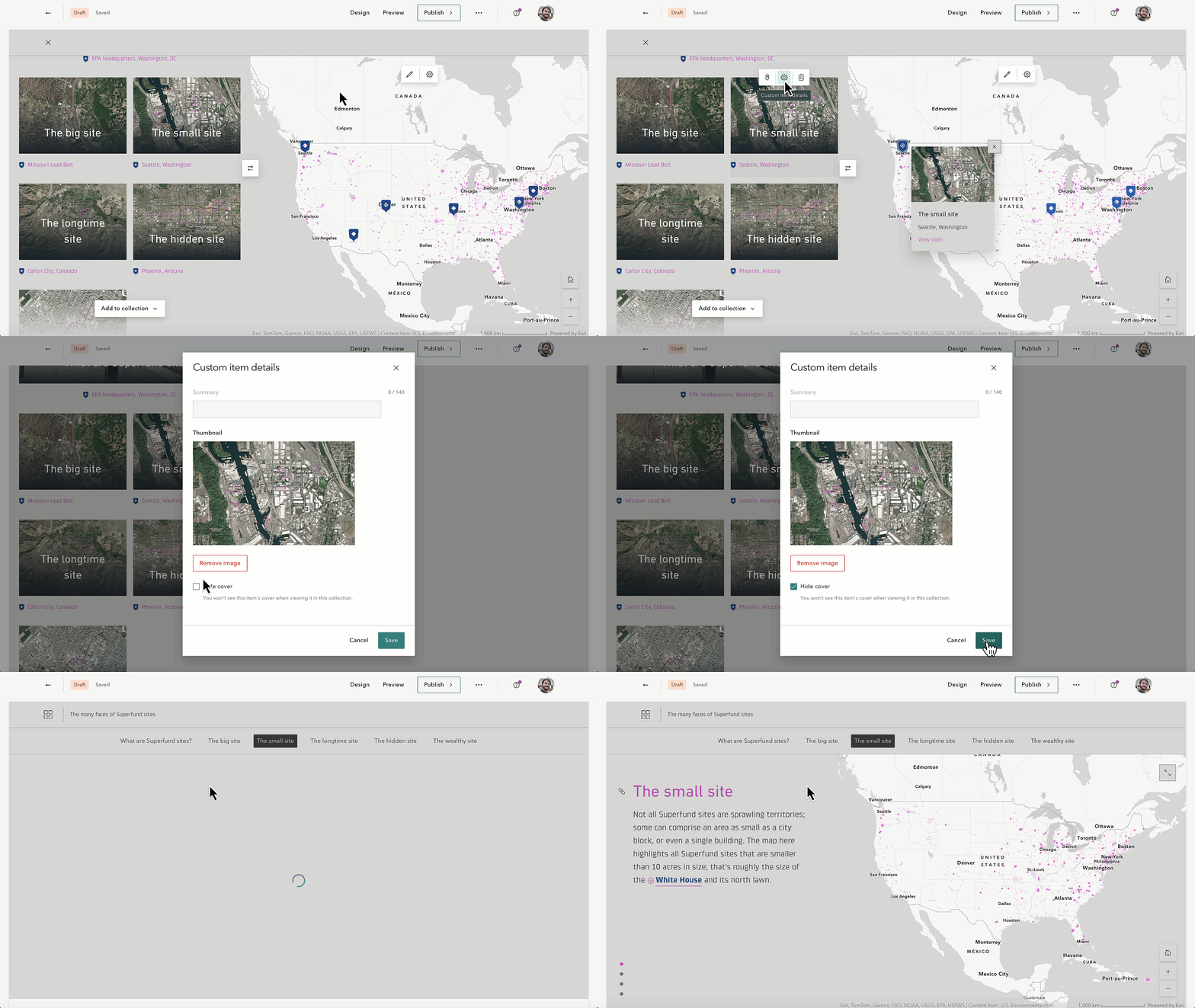
Hide item covers to create a “portfolio” experience
We structured each case study in the Superfund story as its own mini story, with just one sidecar block walking through the concept or characteristic that each case study represents and providing a succinct history of that site. By hiding the covers to those stories, when a reader views one of those case studies within the collection, it will appear as something like a beefed-up pop-up, containing much more information than a typical map pop-up but not feeling like an entirely separate story, giving the entire collection a cohesive, portfolio-like quality.

Don’t forget the other design options!
Before the button for turning on the map function was added, the trusty collection Design panel was still an important place to go. Those other design considerations that have been around for a while — collection theme, cover layout options, and navigation options — are still well worth paying attention to.
For the Superfund collection, we opted for the Magazine cover layout because it emphasizes the first item in the collection, which is an overview of the Superfund program and an ideal starting point. Even though readers are more encouraged to explore the collection non-linearly through the map, we hoped having that introductory story catch the eye more in the side panel would clue readers in that they should perhaps begin their exploration there.

Theming is important, too, as always. For the theme we used in the Superfund collection, we matched the background color to the gray ocean color in the map, a small but powerful touch to help the map feel like a seamless part of the collection. We, of course, also used the same theme in each of the case study stories, further adding to the coherent feeling of the whole thing.
____________________________
The Superfund collection is just one example of how simple ArcGIS StoryMaps features can be creatively used to deliver innovative and memorable experiences to an audience when it comes to telling stories about the world.
To be clear, there is no one size fits all approach; not all content needs to be packaged in a collection instead of a single story, and not all collections need to be presented in map form. There are practically endless options for sharing your place-based stories in ArcGIS StoryMaps, it just takes some delibe rate thought and willingness to experiment to come up with the best solution for your content. If you’re ever feeling blocked, don’t forget that there are plenty of resources available to help and inspire you.
Once you have figured it out, don’t hesitate to share your work with us on X (@ArcGISStoryMaps), the Esri Community message boards, or in person at the next Esri event. We also encourage you to submit your work to the 2024 ArcGIS StoryMaps competition, which is accepting submissions until December 6, 2024.
We love seeing what the global storytelling community comes up with, so keep up the great work!


Article Discussion: