With the June 2024 release, new theme capabilities have made the creation of visually effective dashboards easier than ever. Seven new themes are now available in the Theme panel of the Dashboards application and can be applied with a single click.
Once you’ve selected a theme, you’re ready to enjoy the automatically matched data visualization colors as well. Working with organization brand guidelines that determine what colors you need to incorporate? We’ve got you covered; custom themes will allow you to meet your mark. Read on to learn how to leverage themes in your dashboard and maximize the impact of these new powerful styling capabilities.
Try a new theme
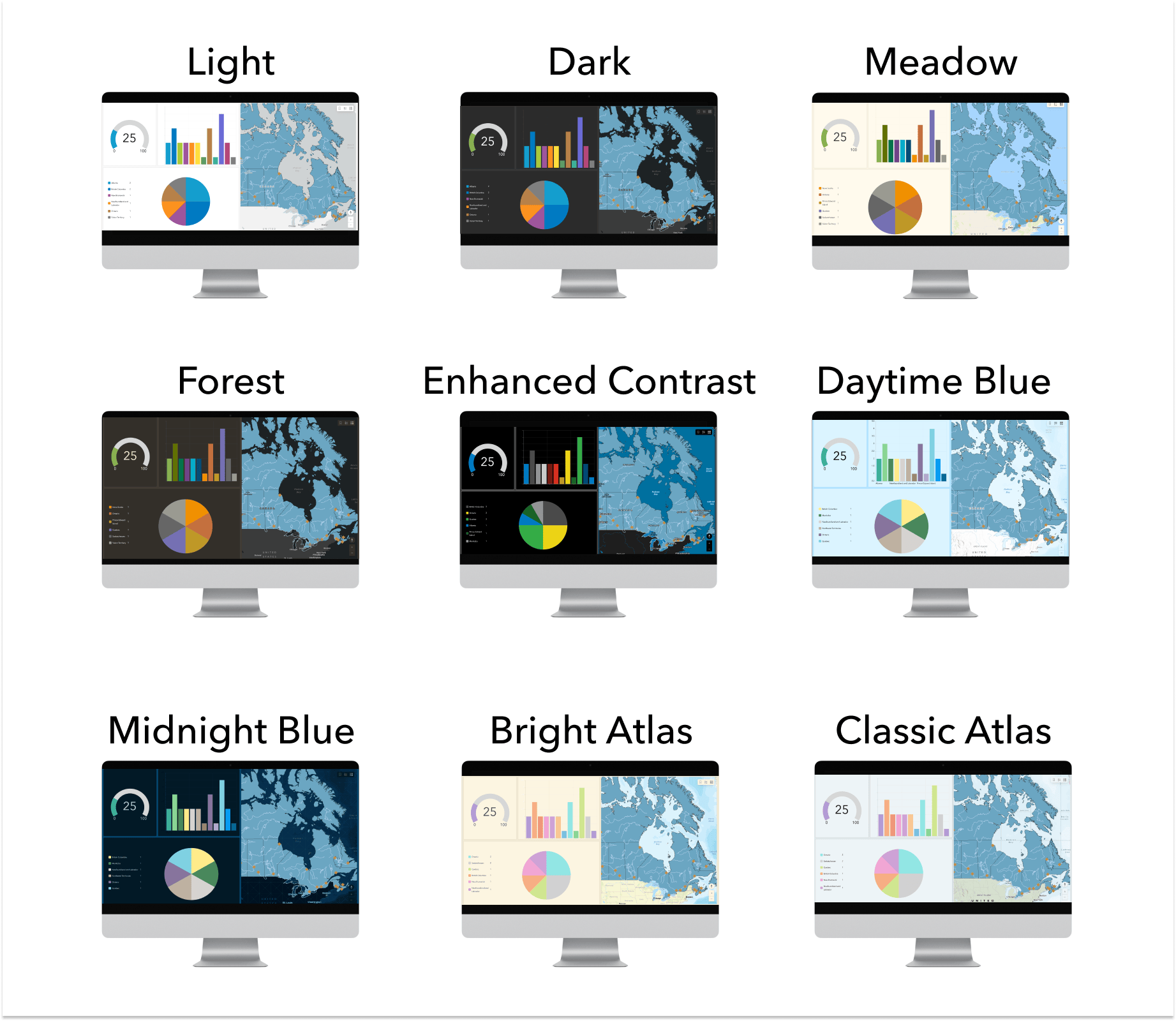
When you create a dashboard, you will now see new theme options available in the Theme panel. The light theme option, with a new, fresh color set, is applied by default. Switching between theme options is easy, allowing you to choose one that suits your needs. All themes have been tested for appropriate contrast between text and foreground, ensuring your dashboard is not only attractive but easy to read. When adding a new chart, you will notice the built-in colors for data visualizations are thoughtfully paired with colors in the layout for a professional, consistent aesthetic.
Working with existing dashboards
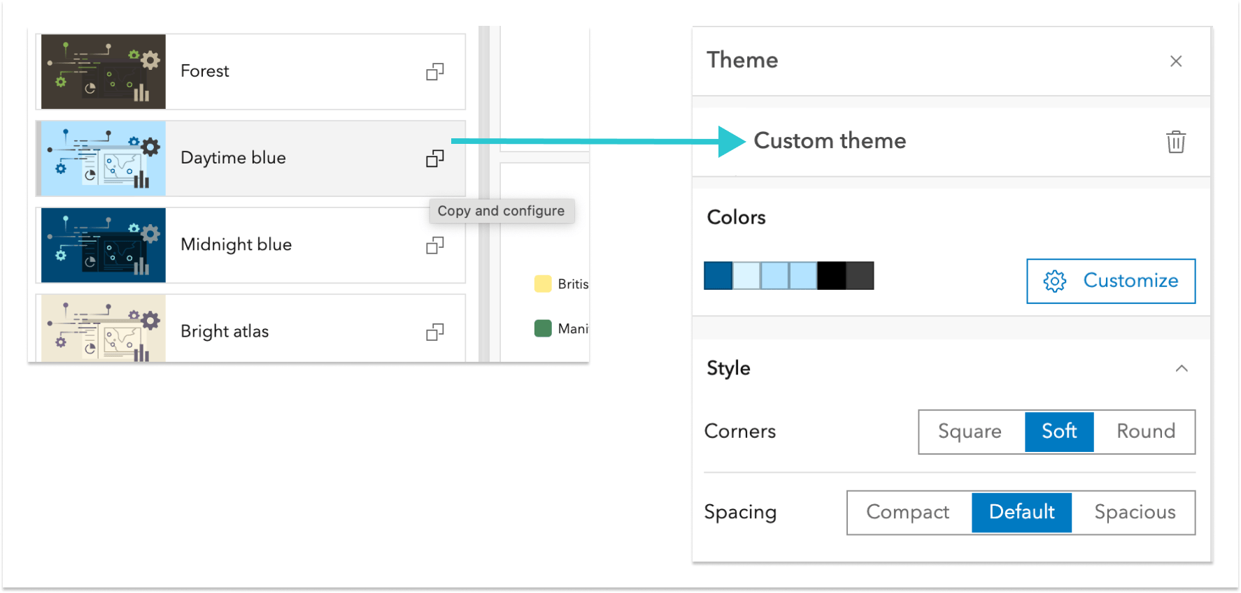
The new theme options can be applied to your existing dashboard using the Theme panel. Your current theme will appear as a custom theme. To switch to the new theme, simply copy a new one for use from the themes list. If you want to try modifying an out-of-the-box theme, it will override your existing custom theme.
Custom themes
Creating a new custom theme, whether from scratch or based on an out-of-the-box theme, is simple and efficient. Notice how each theme has an icon on the right which allows you to copy and configure it. Click this, and you will see a custom theme panel displayed. Here you’ll find options to further customize your colors along with additional styling controls for corner radius and element spacing. Take these options for a spin and discover which ones work best for your specific needs.
Dig deeper into custom themes
When you dig deeper into custom theme settings, you can find additional options to tailor the look and feel of your dashboard. In the Color section, click “Customize” to see options to edit the colors in your dashboard. Three key colors are used for the text, foreground, and accent for your dashboard, and they play a significant role in the overall appearance. If you expand the “Advanced colors” panel, you will see additional color options to adjust areas of the dashboard that were previously unavailable for adjustment.
If you’re working with brand guidelines from your organization, this might be where you choose to incorporate them. As you adjust colors, you might notice an alert next to the color you’ve changed. These are part of our built-in color contrast checker which can help you ensure whether you’ve achieved adequate contrast between text and foreground. If this alert shows up, just open the color picker, and expand the area at the bottom to see where contrast may need improvement. As you adjust the color you will see the alert in the panel disappear and the contrast checker will provide a positive indication.
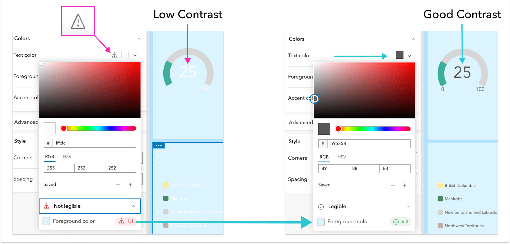
TIP: If you need to adjust colors to meet contrast standards, try gradually sliding the color picker vertically until you see the alert disappear.
Spark your creativity with a few examples
As you start working with themes, you will also find useful documentation here.
Need a few ideas to get you started? Check out some example dashboards below crafted using our new themes! With themes, your data can have a look and feel that’s most suited to the story you are trying to tell – whether you are delivering a business brief or planning a land-conservation project with your community. Which theme options do you think work best for each dashboard below?
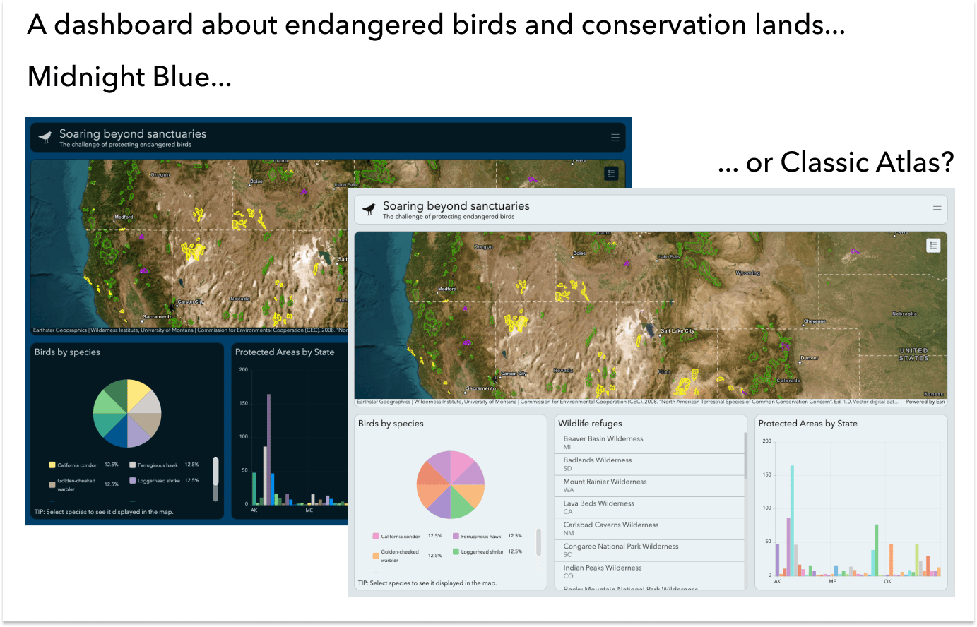
Link to endangered birds dashboard in Midnight Blue theme:
https://www.arcgis.com/apps/dashboards/20962ba8a80848728bdfd64bde8343a7
Link to endangered birds dashboard in Classic Atlas theme:
https://www.arcgis.com/apps/dashboards/a6a8e271f9034f79b486f7e499f58594
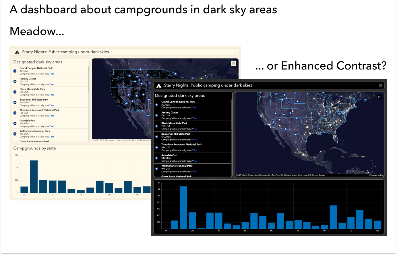
Link to campgrounds dashboard in Meadow theme:
https://www.arcgis.com/apps/dashboards/d516e8bfae854101aac3375aff9a8ca8
Link to campgrounds dashboard in Enhanced Contrast theme:
https://www.arcgis.com/apps/dashboards/4fa985ea964c4d6f8c896fcde1806842


Article Discussion: