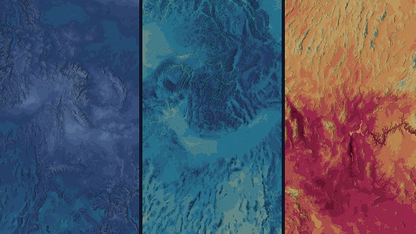
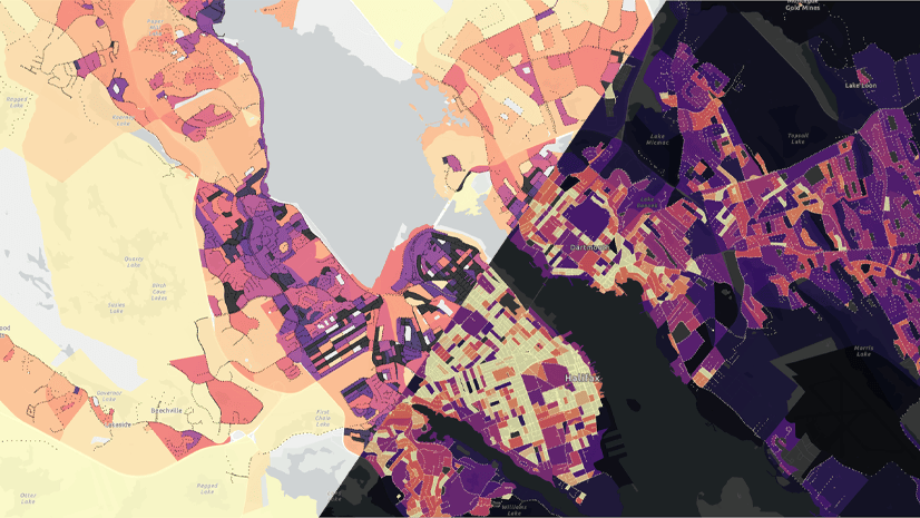
Colors are never neutral. They affect how people think and feel about your map. As a cartographer, you should be aware of the connotations and associations carried by the colors you use. They can be powerful tools to help you communicate more clearly. But if you ignore them, they can just as easily sabotage your map’s message. The two videos below share examples of color choices based on associations and connotations. The examples given are in ArcGIS Pro, but this advice is relevant to any mapping situation.
Takeaways:
- If there’s a color that’s normally associated with your subject, you should probably use it in your map.
- What colors will your audience expect to see on this map? Try those first.
- Color connotations and associations can be overpowered by other signals in your map.
- Color connotations vary (sometimes dramatically) between cultures.
Further learning:
Emily Meriam is a pro at exploiting color connotations and associations. You can learn more about how she does it in the following articles: Creating a meaningful temperature palette and Sunset Colormapping.
You can find more videos like these in the Quick Cartography playlist.
Data sources:
The data in these videos comes from the following sources:
- U.S. Heart Disease Mortality Rates, 2014-2016, Centers for Disease Control and Prevention. Interactive Atlas of Heart Disease and Stroke. https://nccd.cdc.gov/DHDSPAtlas. Accessed on May 2024 and used with permission
- USA Cropland, USDA NASS
- National Hydrography Dataset Plus Version 2.1, USGS, Esri
- USA Parks, Esri, TomTom
- USA Census Urban Areas, Esri, US Census Bureau
- Surface Air Temperature (Average Annual), Generated using Copernicus Climate Change Service information [2020]
- Presidential Election 2020 USA – County, MIT Election Data and Science Lab, 2018, “County Presidential Election Returns 2000-2020”, https://doi.org/10.7910/DVN/VOQCHQ, Harvard Dataverse, V11, UNF:6:HaZ8GWG8D2abLleXN3uEig== [fileUNF]
- ACS Race and Hispanic Origin Variables – Boundaries, U.S. Census Bureau’s American Community Survey (ACS) 2018-2022 5-year estimates, Table(s) B03002


Article Discussion: