Business Analyst infographics are powerful tools for analyzing and consolidating geographic information and—perhaps just as importantly—for presenting that information to others. In addition to running infographics, you can also build infographic templates in the following applications:
- ArcGIS Business Analyst Web App (Advanced license)
- ArcGIS Community Analyst
- ArcGIS Business Analyst Pro

Infographics can be viewed in full page, slide, stack, and side-by-side display modes. Building infographics is more than juxtaposing variables, maps, and graphics. There is quite a bit of design involved if you want your template to look just right.
Grouping your infographic template’s content in layers is helpful for organizing the different panels and elements, and enables you to deliver an optimal experience across the different display modes.
The next three sections will go over display modes, layers, and recommended best practices.
Display modes
In the Business Analyst Web App, when you run an infographic from a site’s pop-up menu on the map, it appears in the default full page display. To change the default display mode, go to Preferences > Reports > Infographics > Run infographics and select your desired option.
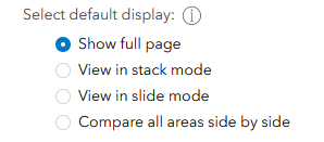
Following is a description of the different display mode options:
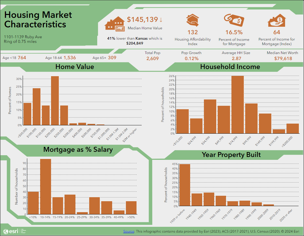
- Full page – this is the default, in which the entire infographic is displayed in its full page layout. When building an infographic template, you use the infographic builder to insert or edit elements and panels in the full page layout, and this display mode is its direct rendering.
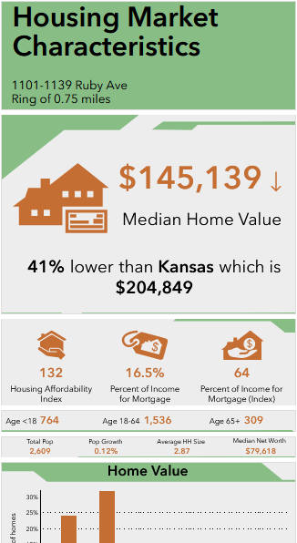
- Stack mode – the individual panels in the infographic are displayed in a vertical stacked order that you can scroll through vertically. Note: This is the display mode used when you run infographics in the BA Mobile app.
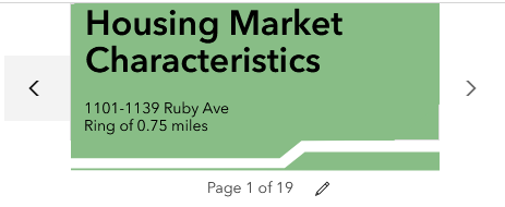
- Slide mode – the individual panels in the infographic are displayed as presentation slides that you scroll through horizontally.
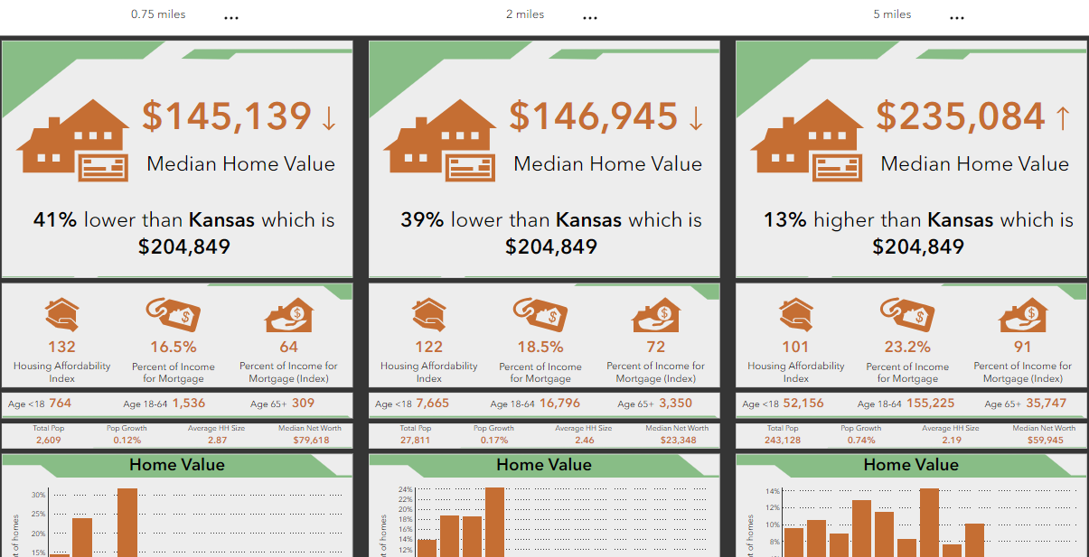
- Compare all areas side by side – the individual panels for each area in the site (rings, drive times, or walk times) are displayed in side-by-side columns. You can even add additional areas to the comparison by expanding the Side by side comparison pulldown menu and clicking Add sites to compare. Each column is a stack mode view of the template. Is there a difference between these columns and the stack mode? Yes, when comparing all areas side-by-side, only the panels that contain data are included – omitting panels that contain only text or shapes draws the viewer’s attention to the data comparison.
Layers
Layers are helpful for organizing the different panels and elements, increasing users’ awareness of the content, and facilitating ease of further customization of the template when the need arises. They also enable you to deliver an optimal display experience across the different display modes.
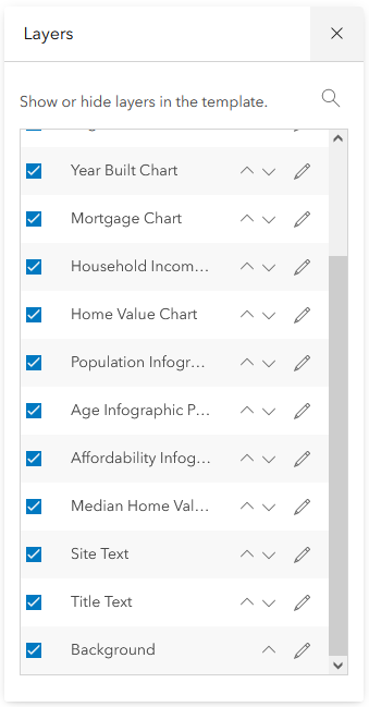
To use layers when building or editing an infographic template in the infographic builder, click Layers.

The Layers window opens, with all the layers listed in order. Use the arrow keys to move layers up or down in the order. To hide a layer, uncheck the checkbox next to it.
Using layers to group and organize the content in your infographic template offers some advantages:
- It helps better organize the panels and elements in your infographic template.
- Sometimes, you will not be able to mouse over a panel or text and click the Edit button, because it is hidden under another layer above it. To be able to activate the edit option, you can either move the layer above in the order or hide the layer above it. You can always restore the original order and visibility later.
Best practices
Following are some recommend best practices regarding layers and display modes:
- When naming layers, assign intuitive names that aid organization and increase awareness. This is helpful when you need to further customize the template later when it is no longer fresh in your memory. It is also especially helpful when collaborating on a template with others in your organization, as it makes it easier for them to review, understand, and edit.
- For stack and slide modes, order layers from bottom to top. The bottom layer is the first element displayed. For example, you may want the Title panel or text to be at the bottom, so that it is the first panel displayed in the stack mode. This is especially important to note when you intend for users to run the infographic template from the BA Mobile app.
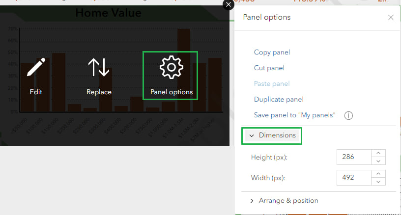
- For slide and stack modes, control the area for each slide by setting the dimensions of the panel in the infographic template. To set dimensions, mouse over a panel, click Panel options to open the Panel options window and expand the Dimensions section.
- Avoid overlapping panels when working with the layout in the infographic builder and keep all added text within the borders of the panel.
- Plain text added to a template is not displayed in the slide and stack modes. To ensure that text, such as titles and footers, are displayed, place all text within text panels (instead of floating text elements). Text panels with at least two text elements will be displayed in slide and stack mode. On the other hand, if there is any text that you intend to appear only in the full page display, use floating text elements for them, or text panels with a single text element.
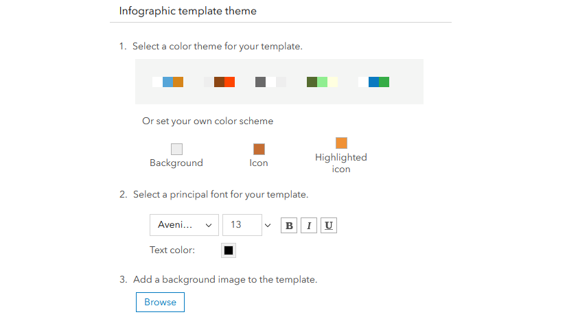
- Tip: When customizing a standard infographic, or a custom infographic shared with you, you may need to customize some layers to fully achieve the unified colors and fonts across the templates – only modifying the theme can sometimes be insufficient. For example, after customizing the theme for the infographic template in the Best practices for themes article, the background color of some panels, and the footer on the second page were still not as expected. That was corrected by opening the Layers window, clicking Edit for the Background layer, and setting the Fill color to the light green brand color used for the Title panel background.

Article Discussion: