Singapore is often regarded as a role model to the rest of the world when it comes to accessibility for its citizens. The Green Man touch pad is an initiative developed by the Singapore Land Transport Authority to make navigating the city easier for those with limited mobility. The elderly and persons with disabilities (PWD) are issued a free concession card that can be tapped on a reader mounted above a crosswalk push button to extend their crossing time by eight seconds. When I learned that I could get the precise location of each of these signals from the Singapore Land Transport Authority, I couldn’t resist using those locations to create a map.
Mapping the availability of traffic signals with added crosswalk time could help city planners in Singapore to visualize the Green Man program and plan for its expansion. Information-rich maps support vulnerable population groups and improve access to important facilities. City planners can use these maps to plan awareness campaigns, easily spot areas in need of Green Man signals, and expand the program by placing similar signals in areas that lack them.
City planning departments use data to improve citizens’ lives. Using ArcGIS for Excel, city planners can gather and analyze information and create maps that help them make well-informed decisions for providing facilities and infrastructure.
Why map Green Man signals?
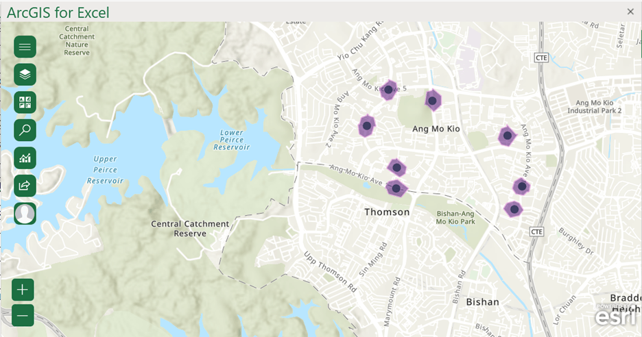
For this project, I started by mapping the Green Man reader-equipped intersections; I then created a buffer around each traffic light and conducted a walking time analysis to assess a fixed walking distance that cardholders must travel to access Green Man-equipped crosswalks.
Finally, I added a reference layer from ArcGIS to assess the proximity to resources and commercial centers by adding those layers to the map. As a future possibility, I could also add a population by age reference layer to see whether the crosswalks are in areas populated by the citizens that need them.
Add the Green Man data in Excel
To replicate my map, you need to add the Green Man location data in Microsoft Excel. You then use the Add a layer from Excel workflow to map those locations in ArcGIS for Excel. Start by setting up your environment.
- Open a new spreadsheet and add locations of Green Man signals from this list: https://www.lta.gov.sg/content/dam/ltagov/getting_around/driving_in_singapore/pdf/latest_gm.pdf
- Create and add a table.
- Select the rows and columns to add to your table.
- Click the Insert tab in Microsoft Excel, then click Table.
- Add filters to your table if necessary.
- Add the following 3 addresses to your Excel sheet:
ANG MO KIO AVENUE 10, Singapore
ANG MO KIO STREET 52, Singapore
ANG MO KIO AVENUE 3, Singapore
When you begin the Add a layer from Excel data workflow, for Excel analyzes the data in the currently selected Excel table or range of cells and identifies the best ways to represent the data on the map. You can add a layer to a map using the default options, or you can manually specify a data source, location type, and styling options. For this tutorial, you’ll manually add the Green Man traffic signal addresses to the map.
City planners can map these locations as a starting point and keep expanding their analysis to larger sets of data. The map is a visual presentation of all the signal locations and is a more tangible way to review this data than a long list of addresses. Furthermore, it provides a comprehensive picture of where the Green Man traffic signals are concentrated in specific areas and highlights areas for future growth potential in other sparsely equipped areas.
Create the analysis
Learn more about the ArcGIS for Excel analysis tools
A buffer is one of the most common types of GIS analytic operations. Creating a Buffer around each Green Man signal, then conducting a simple walk time analysis allows you to find what is proximal to or within the neighborhood of a location. Conducting such analysis on intersections in Singapore that are Green Man reader equipped may help assess signal distribution and proximity to resources and commercial centers (or locations where there are high concentrations of elderly population).
The analysis can also be used to predict the walking distance covered for elderly persons, persons with disabilities, and members of their families or support network to access city facilities. Accessing important community resources such as parks, libraries, museums, and medical facilities becomes easier when you have a Green Man signal nearby that helps you reach destinations safely.
This map can help city planners identify businesses and residential areas that are within a specific walking time or distance.
Follow the Use Buffer/Drive time analysis workflow. For this tutorial, in the Choose analysis type section, choose Walking distance, 0.5, kilometers, Towards to illustrate areas of Singapore that are within half a kilometer of a Green Man signal.
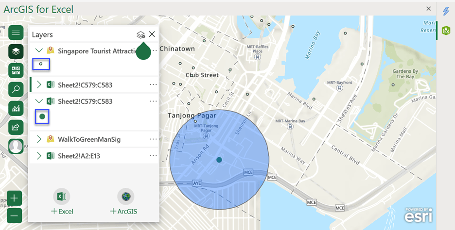
The resultant map shows all areas within a 0.5-kilometer walking distance from a Green Man signal.

ArcGIS for Excel helps you make well-informed decisions. You can access hundreds of data samples and layers and add them to your map.
To expand your analysis, add more point features to your map. First, add the following additional Green Man signal addresses to the Excel sheet, then add them to ArcGIS for Excel:
TAMPINES AVENUE 5, Singapore
TAMPINES AVENUE 3, Singapore
TAMPINES AVENUE 4, Singapore
TAMPINES AVENUE 7, Singapore
TAMPINES AVENUE 7, Singapore
Add a reference layer from ArcGIS
One of the benefits of using a GIS is that you are able to view and use multiple layers organized by space in order to gain actionable intelligence. In this case, If you also add some Foursquare data from ArcGIS using the Add layers from ArcGIS workflow, that content can provide context to your analysis. City planners can use Foursquare data, which highlights the commercial locations—such as shops and businesses—in a geographic location to draw conclusions and project some planning decisions, such as the following:
- When a Green Man cardholder accesses a Green Man-equipped signal, what commercial locations in the immediate vicinity are available to them, thanks to the extended crossing time and safety of the intersections?
- If there are major transport hubs such as bus or train stations, can the intersections nearby be equipped with Green Man signals? Could such hubs also be distribution points for Green Man cards, and can these hubs track their card distribution rates to improve future strategic planning?
- In the next image, you can see the walk time buffer added to the signal. There are a few commercial locations within the buffer and surrounding area nearby that may be accessible from the MRT-Tanjong Pagar railway station.

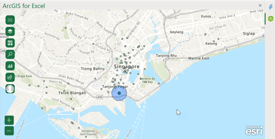
In the following image, there are many commercial locations that are not within walking distance of a Green Man signal. Can the addition of more signals in such areas be beneficial to citizens and tourism in a state or a country?

Summary
This analysis should help city planners assess the Green Man card reader’s distribution to determine whether cardholders can easily access retail or other typical destinations, such as medical facilities or entertainment, and potentially could demonstrate whether the crosswalk locations are conveniently located in neighborhoods with high concentrations of elderly/PWD population.
The results of this analysis can be used to illustrate the success of the Green Man project in Singapore as a guidepost for future, similar projects, or to illustrate what could be done to improve similar projects elsewhere.
Note: For this process, you’ll need to sign in to an ArcGIS account. Don’t have ArcGIS? Create a free trial account.
If you are an administrator, learn how to configure an enterprise ArcGIS connection.
I hope you enjoyed using the Green Man signal locations and figuring out ways to use this data for current or future city planning projects. To learn about a similar project the city of San Francisco implemented, read the San Francisco Municipal Transportation Agency Pedestrian Signals Improvement article.
ArcGIS for Excel provides a suite of tools to help you analyze and scrutinize data. It is designed to help professionals make decisions that improve civilian and business quality of life.
Excited about ArcGIS for Excel and its tools? You can read tips and articles from our experts on the Esri Community forum about how to use them. Detailed workflows are also available on the ArcGIS for Excel web help.
Acknowledgement
For this workflow, I used the online Government of Singapore Land Transport Authority Green Man+ data made available by the Government of Singapore Land Transport Authority.

Article Discussion: