“Time crumbles things; everything grows old under the power of Time and is forgotten through the lapse of Time.” – Aristotle
Time is the sequential progression of events from the past into the present and beyond to the future, an idea known as the Arrow of Time. Time isn’t something anyone can hold or see to measure its count. For that reason, the devices and methods used to measure time have improved throughout the course of history. The first measurements of time can be seen as early as the Bronze Age with the invention of the lunar calendar, a 12-month calendar based on the cycles of the moon. Soon we would see the solar calendar, created by following the location of the sun in the sky. The method of tracking the sun influenced the sundial, the first device used to record time by using the sun, a dial, and a shadow cast by a pointer. Further advancements would lead to devices such as the pendulum, water clock, and hourglass, which allowed us to account for time more accurately and broke us free of our celestial limitations. However, nothing can happen in time that doesn’t happen in space and vice versa.
The natural world is made up of space, which has three dimensions: length, width, and depth, with time being known as the fourth dimension. What device do we have in the modern world that can account for space and time and all the data in between? Timelines allow you to visualize your temporal data, giving you a sense of when in time an event has occurred. By combining timelines and their functionality with the map in ArcGIS AllSource, you can visualize space, time, and your data unlike ever before. Therefore, we aim to prove Aristotle half right— perhaps everything does grow old and crumble under the power of time, but with timelines, not everything is forgotten to it.
Time enable your data
You’ll begin creating a timeline by adding your data to the project. In this case, you will investigate Rochester Police Department’s crime data from 2011 to 2018 to determine when crimes happened, what the statute violations were, and if there are any trends among these crimes.
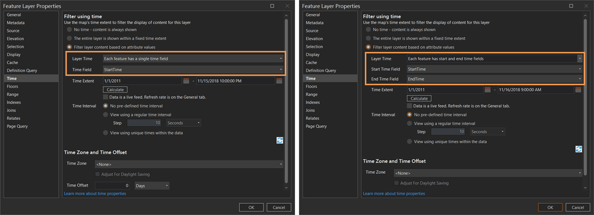
Before you can begin adding data to a timeline, you must time enable a layer or stand-alone table with a date or time field. To time enable your data, do the following:
- Right-click the layer or stand-alone table in the Contents pane and select Time Properties.
- For Layer Time, select Each feature has a single time field or Each feature has start and end time fields.
- Select fields for Time Field or Start Time Field and End Time Field.
- Optionally, select a Time Extent option to modify the overall start and end time for the layer, or select Calculate to automatically set the earliest and latest times.
Create a timeline
Now that your data has been time enabled, you can create your timeline and add this data.
- Activate the map that contains the data to be added to the timeline.
- On the Analysis tab, click New Timeline.
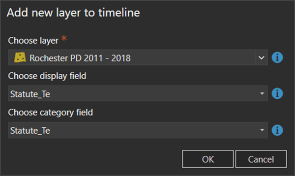
This will activate the Timeline view pane. - In the Timeline view pane, click Add Layer to add a time-enabled layer or stand-alone table to your timeline.
- On the Choose layer drop-down menu, select the layer or stand-alone table you want to add to the timeline.
- On the Choose display field drop-down menu, choose the field you want displayed in the ScreenTip when you hover over data in the timeline.
- In the Choose category field drop-down menu, select the field you want to use to categorize the layer or stand-alone table data in the timeline.
- Click OK.
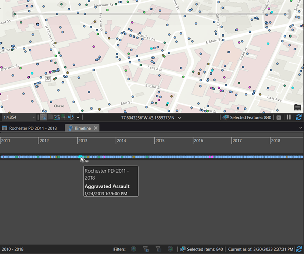
The timeline view adds your data and creates the timeline. You can now visualize when in time each data point lies and connect this visualization with the map’s view and sense of place, allowing for spatial and temporal analysis.
Explore and filter the timeline
Now you can begin exploring, filtering, and understanding your timeline. After creating and adding data to your timeline, it is recommended that you use the Full Extent tool on the contextual Timeline tab. This shows the full extent of your data and displays it on the timeline. By using Time Scales, you can view your data in fixed units of time, the Time Scales options include the following:
- Minute
- Quarter-Hour
- Hour
- Day
- Week
- Month
- Year
- Decade
- Full Extent
In addition, you can choose to use the Rectangle Zoom tool located on the contextual Timeline tab. This allows you to click and drag to a specific extent along the timeline. However, you can also use the mouse wheel to zoom in and out on the timeline for a faster response. Using the Pan tool, you can move along the timeline to see past the current extent. Timelines also include four filtering controls to aid your analysis: Filter By Time, Filter By Selection, Filter By Extent, and Filter By Range.
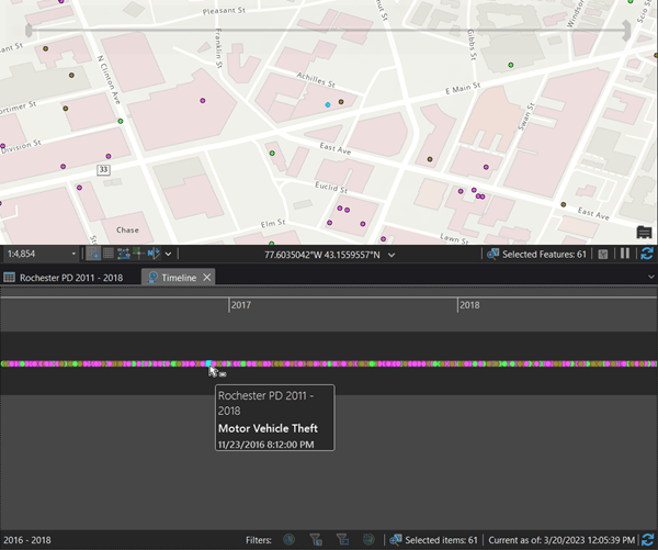
Timelines can filter on definition queries. After analyzing the dataset, you notice the timeframe from 2011 to 2018 is too large to properly analyze. You assess that the years you need to analyze most are from 2016 to 2018. You also want to look at specific statute violations: aggravated assault, burglary, and motor vehicle thefts. You will build a definition query to filter your data and timeline accordingly.
Stay afloat with swim lanes
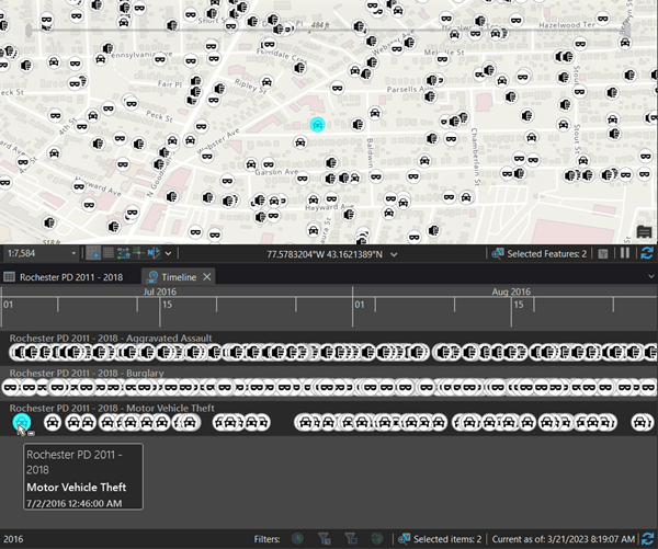
Timelines include an alternate mode in which you can split a single swim lane into multiple swim lanes that stack on top of each other. When in this mode, your features can be categorized into different swim lanes in a variety of ways. The first is to categorize by the feature’s layer, but you can also split swim lanes based on values in the field of a layer or stand-alone table. To enable lanes, do the following:
- Click Enable Lanes on the contextual Timeline tab to split features into lanes.
- Right-click the timeline layer you want to split into lanes and click Properties.
- On the Category field drop-down menu, select the field to use to split lanes.
- Click OK.
The timeline is updated to display data in separate lanes. - Optionally, click Show Lane Names on the contextual Timeline tab to label each lane with the timeline layer name and category field value, if applicable.
Summarize the view
Summary View complements Timelines by allowing the user to display their data as a histogram. This graph represents data along a temporal axis where you can specify the distribution of numerical data into ranges known as bins and allows for analytics on trends that may be occurring. To enter Summary View, complete the following steps:
- Open a map with Timeline
- Right-click Timeline in the Contents pane and click Open Timeline if not already open. The Timeline pane appears and shows the data from the map.
- On the Timeline contextual tab, in the Summary group, click the Summary View button.
The Timeline pane changes from a single lane of data into bins along the timeline that assemble data into groups based on time and category.
Select timespan in each bin
In addition, by using Binning Timespan, you can control the amount of information in the timeline by selecting the timespan you want to be visualized in each bin on the timeline. To use Binning Timespan, do the following:
- On the Timeline contextual tab, in the Summary group, click the Binning Timespan drop-down arrow.
- Choose a time frame to analyze.
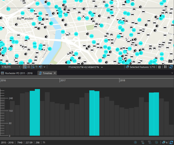
Here you can see an identifiable trend. In the months of July and August of the years 2016–2018, more crimes are committed of these violations than any other months of the year. Now you can investigate why and prepare for increased crime rates in the summer months.
Related resources
To learn more, visit the ArcGIS AllSource website.
To get more help with timelines, check out the ArcGIS AllSource help documentation.
To download the data used in this blog see the RPD Open Data Portal.
Banner photo by Bryan Goff on Unsplash

Article Discussion: