When configuring your organization one of the options is to include a featured content ribbon on your home page. This is handy way to showcase maps, apps, and more, and provides one-click access to content.
First, create a group containing the maps and apps you want to feature, making sure the group is public and items in it are public (recommended if your organization Home will be publicly accessible). Feature the group items by clicking My Organization, then Edit Settings:
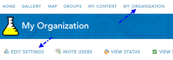
Choose the Home tab and select the group you want to feature from the dropdown list:
The name of the group will appear as the gallery title, and the item title is used for the label displayed under each thumbnail. The group title appears in black, the item title in blue.
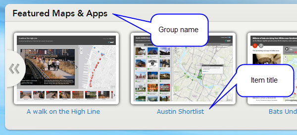
What you see will vary depending on the dimensions of your Home page banner graphic. The following are examples using several common banner sizes.
Banner size 960 x 180 px
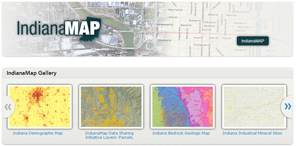
The dimensions for the standard small banner are 960 x 180 pixels, and here’s an example from IndianaMAP:
This layout allows the featured content title and item titles to display effectively, and delivers a clean look.
Banner size 960 x 400 px
If using a larger banner the featured content title will be hidden. The maximum image size is 470 px in height, so if you make your graphic a bit shorter the remaining space will show as a gray border, enabling the blue item title to display nicely. This example from the City of Greenville, South Carolina, uses a Home banner 960 x 400 px, a recommended size for larger banners.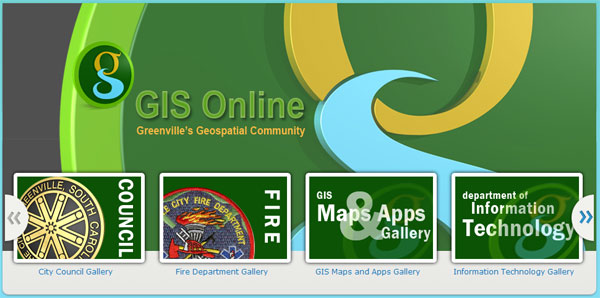
Banner size 960 x 470 px
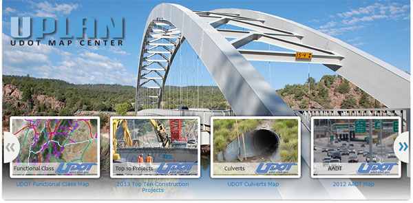
Another popular large banner size option, these dimensions completely cover the standard banner area allotted by the current ArcGIS Online styles. Using banner graphics of this size requires extra consideration since the gray area upon which the item labels display will be covered by the banner graphic. The bottom of the banner will need to complement the default blue text, or a light stripe along the bottom must be added to your graphic to make the text visible. Another option, not covered in this post, is to override the style to change the text color. See Supported HTML for configuring the website for more information.
This example from UPLAN (UDOT Map Center) uses a 960 x 470 px banner that includes a lighter colored, faded stripe along the bottom to enable the item titles to be more readable.
Going bigger?
Bigger is not always better, and while you can experiment with banner sizes larger than the three mentioned above, you will be overlapping and underlapping other parts of the Home page style, and will need to factor that into your banner art and overall layout. If you’re really looking to do something different, you might consider embedding your featured content group in a web page of your own design.
Tips
- If your organization Home is public, ensure a good user experience by making your featured items public. A visitor being prompted to login to your organization when they attempt to open featured content is not ideal (though may be valid).
- Think about how featured content is displayed – using app templates, Story Maps, or custom applications instead of the default map viewer is recommended for featured content, especially if your Home is publicly accessible.
- Use a compelling group name if your home page layout allows the the group name to display.
- Make sure that featured items have titles that fit nicely on the two rows of text allowed, and that they make sense to visitors.
- If you use a large Home page banner, consider adding graphic effects to make the item titles pop.


Commenting is not enabled for this article.