Over the past year, Esri’s StoryMaps Editorial team has taken a special interest in using data as a powerful and effective storytelling vehicle. Our 2022 ArcGIS StoryMaps competition was centered around data-based storytelling and data visualization. We also published a blog post about how to present a data-focused story in ways that are relatable to a wide audience, as well as one about why ArcGIS StoryMaps is an ideal tool for storytelling with data.
It can be tricky, though, for any any storyteller to figure out what the story even is when faced with a veritable mountain of data points. So, to help you reach the point of delivering that compelling data-focused story, this post will jump back to the early stages of the data storytelling process and explore some strategies for unearthing the story buried within data.

Approaching a data story
Many stories that are told through the lens of data arrive at that point via one of two primary ways:
- The storyteller has a set of data and wants to find a story to tell within it, or;
- The storyteller wants to find data that can help explain a thing that’s happening, like a trend or pattern.
Regardless of which route you take, there are a few things to keep in mind are you prepare to sift through the data in front of you.
Just asking questions
As you being to embark on a data story, it’s always good to have an idea of the question(s) that you hope the story will answer, or at least investigate. Starting with a question and working forward tends to be a more functional strategy than starting with a conclusion and working backward to try to make the data fit your conclusion. That kind of “prosecutorial” approach can lead to unconvincing methodologies and biased results, which will undermine your work.
Understanding the data
When telling a data-oriented story, it’s crucial to have a reasonable understanding of the data you’re working with: what it’s saying, where it came from, how it was gathered, and how it can be used to answer the question(s) you’ve posed. For that last point, it’s especially important to consider the data within a larger framework, not in a vacuum.
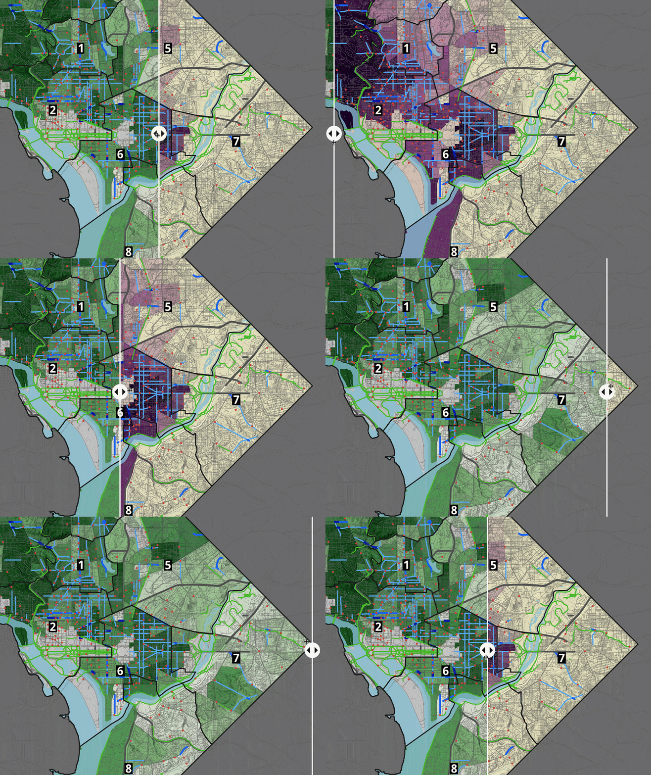
For an example of how that works in practice, take a look at the story Opportunity on two wheels, a collaboration by Esri’s StoryMaps and Living Atlas teams. This story uses geospatial data to examine the question of how easy or hard it is to use a bicycle to access various everyday needs and opportunities in Washington, D.C., depending on where you’re starting from in the District.
Simply analyzing routes to the places people need to go, taking into account the existence (or lack thereof) of bike infrastructure such as bike lanes and paths, begins to provide some answers, but it’s far from the complete picture. Going one step further by layering in demographic factors like income and race adds meaningful dimensions to the output. Observers can now start to answer questions like who benefits the most—or least—from bike infrastructure.
Consulting the experts
It should be expected that you’re not going to have an expert’s grasp of a given subject or data set as soon as you start sinking your teeth into it. Don’t ever be afraid to seek out the guidance of people who know more than you do! Subject matter experts can help with every step of the data-centric storytelling journey, from formulating the most pertinent questions to ask, to tracking down and understanding the data, to finding meaning in its outcomes.
For Opportunity on two wheels, we were fortunate that two leaders within the D.C. Area’s primary bike advocacy group were willing to provide generous support to our effort. They helped us to identify key issues facing bike accessibility in D.C. and to decipher interesting aspects of the analytical output.
Finding the story in the data
Even if you have a good understanding of the data you’ve compiled and analyzed, it can still feel daunting to find the right threads to pull to reveal the story within. After all, some data sets can contain tens, or even hundreds of thousands of points; it’s normal to feel like you don’t know where to begin when it comes to interrogating it in a relevant way.
While there isn’t a one-size-fits-all approach to extracting a story from a large data set—and multiple paths can be equally effective even within the same data—there are some places to look that can at least give you a useful starting point.
Investigating outliers
Outliers are those data points that fall furthest from the average point, and in their divergence from the norm, an interesting explanation is often lurking. Examining why a particular outlier is the way it is can be revealing about the nature of the data analysis outcomes on the whole. Just be wary of outliers that seem too good to be true, or those that are especially extreme. Do a little digging into the underlying factors to make sure they’re not the result of an error or inappropriate methodology.
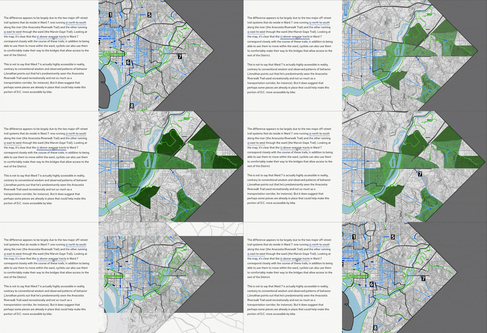
While in the world of outliers, pay special attention to a type of outlier called a positive deviant. These are data points that stand out relative to other data points with similar characteristics. For instance, in Opportunity on two wheels, we could see before we even ran our routing analysis that the presence of bike infrastructure tended to coincide with higher-income areas, so we hypothesized that Census tracts in higher-income areas would tend to have higher bike access scores. Although that did hold true in many parts of D.C., there were a number of lower-income areas with above average scores, as well as some higher-income areas with very low scores. By focusing on those kinds of deviants as case studies, we were able to get a better sense of what factors really matter the most for bike access.
Being open to anecdotes
When working with data, the use of anecdotes can feel counterintuitive, for they’re single instances that often don’t take the full context of a data set into account. But anecdotes can actually be quite helpful when attempting to tell a data story—as long as you don’t let anecdotal evidence stand in for in-depth data analysis. Anecdotes are most useful as a starting point for formulating questions, digging into the data, or illustrating cross-sections of that data. And, of course, they can also help a data-driven story maintain a connection to the human element.
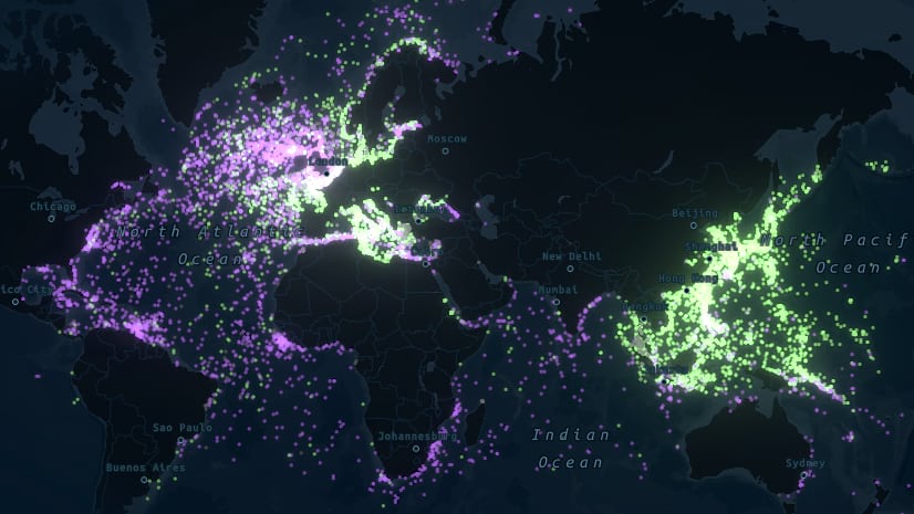
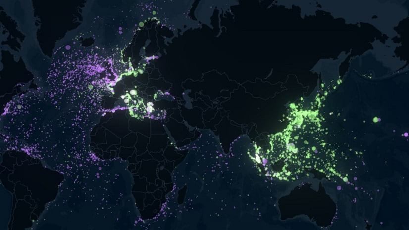
The story Resurfacing the Past serves as an introductory tour through a data set of every ship that was sunk during World War II. With over 15,000 records to parse, it took some research to figure out how to best tell the story of that data, and we found that anecdotes were the most efficient window into the data. We use the tragic plight of one ship—the Gulfamerica oil tanker—to reflect both the enormous share of non-military casualties and the geographic angle of how close the conflict came to U.S. shores. Similarly, the confrontation between the Hood and Bismarck is used to relate how naval engagements almost fully shifted away from head-to-head battles between gigantic warships during the war.
Seeking out pertinent anecdotes is another place where building a rapport with experts can really come in handy—they’re the ones who will know what to look for!

__________________
The methods and strategies outlined above might seem somewhat broad, but that’s a feature, not a bug. The more open-minded you’re able to be when trying to tell a story about data, the more likely it is that you’ll unearth the engaging story or stories buried within.
We’ve already seen so many remarkable data stories produced by our wonderful community of storytellers, and we can’t wait to see what you create next! Don’t hesitate to reach out to us on Twitter @ArcGISStoryMaps, or in the Esri Community, if you have questions, feedback, or just want to show off your work!
__________________
Cover photo: Janusz Maniak, via Unsplash. Thread photo: Boris Dunand, via Unsplash.


Article Discussion: