Did you know that the majority of our ocean floor’s mapping was done with radar measurements from a space shuttle orbiting the earth detecting the relative change in sea level and making depth estimates based on the known effect of gravity by undersea features? It took going to space to get a general mapping of the sea floor. Though magnificent in its cleverness, there’s something tragically ironic about that.
The General Bathymetric Chart of the Oceans (GEBCO) is a project whose goal is to map the seafloor in detail, improving on these general outer space-based measurements, using methods like multibeam echosounders. GEBCO is dramatically increasing our understanding of the terrain of the bottom of the oceans each year.
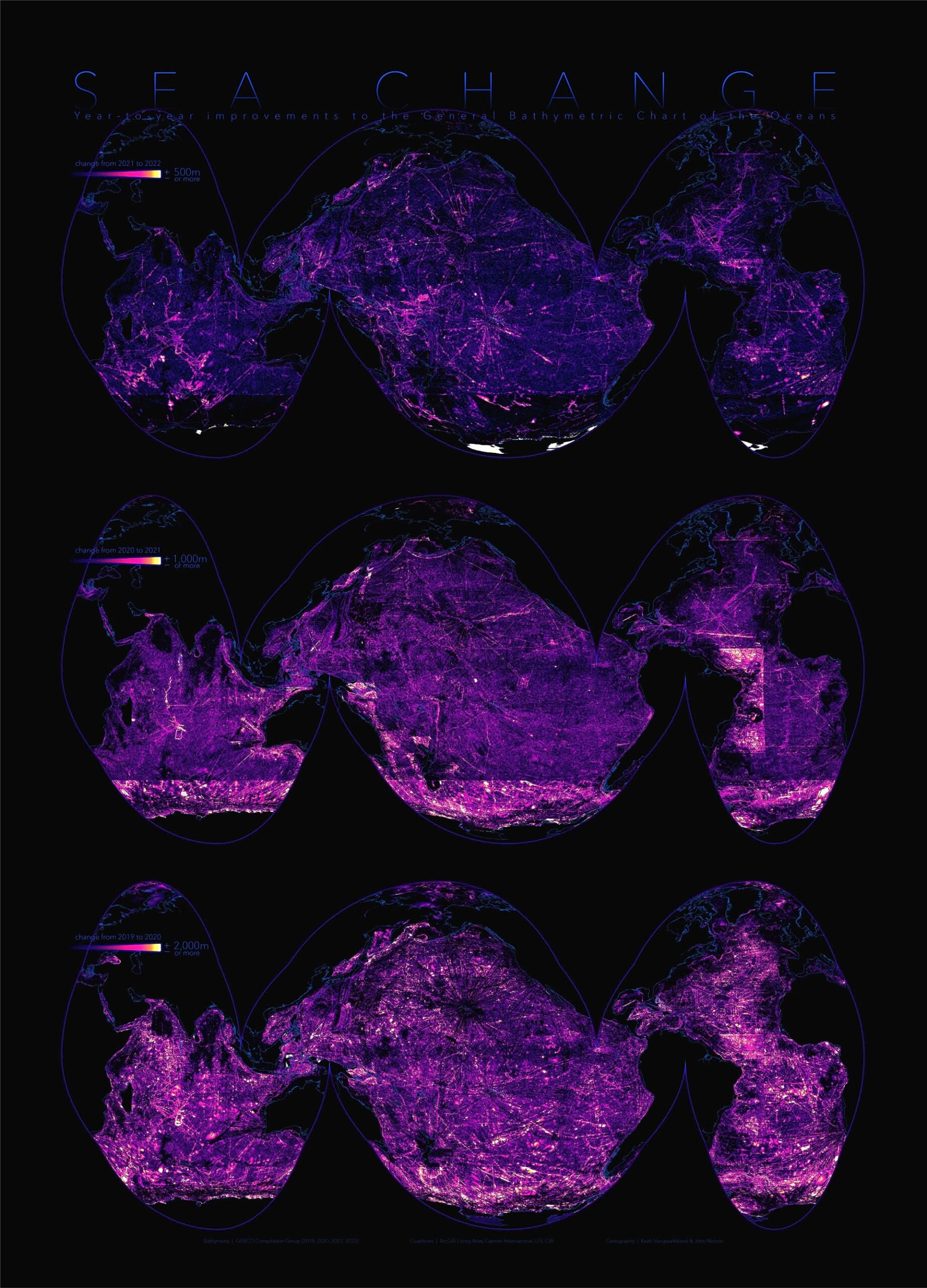
Here is a poster showing the advancements of this detailed mapping over just the past three years.

Encouragingly, in order to visually map the improvements, the color scheme used to show the amount of change year over year had to be cut in half with each update. 2020’s improvements had to be mapped to a range of +/- 2,000 meters. 2021 was mapped to 1,000 meters, and 2022 was mapped to a change of just 500 meters.
The oceans are big. And areas of new mapping are detailed. Click here to take a closer look at a big and detailed (15.6MB) version of this poster.
If you’d like to work with this amazing data (including year-to-year comparative improvements, contours, hillshade, depth zones, etc.) directly in your work, check out an ArcGIS Online group stuffed with data and resources here. Find the source GEBCO data here.
How?
This poster was made by running a minus raster function in ArcGIS Pro, between successive years of GEBCO’s annual bathymetry products, to generate a change map (difference) of each year. Each year’s change map is presented in the Goode Homolosine (oceans) projection and given a color gradient to represent a location’s change in depth (plus or minus) compared to what was previously known (dark = no change, bright = lots of change).
The color values mapped for the 2019 to 2020 differences are set to 2,000 meters for the best visual result. This means the newly mapped (2020) depth of the seafloor changed the previous (2019) measurement by over two kilometers in many areas! To map improvements the following year, this visualization range was set to 1,000 meters. The year after that it was mapped to a change of only 500 meters. This annual halving of the visual range used to show improvements means the project is honing in on mapping the global seafloor in detail. But there is still much work, and much of the seafloor, to map yet.


Article Discussion: