Adding a list to your dashboard is a great way to show features or rows from a layer. Lists can show field values, unique text, images, and more – but using the out-of-the box configuration, lists cannot be configured to use grouped values (like charts can).
For example, I have data for homeless shelters around the city of Toronto. I want a list of the organizations that I can use to filter the map by, but since multiple shelters are run by the same organization, they repeat in the list.
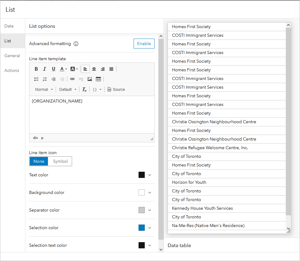
There are two ways that I can get a list with all the organizations grouped.
Using a table
The quickest way to make a grouped value list for your dashboard is to make a single column table. Add a table to your dashboard and choose the Grouped values table type, then choose the category field you want to group by (in this case, the organization name).
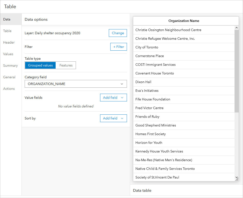
Don’t add any value fields – and there you have it, a grouped value list.
You can then use the table’s configuration options to determine how your new ‘list’ looks and enable a filter action targeting the map.
Using a data expression
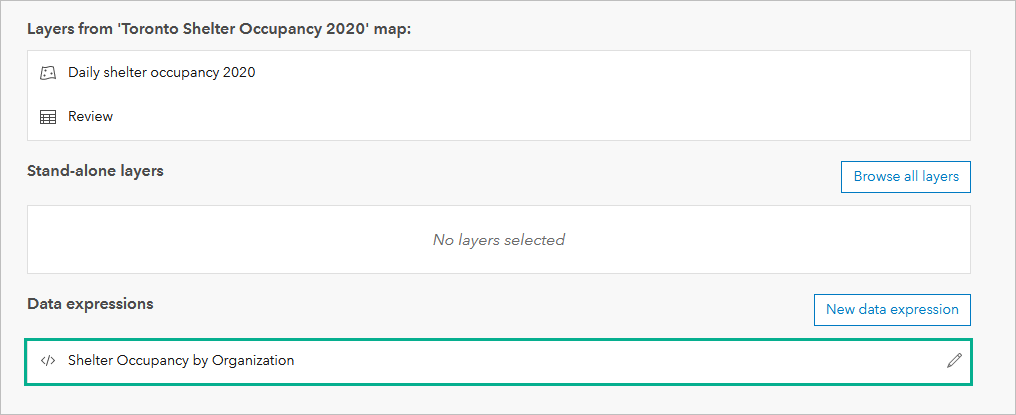
Another option for creating a grouped value list is to create a new data expression that is then used as the data source for your list. The data expression uses the GroupBy function to calculate multiple statistics based on a chosen category field.
So, for my same layer, I can create the following data expression:
The expression is taking the same feature layer (referenced by the itemID) and the fields from the layer that I want (occupancy, organization name, and capacity), and returning a FeatureSet that is grouped by the organization name field in my layer and returning a few statistics as well (the maximum capacity, and the average occupancy).
I can then use the data expression as the data source for my list.
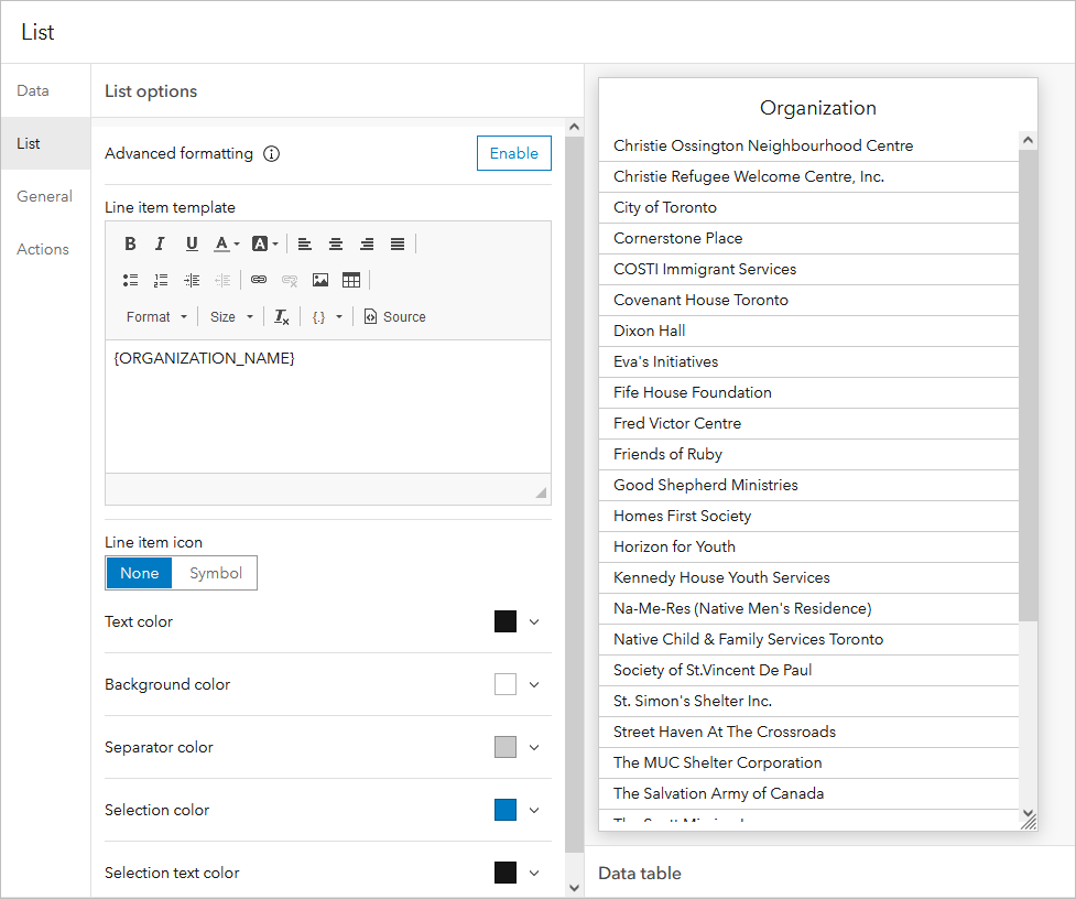
Then, in my list configuration, I can use the ORGANIZATION_NAME field from my FeatureSet in the Line item template.
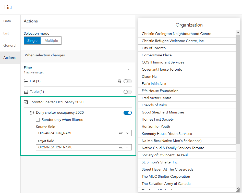
The list can then be used to filter the map. All that I need to do is choose the field from my list’s data source (the FeatureSet created with the data expressions) and the matching field in my map’s layer.
There you have it – two ways to create a grouped value list. Try these strategies with your own data and dashboards. As always, we love seeing the creative workflows you use for your dashboards. If you can, share them with us on Twitter and LinkedIn using #ArcGISDashboards.

Commenting is not enabled for this article.