Sometimes I’ll spend a fair amount of time getting a map just right. Then a little cartographic muse whispers into my ear…how would a dark version of this map look? Do I have to start over replacing all the symbology to a dark (or light) version? Not necessarily.
Here is a lovely plate of birds, accessed from the Boston Public Library’s digital commonwealth collection.
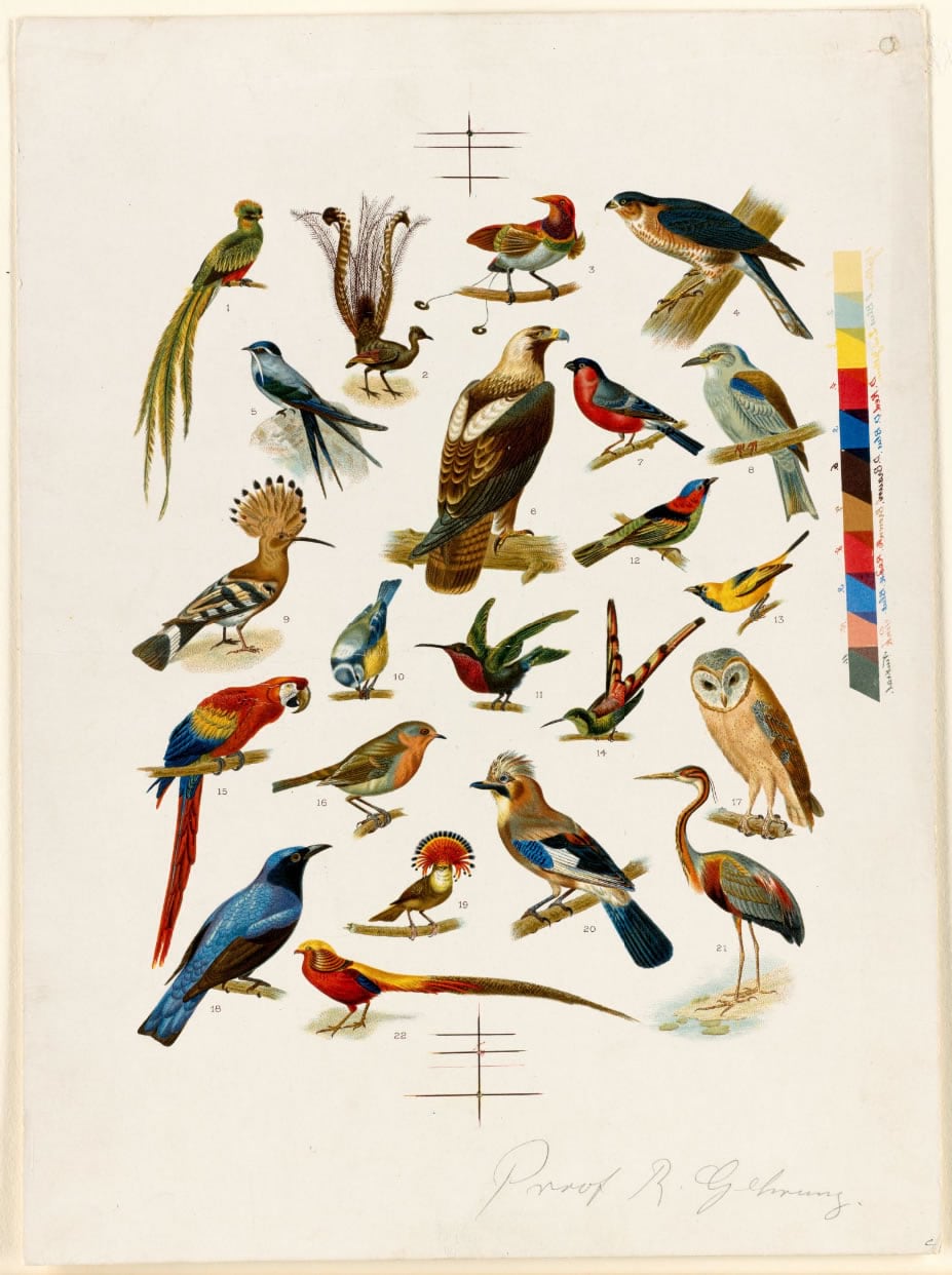
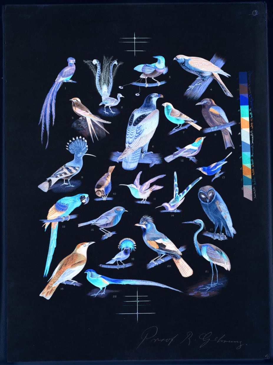
If I simply invert the image colors, all the tones are flipped so that light is dark and the hues are inverted to their opposites on the color wheel.
Now, if I apply a hue rotate effect, the hues are counter-inverted —returning them to their original hues while leaving the light/dark tones inverted.
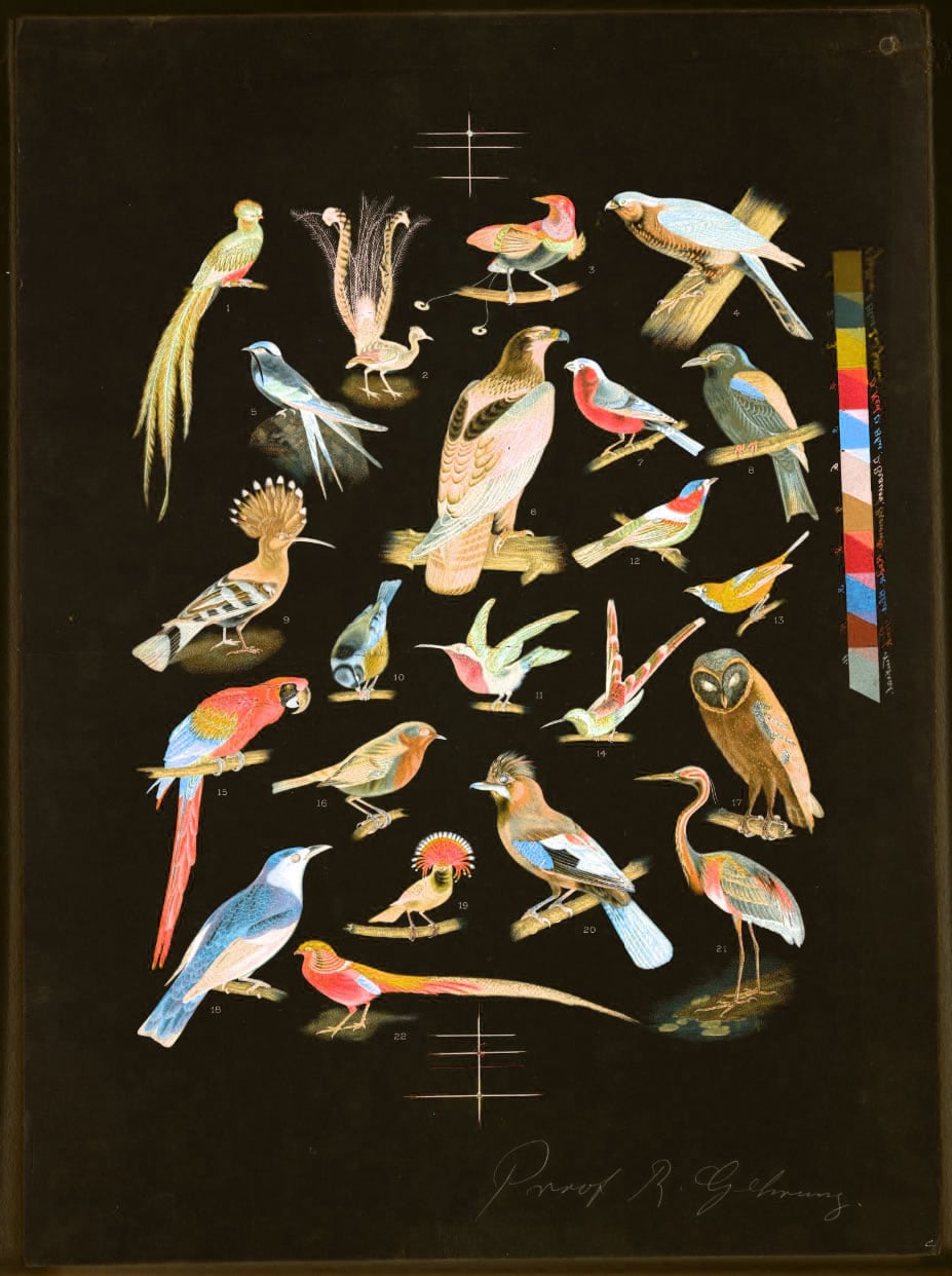
Reds are reds, blues are blues, but the relative lightness and darkness of the colors remains inverted. We’ve created a “dark mode” version of the image. If the image was originally dark, we would have created a light mode.
If you are curious how this looks for basemaps, and not just lithographs of birds, we’re in luck because “invert” and “hue rotate” are both available as effects in the ArcGIS Online Map Viewer. Here are some examples.
Here is the OpenStreetMap basemap:
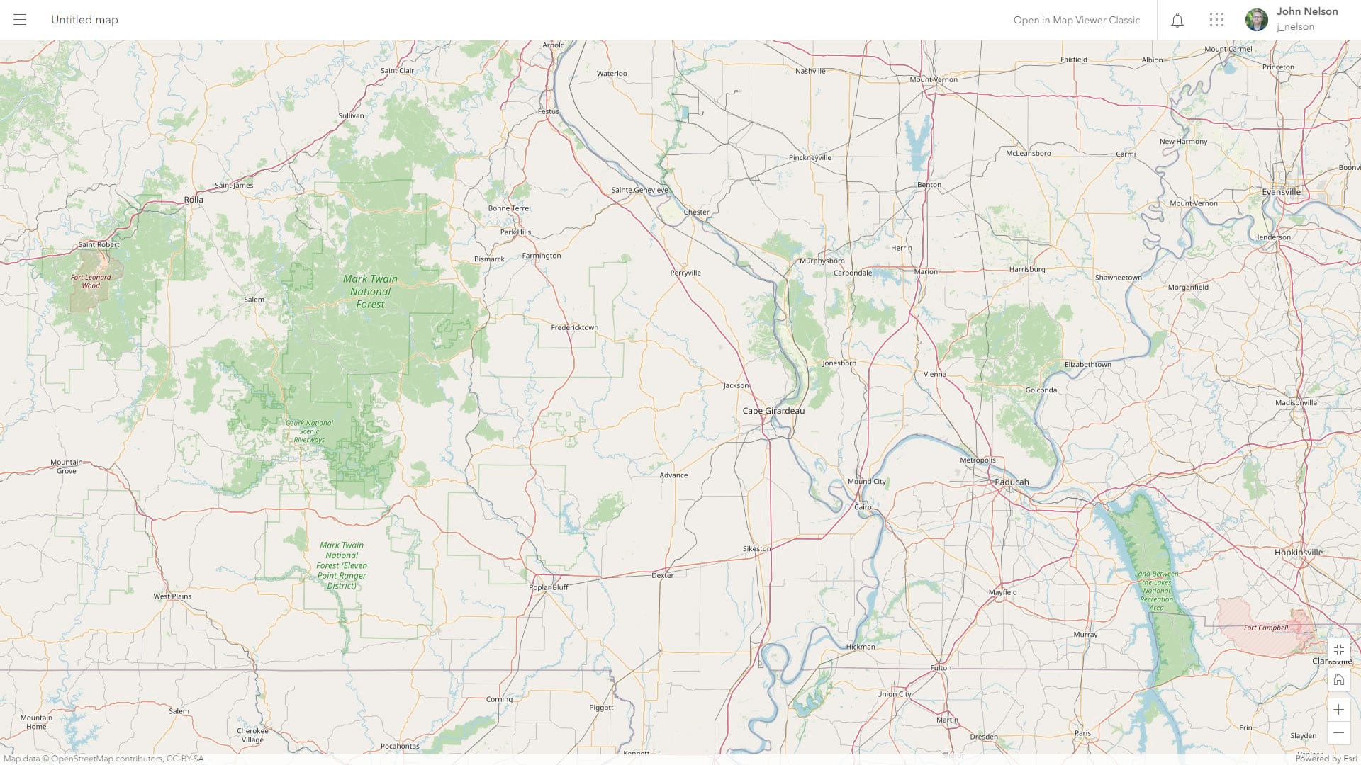
OpenStreetMap with the invert/hue-rotate trick resulting in a dark version of OpenStreetMap cartography without having to edit any styles:
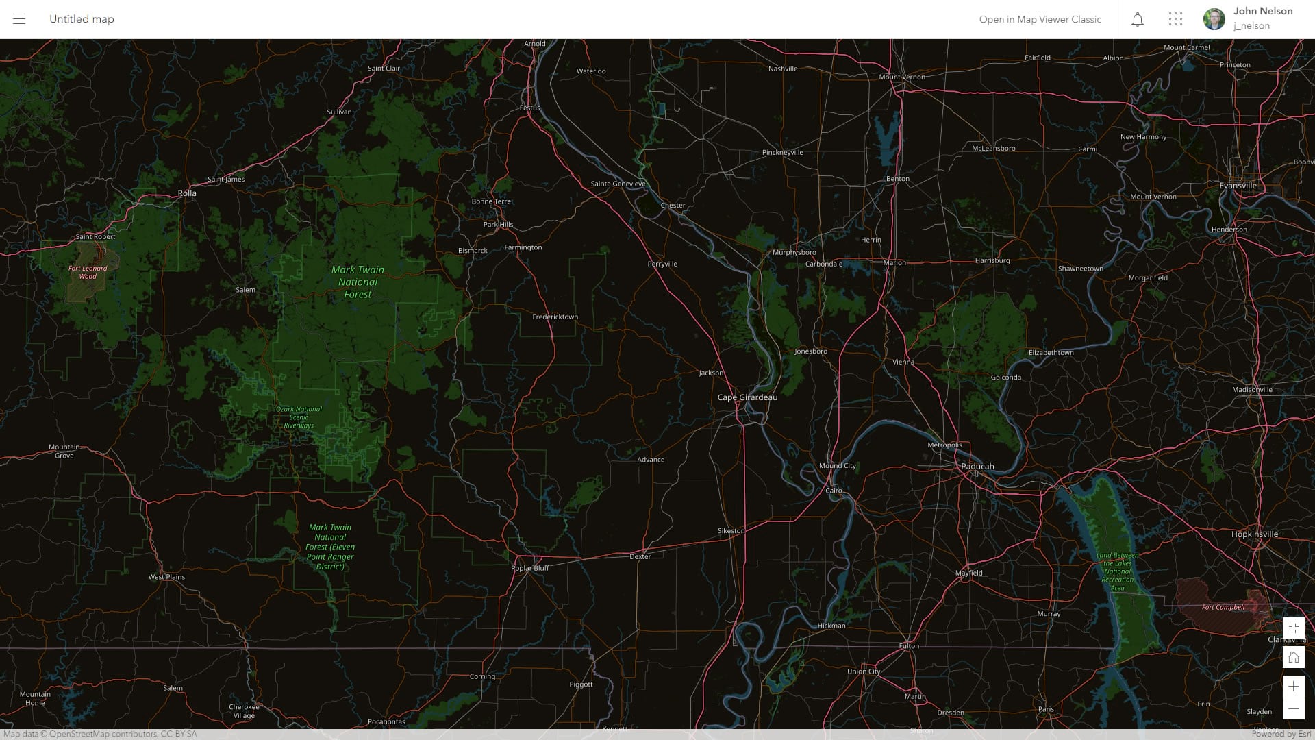
The green natural areas are still green, water is still blue, roads are still magenta and orange. Only the tones have reversed so that light is dark and dark is light.
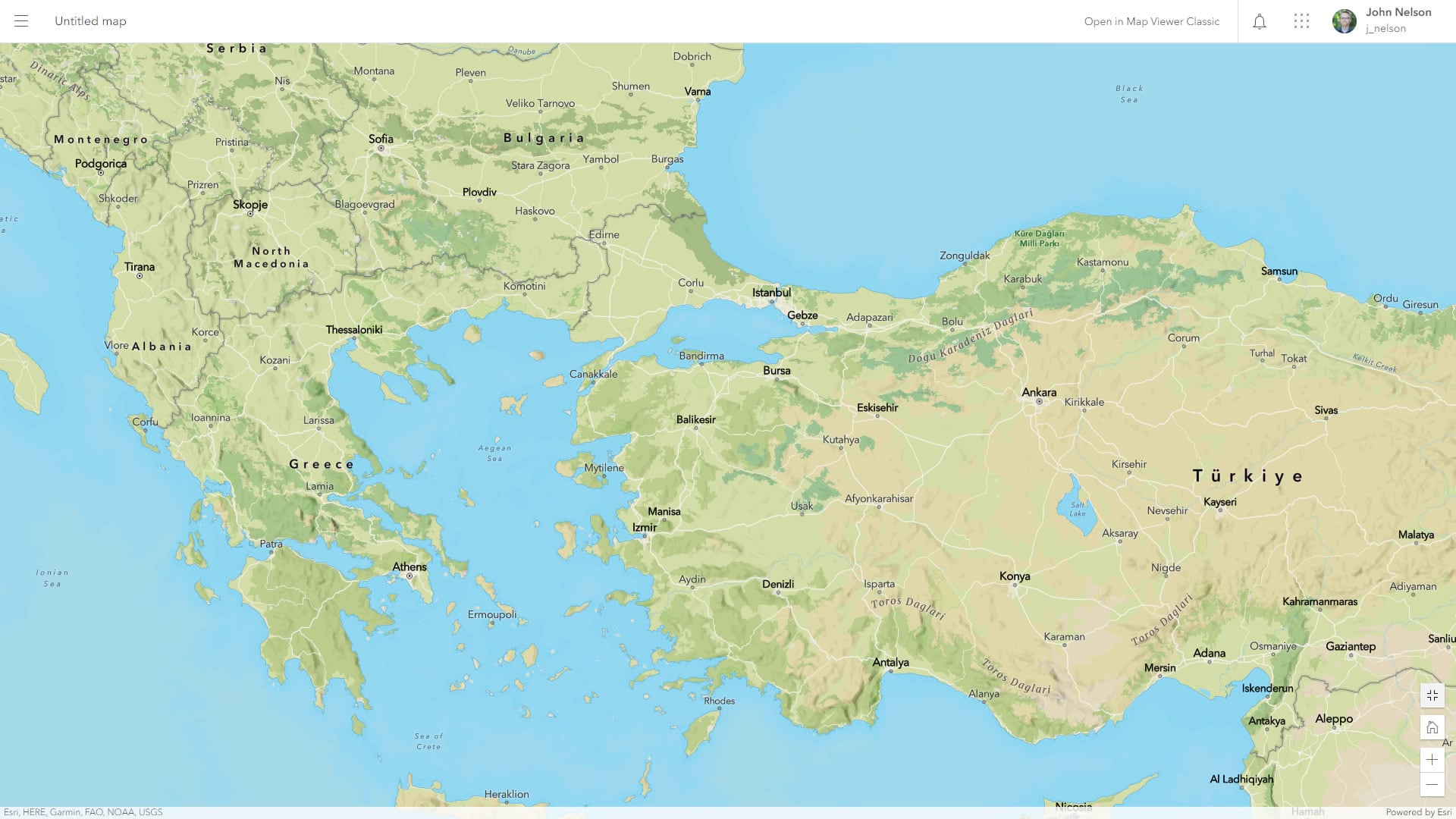
Here is the beautiful new Outdoor Map with its lovely naturalistic palette:
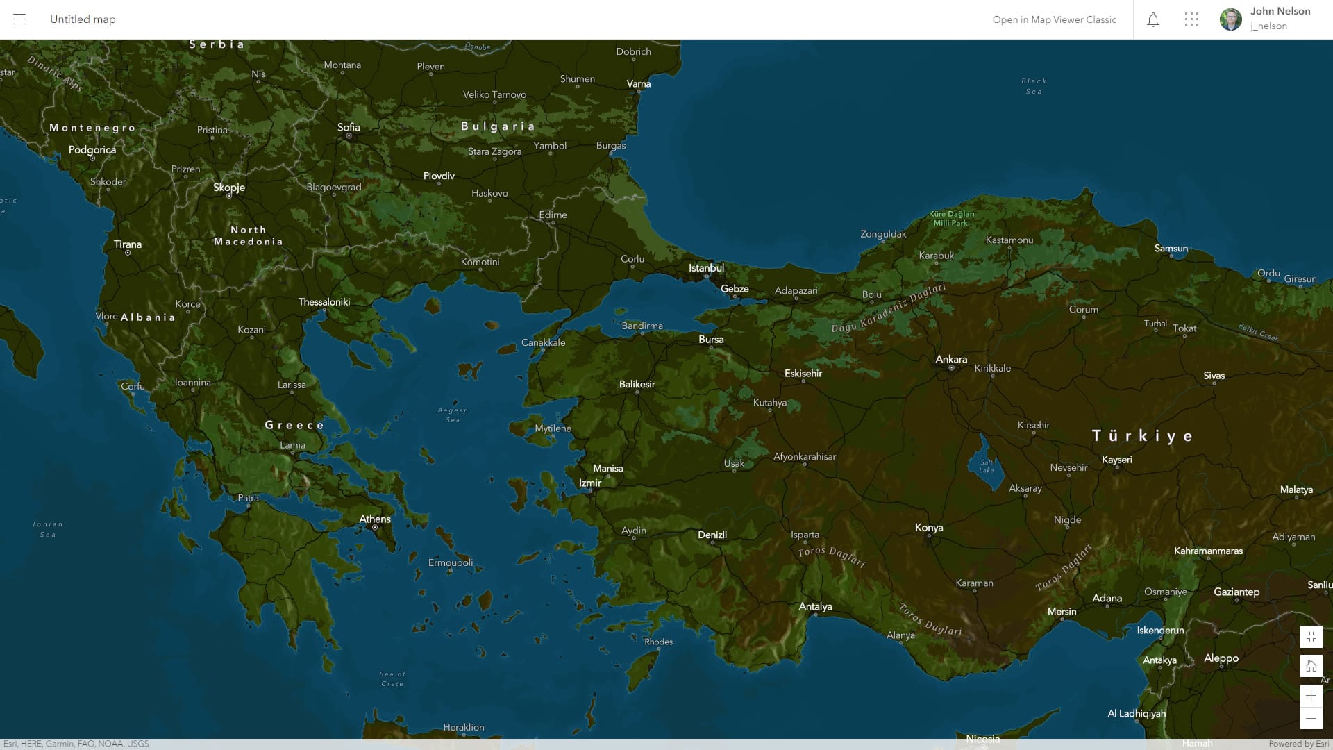
Here is a dark mode version:
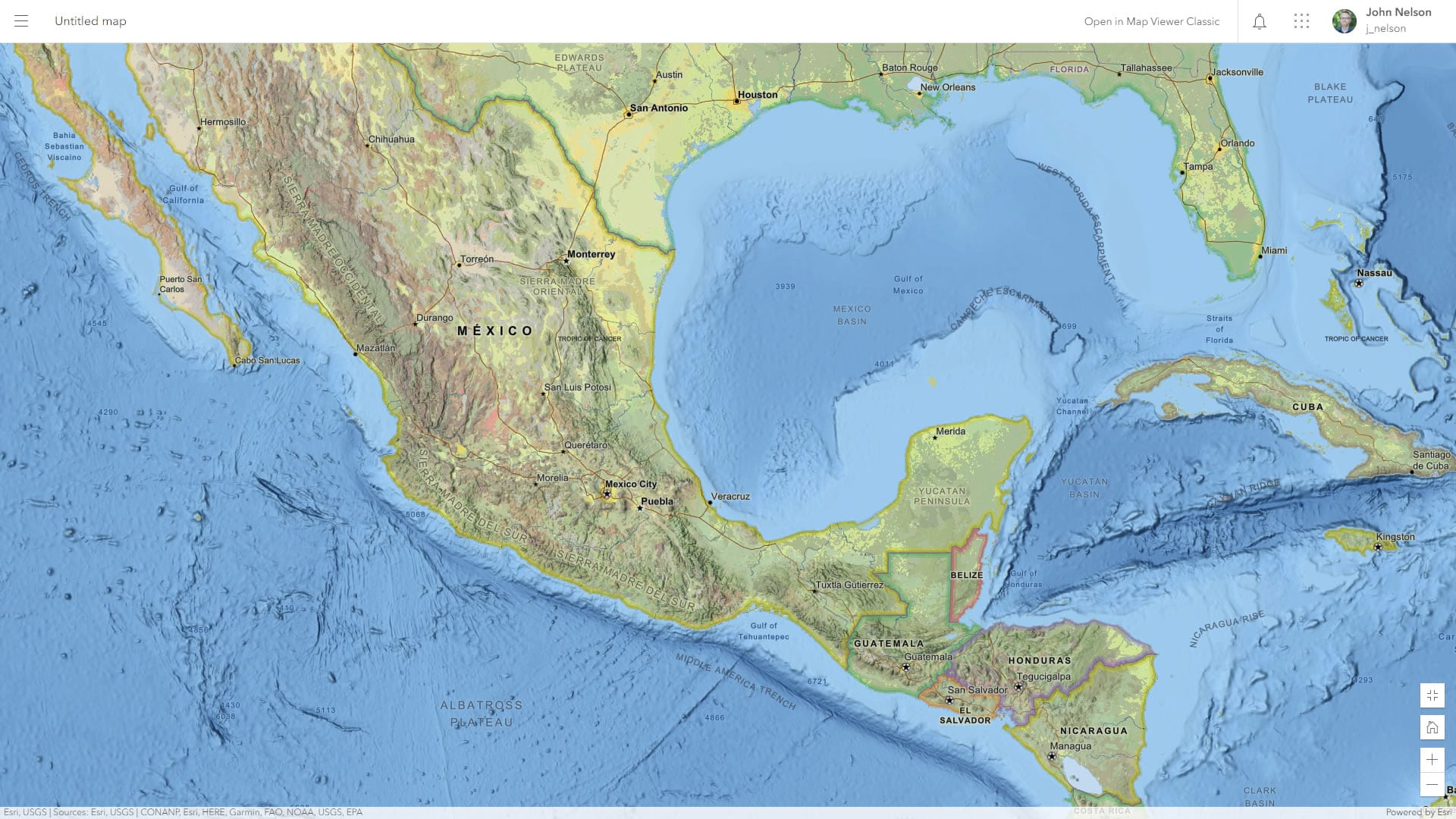
And here is the beautiful National Geographic Style Map:
And here it is in dark mode:
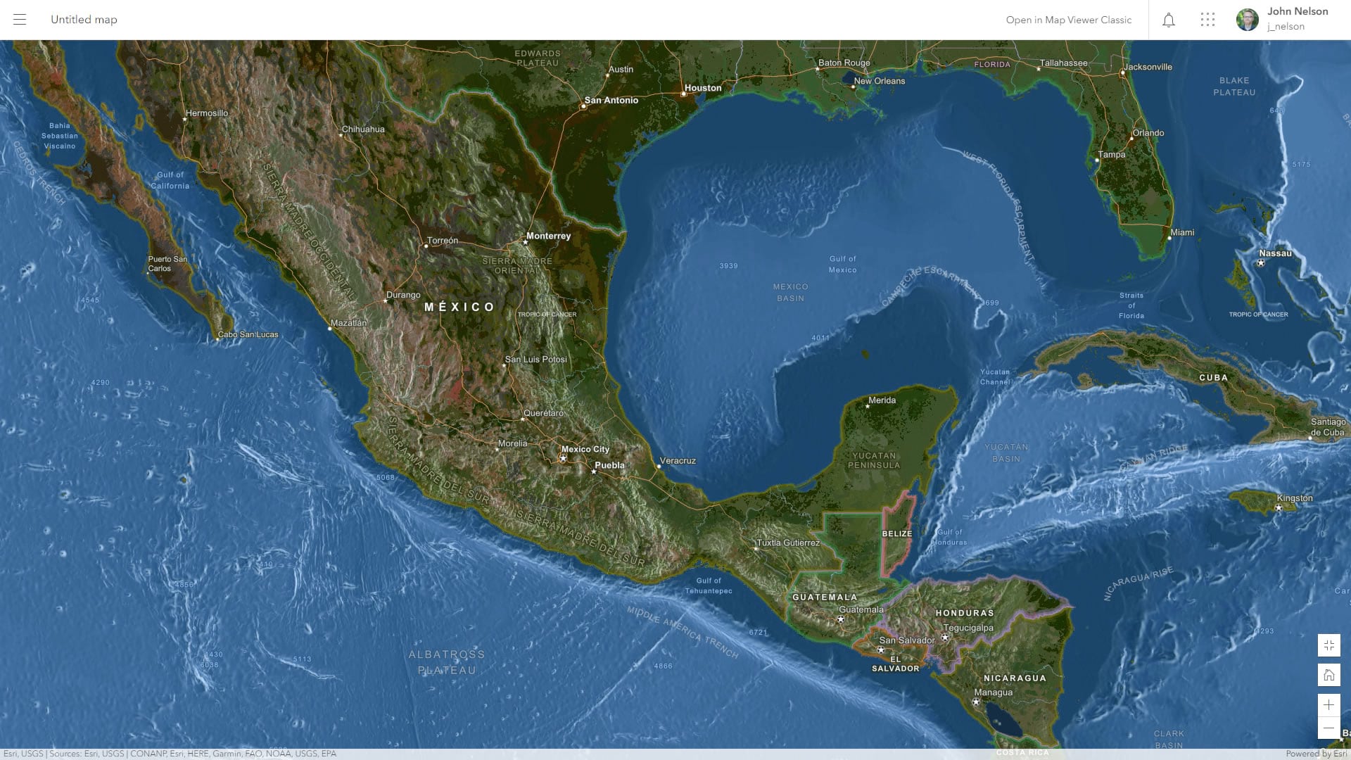
If you are interested in exploring the dark or light versions of your maps, it’s so simple and fun. Here is a how to…
Happy inverting! John

Article Discussion: