As a judge for the Map Gallery at the Annual Esri International User Conference, and the Cartographer for the Esri Map Book, I am fortunate enough to see what many of you are doing with ArcGIS to create printed maps.
This year, one issue I frequently noted was very wide columns of text. Below is an example, and the reason it doesn’t work is that it is hard to make your eye track along the long lines of text and then reliably find the next line. As presented, the text below almost guarantees that nobody will bother reading all the text that the Mapping Center team worked so hard to write.

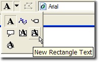
The default New Text tool in ArcMap’s Draw toolbar produces text that fits within a box that you draw and can resize, but that’s all–the text just flows to fit the box. If you instead use the New Rectangle Text tool (highlighted above), there are several advantages including a handy columns feature in the text box properties. I will use Mapping Center’s Gulf of St. Lawrence map to illustrate how to use the New Rectangle Text tool:
- If you open up the Gulf of St. Lawrence map document, it doesn’t have any text boxes, but we’ll add some and play around with the columns feature and see how adding columns not only makes it easier to read your text, but can actually let you use less space for text on your map layout. For the sake of this example, move the map up in order to make room for text box at the bottom.
- On the Draw toolbar, click the drop-down arrow next to the big letter “A” (new text), to show the context menu that has more options for adding text to your map. Choose the New Rectangle Text option:

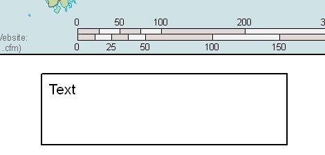
- Draw a rectangle on your layout. You will be left with a text box with the word “Text” in it.

- From your web browser, copy the Purpose and Audience text from the Mapping center Gulf of St. Lawrence site.
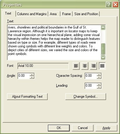
- Double-click on your text box to open it’s proerties and paste (Ctrl+V) the text into the Text box.

- Click OK and you will see the text is too long for the text box on the map, so go ahead and resize it so it looks similar to the example shown above (illustrating why wide text boxes are a bad idea).
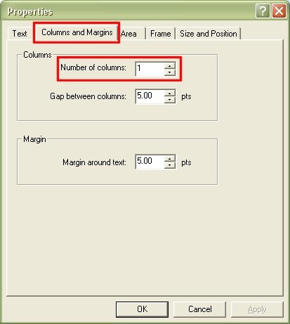
- Double-click the text element to open the properties and then click on the Columns and Margins tab:

- Change the number of columns to 3, move the properties dialog box to the side of the screen and click Apply to see the changes.
- The result won’t be bad, but there is room for improvement. Note, however, that we have decreased the amount of space needed to fill the box. We can resize the box manually to fit the text by grabbing the bottom handle on the text box and moving it up to fit out page, but that could get a little tedious, and we’d likely want to stick to a specific size for our text box. While still in the text box Properties window, access the size and position tab. We’d like to stick to a 9” wide text box, but we’re not sure of the height at this point. After a little trial and error, the ideal height seems to be 1.45”.
- Click Apply to see the changes:

- Let’s try a little more, like using Formatting Tags to make the title bold.
- Change the first line of text to look like: <bol>Purpose and Audience</bol>
- Now add another tag around this to make the the font larger: <bol>Purpose and Audience</bol></fnt>
- Next, change the border and background to suit the map by editing text properties on the frame tab.
Here’s the final result:

I hope this helps reduce the time it takes you to edit the text in your layouts and improve your maps. I also hope to see more maps using this feature in the 2009 Map Gallery!

Commenting is not enabled for this article.