(Updated for the June 2022 release)
For the most recent release of ArcGIS Online, updates have been made to the Portfolio template to improve how content can be displayed and interacted with in the app. The Portfolio template is used to showcase web maps, web scenes, ArcGIS Instant Apps apps, ArcGIS StoryMaps stories, dashboards, images (.jpeg, .png, and .pdf files), and external video links from Vimeo and YouTube. The Portfolio template now includes an additional content type and new ways to present content.
The following updated features are available:
- Two new layouts(Accordion and Tabbed)
- Additional size for Accordion layout
- Support for adding external web sites as sections
- Theme component
- New interactions with the section description
- Updated mobile view
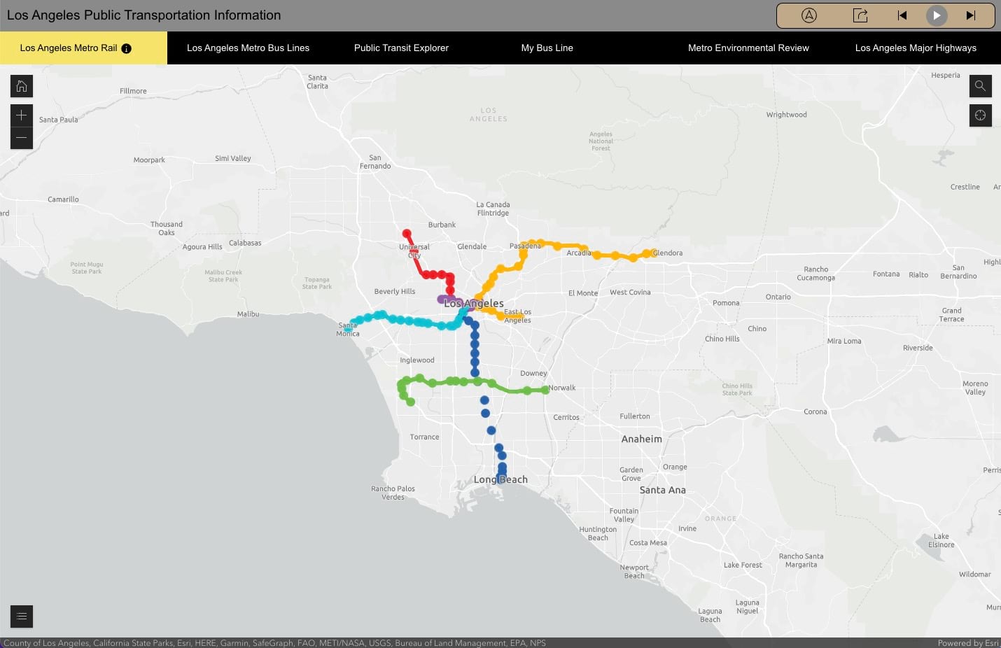
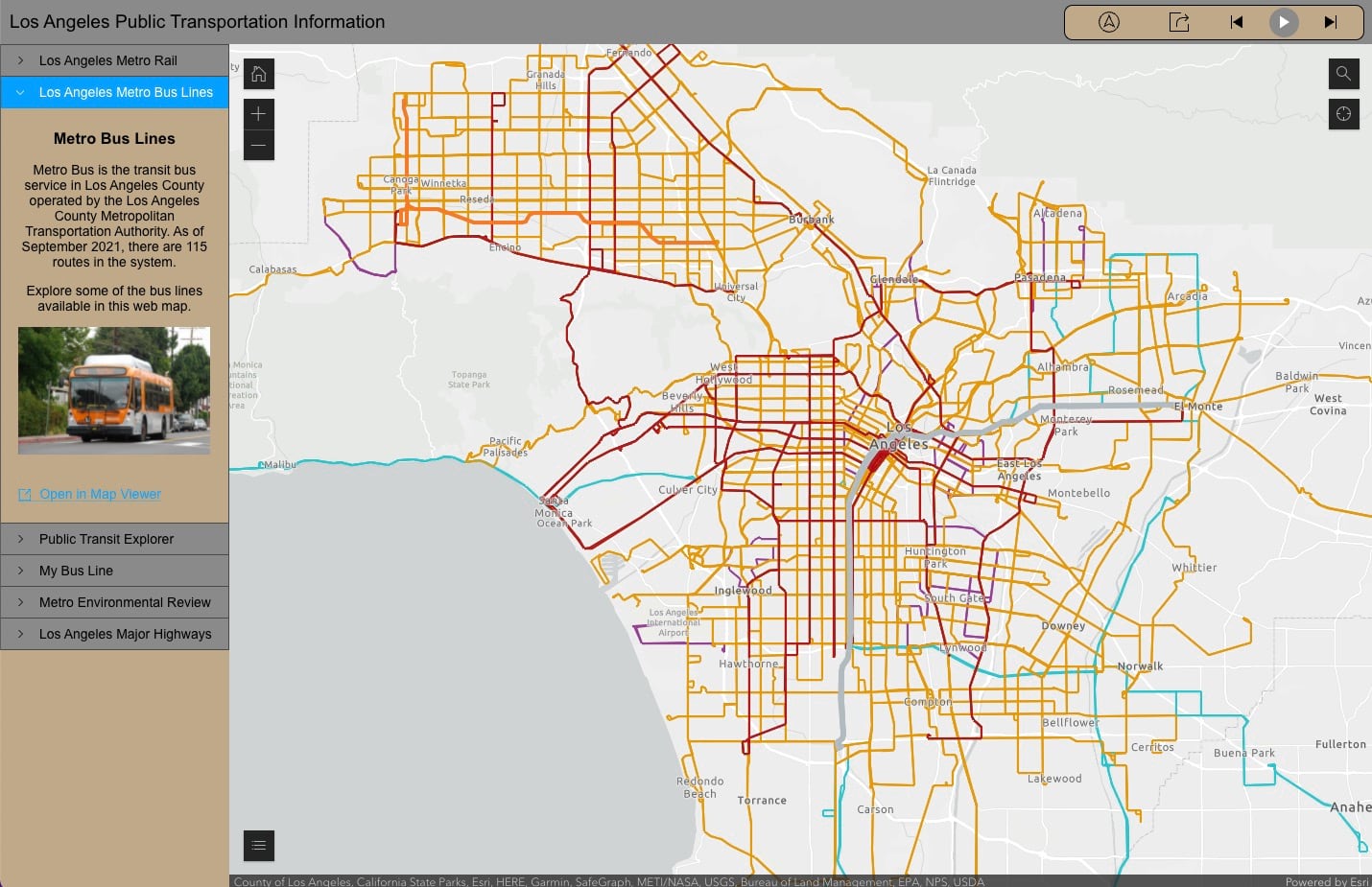
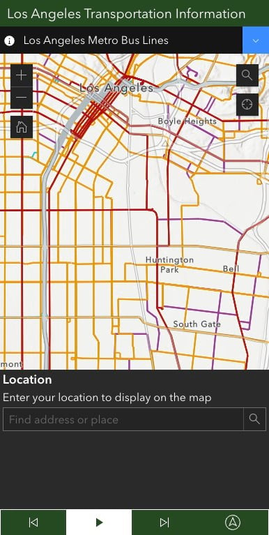
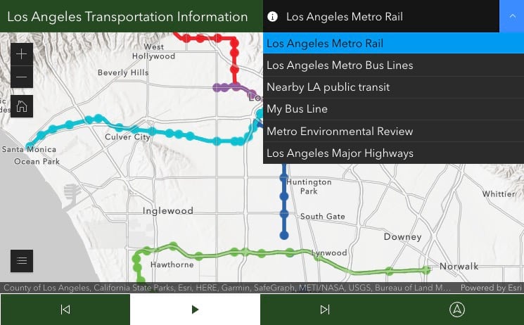
New layouts
Previously Portfolio had only one layout to display the content in the app, the carousel layout.
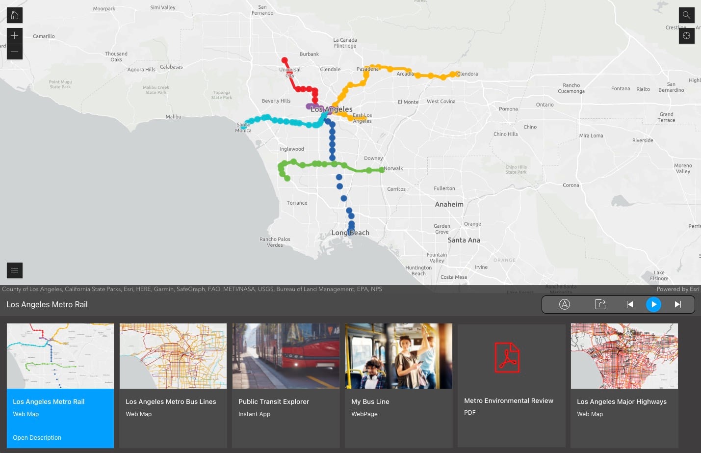
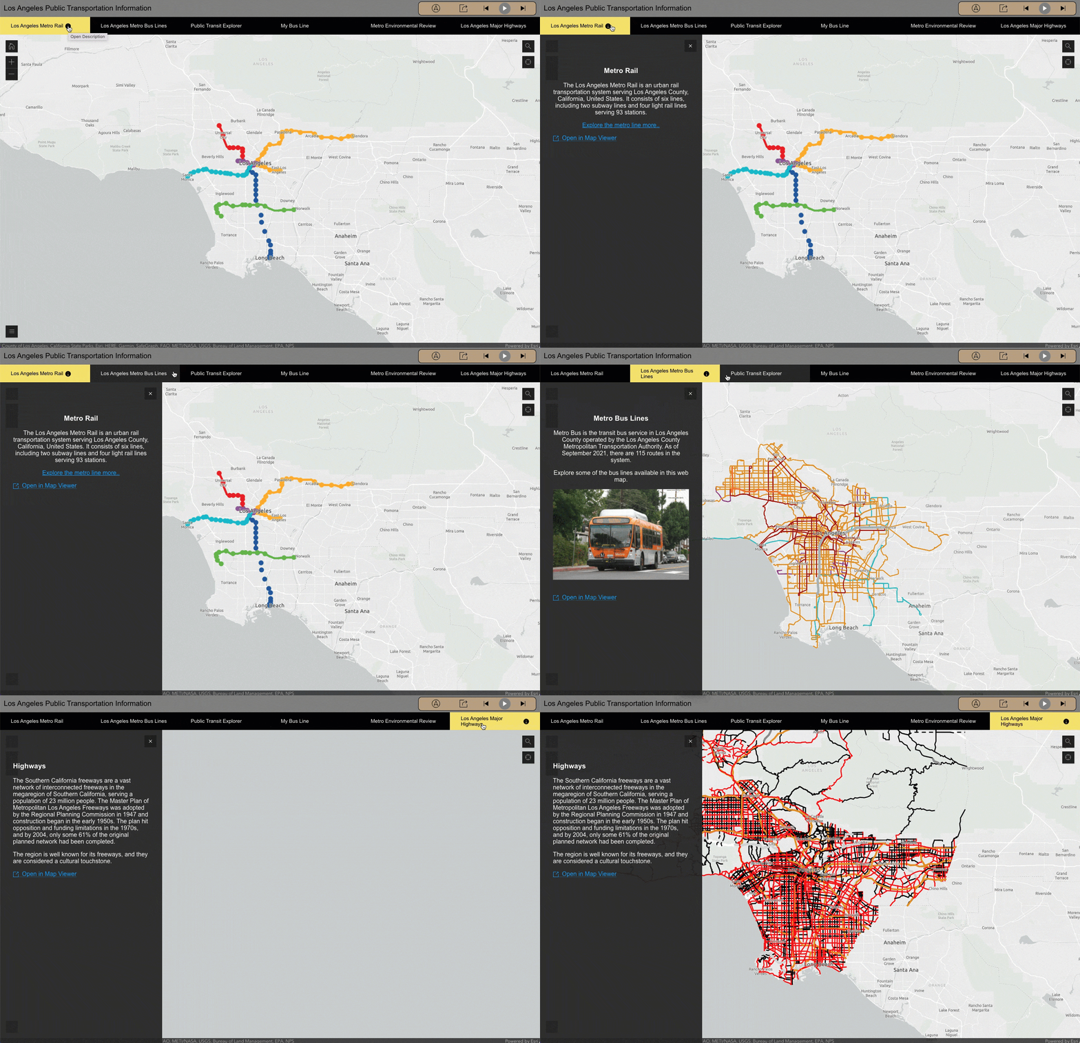
Two new layouts are offered: the tabbed layout and the accordion layout. The tabbed layout provides a minimal look for an app. In the tabbed layout, the sections that are added to the app are listed in order at the top of the app horizontally, similar to tabs in an internet browser. Like the carousel layout, the tabbed layout uses a floating section description panel, which can be open or closed. When it is open, it overlays the main stage content.
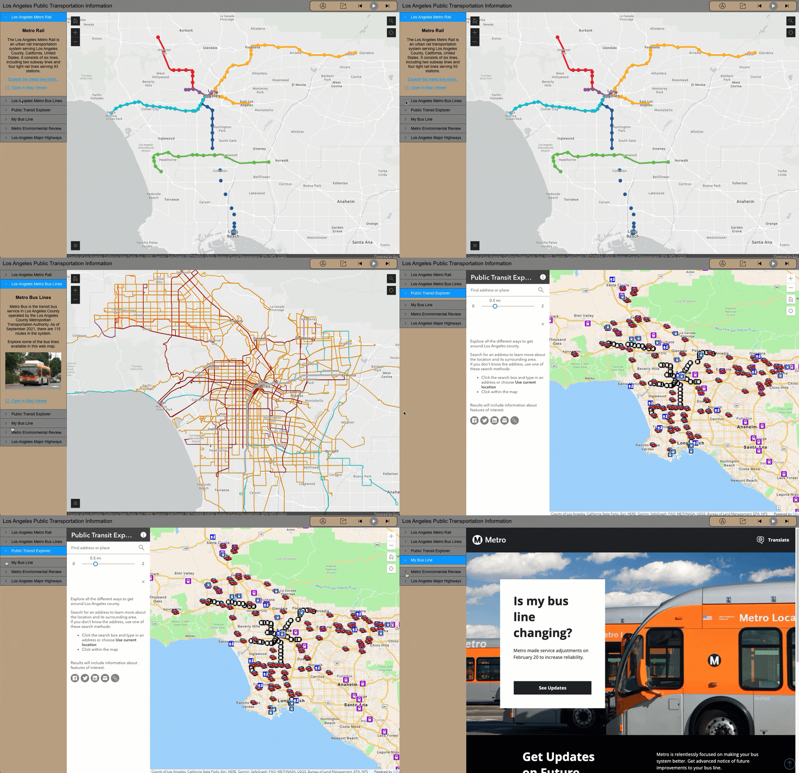
The accordion layout displays the list of sections to the side of the main stage of the app. When a section is open in the accordion layout, the section details panel is pinned open. This layout allows app authors to display descriptive text alongside the main stage content. The accordion layout will also offer two sizes, small and large.
Support for external sites
Using the existing workflow for adding sections, app authors can now use URLs to add external web sites in the app.
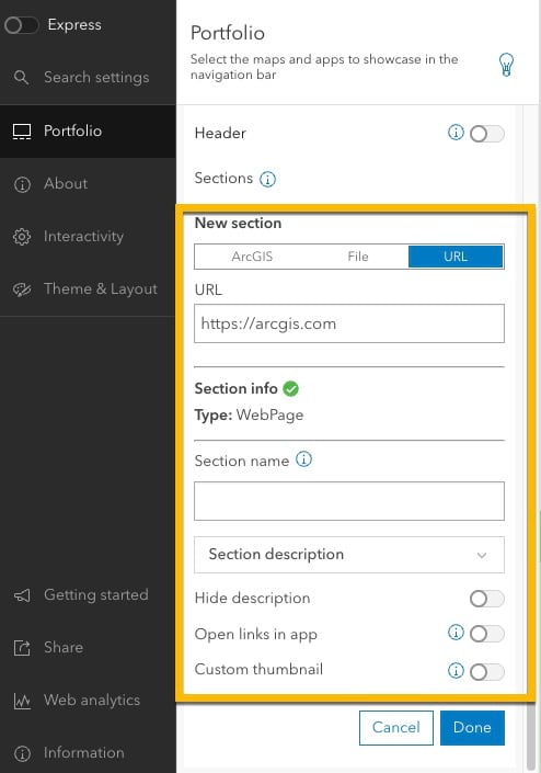
If the external sites do not meet the requirements, authors cannot add them as sections in the app. Requirements for external sites in Portfolio include:
- Web pages must use https protocol
- Content for the specified URL must allow embedding
- Web page cannot host a .pdf (.pdf’s can be added via file)
Section descriptions
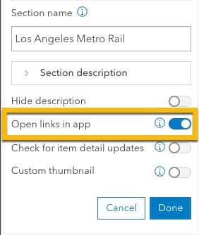
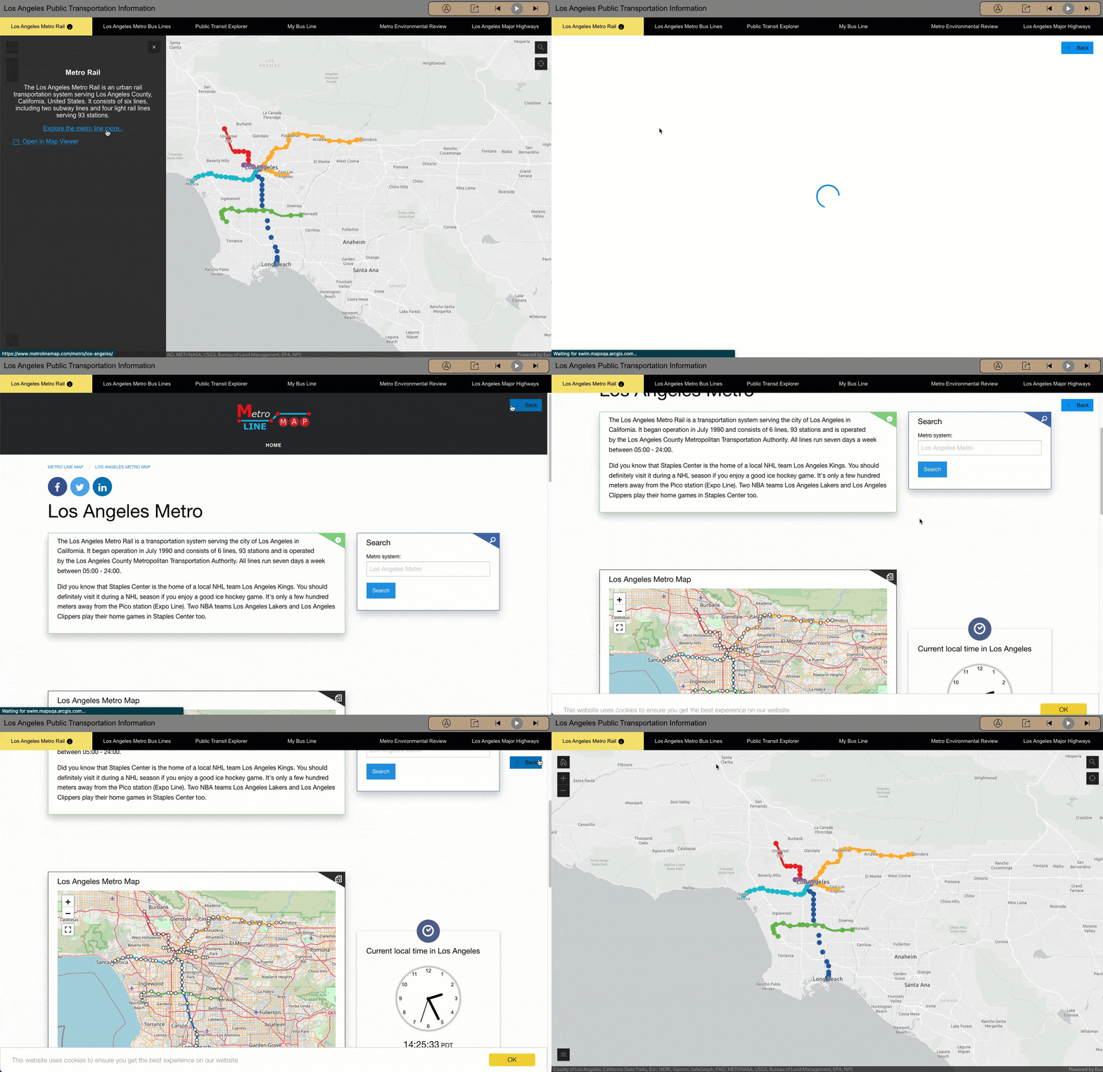
When adding a section to a Portfolio app, app authors can add a description for that section. Typically, that description includes text and, optionally, images to describe the content in the section. For section descriptions that include hyperlinks, app authors can choose to open those links in the Portfolio app. However, the sites must follow the same requirements as external sites when being added as a section. If the site attached to a hyperlink does not meet the requirements, it will open in a new tab. To allow users to open hyperlinks in the app, use the Open links in app setting under the section description in the configuration panel. For the carousel and tabbed layouts, there is now an option to open the descriptions for each section by default, or at the initial load of app.
Web maps and web scenes
Another update for section descriptions in Portfolio allows users to open web maps and web scenes in Map Viewer and Scene Viewer. This new capability will be available by default for all web maps and web scenes added to a Portfolio app. When available, the Open in Map Viewer or Open in Scene Viewer link will display and when clicked, a new tab in the browser opens with the web map or web scene.
More theme options
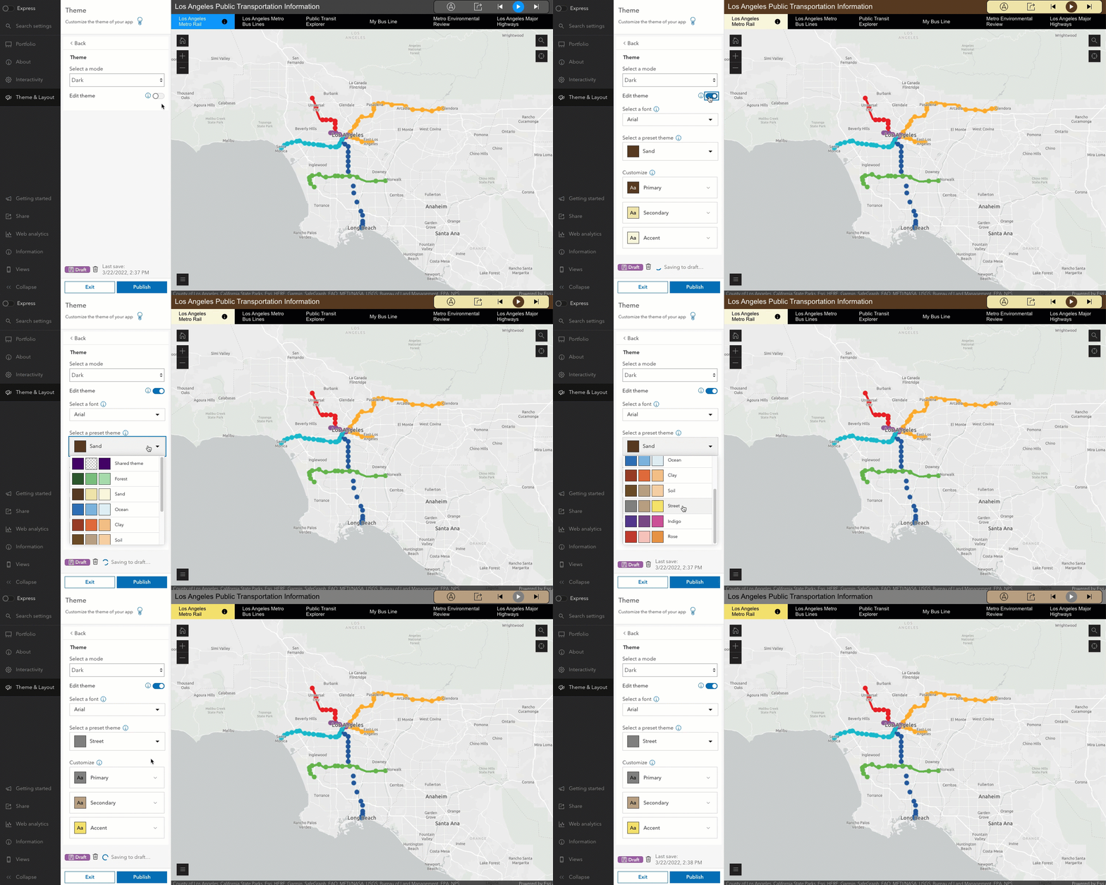
The theme component is now available in the Portfolio template. This component can be used to apply predefined themes across the three layouts available in Portfolio. An organization’s shared theme is also available among the predefined themes. App authors can also choose custom styles from a color picker to apply to the app. While creating a custom theme, the component includes a contrast ratio. The contrast ratio is used to determine the legibility of the text color and background color that is used in the component. The theme component also allows authors to choose a font that can be applied to certain elements in the Portfolio app. And finally, there is also now the option to include a custom logo in the header for Portfolio apps.

Article Discussion: