When sharing your workbook with others, you want it to look its best. You’ve no doubt carefully crafted charts and layouts and styled them with your favorite colors, but there’s still something missing… Well look no further, in our Insights 2022.1 release we’ve expanded the styling options within the workbook banner. Say goodbye to those defaults!
Show me the new stuff
You’ll notice at the top of the workbook we’ve recently added a ‘Style workbook banner’ button. This is where we’ve sprinkled some new enhancements. Inside you’ll find options to customize both the logo and the banner. With these new options you’ll have the tools to style a bespoke workbook that aligns with corporate branding, or you own creative flair. Here’s a quick breakdown of what’s new and how you can use it to spruce up your workbooks.
Workbook logo
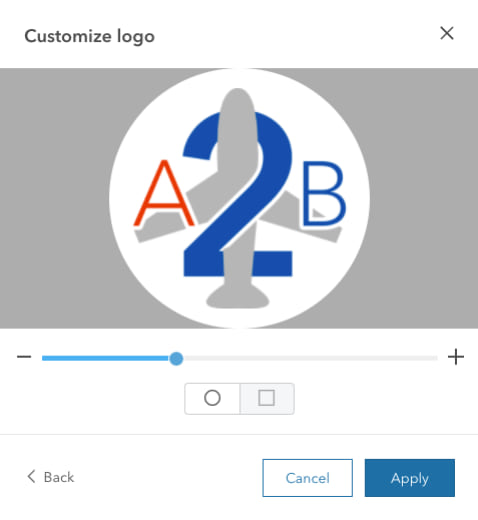
Adding a logo to your workbook was added in a previous release, but we’ve improved the upload process to provide greater flexibility and control over how the image is cropped and scaled. You can now scale the selected image and adjust the location of the image within the chosen shape.

When adding an icon, this image will replace our default Insights logo in the banner of the workbook. This logo retains its functionality in both the workbook and the shared page, linking back to the Insight homepage.
Customizing the icon is a great way to furnish your workbook with a crest, badge, or logo referencing your organization, initiative, or project.
Banner image
Now for the banner. We’ve added the ability to place an image atop your workbook. You can now replace that lovely default blue with your own color and image! What you do with these newfound capabilities is totally up to you. Perhaps dressing the banner in corporate approved colors and images will lend your analysis that official look you’re seeking. Or maybe you want to make a statement and get creative with your own image to suite the topic or color palette from your analysis.

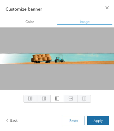
When uploading an image for your banner you’ll be able to crop the image to fit the banner perfect (if you’re into all the specs, it’s 60px). In addition, the upload process also has controls for setting how the image is aligned within the banner.
These banner enhancements allow you to utilize the real estate above your page to further customize the appearance of your workbook and open endless possibilities to author visually cohesive pages and reports.
Where’s the analysis view?
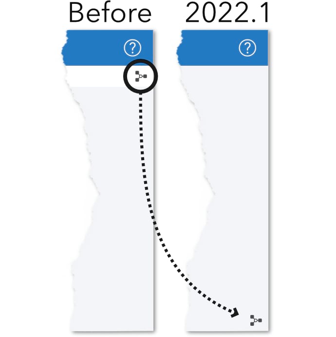
You’ll notice on any of your fancy new pages the Analysis view button isn’t in the usual spot. As part of the enhancements, we opted to relocate the button to grant some extra space to your charts and maps. On shared pages and shared workbooks with a single page we now move the Analysis view button down to the lower-right corner.

Inspiration
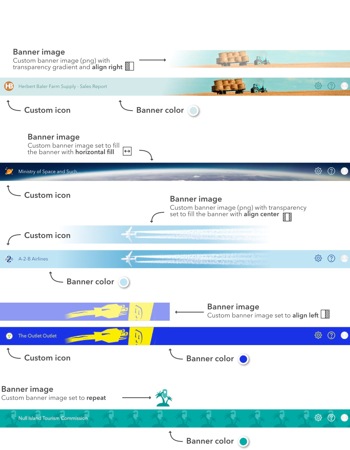
I think I’ve now satisfied all the contractual obligations of this blog post and now I want to dive into the fun stuff. I’ve developed a few banner examples I’d like to share as inspiration and provide a few tips and tricks for creating your own. As always, if you come up with your great examples, leave a comment because I’d love to see it!


Article Discussion: