This blog has a few helpful features that you can leverage while creating Charts in Map Viewer. You’ll learn to:
- Utilize & customize legends
- Save custom colors so that your favorite color doesn’t disappear
- Instantly search for the variable you need
- Save time with Histogram Statistics
- Use Layer Switcher to optimize charts
1. Clicking Series in legend turns them On and Off
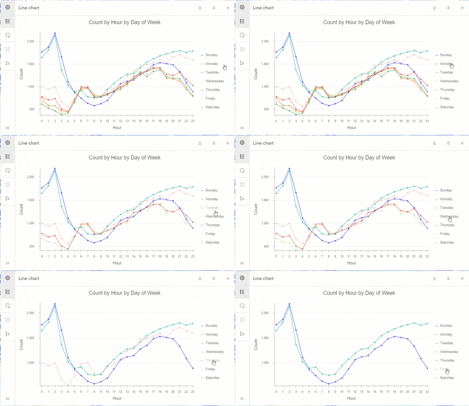
Did you know that you can focus on a few series in a multivariate chart by simply clicking on the undesired series and hiding them? Now you know!
Let’s say we want to only look at the car accidents which happened over the weekend from a dataset which shows the entire week. By simply clicking on the series in the legend you can turn off all days except Saturdays and Sundays. This way we can avoid the need to adjust the dataset to filter out the undesired series.
To bring back the hidden series, simply click them again.
2. Rename series name (Label) in Legend
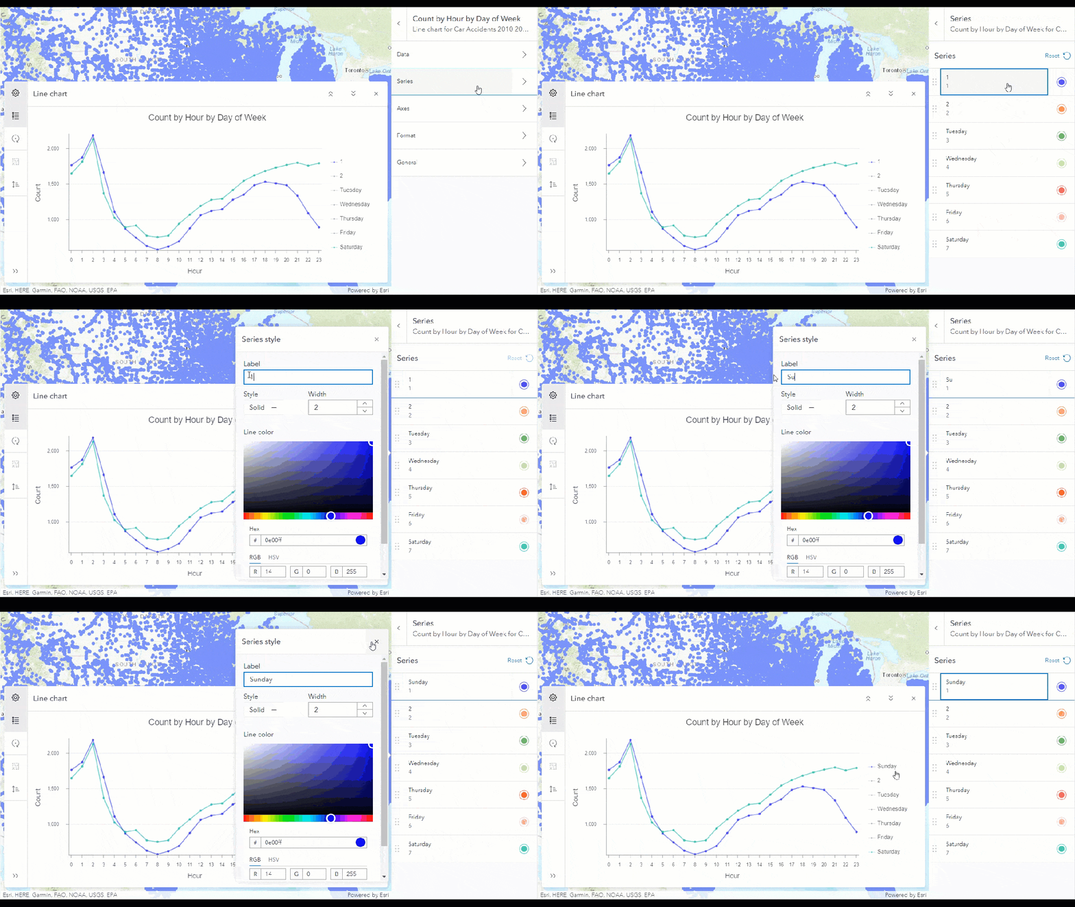
Did you know that you can edit the name of a series by navigating to the Series tab and clicking on the individual series? This will open the style popup which will allow you to edit the label text. This comes handy when you want to make aesthetic changes so that the chart becomes more presentable and easier to read.
3. Using custom colors across all charts
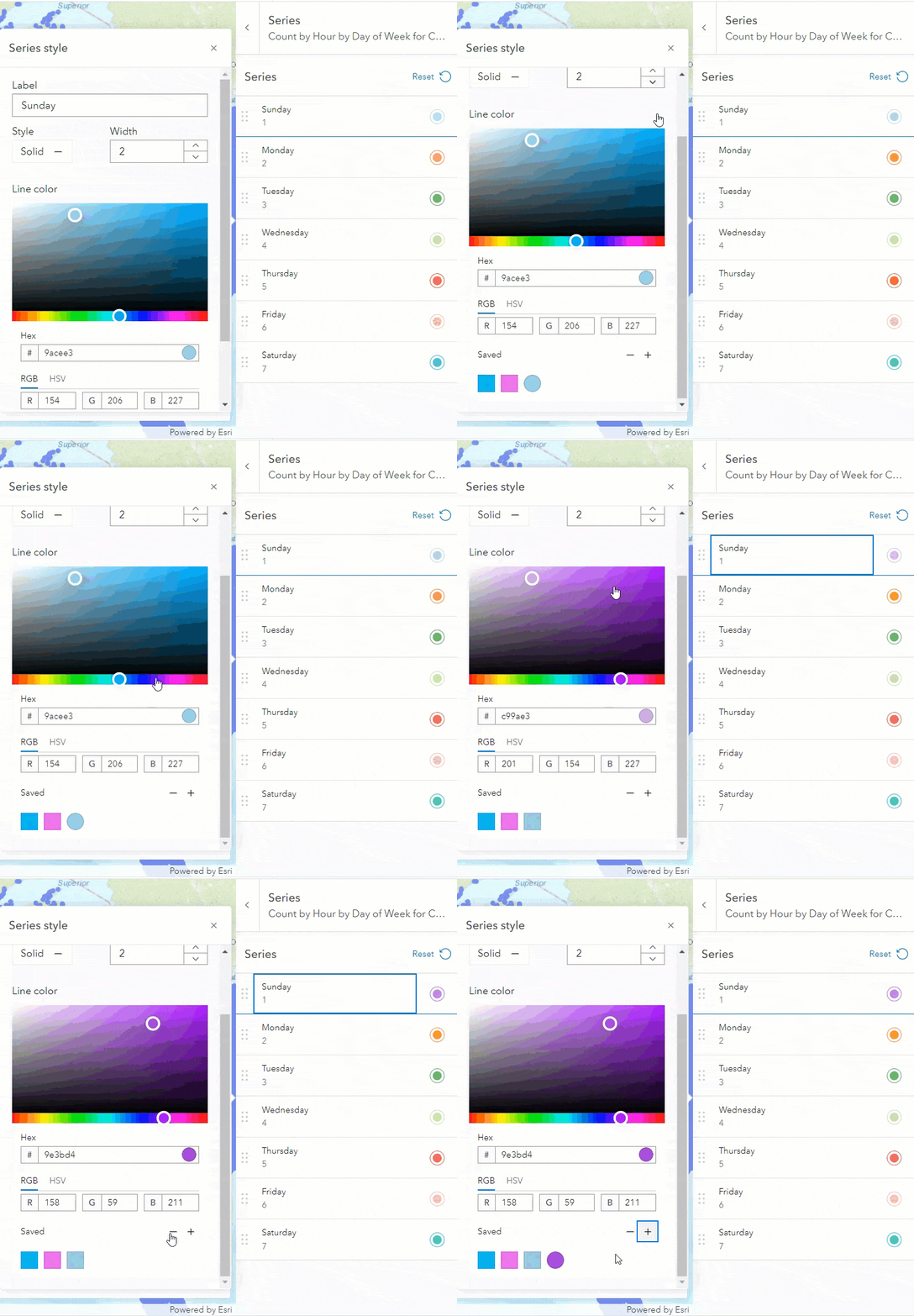
Ever found the perfect custom color using the color palette for your chart but couldn’t select the exact same shade while creating another chart? Map viewer provides you with the option to save your favorite color so that you can use it anywhere in your web map. This feature is included in every style popup. Simply select your custom color using the color pallet and click on the ‘+’ icon to save it. All saved colors will be displayed beneath the ‘Saved’ text. Clicking on the ‘-’ icon will remove the selected saved color.
4. Instantly search variable names while authoring a chart
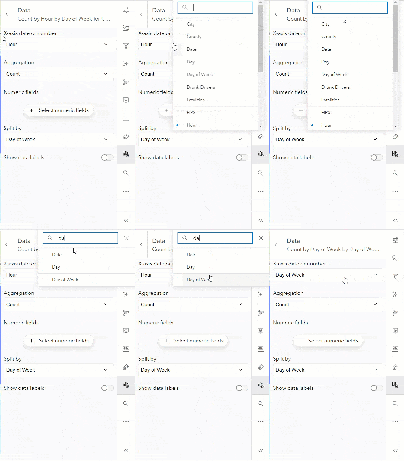
Working on a large dataset with many variables? It would be painful to scroll down the list to find that one variable you are interested in visualizing. Map Viewer has a solution for this problem. For each chart type, navigate to the Data tab, type in the first few characters of the variable name in any of the dropdowns which require a variable as an input and Map Viewer will search it for you.
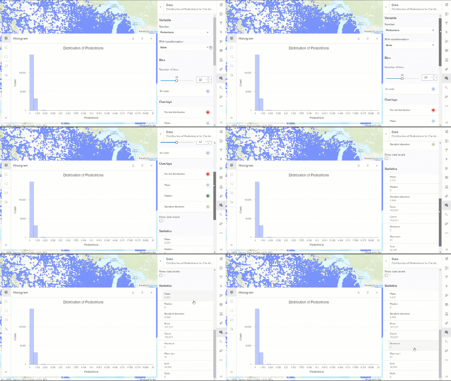
5. Quickly view statistics for any variable
Creating a Histogram in Map Viewer quickly provides us with descriptive statistics for the variable selected. This could be a good way to understand your dataset quickly. The best practice is always to chart the data to better understand your distribution and help plan forward.
6. Navigating feature layers while authoring charts
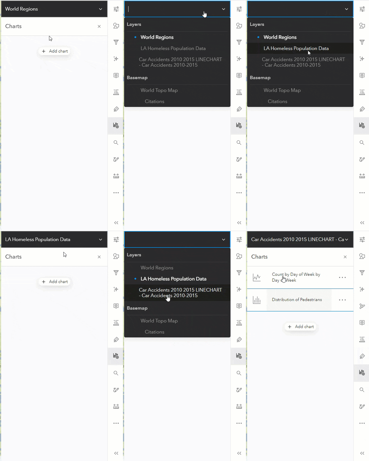
Do you keep your layers panel closed to get a bigger view of the Map? When switching between layers, do you keep opening and closing the layers panel? If yes, Map Viewer provides you with another handy option to switch between layers without leaving the configure charts pane. You can do so by clicking on Layer Switcher on top of the configure charts pane and select the desired layer.
This blog presented a few helpful features of Map Viewer. If you were already aware of them then that’s awesome (cheers!) But if this was something new for you, I hope you enjoyed it. If you have a favorite feature which is absent from the list above, please leave it in a comment below to share it with other users.

Article Discussion: