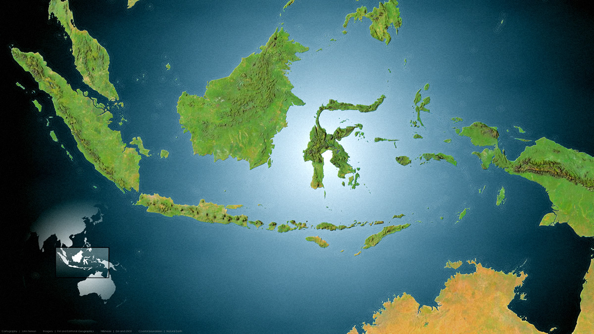
Here is a map of the area around Indonesia. It sports a pretty dramatic vignette, a sculpted terrain, rippley water lines, a paper texture, and that crazy glassy overview map. And it was made entirely in ArcGIS Pro.

For your carto-adventure edification, I’ve made a two-part video series showing how to make it. I’ll also list the steps beneath each video if you wisely decide you can’t abide my nasally Midwestern narration.
…
0:00 Intro. Set the hook…
0:13 Grabbing a big ocean polygon from Natural Earth.
1:38 Pulling in the glorious World Imagery basemap (coordinated by well-rounded, passionate, results-driven, Living Atlas colleague Robert Waterman; hero of basemaps).
2:05 Pulling in regular, and dark, hillshade (coordinated by masterful terrain-slinging Living Atlas colleague, Rajinder Nagi; champion of elevation).
2:40 Using blend modes to digitally stitch the hillshade texture to the imagery colors for a terrain that looks carved out of play-doh.
4:05 Ditching Web Mercator in favor of the charmingly-orthographic World from Space projection…and changing its center to Indonesia.
5:33 Creating a new layout to fit a typical 1920 x 1080 monitor.
6:02 Big margin and neatline. Just kidding, we’ll take this map right to the edge. And crush the neatline into oblivion.
6:59 How to work with that basemap credits text. You aren’t stuck with it as-is! Endlessly grateful to Heather Smith for teaching me this.
7:47 Oh goodness, here we go with the gradient! Ah a nice circular smooth gradient to inject some vignette loveliness into our map.
9:38 Adding in a complete hack sandy coast bevel effect.
12:03 Using buffers to create coastally-radiating water lines? No way! Just use symbol layers so it dynamically draws well at all scales!
15:44 Bring in some papery texture. Give this map a bit of tactile realism. Here’s where you can download the paper texture image I used. Then blend it into the map.
…
0:00 Re-cap. You don’t need to trouble yourself with this.
0:15 LAND! We’ll grab some moderate-precision polygons from the generous and handy Natural Earth.
0:36 Inserting a new map into the Pro project, and adding the land layer.
0:54 Applying the Indonesia-specific version of the World from Space projection.
1:12 Adding this simple overview map into the layout.
1:27 Dissolving all the land polygons into a single mega multi-part polygon using the Dissolve tool. If you assign no dissolve field, it just dissolves everything. 🙂
2:45 Giving this global land polygon a smooth circular gradient. White in the middle and transparent white at the edge.
3:40 Ah, the extent indicator! A handy little rectangle that dynamically knows where to draw a view extent on your overview map. Check it.
3:49 An extent indicator is just another polygon so we can style it up with all the glassy/shadowy tricks we have up our sleeves.
5:19 Smiting that default map frame outline.
6:10 Don’t forget to add/style the data credits! And always sign your work.
…
Well thank you friends for coming along on this fantastic map voyage! If you use some, or all, of these tricks in a map you’re working on believe me when I tell you I would love to see it. Feel free to share a link in the comments or email or socials or whatever!
Love, John

Article Discussion: