“This is my truth, tell me yours.”
-Aneurin Bevan
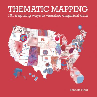
Every map is a product of its maker and its reader, and maps are rarely right or wrong but simply different versions of the truth. The meaning you see in a map can reinforce or challenge your understanding of the theme it represents, and you are much more likely to believe a map if it presents a version of the truth that you believe in already. But how do you decide what map you want to make? How do you understand the way in which different maps can be used in different ways to tell a story? How do you design a map to be read in a particular way? My new book Thematic Mapping: 101 Inspiring Ways to Visualise Empirical Data answers these questions, and more. In this blog I’ll explain more about the book, and tease a few of the spreads.
Sometime in the early part of 2018, Professor Alberto Cairo visited Redlands, California, and I was keen to show him the final draft of my first book, Cartography. Some of you may have a copy. It had taken me several years to write, and I poured everything I had into it. It was designed to contain all I knew and had learnt about cartography, and, frankly, I was exhausted. Yet Alberto stumped me with a question I’d not even considered: ‘What are you going to do for your second book?’ My response was brief: ‘I’m not writing another book. I’m done.’ He said,’You will.’
My second book on cartography is published as an eBook by Esri Press on 31st August and available anywhere you buy books online. More recently, Alberto has said to me, ‘I told you.’ He was right, and his reward was an invitation to write the foreword, which he graciously accepted.
The idea for this new book emerged out of part of my work in exploring ways in which you can make quite different maps out of the same data. I’ve always had an interest in thematic maps, and when I moved from the United Kingdom to California in 2011, I inevitably started making many more maps of United States data than maps of United Kingdom data. I also enjoy making maps of election data and at that point in time Barack Obama was coming to the end of his first term as president, and the 2012 election was on my radar. I made many maps of the 2012 election.
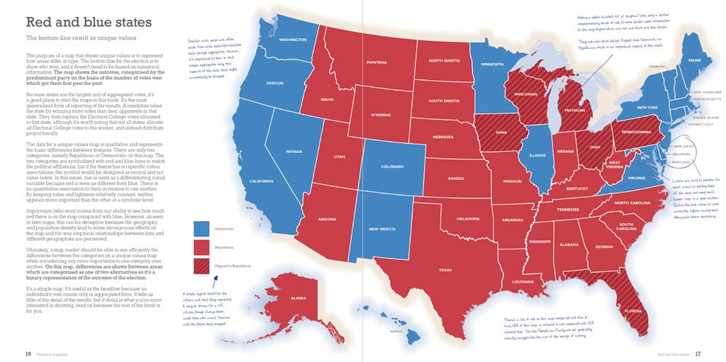
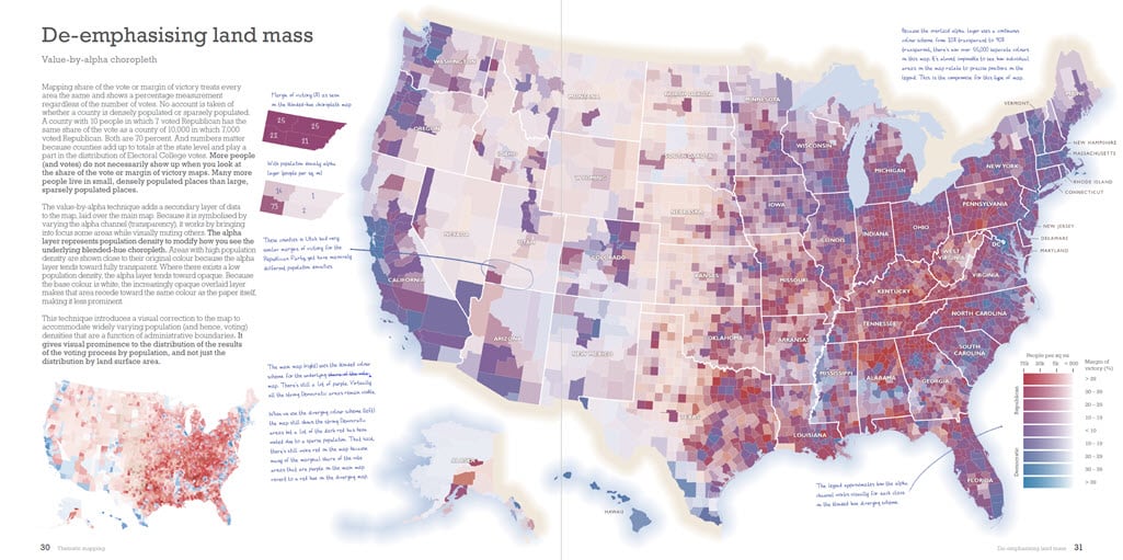
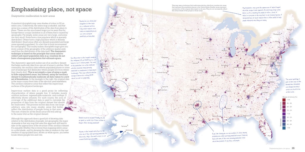
I started teaching with this collection of maps, and since 2013 at the annual Esri User Conference, I’ve taught technical workshops on thematic mapping using election data as a case study. But no map is ever done, and with the Republican victory in the 2016 presidential election, the maps of 2012 were consigned to history and a new 2016 set emerged. I made a few more alternative maps, and the workshops continued to grow. Without even knowing it, I had the basis of a second book, focused on thematic mapping, and the varied ways you can map the same data.
Thematic maps are such a rich source of interest, and in the cartographic community, there have been plenty of fine academic texts over the years that explore the detail of their construction. As a student, one of my favourite books was Thematic Maps, by David Cuff and Mark Mattson, published in 1982 by Methuen in the United Kingdom. It became one of the core texts of my undergraduate cartography degree at Oxford Polytechnic, and I continued to use it once I began my own career as an academic. Cuff and Mattson had based their text on the work of a wide range of United Kingdom, United States, and Canadian academic cartographers, and crucially, also that of practising professional cartographers working in the journalistic realm. This recognition that cartography was not, and never has been, simply an academic pursuit is as important today as it ever has been.
Many more maps are made by people who have little cartographic training than by those who have a background in cartography. Visual journalism has blossomed over the last decade. The technology we have at our disposal means the entry point to making a map of an interesting dataset keeps getting lowered. This is all great news for thematic maps, and we see them everywhere. But having a source text that organizes ideas and concepts in a fresh way also has never been more necessary. That is how I see the value, and contribution of this new book.
It’s not a lengthy treatment of the nuts and bolts of cartography. For that, you might want to look at my first book. But it’s a complementary and updated book to Cuff and Mattson, and to many others such as Francis J. Monkhouse and Henry R. Wilkinson’s wonderful Maps and Diagrams (1973); Borden D. Dent’s Cartography: Thematic Map Design, 6th ed. (2008); and Jacques Bertin’s deep-dive text, Semiology of Graphics: Diagrams, Networks, Graphs (reprinted by Esri Press in 2010).
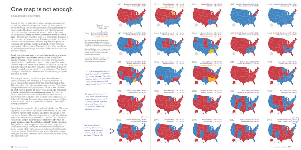
Away from the purely cartographic realm, there are plenty of additional excellent books that explore the role and design of information graphics more widely, such as Cairo’s own books. His latest, How Charts Lie, encourages people to become smarter about visual information. Most similarly themed books attempt to do the same, such as the practical advice in Andy Kirk’s Data Visualisation (2nd ed., 2019) and Edward Tufte’s range of books on conceptual ways to display quantitative information. I also have this aim in mind, for it isn’t just about sharing knowledge and advice on how to make a better map but also better enabling people to read maps. It marries concept and practice, cartography and design, and focuses on maps as a core part of the wider field of information communication. In fact, there’s a whole chapter on charts, graphs and plots, as well as another on using charts on maps.
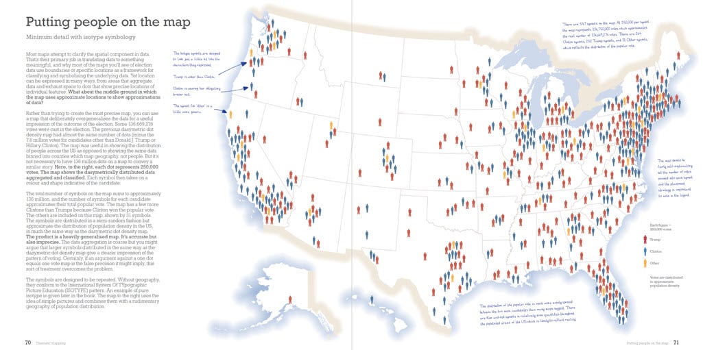
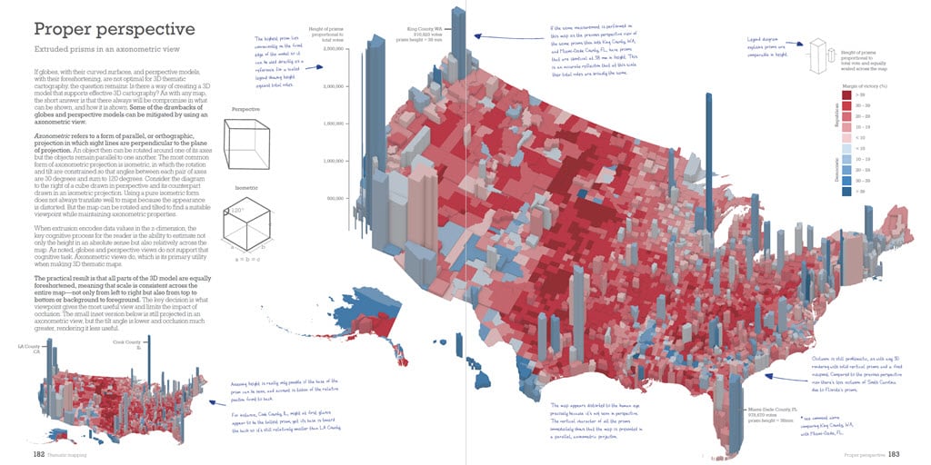
The nine chapters in this book focus on the portrayals that apply to the same data but displayed using different feature types, such as areas, points, and lines, as well as the distorted shapes of cartograms, 3D approaches, and chartmaps. It explores the display of empirical data through illustrations and attempts to do so comprehensively, with as few words as possible. The intent is not to set out detailed layout, design, and production content because most will be working in an environment of specifications and that largely is dictated. And tastes differ. In fact, I decided early on that each spread, and map, would have hand-written annotations, and callouts, scribbled in the margins. The intent is to add comments that explain specific aspects of the map at hand as if a reader had marked up the map themselves. It’s akin to an editorial mark-up that shines a light on parts, and the consequences of the design that may go unseen. Helping people to see the unseen helps people gain a better understanding.
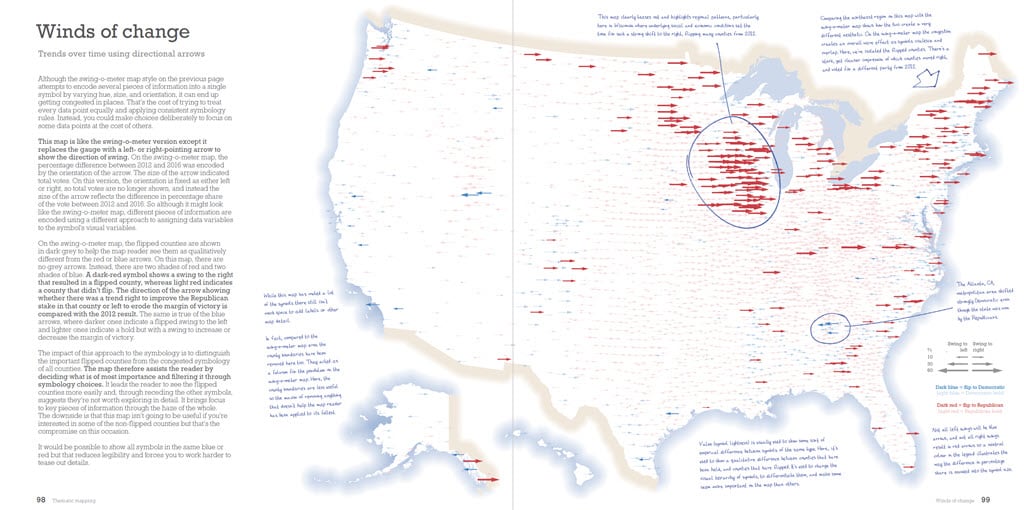
Coming up with a list of 101 maps, graphs, and charts proved to be straightforward for the first 70 to 80. Many common techniques had to be included, as well as a wide array of techniques that are seen less commonly, largely because of difficulties either in construction or interpretation. Many of those in the latter category are excellent alternatives, and hopefully this book will help lead to seeing more examples in the media. I also have included some obscure mapping techniques. Not because they are less relevant, but they perhaps have fallen out of favour as software tends to lead people down a path of least resistance using common (and useful) defaults. But again, you might feel it worth the extra effort to try something a little different.
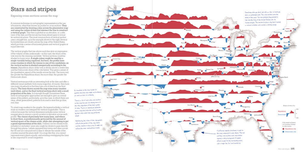
I also have included remakes of some of the most impressive work seen in the media over the last couple of decades. Visual journalism often innovates more than industry or academia, perhaps to try to appear different and engaging. Finally, there are a few curiosities—maps that usually are made as one-offs for fun or perhaps to be deliberately provocative. But it’s worth remembering that there are only 101 examples in this book (well, 101, plus a few more). The maps included are only a subset of a longer list of potential maps, charts, and graphs that were considered. There likely are as many more that might be made, though they also likely will be removed even further from conventional practice, and the book certainly isn’t simply about showcasing the novel or the bizarre.
But maybe you can take inspiration and come up with something altogether new by building on the basics and best practice, and going beyond the defaults?
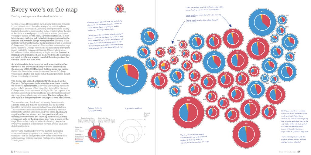
My hope is that this book will support everyday mapmakers by providing an accessible visual glossary (an atlas) of the different ways they might map their own data. The book is not about mapping political data (though you may find interest in the map’s themes that is true) but about mapping any empirical data. The techniques are widely applicable and different data will demand a certain treatment to support a specific meaning.
The book is also designed to be suitable for any introductory course on thematic mapping or as a text that supports that content in a broader course on cartography, geography, or GIS. If you happen to be a political scientist, or simply interested in how election data can be seen through different lenses, then you’ll find copious examples that illustrate how maps mediate the message.
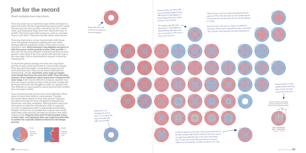
I also have included an appendix to the book that details prior art in the maps and other visuals described in the book. I do this for two reasons. Firstly, as a reference so you can explore early examples of the map types featured. Old is always new again, and we can learn as much from the maps that have come before as from our modern efforts. Secondly, as a way of recognising inspiration behind the work I’ve included because we all follow in the footsteps of previous mapmakers.
“This is my truth, tell me yours.”
-Aneurin Bevan
So why did I precede this blog with the quote ‘This is my truth, tell me yours.’? Because what lies at the heart of this book is the simple notion that the same data can be portrayed in many different ways which will shape a reader’s impression of the message. The quote, by British politician Aneurin Bevan in the mid-1900s simply means ‘this is my viewpoint, but let me listen to yours’, and this seems an important framework not only for how we make maps, but also in how we consume them in relation to our own beliefs and search for the truth in what we see. Maps are made along a spectrum of truth. Even very well-dressed maps can be awful liars. Some will speak to your truth, some may challenge preconceptions. Being open-minded and questioning, with some understanding of how the map techniques plays a part in the message is never more important.
Whatever your truth, I hope this book helps you discover truthful approaches to making maps. These are my maps, show me yours.
I’ll wrap up with some nice things that people have said about the book which I greatly appreciate. Hopefully you’ll enjoy it too. And before anyone asks…yes, all the maps were made in ArcGIS Pro, but the techniques are applicable independent of software. You can find it anywhere you buy books online.
So good! This book ought to be a bestseller.
–Alberto Cairo, Knight Chair in Visual Journalism, University of Miami, author of How Charts Lie
An excellent overview of thematic mapping. May it lead to a better understanding of the ways to visualise and interpret maps.
–Lauren Tierney, the Washington Post
A really great and exhaustive (in a good way!) way to explore one dataset.
–Rosemary Wardley, National Geographic
An excellent book, and one that will be equally useful for mapmakers, journalists, and political junkies alike.
–Anthony C. Robinson, Penn State University
Ken’s first book set the stage for better cartography. This book will undoubtedly take you to the next step to better mapmaking and truth telling.
–Jon Schwabish, PolicyViz and Urban Institute
This book’s focus on one consequential dataset can teach you to read and make maps more carefully.
–Amy Griffin, RMIT University
This book is amazing!
–RJ Andrews, Info We Trust
Still here? Thanks for reading. As a small token of appreciation, please feel free to download a high resolution poster of the results of the 2016 presidential election, or if you prefer, the results of the 2020 presidential election.
Happy thematic mapping!

Article Discussion: