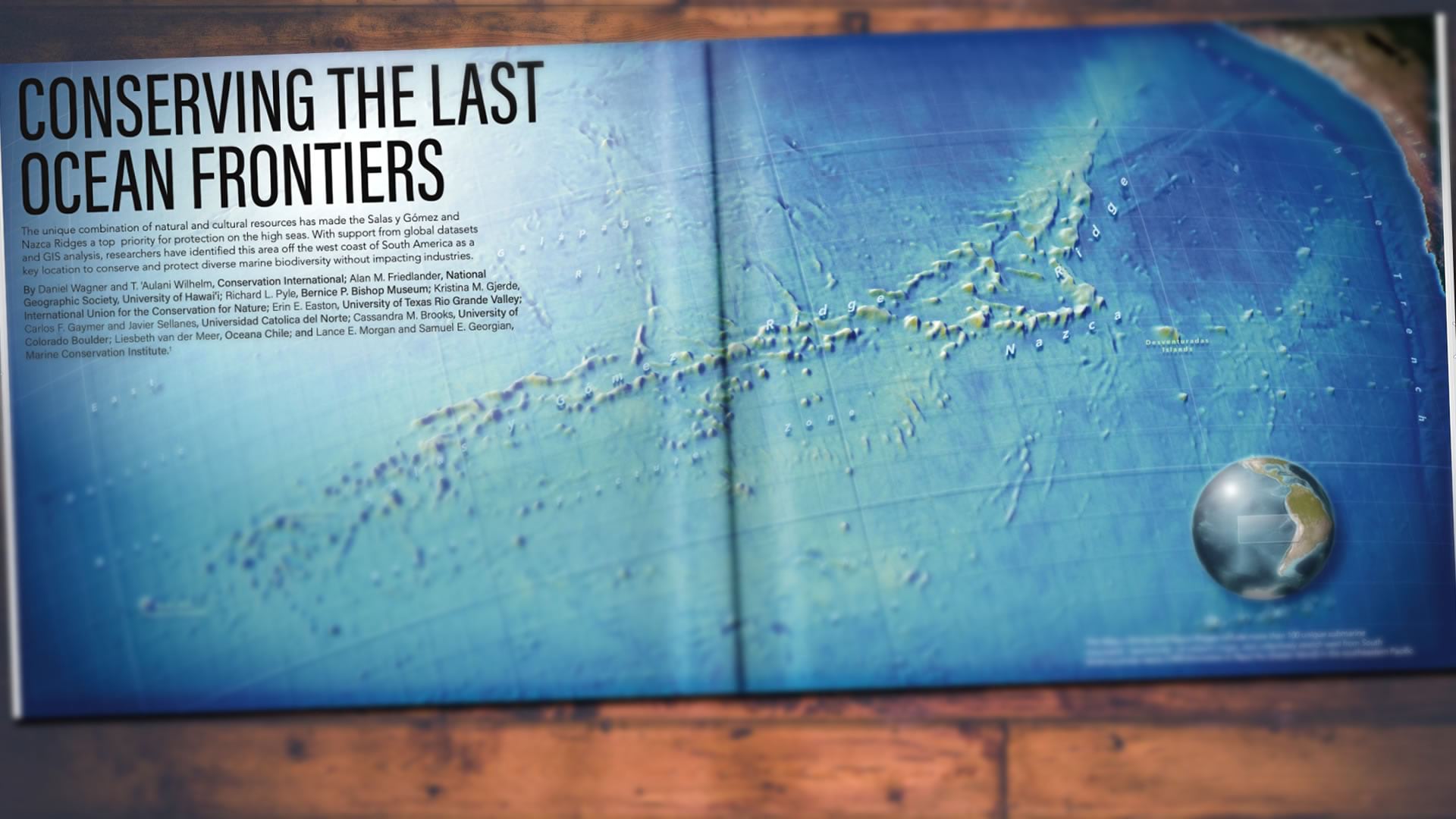
GIS for Science Volume 3 is a wonderful new book stuffed with examples of the work going on in our spatial science community.

Chapter 6, “Conserving the Last Ocean Frontiers” kicks off with a giant map of the Salas y Gómez and Nazca undersea ridges in the eastern Pacific, off the coast of Chile. There are some aspects of it that might seem like they were made outside of a GIS (specular ocean reflections? offset label dropshadows? shadow-casting 3D graticule?) but I am hear to tell you, and show you, how it was made in ArcGIS Pro.
All of the data used in these videos can be found here.
…
0:00 Just your run of the mill intro.
0:53 Cracking open the bathymetric DEM (from GEBCO) and smoothing its rendering from 2 standard deviations to 4.
1:16 Changing the grayscale default colors to muddy brown seafloor colors.
1:38 Ah, glorious hillshade. Using the always-helpful raster functions.
2:11 Blend-mode-ing that hillshade into the muddy bathymetry.
2:45 The good old water visibility trick that uses varying transparency (deeper are opaque, shallower are transparent) to make a realistic ocean.
3:22 Converting the 2D map to a 3D map so it POPS.
3:46 How to use a custom elevation service for your 3D terrain.
4:07 Cranking up the vertical exaggeration to 15x so those ridges look positively ridgey.
4:26 Creating a layout and setting up the 3D map perspective.
…
0:06 Adding a new map to serve as an overview.
1:00 Projecting it to the charming globe-like (though still 2D) World From Space.
1:19 Tweaking the projection parameters to have a different center (which has the effect of “rotating” the 2D globe).
1:55 Adding the overview map to the layout, and positioning it in the map frame.
2:14 Removing the default black border around the map frame.
2:32 You can rotate your map! Here’s how.
2:49 North arrow! I rarely use north arrows but when I do I prefer them to be all glassy looking. Here’s where you can find that sort of thing.
3:51 Manually drawing an extent indicator on the overview map (because the main map is 3D, automatic extent indicators are not supported).
4:17 Styling the extent rectangle to look all glassy. Because glassy!
…
0:00 Preparing mentally for the magnitude of hacking that is about to happen.
0:23 Adding a vignette! Ah, the glorious vignette.
1:46 Re-ordering layers (maps and graphics) in a layout.
2:03 Spinal Tap reference introducing a specular reflection hack.
3:27 Same thing for the overview globe.
4:07 Same thing but changed to black so it looks like an overview map shadow! These are the tricks, people.
…
0:00 An emotional welcome.
0:20 Adding a lat long grid layer. Semi-transparent blue, sort of blurry looking. Since it is draped to the seafloor it looks shadowy.
1:10 Duplicating this grid, making it white, and setting its elevation properties so that it floats smoothly at sea-level. Now we have a graticule that appears to cast a shadow!
1:36 Adding in some swooshy curved text.
2:00 Formatting the label so it has a grand sense of scale (bigtime letter spacing).
2:32 Giving that text a dropshadow megahack with multiple symbol layers that are semitransparent and offset.
3:44 Did you know you can edit the shape and curves of layout graphics by right-clicking it and choosing “edit vertices”?
4:30 We did it! Thanks for following along!
Well this series was jam packed with little ArcGIS Pro tricks that I use in all sorts of maps. Hopefully you learned something new and can’t wait to apply it in your own glorious domain. I’d love to see what you come up with! Thank you!
Love, John

Article Discussion: