By Denny Rivas. Center for Research in Water Resources. The University of Texas at Austin.
Consider you are asked to undertake research on hydrology, in which you have to propose new methodologies using scarce available data, and look for novel media to make your findings readily accessible to multiple and broad audiences. This scenario might seem familiar to you. We experienced it two years ago at the Center for Research in Water Resources at UT Austin, when we were asked to study how glacier retreat is creating flood hazards as a consequence of climate change in high mountain regions of Peru.
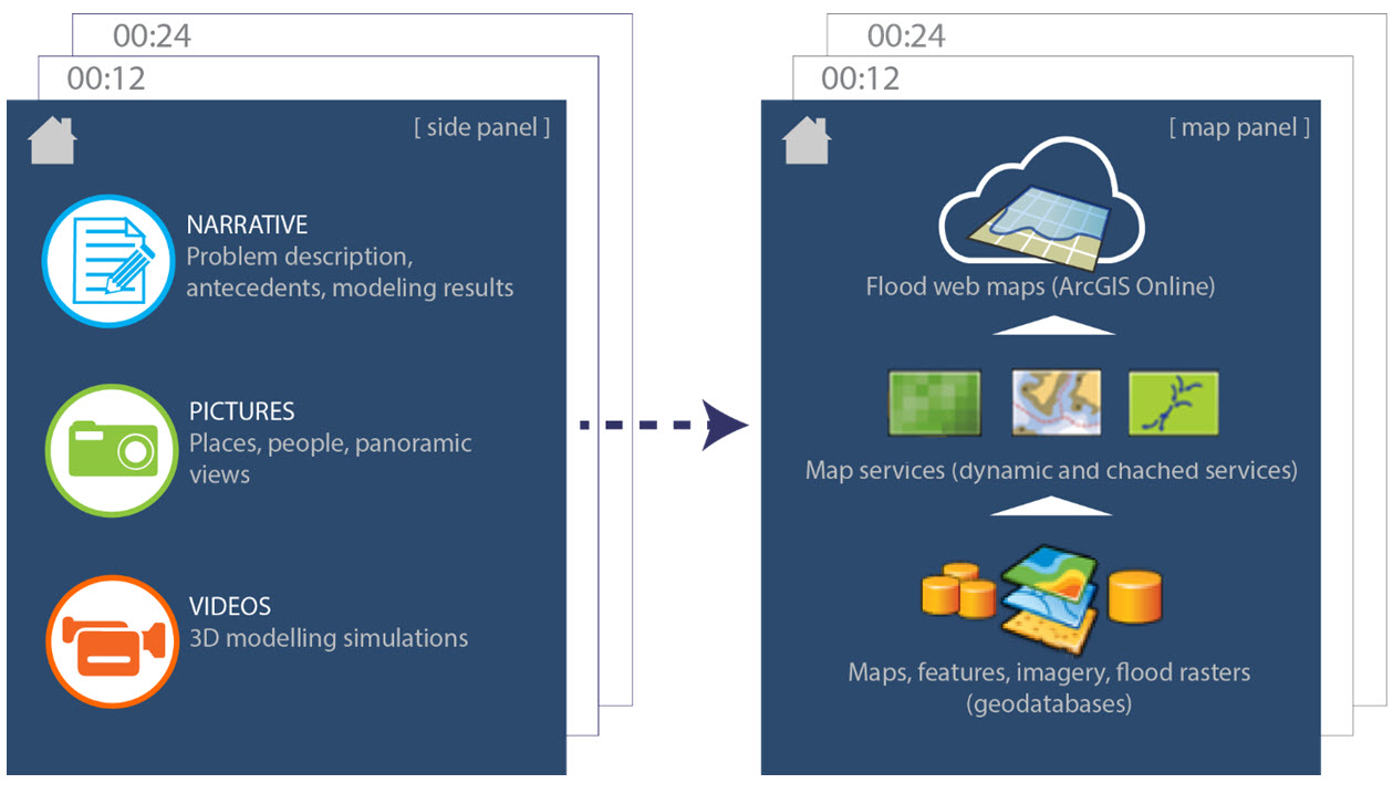
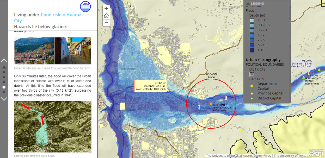
Figure 1. Journalistic style Story Map: Living under flood risk in Huaraz City. While the left panel narrates the story using words, pictures, and videos, the right panel narrates it using maps. Both kinds of narratives complement each other.
At that time, we had barely an idea of the mountain we were about to climb, academically. Physically, though, we were lucky enough to actually climb the glaciers. Let’s start by saying that modelling the whole chain of processes driving glacier lake outburst floods (GLOF) was a novelty in its own right. Combining several hydrodynamic models, we simulated an avalanche hitting a glacier lake (RAMSS – Rapid Mass Movements model), the resulting wave rising and running-up over the lake (Flow 3D model), the lake’s natural dams collapsing (MIKE 11 model) and triggering massive floods and destruction in Huaraz, a downstream city (Flo-2D model).
The technical report we prepared contains interesting findings on flood hazard modelling. I think experts in fluid dynamics will find it informative and enjoyable—satisfying the research’s number one purpose: to provide a practical methodology for GLOF modelling. A broader audience, however, might die because of tedium while reading the report’s introduction; the few survivors will hardly make it to the end of the methodology.
We realized, then, that presenting our findings to broad audiences, beyond academic walls, would demand us a different kind of effort; we needed to modify both our language style and the reporting media. Helen Sword, a language academic, passionately claims that elegant ideas deserve elegant expression. Her “elegant expression,” likewise applies to graphs, maps, and any visual media useful for conveying a story.
Story maps have emerged as a versatile tool that provides effective ways to “elegantly” tell scientifically based stories, and to support the sort of research endeavors we dealt with in Peru. Thereby, story maps are drawing bridges, which hydraulic engineers lacked in the past, to reach new and broader audiences through a massive media. Fortunately, for the hydro-community, incorporating outputs of hydraulic simulations into story maps is more straightforward than we might think. Our experience, modelling flood hazards in Peru, portrays a great example of a story map, while providing some valuable lessons on making scientific data accessible to non-technical users.
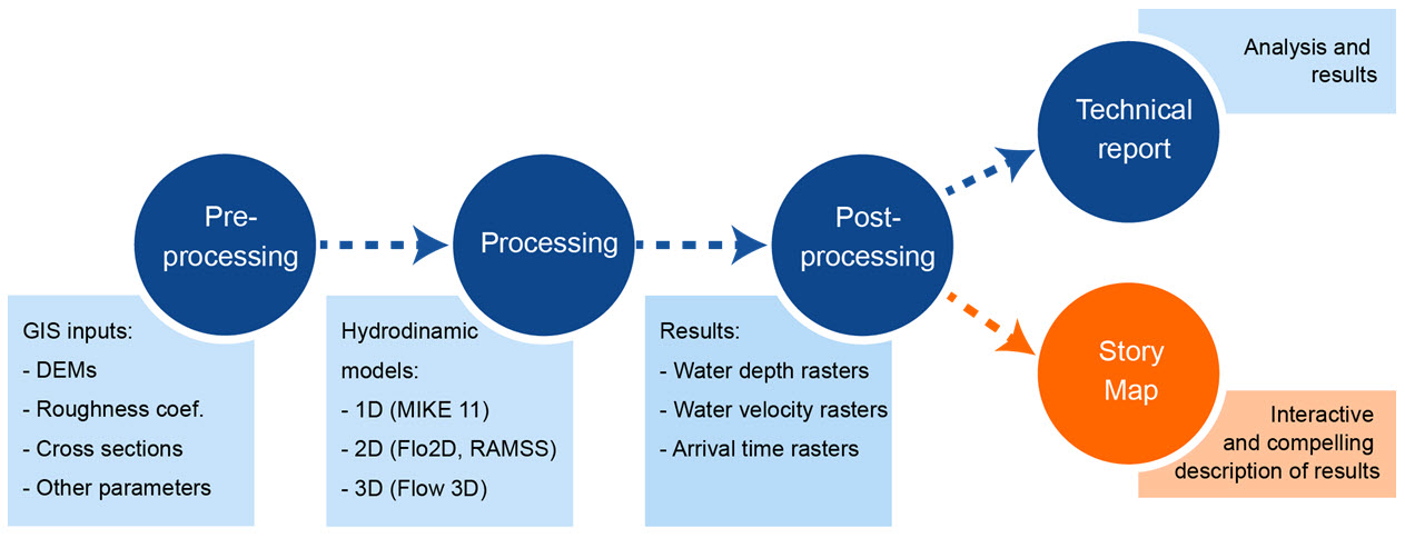
The Model: Most of the commercial hydrodynamic modelling software handles GIS-driven data and follows the three-step framework of pre-processing, processing, and post-processing data. For example, we used 5 m-resolution DEMs to feed numerical hydrodynamic simulations, producing output data such as water depth and water velocity raster files. Thanks to that close integration between GIS and hydro-modeling technologies, incorporating hydro-simulation outputs into Story Maps only requires a deviation at the end of the regular modeling process. As a result, one is able to produce an interactive story, not only a technical report, and publish it in massive media like ArcGIS Online.
Figure 2. Modeling scheme of hydrodynamic phenomena: a story map is an additional product built upon the modeling results.
ESRI recently released a new Journalistic Template for Story Maps. This template allowed us to coherently plot the Huaraz flood story. Although the story, in this case, is chronologically told as the flood moves towards the city, the new template enables alternating zooms and locations as viewers move through sections or scenes. All the content of the story is linked in a single web application: the maps in the main panel changes as the narrative flows, as well as locations, scales, and flood data. So that the narrative guides the reading experience of viewers, but also the geographical experience in the context of flood issues, unveiling (zooming and panning) places and landmarks exposed to the flood hazard. The story map successfully turns a scientific modelling effort into a more human story. Likewise, by zooming into specific locations, the story map brings that same sense of human scale to the maps, which are the geography component of the story.
Viewers will witness dramatic landscape changes in a short journey starting at the foot of Glacier Palcaraju, and ending, only 22 km downstream, at Huaraz City. Each section of the story map displays a different time step of the flood evolution (from 00:12:00 to 01:48:00), briefly explaining current human and infrastructure exposure to flood, as well as hydraulic parameters (depth and velocity of water).
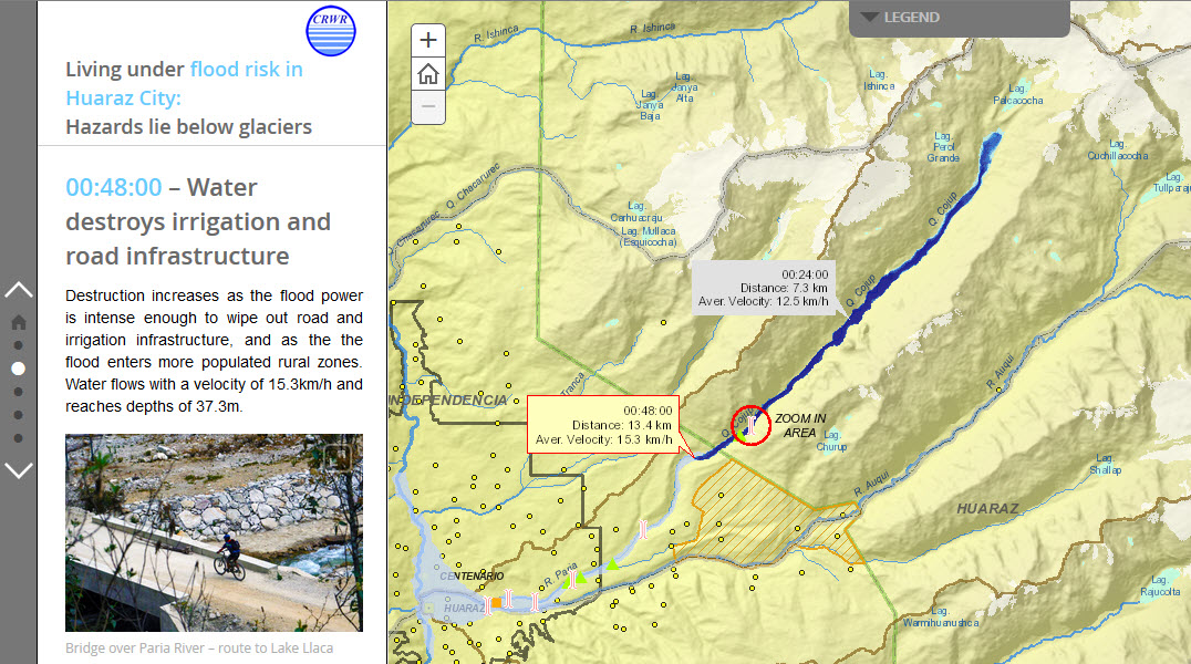
Figure 3: Journalistic style Story Map: Living under flood risk in Huaraz City. At time 00:48:00, the flood is moving closer to the City, destroying irrigation and road infrastructure along its way.
The story map composition changes in each section, loading different web maps supported by map services deployed in ArcGIS Server 10.2 at the University of Texas at Austin. To improve web displaying performance, the static background cartography employs cached map services and imagery from ArcGIS online (where available), whereas large dynamic data (e.g. flood rasters for each time step) comes from image services, created from mosaic datasets. The appearance of the maps in our story automatically changes as the underlying web maps are edited, providing us with flexibility for further reviewing and editing processes.

Figure 3. Composition of a Journalistic Story Map for flood modeling applications.
We adapted pure scientific language to a more engaging style using all the media capabilities compiled in the Journalistic Template and we think we succeeded in crafting our flood story. Please visit the Living under flood risk in Huaraz City map and compare it with the technical report. Which one do you like the most?


Commenting is not enabled for this article.