By Aileen Buckley, Mapping Center Lead
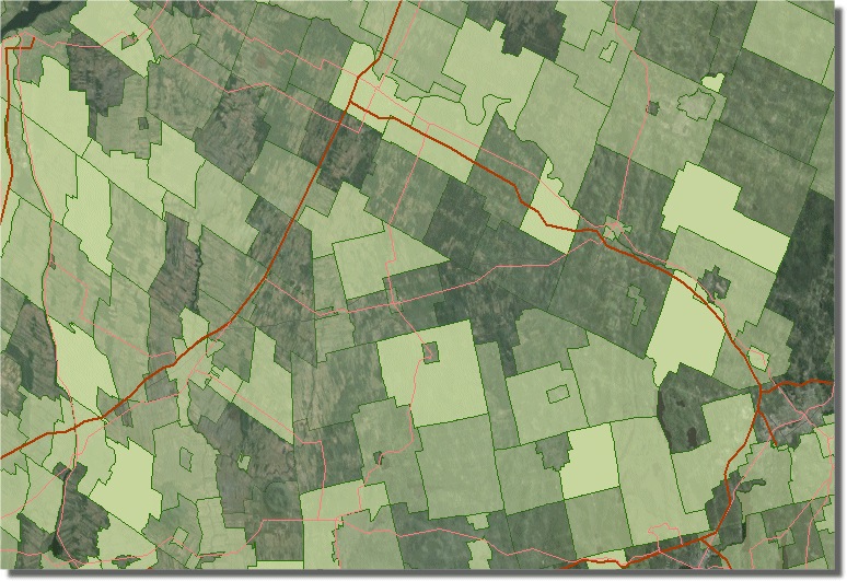
This question comes in fairly regularly at Ask A Cartographer, so I felt it was time to add a brief blog to use for future queries. This issue is a common one, and is the topic of a Knowledge Base article that describes the basic steps needed to solve the problem. The value added here is a bit more discussion as to why this is a necessary workflow.

Consider what transparency is doing: taking the original color you’ve set for multiple features and drawing them across a variety of other background colors and symbols. How many individual shades will this produce on your map?
Basic choropleth map
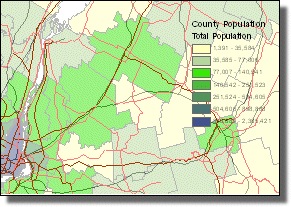
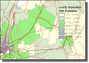
If you’re creating a simple, easy-to-understand map showing one layer on a plain background, use the workflow described in the knowledge base article mentioned above. Plan to use the steps in the Knowledge Base article as close to end in your production workflow as possible. Because this method requires that you convert the legend to graphics, and any changes to your layer or data may require you to repeat this step. Here is an example of how these steps impact a simple map:
| Before: | After: | ||
 |
 |
||
If your map has another layer in the background like a hillshade or polygons that may be showing unique values for political units, then determining which color should the legend use becomes much harder to figure out. When you have more than one symbol for the background features, the transparent shades will be different for each of the background colors. You can see how this is a complex issue, and one that the software cannot figure out. Therefore we leave it to you to tell which colors you want shown in the legend, and thus it remains a fairly labor-intensive, manual workflow.
Variable feature-level transparency
Additional symbol complexity is created when you set feature-level transparency by attribute through the Layer Properties.
Before you apply this symbol setting to your data you must first identify or create a field in your layer’s data that contains percentage values. This aspect of the transparency setting is not well documented, and if inappropriately applied will result in symbology that is, at a minimum incorrect, and potentially misleading.
Note the description on the dialog – the software expects that the values being used fall within a range of 1 – 100:
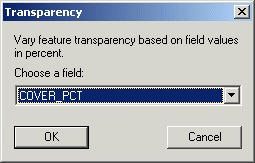
What this means in practice is that you need to pre-process your data and design how you want the feature-level transparency to appear. There are two ways in which the resulting percentage-based feature opacity can be modeled both visually and in the data: by class or by range. The suggestion made here is that you break your percentage values into a small number of classes (e.g. 0%, 20%, 40%, etc.) and assign one to each feature. Also, you may want to reduce the range of transparent values in the data: 0% to 100% values may not be necessary to support the actual visual values on the map, 15% – 80% might work just as well. This will largely be determined by which base color(s) you start with. You can also use your data to create a range of percentages (i.e. 0% – 100%), but these values will result in a gradient of opacity which may be a challenge to manage in a legend.
Also, keep in mind how “transparency” or “opacity” will actually display on the map. Think about the phenomenon you’re trying to communicate, and what the software will do with the values:
100% transparent = clear polygon = perceived absence of phenomenon
Therefore, you may need to invert the percentage values you use for transparency to accurately depict the absence or presence of what you’re trying to show on the map.
Once you have prepared your data and decided how you want to organize the map legend, you need to make another decision: how to display the semi-opaque data in relation to other map data. There are two ways you can use feature-level transparency for your data visualization: as a single feature layer drawn over a base map or separate thematic layer; or as a second opaque variable drawn over the same data (e.g. percentage of males over total population per acre). Your choice will determine the symbology method you use to apply the transparency, as there are two ways to do this: from the Advanced button on the Features -> Single Symbol or the Categories ->Unique Values symbology methods.
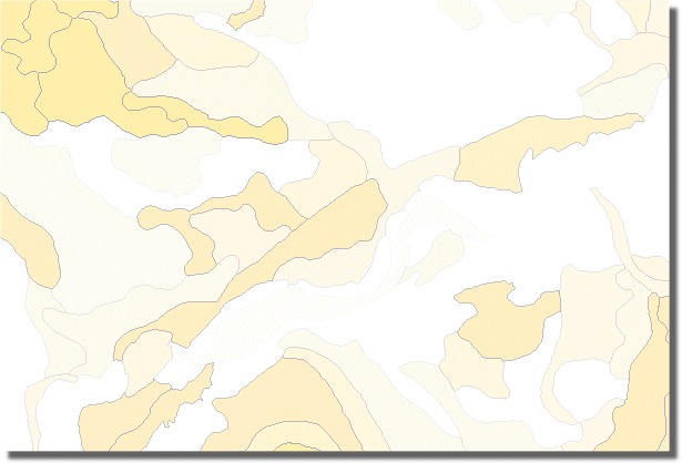
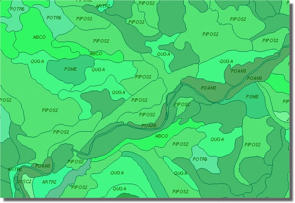
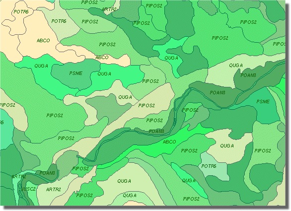
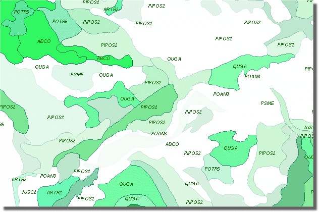
In the examples shown below, the map shows forest vegetation data: the classified green-shaded data is primary species, the transparent layer shows percentage of ground cover.
As two separate layer files:
Percentage cover
Primary Species
Combined
As one layer with transparency applied to primary species:
Create legends for feature-level transparency
When you apply feature-level transparency to your data, neither the Table Of Contents nor the legend draws a group of feature classifications with a color gradient, instead it draws only a single feature symbol based on the color you define (as if no transparency was involved). Therefore, you need to manually create a custom type of legend.
Tip: You will need to plan your colors, attribute classifications, and percentage transparency values well in advance of reaching this step.
A method for creating this type of legend for raster hillshades is contained in the blog article “Creating a legend for hypsometrically tinted shaded relief” the workflow described here is similar.
- Create a second feature layer from the one with feature transparency applied
- Change the display to classify and symbolize it based on the base color of your existing transparent layer
- Create a new legend based on these settings and convert the legend to graphics
- Use the eye dropper technique described in the support site article listed above to define the transparent colors for the percentage classes
- Finish your legend
In effect, what you are doing here is creating a bi-variate legend (one attribute representing your primary data values and one representing the characteristic represented with transparency), so you will need to be careful about your color choices and the number of attribute classes you define. The various combinations could easily become far too numerous, making for a complex legend for you to construct, which may also be a legend your map’s readers might not even try to read.
Create polygon feature class for legend color patch
Another option that you could use for both of the situations described above is to create a feature class in which you store a single rectangular polygon to carry the legend symbol as a gradient fill with transparency applied. The workflow is straightforward:
- Create the legend with the final settings you want
- Digitize a new rectangle feature in the ‘legend’ feature class (Use the existing legend color patches as a template)
- Create and apply a custom gradient fill to the new polygon
- Convert the features to graphics
- Add the new gradient fill polygon to the legend and group the elements

Article Discussion: