By Aileen Buckley, Mapping Center Lead
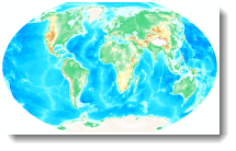
In a previous blog entry, Using ETOPO1 data, we explained how you can download and process ETOPO1 world elevation and bathymetry data for use in ArcGIS. In this blog entry, we explain how you can quickly and easily symbolize the data – with beautiful results!
To help, we’ve added to Mapping Center a colormap file that Dr. Jon Kimerling, professor emeritus of Oregon State University, created. You can download this file from this link.
A color map is essentially a text file that contains four columns of information. The first column is the value that will be assigned a color – for the ETOPO1 data this column contains each of the elevation values in the DEM. The next three columns have the red, green, and blue values that define the color using the RGB color model.
Note that with ArcGIS 10.0 there is a limitation when using color maps (this will not be the case with version 10.1). All the values in the color map file have to be positive. So this means that you have to do two things:
- edit the color map so that all the elevation values are positive (we’ve done this for your so you can simply download and use the etopo1_pos.clr color map file until 10.1 is released, at which time you can use the etopo1.clr file), and
- edit the ETOPO1 data so that all the values are positive.
Processing the Data
Here is how you would create the file with all positive elevation values if you wanted to do the processing yourself:
- In ArcMap, add the ETOPO1 data to your session. You will see that the lowest value is -10,898 (this is apparent in the Table of Contents or when you right click the ETOPO1 layer, click Properties and review the information on the Source tab.) This is the case for both the bedrock and the ice surface data.
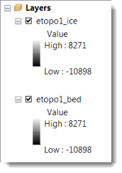
- You need to add this lowest value to all the elevation values so that they range from zero to (the highest value + 10898) (i.e., 19196). To do that, use the Plus tool in the Spatial Analyst toolbox (in the Math toolset). The input raster is the ETOPO1 data and the constant value is 10898.
- Name the output raster etopo1ice_pos or etopo1bed_pos depending on which data set you are using.
Symbolizing the Data
At this point you can display the raster with the color map. This is very easy. Here are the steps.
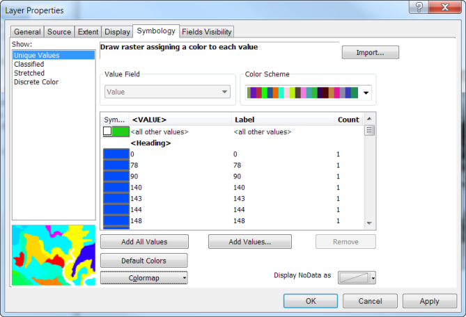
- Right click the raster in the Table of Contents, click Properties and click the Symbology tab of the Layer Properties dialog.
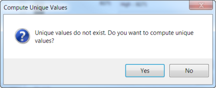
- Choose the Unique Values renderer under Show. If you are advised that unique values do not exist and asked if you want to compute them, click Yes.
- The dialog will change a little and a Random Color Scheme will be applied to the unique values. In the lower left of the dialog, click the Import Colormap option.
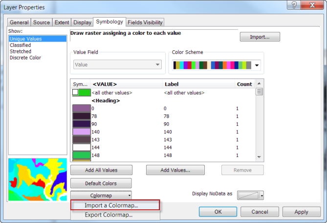
- Navigate to the location of the colormap file that you downloaded from Mapping Center and select this as the file to import.
- The dialog will change again and the colors in the colormap file will be applied to their associated values. Click OK to accept the changes.
The result is a hypsometric tint of the elevation data with a specific color assigned to each and every elevation value.
Note the differences between the bedrock and the ice ETOPO1 data sets — they can be easily seen in the higher latitudes in Greenland and Antarctica where we know the land masses are covered with ice.
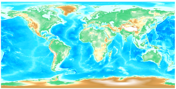
ETOPO1 ice data.
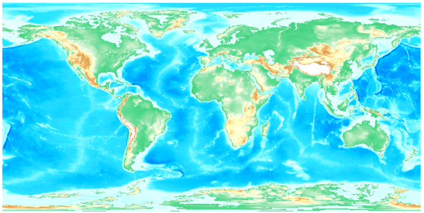
ETOPO1 bedrock data.
Adding Snow and Ice
In these higher latitude areas, you may want to add an ice layer since the colormap file assigns colors based on elevation and ideally these areas should appear to be snow and ice (the color for a higher elevation). A good source is the Glaciated Areas data set in the Natural Earth Data collection. These data come in various resolutions — the 1:10,000,000 Glaciated Areas appears to align nicely with the ETOPO1 data (I have also used the 1:10,000,000 Antarctic Ice Shelves data). Symbolizing these data with a white fill, no outline and about 10% transparency provides a nice result.
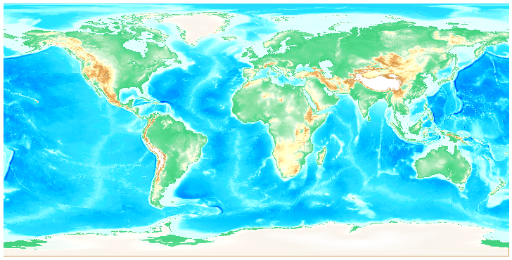
Natural Earth Glaciated Areas data (1:10,000,000) shown with 10% transparency over ETOPO1 Ice data.
Adding a Hillshade
You may also want to display the hypsometically tinted data (that is, data that use color tints to represent elevation or hypsometrty) with transparency over a hillshade. This is easy, too. Here are the steps:
- To create the hillshade, use the Spatial Analyst Hillshade tool (in the Surface toolset). The input raster is the ETOPO1 ice or bedrock data.
- You can accept all the default values, unless you are working with the data in its original coordinate system — WGS84. Ideally, you should project the data to the projection you will use on your final map — we used a Winkel Tripel projection. If you must create the hillshade in the WGS84 projection, you will need to input a Z factor to compensate for the fact that the elevation units (meters) are not the same as the linear units (degrees). You can use the value that would be appropriate for data centered on the Equator (0.00000898).
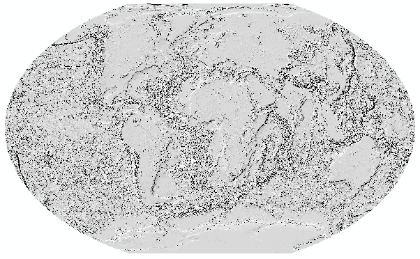
ETOPO1 hillshade.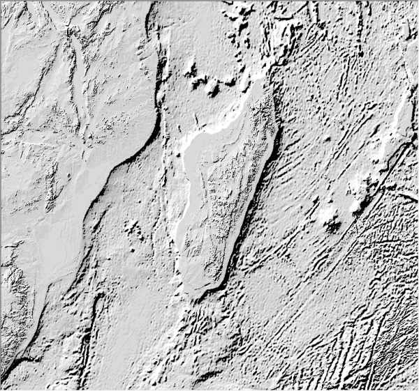
A close up of Madagascar.
Displaying the ETOPO1 Data with a Hillshade
To display both the hillshade and the ETOPO1 data, first position the hillshade under the ETOPO1 data in the Table of Contents.
- To display the ETOPO1 data, right click the layer in the Table of Contents, click Properties, and on the Display tab set the Transparency to about 30%.
- To display the hillshade, right click the layer in the Table of Contents, click Properties, and on the Display tab set the renderer to Bilinear Interpolation. On the Symbology tab, set the Stretch Type to Standard Deviations and set the number of standard deviations (n:) to 1 (to slightly exaggerate the elevation). Check the option to apply as Gamma Stretch and set the value to about 4 (to tone down the grays so that the brilliance of the colors in the hypsometric tint are not de-saturated).
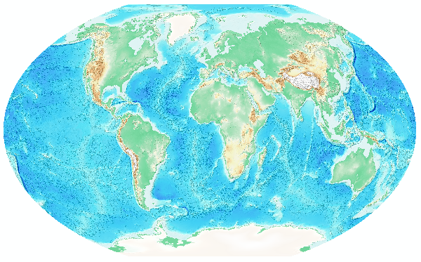
ETOPO1 hillshade and hypsometric tint, along with the Natural Earth Glaciated Areas data.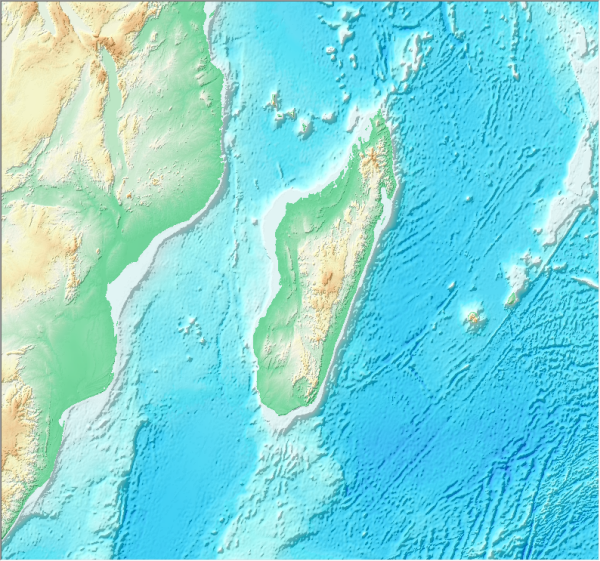
A close up of Madagascar.
We find the results stunning!
Here is the citation from NOAA that you can use if you have included the ETOPO1 data on your maps:
Amante, C. and B. W. Eakins, ETOPO1 1 Arc-Minute Global Relief Model: Procedures, Data Sources and Analysis. NOAA Technical Memorandum NESDIS NGDC-24, 19 pp, March 2009. Go to this web site: http://www.ngdc.noaa.gov/mgg/global/global.html.
You might also want to give credit to Dr. Kimerling for his color map. Here is a citation you can use for that:
World elevation color map courtesy of Dr. A.J. Kimerling, Oregon State University.
We hope you find these data as useful as we do, and we also hope that the data and color map downloads will lead you to use them again and again!
Thanks to Ken Field and Mark Smithgall, cartographers on the Esri Mapping Center Team, for their help with this blog entry!

Article Discussion: