Welcome to Week 7 of ArcGIS Hub’s Civic Analytics Notebook series. In our last post we saw how charting libraries in Python can be used to visualize temporal and spatial patterns in civic data. We extended that study further to detect statistically significant patterns in the specific data (phenomenon such as crime, 311 calls) and the population in that region to see if the number of incidents is proportionate to the the number of people, without drawing causal conclusions. If you would like to check out other offerings from this series, you can find them here.
This week we shift gears to analyze a data catalog for a Hub. A Data Catalog, simply put, is an organized inventory of data assets and their metadata across all the data sources in your Hub. Metadata provides information (source, license, description, etc.) about the datasets and other data resources. A classic analogy is of the information about a book that a library (catalog) maintains, such as the name of the author, the number of times the book has been previously borrowed with dates, edition, etc. Similarly, a data catalog can be used to manage and describe the metadata of all your content to help users easily discover and consume data of interest. It provides a broad, comprehensive view of the contents of your Hub to improve data transparency, access and governance.
Why would I analyze a data catalog?
A data catalog is an important tool for those working with data or interested to understand the data assets of their local Hub. For instance, data journalists and community data scientists can use their data catalog to search for relevant and reliable data in their field of interest. It also helps transparency watchdogs in the community to investigate how complete or up-to-date or compliant the data assets are to good data collection and sharing practices, so that they can keep their regional data providers accountable. Conversely, internal staff who work on Hub can use this as a tool to track and rectify missing or incomplete data, as well as to understand the types of data in their catalog.
We have set up two notebooks to analyze data catalogs with different sources of data. One notebook can be used to analyze basic summary of any data on a Hub, even those with data distributed across multiple different platforms (including the ArcGIS platform). We demonstrate this notebook with the City of Seattle’s data catalog. The other notebook can be used to analyze both basic and advanced summary of ArcGIS-hosted data on a Hub, i.e. one with all of its data on the ArcGIS platform. We demonstrate this second notebook with the data catalog of Washington, DC.
What can I learn by analyzing a data catalog?
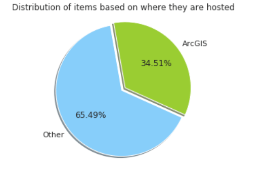
We start by demonstrating how to use the DCAT API for these Hub sites to extract all their data and to explore all the metadata for a single data item. For the first basic notebook (Seattle) we pull up a chart that highlights what proportion of the data is on the ArcGIS platform (pie chart above), and what proportion is hosted elsewhere. Having worked with keywords/tags in some capacity, we know that keywords are important semantic tags assigned to objects to help categorize them. Next we show how users can filter data assets based on these keywords, as well as visualize the most popular keywords across all the content, to get a sense of the common themes across the site. We then build a chart of the groups or agencies that have published most of the data. This is useful to understand which teams have contributed data content. This is followed by a visual representation of the different formats in which the data is made available such as API, CSV, map service, etc.

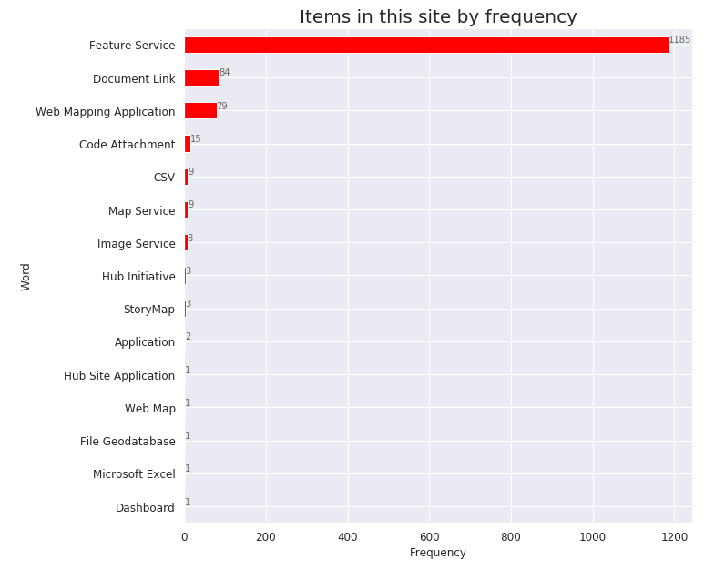
In the second notebook (Washington, DC), we start with similar analyses and then demonstrate how Hub’s Python API (arcgishub) library – which uses the ArcGIS Rest API to inspect the data on the ArcGIS platform – can be used to extract more information. We visualize the distribution of each data item based on the different item types and use arcgishub to search and filter data based on search queries and item types.

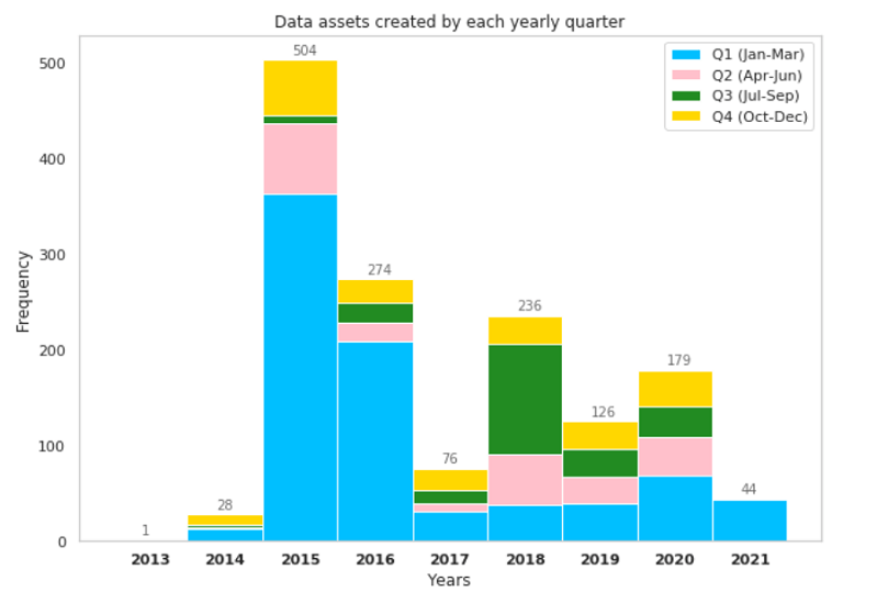
We conclude both notebooks with a few temporal charts that show monthly trends of data being created and updated for each year. This tells us if our local Hub has been actively adding and updating data on a regular basis. We start by plotting a histogram across months of the entire time period for which the Hub has shared data. This gives us an overall trend of data sharing practices across the time period. Next, we build small multiple charts that explore the number of datasets added/modified for each month of each year. Following that, we explore the presence of cyclical trends in datasets added/modified for each month and yearly quarters (as shown below) for each year.
We understand that some of these charts may not be relevant for your specific Hub, but this is an effort in demonstrating the various practices for summarizing and reviewing the data assets in your Hub. Do connect with us on our Geonet discussion thread to share which analyses are most meaningful for your Data Catalog.

We invite you to explore your local Hub’s data available at your fingertips and their data sharing practices. Use the techniques in these notebooks to build a data catalog and investigate the metadata of the contents. I would love to hear of your findings and if you have examined and visualized different metadata fields. Feel free to share your thoughts and results from your data catalog experiments with us on our Geonet discussion thread. I look forward to connecting with you on your experiments with analyzing the data catalog for your Hub.
Links to Notebooks:
Click here to learn more about Week 8 of Civic Analytics with ArcGIS Hub.

Article Discussion: