A basemap provides general reference information to your audience. When you first create a map using ArcGIS for Power BI, the visualization uses the default ArcGIS basemap: Light Grey Canvas. This basemap is great because it contains a muted background with minimal detail, so background information doesn’t get in the way of displaying your data.
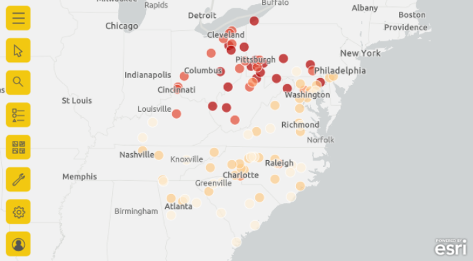
When you style your map by adding data to the Color field well, however, you may discover that your locations no longer stand out, as shown in the image below.

With the default light grey basemap, the high values on the map seem washed out and hard to see and the low values become too prominent.
As a designer, you determine how the final map and report looks and behaves, so consumers will see the map exactly as you intended. Try changing the basemap to one that makes the locations and their colors stand out.
Expand the map tools and click the Basemap tool to display the basemap gallery. If you’re using the Standard visualization that comes with Power BI, you’ll see the four basic default basemaps. If you’re signed in to an ArcGIS account, you’ll have access to all the basemaps made available in your organization.
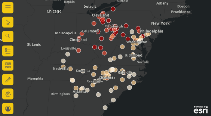
Try applying a different basemap to see how it affects the locations on the map. As you can see, the Dark Grey Canvas basemap allows the colors on the map to pop: the high values now stand out, while the low values recede, allowing the map to better tell the story at a glance.

If you enable the Basemap tool in your completed report, report consumers can use the same process to change the basemap in Reader view, although those changes don’t persist with the report. To enable the Basemap tool, turn the Basemap option in the map visual’s Format pane to the on position.


Article Discussion: