Mapping time has perhaps never been as well supported
There’s a perception that GIS and cartography have always struggled to adequately deal with and represent time. The notion that a phenomena that varies temporally is difficult to model perhaps gives rise to the idea that static layers are unable to capture such variability. If this ever were the case, it’s not so any more. Our ability to handle large temporal datasets in GIS is now well supported. Adding time and date fields to data in ArcGIS allows you to configure and work with the temporal dimension including animating the map and controlling playback. Many online map services have a temporal aspect and it’s important to be able to reveal and make sense of this. Functionality is available across the ArcGIS platform to support temporal analysis and visualization.
Creating animations of thematic layers only goes so far though, and sometimes it’s difficult to gain a detailed impression of the message in the map if you’re trying to assimilate a slice of your data from one time period with another that flashes briefly then moves to the next time period. A good example of this problem is the animated choropleth, where trying to build a mental picture of change over time is challenging as the map continually changes. Is this an insurmountable problem for cartography?
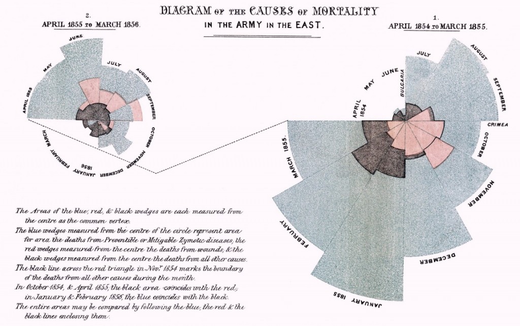
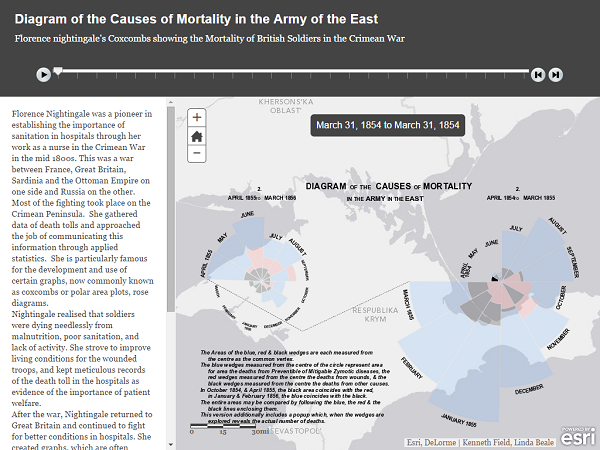
Time is a hotter topic than ever and as the North American Cartographic Information Society (NACIS) prepares to gather in Pittsburgh in October for its annual conference, and the conference theme “Cartography and Time” reflects this. This coincides with the publication of Mapping Time from Esri Press, in which Professor Menno Jan Kraak explores the many ways you can map time using the classic mid-1800s map of Napoleon’s 1812 march on Moscow by Charles Minard (see below).

First up is the space-time cube, created by geographer Torsten Hagerstrand in 1970 as a framework to study the social interaction and movement of individuals in space and time. The space-time cube adds a z axis denoting time to the familiar planar x,y coordinates we use. It’s seen sporadic use over the last few decades because of problems relating to its construction and usability. For instance, when you add multiple pieces of data it suffers from visual clutter and occlusion and estimating size and values are problematic, particularly when multiple trajectories are displayed together. They also struggle when you try and show multiple polygon layers together. For instance, when you stack layers on top of each other it’s only really possible to see the outer faces, and making sense of what’s going on inside a column of stack polygons is difficult. For that reason, space-time cubes of polygonal data should be avoided.
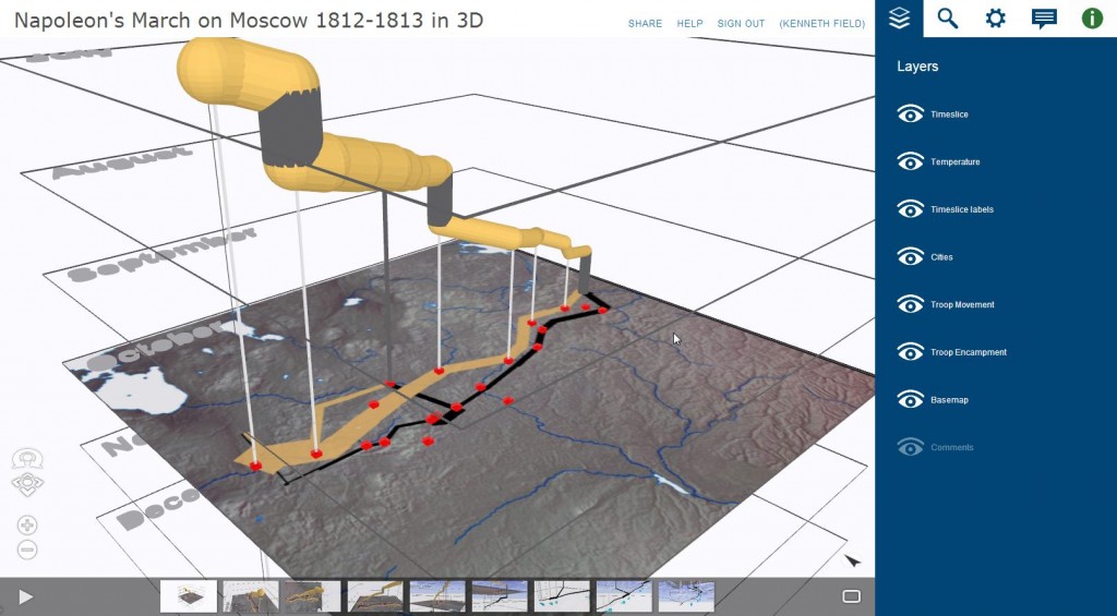
Using either ArcScene or ArcGIS Pro it’s possible to rebuild the famous Minard map as a 3D space-time cube which shows how the troops of Napoleon’s Grand Army were decimated by a range of factors during their 5 month advance and retreat.
The temporal dimension of data can also be a great way of engaging with history, and Story Maps provide a terrific way of combining maps with other digital artifacts and a narrative to detail changes over time in an historic context. For instance, using the Map Journal App we rebuilt the Minard map to tell the detailed story of the march in collaboration with Lieutenant Colonel James McGhee, whose short book provides the narrative and imagery.

The Map Journal was also used to good effect to tell one man’s story in the World War I battle of Gallipoli in 1915. As we approach the centenary of the Gallipoli conflict, the ‘For King and Country’ Story Map follows John Henry Cartwright’s journey from a small town in Australia to the frontline, to his ultimate death and to the ongoing legacy memorial of his involvement. History, brought to life in maps. The Minard map aggregated data into a single thematic map, whereas the Cartwright map tells an individual story—both powerful ways of engaging with the horror of battle.


insider