
January 7, 2025

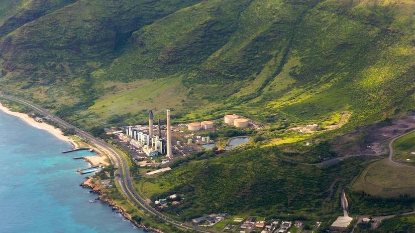
Hawaiian Electric’s Kahe Power Plant at Kahe Point, West O‘ahu, Hawai‘i
Petroleum has a single path into Hawai‘i.
Two miles off the coast of O‘ahu, the state’s most populous island, tanker ships offload crude oil onto a floating terminal. An underwater pipeline brings it to Hawai‘i’s sole refinery, in Kapolei.
Two 23-mile distribution pipelines send a portion of the refinery’s output—which includes gasoline and aviation fuel—to Honolulu, Hawai‘i’s capital and largest city. Another portion travels on barges to other Hawaiian Islands. Additional pipelines carry fuel for the electrical grid to power plants around the island.
If a natural disaster destroyed—or even disrupted—the refinery or its assets, that would be bad. But how bad? And how likely is it to happen?
The Hawai‘i State Energy Office (HSEO) can put a number on it. These numbers are the foundation of an award-winning tool, the Geospatial Decision Support System (GDSS), built and supported by a geographic information system (GIS).
“It’s a fully integrated mapping, risk assessment, and mitigation generator,” said Jon Chin, manager, resilience, clean transportation and analytics at HSEO. “It packages all of these things we do.”
The GDSS has become a common operating picture of critical infrastructure for Hawai‘i state agencies. For this work, HSEO earned an award for innovation from the National Association of State Chief Information Officers.
To build the system, the HSEO team began by compiling a primary list of critical energy infrastructure, including power plants, electrical substations, the oil refinery, pipelines, and fuel terminals. They examined what emergency managers call community lifelines—the services that keep society healthy and secure, including fire and police stations, hospitals, pumping stations, senior residences, shelters, important government buildings, and emergency operations centers.
Every community lifeline requires critical energy infrastructure to function. If a part of the infrastructure chain is disrupted, the downstream lifeline suffers.
“The novel thing about what we built is that it explores the relationships between the energy infrastructure and those community lifelines,” Chin said. “We use the lifelines to quantify the consequences of losing any node that serves that lifeline.”
To quantify risk, the team placed the most important lifelines on a GIS map of O‘ahu. They assessed the relative impact each had on local communities, added layers of infrastructure—electrical, oil, natural gas, and several others—and observed how they connected with the lifelines.
“Once we had the information about who was getting served and the relative importance of each lifeline to the local community, you could count up the scores,” Chin said. “Knowing if this substation serves 5 lifelines and that one serves 10, we’re able to quantify the consequences and determine which node is more critical.”
They also employed historic climate data and probabilistic models to assess the likelihood of disasters impacting infrastructure and the relative vulnerability of each infrastructure type to various hazards. Substations, for example, are very vulnerable to flooding while overhead transmission lines are more prone to high winds.
Considering all this information—the importance or consequence of losing a piece of infrastructure, its vulnerabilities, and the likelihood of disruption—the team tallied risk scores for each.
With scores in hand, the team went to work on visualizing the data and creating the GDSS. They layered different energy infrastructure types and community lifelines onto the map, along with geospatial data for likely hazards.
Because the main objective was to consider relationships, as opposed to marking exact locations of infrastructure the way a surveyor might, the map came together quickly.
“We wanted to map it, so we mapped it,” Chin said. “But we also wanted to really understand those relationships, and that was the tricky part.”
To display those relationships, the team decided on a dual approach by designing the GDSS with two tabs. Each offers a different perspective on the relationships.
One tab displays the map of the island, with infrastructure, hazards, and lifelines. A dashboard lists the relevant risk scores.
In lieu of the map, the second tab uses link charts to display hierarchical relationships. With a graphic that resembles a decision tree, one can see how the floating terminal and refinery, for instance, connect to pipelines, barges, and terminals.
The GDSS provides a way to prioritize mitigation strategies. It allows HSEO’s government partners—the Hawai‘i Office of Homeland Security and the Hawai‘i Emergency Management Agency—along with utility companies, the military, and other stakeholders, to collaborate on shared goals.
The GDSS strengthens Hawai‘i’s preparedness for energy emergencies and disruptions.
“We haven’t used it yet in a live event, but it’s certainly going to be useful when [a disaster occurs], because we’ll understand these relationships,” Chin said. “If we find out that a critical node is down, we’ll know the cascading impacts, as well.”
The tool also provides a user-friendly way to communicate data when applying for federal grants.
“A lot of other states can say, ‘Well, we know the refinery is important,’” Chin said. “But we actually have quantifiable data and a map to support that.”
Learn more about how GIS supports utility emergency management to prepare, respond, restore, and recover.
