


A city’s annual budget—weighing in at a few hundred pages of figures and charts—is vitally important, even interesting to those in the know and those who wish to be. What it isn’t, is something the typical resident would choose to pick up and read.
“It’s a big document. Lots of layers. Lots of departments. And it’s hard to wrap your head around figures that are that big,” said Jay Warren, director of communications and legislative affairs for the City of Arlington, Texas.
Looking for a friendlier way to tell the story of the city budget, Warren took inspiration from a sprawling Lego city he spent years building as a hobby.
In 4.5 minutes, a colorful, action-packed short film filled with Lego figures hits the highlights of the city’s fiscal year 2022 budget, including $54 million dedicated to road construction and a three percent increase for water fees.
“We’re trying to tell the budget story in a way that folks can understand and relate to,” Warren said. Hundreds of thousands of people watched the film and it was featured on the Today Show.
It’s the same storytelling spirit the city has embraced in making other facts and figures more accessible to residents. That includes using geographic information system (GIS) technology to better communicate key performance indicators (KPIs) to the public. KPIs include the tons of litter cleaned up, the number of visitors to the library, and the percent of building inspections conducted within 24 hours. The metrics are not presented as a list on a spreadsheet, but rather as eye-catching visuals showing whether there’s been improvement.
Governments, like other institutions and businesses, keep score to focus on what matters most and to assure investors (in this case, tax-paying residents) that they’re getting a good return. In Arlington, a scorecard of KPIs is a municipal mainstay. Each department catalogs their quarterly metrics for elected officials, highlighting what’s working and what isn’t. It’s essentially the business plan for the annual budget. And much like the annual budget, it’s not easy to read.
“It is written in such a way that I think you would be hard-pressed to find anyone in our community who could understand it. It’s just not user-friendly,” Warren said.
When Warren decided to make the quarterly scorecard reports for Arlington more palatable to the public, he turned to the city’s IT department to harness the storytelling capabilities of GIS. He wanted an online site to illustrate City Council priorities: championing its neighborhoods, supporting Arlington youth and families, investing in the city’s economy, enhancing regional mobility, leveraging technology, and building unity.
The IT department created the site called “Your City at Work”, building in functionality to quickly convey goals, metrics, and progress and automate the collection of KPIs. The site was created with ArcGIS Hub.
“By and large, it’s a self-sufficient program,” said Ravi Devulapalli, applications specialist with Arlington’s IT department.
Five years later, the dashboards are essentially running on autopilot. The latest figures are updated by individual departments. Dashboards are added when the City Council outlines new goals, including the recently launched Clean Arlington program. The program coincides with the city’s latest priority to clean up neighborhoods, graffiti, and illegal dumping sites more proactively. Now, a dashboard shows how much litter has been cleaned up in neighborhoods (125 tons as of early April) and how many cubic yards from illegal dumping sites were removed (176). It will eventually show how much freeway litter was cleaned up, too.
The KPIs have been curated by Warren’s team and city departments to highlight issues of most concern to the public, such as the number of potholes filled.
“That is something we know our residents care about,” Warren said. “It’s nice to be able to add that measure so they can see their tax dollars at work.”
Much like a voluminous city budget document, a municipality’s open data portal can be overwhelming. It’s like trying to make sense of an entire database. The City of Arlington used the information in its open data portal to feed additional, easily understood dashboards.
Dashboards that use open data to tell a more visual story include:
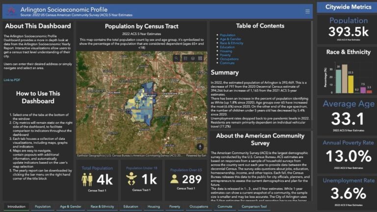
Socioeconomic Dashboard—The view allows anyone to learn more about the people living in individual census tracts based on the most recent census data, including age, gender, race, education, housing occupancy, poverty levels, and commute times to get to work.
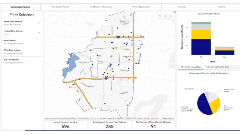
Development Dashboard—Using an interactive map of Arlington, a person can pinpoint information about all commercial permits, residential permits, certificates of occupancy, permit applications, land-use information, and zoning based on the location of the project.
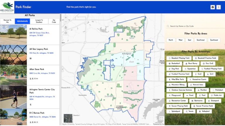
Park Finder—Looking for pickleball? A splash pad? Dog park? The city’s Park Finder includes a way for residents and visitors to look up Arlington’s parks by location on a map (including proximity to the person doing the searching). Results show up as an alphabetical list or can be listed by park amenities, including the aforementioned features as well as boat ramps, hiking trails, sports fields, ponds, playgrounds, and more.
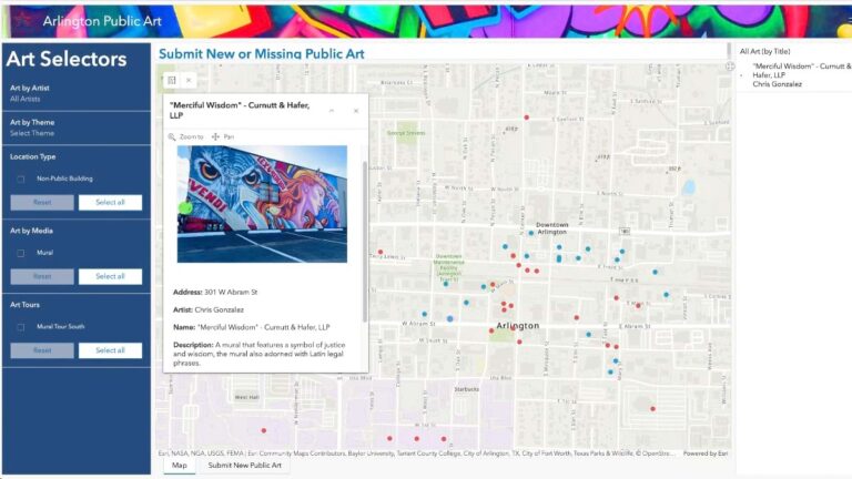
Public Art—Driving around a city can lead to moments of serendipity in noticing a work of public art. In Arlington, a resident or visitor can search an interactive map for all the city’s public art, finding a picture of the piece, the address, artist, and a description. People can also submit information about a piece of public art through an online GIS survey.
While many of the city’s dashboards have been created and are maintained by individual city departments, the effort to better tell the city’s story has been cross-departmental and enterprise-wide. The new Clean Arlington indicators, for example, come from code enforcement staff, the parks and recreation team, the asset management group, public works, and Warren’s communications team.
Each city department has interior landing pages where more detailed indicators can be found on a dashboard.
“If you’re a resident, and all you care about is the library, you’ll see scorecard measures that are important to you,” Warren said of the public’s ability to tailor what information they see.
Tying the City Council’s priorities to innovative storytelling helps keep the public engaged. Warren has seen a noticeable difference in the questions staff members get at public meetings, too.
“We do town hall meetings during the budget process and, routinely, the questions that we get from our residents are much more informed as a result,” Warren said. “They have that background going into it.”
In 2020, Arlington’s voters approved a quarter-cent sales tax to fund an economic development corporation to attract jobs and companies to the city. Telling the city’s story is a key component of that recruitment effort. Whether it’s improving road conditions, learning how the city is supporting its families and neighborhoods, or encouraging new businesses to open, “those are all core things that our residents truly care about, day in and day out,” Warren said.
Learn more about the many community-focused GIS solutions that local governments deploy. Many of these solutions start with a template, such as the Performance Management solution that Arlington picked. Review more state and local government solutions that jumpstart this work.

