GIS Helps Us Make Sense of Our Planet, which is One Large, Complex Intelligent Nervous System
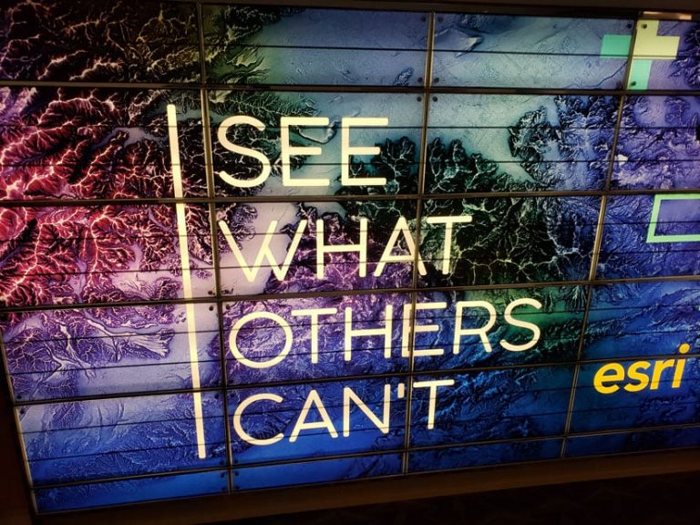
The phrase “See what others can’t”—which appeared on signs, T-shirts, and water bottles at the 2019 Esri User Conference (Esri UC)—is more than a catchy slogan. It describes the power of GIS analysis and visualization, enabling the technology’s users to make sense of complex information.
“You are opening up eyes to what others can’t see,” said Esri president Jack Dangermond at the Plenary Session of the 39th annual Esri UC. The conference was held July 8–12 in San Diego, California.
The intention of hosting the Esri UC each year is not only to demonstrate ArcGIS technology but, more importantly, to share GIS work so that everyone can learn from each other, Dangermond said. “At this meeting, we intend to accomplish some major things—inspire you to do your work even better,” he said. “People [here] come from every walk of life—different cultures [and] different experiences—and the richness we can give each other is about contributing your real experience and your thoughts and your visions for making the world a better place.”
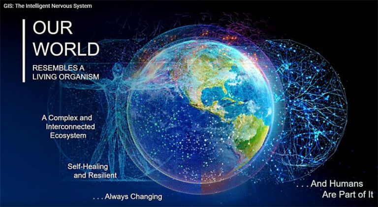
Dangermond explained that the theme of this year’s conference, GIS—The Intelligent Nervous System, was a metaphor built around the human nervous system. “It’s essential, as all of you know, to our life. One might say it’s our most important organ,” he said. “And it’s an organ that [handles] more than stimulus response. It’s intelligent. It integrates data from many sources. Sound familiar? It couples that data with logic and reasoning, ethics, values, and—in some cases—emotions. And then it carries out coordinated responses.”
Dangermond said that our planet resembles a living organism and that it faces great challenges such as overpopulation, biodiversity loss, and unconstrained development. GIS can act as an intelligent nervous system to help address issues like these, creating more understanding and prompting collaborative action.
“Geography, our science, provides all the rich content—biologic content, geologic content, and sociological content—as well as a common reference system,” Dangermond said. “It helps us see complexity, relationships and patterns. That’s why people love maps, and this science brings it all together. It helps us understand and it helps us intelligently respond.”
“GIS is like an intelligent nervous system. “We sense through geographic measurements,” he said. “We see through visualization and mapping; we model relationships and patterns and make projections and interpret things; and then [we] plan, design, take it to action, and make better decisions. This is the foundation of your work.”
Throughout the Plenary Session, Dangermond pointed to various types of work done by organizations that use Esri ArcGIS technology. Examples included the analysis and visualization of ocean health, biodiversity, urban development, indoor space, deforestation, and noise pollution.
“The geospatial revolution is just beginning, and this geospatial nervous system that is going to emerge is going to profoundly transform our world,” he said. “Like our nervous system, it will be intelligently respondent. ”
Government agencies, private companies, schools, utilities, and nonprofit organizations use GIS to better see and understand their data, collaborate, and make more informed decisions. Representatives from several of these types of organizations made Plenary Session presentations, demonstrating how GIS gives them and their communities information they couldn’t see before and how the technology helps them manage operations and reach decisions.
Here are a few of their stories.
Bringing the Intelligent Nervous System to Life in Pasadena
The City of Pasadena, California, uses GIS for everything from viewing land parcel data to managing major events such as the Rose Parade.
Pasadena Fire Department, for example, uses Operations Dashboard for ArcGIS to track calls for emergency medical, fire, and other services in real time within the city. Captain-paramedic Oscar A. Sepulveda III can easily use apps like Operations Dashboard even though he’s not a GIS professional. He says the information he derives from the technology is highly useful.
“Look, I’m a firefighter by trade. I’m not a GIS analyst. I can’t write code. I put the wet stuff on the red stuff,” Sepulveda said. “[With] Operations Dashboard, I’ve been able to incorporate real-time data feeds and present them in a way that is both viewable and intuitive on any platform.”
Sepulveda showed how fire officials can now view data about active calls , fire hydrants, and critical facilities such as schools and hospitals. “[This] means our company officers can now make strategic and tactical [decisions] based on actual—not historical—data,” he said.
The dashboard also includes calls that neighboring fire departments are handling in real time, plus some basic performance analytics for the Pasadena Fire Department, including call volume, total response time, and travel time. (See the ArcNews article, Real-time Dashboard Keeps Pasadena Rose Parade on Track.)

When diving deeper into analytics, Sepulveda uses Insights for ArcGIS. He said, “Insights has allowed me to bring that real-time data we just visualized within Operations Dashboard and analyze that dataset based upon the variables already available in the data.”
Sepulveda then produced a call volume concentration heat map that showed where the most calls were originating within each of the city’s eight fire management zones.
Sepulveda said that by using histograms within Insights for ArcGIS, the fire chief was able to view the call volume for each fire management zone based on call categories such as for fires, hazardous materials reports, medical emergencies, and technical rescues.
After filtering out a high volume of 12,000 emergency medical services [EMS] calls, for example, the chief could better see calls for other types of services such as a high number of technical rescues downtown. “That’s due to a large number of elevator rescues within high-rise buildings that are located within this district,” Sepulveda said.

The City of Pasadena ‘s Department of Planning and Community Development uses GIS to envision what the city could—or will—look like in the future.
“The Department of Planning and Community Development is the arbiter of our city’s unique sense of place,” said David Sanchez, the city’s principal planner. “Every day, our responsibility is to balance how the city grows and protect its historic character.”
Right now the department is updating eight specific plans for the city and is using ArcGIS Urban to collaborate, for example, on transit-oriented development, aligning future growth with the locations of the Los Angeles Metro stations in Pasadena.
Planner Ana Española showed how she and her colleagues are using ArcGIS Urban to plan what the South Fair Oaks area will look like in the future. While the past specific plan had focused on bringing in biotech companies, the new plan will emphasize walkability and livability.
During her demonstration, she used ArcGIS Urban to add to a map some wider sidewalks and a mix of land uses. “Our vision for South Fair Oaks introduces . . . residential opportunities, outdoor cafés, and maybe even a few breweries,” she said. “Urban provides us a conceptual analysis, which is not meant to dictate architectural styles. Because Urban allows us to visualize [zoning] code changes, we can see the character and quality of the urban form.”
View the presentation “City of Pasadena: Everyday Ingenuity” in its entirety.
Creating an Intelligent Nervous System for Conservation
NatureServe, a nonprofit group that provides species-related data, tools, and services for conservation purposes, uses GIS to better see and understand where to find at-risk species in the United States, Canada, and Latin America.
The company has just created the Map of Biodiversity Importance to help guide conservation efforts in the United States.
“Using Microsoft cloud computing and Esri’s modern [GIS] tools, we are able to generate, analyze, and share biodiversity data at a pace and scale never before possible,” said Healy Hamilton, NatureServe’s chief scientist. “Today we are unveiling the first high-resolution view [of] where our nation’s most imperiled species are found. We’ve produced detailed maps of the geographic distribution of over 2,000 species at risk—plants and animals [and] vertebrates and invertebrates, both aquatic and terrestrial. We’ve stacked these maps to see what we’ve never seen before—we can identify the places that matter for sustaining our nation’s biodiversity.”

Despite rapid development, Florida is one state that is rich in biodiversity, according to Hamilton. With NatureServe’s data models and new interactive mapping capabilities, answers can be found to questions about at-risk species in the state.
“Which species [are] at risk? How many? Are they butterflies, crayfish, or salamanders? How imperiled are they?” Hamilton said. “This map provides conservation intelligence for better, smarter decisions.”
The data for the Map of Biodiversity Importance was collected over the last few decades by a network of 1,000 botanists and zoologists in NatureServe’s network. Regan Smyth, director of spatial analysis for NatureServe, explained that for areas on the map where little or no data has been collected, data science can fill in the gaps.
“With Esri technology and support from Microsoft’s AI for Earth program, we’ve built a spatial modeling infrastructure in the cloud that allows our scientists, from New York to Arizona, to work together to fill in these blank places on the map,” Smyth said. “We are doing it by building predictive information models for thousands of species.”
To learn more about the Map of Biodiversity Importance, watch the presentation “NatureServe: Biodiversity Conservation” and visit the Map of Biodiversity Importance web page.

Using an Intelligent Nervous System for Flood Monitoring
The city of Zwolle, the Netherlands, is prone to flooding—an issue that is only getting worse.
“We need to be resilient to climate change, and GIS is helping us do that,” said Marcel Broekhaar, an adviser for the city’s Smart Zwolle initiative.
The city wanted to involve residents of the Stadshagen neighborhood in flood monitoring, so Broekhaar and his team created an ArcGIS Hub initiative called SensHagen. They built and dispatched weather and air quality sensors and then held an informational meeting to show residents how the sensors work and where to access data on the hub.
“[Residents] appreciated that we involved them,” Broekhaar said. “They wanted to participate.”
Many people wanted to get involved, so local university students made more sensors. Residents learned how to use SensHagen Hub to make maps and analyze data. People downloaded a Survey123 for ArcGIS app to report standing water. A group of engineers even built sensors that report flooding directly to the hub—and now residents are constructing their own sensors that will do the same thing.
“What started as a project became an initiative—and is now a movement,” Broekhaar said.
To learn more, watch the presentation, “City of Zwolle: ArcGIS Hub Citizen Engagement.”

Getting a Census Ready—and Right
The 2020 Census in the United States is just months away from launching. And GIS is playing a role in this major undertaking.
“Our goal is to count everyone once, only once, and in the right place,” said Deirdre Dalpiaz Bishop, chief of the US Census Bureau’s geography division. This is why the bureau has incorporated GIS heavily.
To verify that every state, county, city, tract, block, and address is accounted for, the Census Bureau used imagery. And for following up with nonresponding households, census takers will use a native app, built with ArcGIS Runtime, on iPhones.
“Our route optimizer leverages data from industry leaders, combined with census-specific criteria such as work availability, and calculates [an] optimized case assignment,” said IT specialist Anika Adams-Reefer.
Additionally, all completed cases will automatically sync to the Census Bureau’s servers, saving time, money, and paper.
To help tribal, state, and local governments prioritize census outreach efforts, the bureau is using a configured web app—the Response Outreach Area Mapper, or ROAM. With this, local leaders can see areas with predicted high nonresponse rates and plan appropriate actions.
“We’re able to make quick, well-informed, and responsible data-driven decisions to help motivate people to respond,” said computer mapping specialist Suzanne McArdle.
Watch the presentation “The 2020 Census: Mobilizing Everyone.”
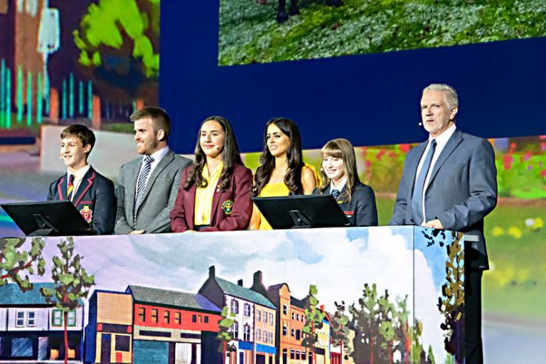
Using GIS to Build Friendships and Peace
For 30 years, Protestant unionists and Catholic nationalists clashed violently in Northern Ireland. Although a peace agreement was reached in 1998, a small town called Lurgan is still divided along religious lines.
But there is hope for a more peaceful future. This year, students from two Protestant schools and one Catholic school participated together in a citizen science project in Lurgan. The students visited 15 sites to “map how people felt at a variety of Protestant and Catholic areas in our town, both during the day and at 10:00 p.m. on a Saturday,” explained Catholic school student Aiesha Mouhsine.
At each site, students used Survey123 for ArcGIS to record how comfortable or uncomfortable they felt. Back in class, they visualized their data on a map.
“It was really quite exciting to see the patterns that started to emerge,” said Protestant school student Leon Van Der Westhuizen, who used Insights for ArcGIS to analyze the data.
The local police department and the town council are using the students’ findings for further research. But data collection and exploration were only part of the project.
“It’s about breaking down barriers and building friendships,” said Hannah Trew, a student from a Protestant school. “We recognize that . . . there’s more that unites us than divides us.”
Watch the students’ presentation.