Charts in pop-ups in ArcGIS Online provide a visual and meaningful way to display numeric attribute information. You can add pie, bar, column, and line charts.
Bar and column charts are best used to show data in discrete categories. Spaces between the elements separate the values.
You can use line charts to show change over time or a progression. A line chart implies an inherent order, progressing from left to right.
Pie charts are effective for showing the parts of a whole. All the attributes shown in the pie should add up to 100 percent.
In this tip, you will learn how to configure bar, column, line, and pie charts in layer pop-ups. The examples focus on change in worldwide population over time and the lot value and improvements value of property in Peoria, Illinois.
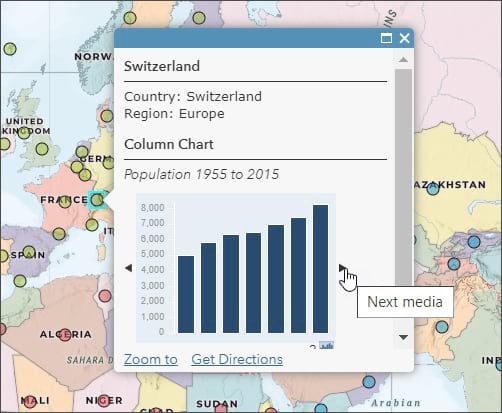
Open the completed map to view the configured pop-up charts. Click any feature to view the bar, column, and line charts. Click the arrow to advance to the next chart.
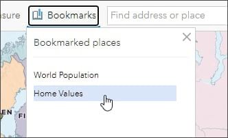
Use the bookmarks to navigate from World Population to Home Values.
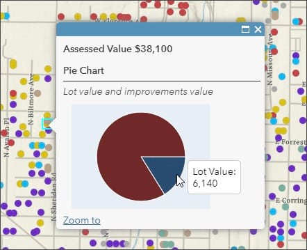
Click any feature to view the pie chart showing Lot value and improvements value.
You can configure these charts yourself by following the steps below.
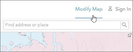
Open the sample map and click Modify Map, or sign in and save the map.
Adding Charts
You can add charts to your layer pop-up in two ways: by configuring the layer in your web map or (if you own the hosted feature layer) by configuring the layer using the Visualization tab on the item pages. In this example, you will configure the layers in a web map. See Pop-ups: The essentials for more information.
Step 1: Open the sample map, where you will add your charts. Click Modify Map or sign in and save the map so you can make changes.
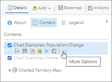
Step 2: Hover over the Population Change layer and open the layer options by clicking the ellipsis button (…)
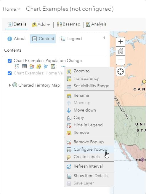
Step 3: Choose Configure Pop-up.
Step 4: Add a bar chart.
The pop-up has been partially configured, but it does not include charts.
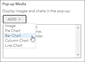
In the pop-up configuration panel, scroll down to the Pop-up Media section, click ADD, and choose Bar Chart.
Step 5: Configure the chart.
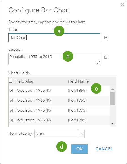
While each chart is different, the chart configuration panel is similar for each chart type.
a. Choose a title for the chart (optional).
b. Enter a caption for the chart (optional).
c. Choose the fields whose values will be used to populate the chart. To show the population change over time, check off all fields with population data.
d. When you finish, click OK and apply your layer configuration settings.
Step 6: Repeat the steps above for column and line charts. When you are done, click OK to save your changes and dismiss the pop-up configuration panel.
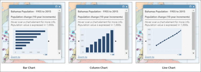
You should have three charts in the Population Change layer pop-up. Click any feature to view the pop-up and click the arrow to the right of the chart to view them all.
Next, go to the Home Values layer and add a pie chart.
Step 7: Use the bookmarks to navigate to Home Values.
Step 8: Hover over the Home Values layer and open the layer options (like you did in step 2).
Step 9: Choose Configure Pop-up from the options (like you did in step 3).
Step 10: In the pop-up configuration panel, scroll down to the Pop-up Media section, click ADD, and choose Pie Chart.

Step 11: Configure the chart.
While each chart is different, the chart configuration panel is similar for each chart type.
a. Choose a title for the chart (optional).
b. Enter a caption for the chart (optional).
c. Choose the fields whose values will be used to populate the chart. The values should add up to 100 percent. In this example, the Total Assessed Value is the sum of Lot Value and Improvements Value.
d. When finished, click OK and apply your layer configuration settings.

Click OK to apply all pop-up configuration changes, and click a Home Values feature to view the pop-up and pie chart. Your chart should look like the one shown below:

For more information, see the following:

