
By Bern Szukalski
ArcGIS Dashboards is a configurable web app available in ArcGIS Online that provides the ability to convey information using interactive charts, gauges, maps and other visual elements that work together on a single screen.
From a dynamic dashboard, you can view the activities and key performance indicators most vital to meeting your organization’s objectives.
For more information, see What Is a Dashboard.
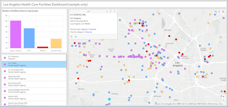
In this tip, you will use ArcGIS Dashboards to configure a simple dashboard. The example dashboard uses a map of medical facilities in Los Angeles County (sample data only) and includes interactive chart and list elements.
You can view the completed dashboard and follow along by using the Los Angeles Health Facilities web map.
A dashboard is composed of several elements that work together. Each element is unique and has its own configuration settings. For more information, see Dashboard Layout.
The dashboard will include four elements: a map element, a serial chart, a list, and header. The map will be configured to interact with the chart and list, and the list will be configured to interact with the map.
Follow the steps below to create the dashboard and configure its elements.
Create a Dashboard
A map is often the centerpiece of a dashboard. Best practices are important for the dashboard experience. Apply basic web map craft such as configuring effective pop-ups and using scale dependencies. For details, see Create Web Maps for Dashboards.
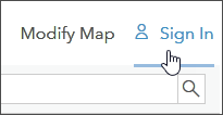
Step 1—Open the sample map and sign in to your account.
Step 2—Save the map, share it, and click CREATE A WEB APP.
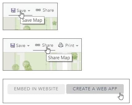
Step 3—Choose ArcGIS Dashboards.
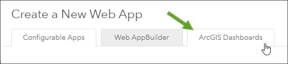
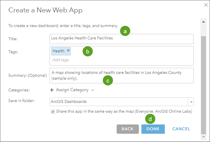
Click the ArcGIS Dashboards tab and enter the required information.
Add a title (a) tags (b); optionally, you can add a summary (c) as well. Click DONE (d) when finished to open the dashboard configuration panel.
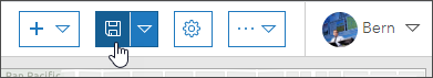
You have now created a dashboard with a map element. Save your work by clicking the Save button from time to time.
Next, you will configure the map, serial chart, list, and header elements.
Configure the Map Element
Maps play a central role in many dashboards. Not only are they often the most effective way to display your geographic information, but also their operational layers can be used by other data visualizations in the dashboard to create interesting, intuitive, and compelling information elements.
In this section you will
- Configure a map element that displays pop-ups.
- Add tools to view the legend, navigate to default extent and bookmarks, and zoom.
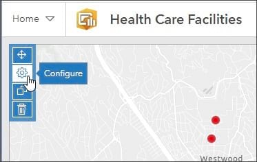
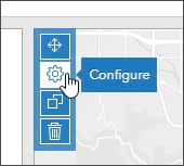
Step 1—Open the map element menu and click Configure.
Point to the upper left corner of the map to display the hidden menu. You can access all of an element’s settings through this menu. Next, click the Configure button.
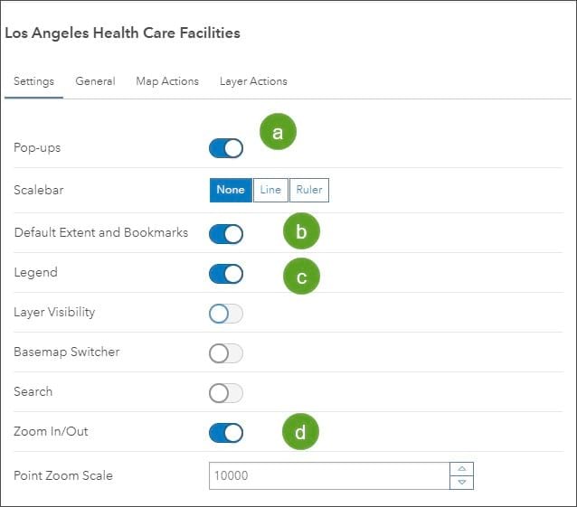
Step 2—On the Settings tab, choose which tools to display in the map.
In the settings shown below, pop-ups (a), default extent and bookmarks (b), legend (c), and zoom tools (d) are enabled. Click Done when finished.
Add a Serial Chart Element
A serial chart visualizes one or more series of data points along a horizontal (x) axis and a vertical (y) axis.
Next, you will
- Add a serial chart element that displays a chart of facility types.
- Change the chart colors to match the map symbols.
- Use a map action to sync the chart to the map extent.
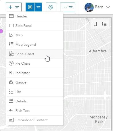
Step 1—Open the element drop-down list and choose Serial Chart.
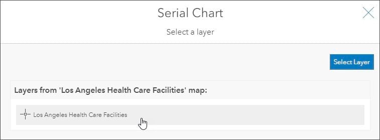
Step 2—Choose the layer that the serial chart will use for the data.
There is only one layer in the map. Click Los Angeles Health Care Facilities.
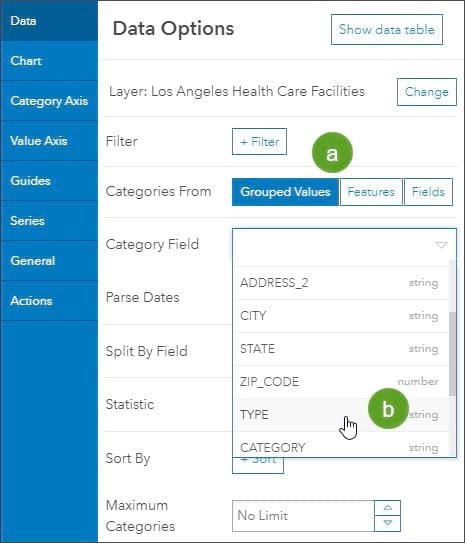
Step 3—You will see a series of tabs along the left side of Data Options. Click the Data tab and set the data options.
a.—Set the Categories From to Grouped Values.
b.—Choose TYPE from the Category Field drop-down list.
This will group all values of the Type attribute in the serial chart segments. Type is also the field by which the health care facilities are symbolized.
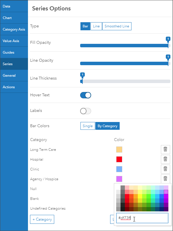
Step 4—Click the Series tab to set the series options.
Set the bar colors to match the symbols in the web map layer.
You will see the legend for Los Angeles Health Care Facilities below.
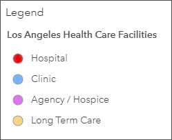
Change the color for each series column to match the color of the layer symbols. You can use the color picker or enter the following hex color code for each color:
- Hospital: #ff0000
- Clinic: #73b2ff
- Agency/Hospice: #df73ff
- Long Term Care: #ffd37f
Step 5—Click the General tab to set the general options.
a—Add the following title: Number of facilities shown in map by type.
b—Turn off Last Update Text. The data in the map is not dynamic, so the update text option is not needed.
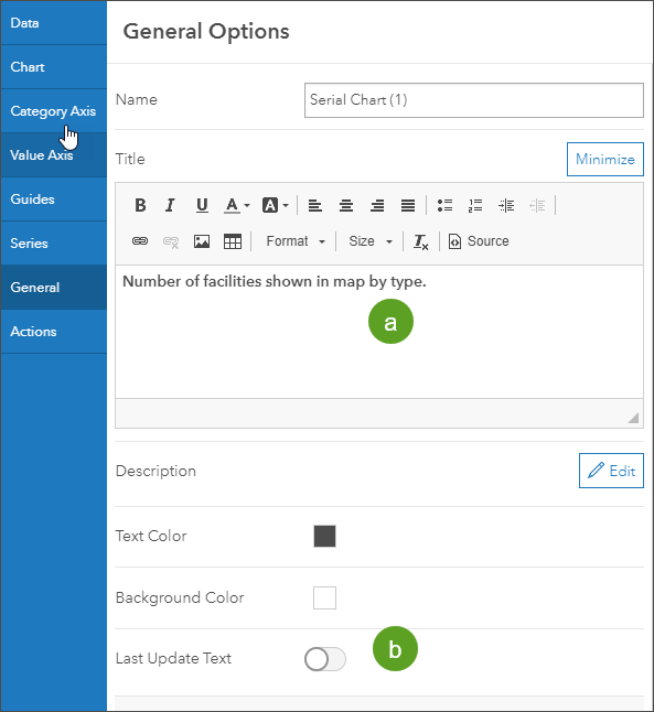
Click Done when finished.
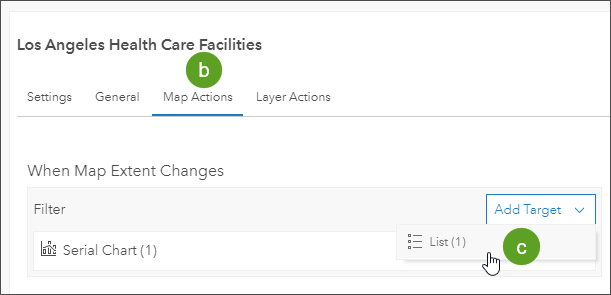
Step 6—Configure the map to trigger a chart update whenever the map extent changes.
a—Open the map configuration options by hovering in the upper left corner of the map element and choosing Configure.
b—Open the Map Actions tab.
c—Click Add Target and choose the serial chart added above.
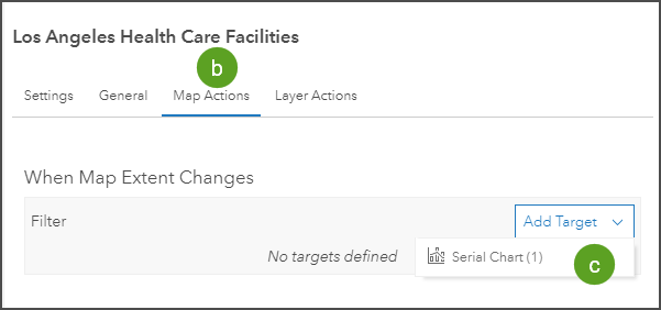
Click Done when you finish, then save your work. Pan and zoom in and out on the map to see the series chart update. Point to the chart to view the count of facility types.
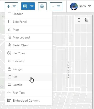
Add a List Element
A list is used to show features or rows from a layer and can contain information from any field.
You will now do the following:
- Add a list element that displays details about the facilities shown in the map.
- Use a map action to change the list based on the facilities in the current map extent.
- Use a list action to highlight the selected facility on the map.
Step 1—Open the element drop-down list and choose List.
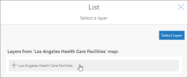
Step 2—Choose the layer that the list will use for data.
There is only one layer in the map. Click Los Angeles Health Care Facilities.
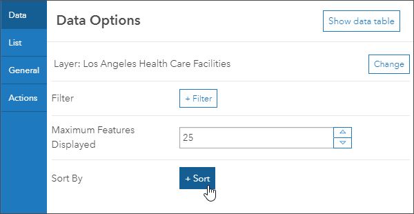
Step 3—On the Data Options tab, click Sort.
The list will be displayed using the sort by field order.
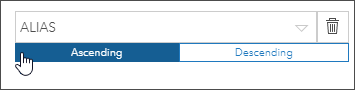
Step 4—Select ALIAS from the drop-down list and choose Ascending as the sort order.
This will use the alphabetical ordering from the ALIAS field to sort the displayed list.
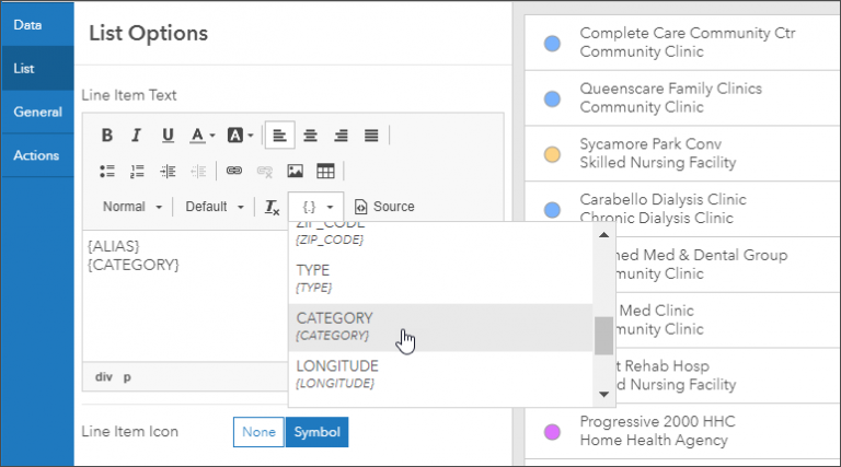
Step 5—Click the List tab to configure the line item text.
Click the drop-down with the { } and choose ALIAS and CATEGORY. Add a return after ALIAS so that they are stacked.
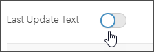
Step 6—Click the General tab and turn off Last Update Text.
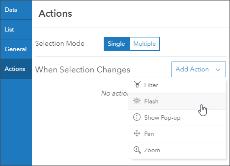
Step 7—Click the Actions tab and choose Flash from the drop-down list.
Step 8—Select the map as the target for the flash action, which highlights the feature on the map.
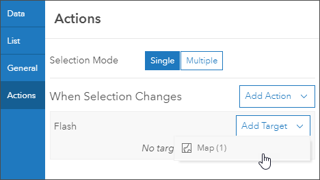
The map feature will flash when selected from the list. Click Done.
Step 9—Configure the map to update the list whenever the map extent changes.
a. Open the map configuration options by pointing to the upper left corner of the map element and choosing Configure.

b—Click the Map Actions tab.
c—Click Add Target and choose the list added above. Click Done.
As you pan or zoom in and out on the map, the list will update. When you select a facility from the list, the feature will be highlighted on the map.
Arrange the Dashboard Elements
Your dashboard likely shows the list, series, and map elements arranged from left to right.
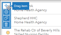
To arrange the elements in a different way, point to the upper left corner, then click and hold the Drag item button.
Drag one element over another to reveal the docking targets, then place the cursor over the target in the desired location and release it to place it.
Grab the vertical and horizontal bars to finish arranging the dashboard element.
Add a Header Element
Now that all the elements have been arranged to your satisfaction, add a title using the header element.
A header is a reserved area along the top of your dashboard that you can use to give your dashboard a title, apply corporate branding standards, and provide links to additional content.
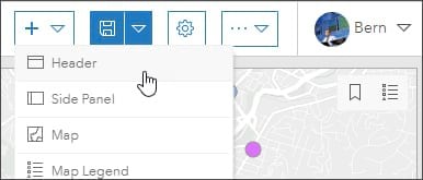
Step 1—Open the element drop-down list and choose Header.
Step 2—Change the title. Optionally, you can also make other changes.
By default, the title that appears on the header panel is the title of the dashboard. Enter a title for your dashboard and make any other changes you like, such as changing the text color or background color.
When finished, click Done and save your dashboard.
Follow Best Practices
The dashboard created for this tip is suitable for general use cases. But if you expect your dashboard will receive high traffic, it’s important to follow additional best practices to ensure it scales well when in high demand.
See Building Highly Scalable Dashboards to learn more.
For more information, see the following: