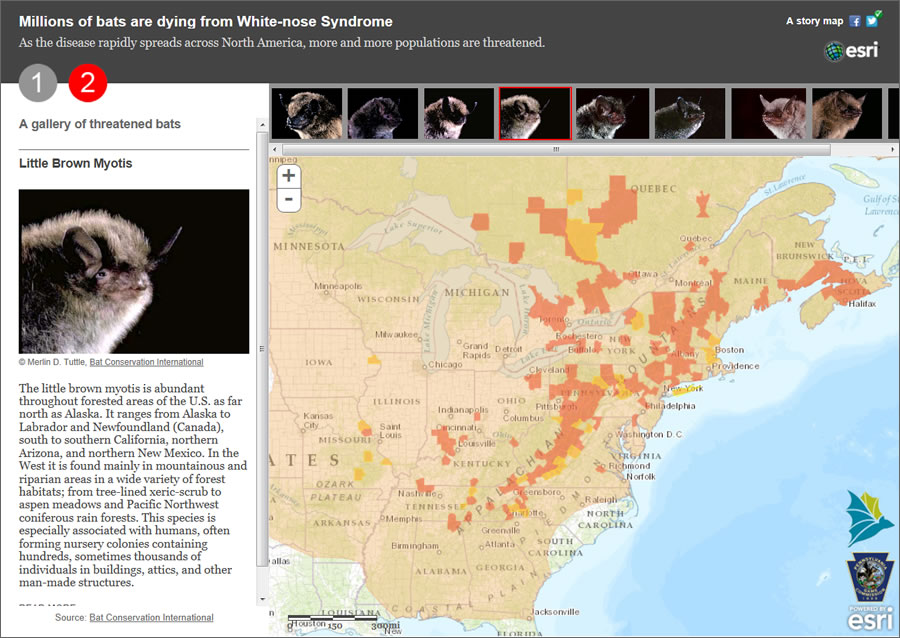
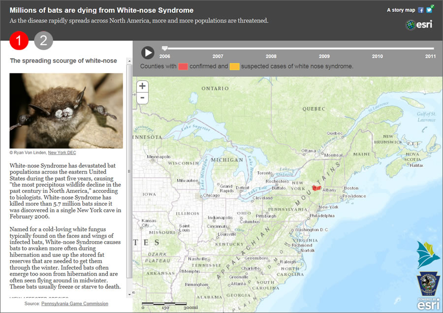
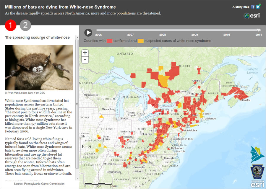
More than 5.7 million bats dead: that’s the toll from white-nose syndrome (WNS), a fungus that’s rapidly killing bats in the United States and Canada. This Esri story mapillustrates the problem, showing how, over a five-year period, the disease has spread from one county in New York south into Alabama, west into Oklahoma, and north into the Canadian province of Quebec.
Since Esri’s release of story map templates, organizations and individuals from all over the world have been rapidly creating story maps online to showcase topics of interest: natural disasters, climate change, elections, unemployment, city attractions and historic sites, health care information, and much more.
The story map showing the spread of white-nose syndrome in bats throughout North America was born out of a concern for the vulnerable mammals, which are important to the ecosystem. Bats feed voraciously on insects that might otherwise destroy crops, and according to Bat Conservation International (BCI), bats help pollinate plants and spread seeds. This story map raises awareness about a little known disease that’s threatening an often misunderstood but vital member of the animal kingdom.

Why a Story Map?
Like pictures, all maps tell a story. Many people think visually, which is why using story maps is such a powerful way to present problems and, oftentimes, solutions. Maps also deliver complex information so it’s readily understood and capture the tradecraft and knowledge of others in a form that’s easy to share.
Over the last 20 years at Esri, maps and the technology behind them have evolved in amazing ways. Maps are now interactive and can be data driven, dynamic, and enriched with multimedia content—a far cry from the paper maps that many of us used growing up.
Headed by Allen Carroll, former chief cartographer at the National Geographic Society, the Esri story maps team is focused on improving web map capabilities and developing new tools and application templates to unlock spatial data to tell stories. A good story map is based on authoritative content, and that’s where using GIS and veracious data to tell interesting stories comes into play.
Creating the Story Map
Some of the data for the story map on white-nose syndrome came from static GIS maps produced by Cal Butchkoski of the Pennsylvania Game Commission. Those maps were compiled from a variety of sources to show the spread of WNS. Data from 2006 through 2011 was used in the map. BCI also publishes detailed species information and habitat ranges for bats on its website. This information was also used in the story map.
The Esri story maps team’s bat story map focuses on the problem of white-nose syndrome, using text; photographs; and a live, interactive map. The text describes white-nose syndrome, profiles each of the nine affected species of bats, and details their habitat and range.
A gallery shows photos of the impacted species. An accompanying live web map displays the US counties and Canadian provinces with reports of WNS as depicted in Butchkoski’s maps. The story map also depicts habitat ranges, combined with a GIS animation of the spread of WNS.
How did the story map come together? BCI provided the habitat ranges for the nine affected bat species—including the big brown bat and the grey myotis—in the form of shapefiles. The organization also gave permission to use information from its website and provided a license for use of Merlin Tuttle’s photographs of those bat species for the application, a key ingredient to the story map.
BCI also contacted Butchkoski, who provided Esri with the shapefiles he used to make his static maps. The data included the date of each suspected or confirmed case of WNS. All the data pieces were now in hand to produce the story map application.
After experimenting with animating the data using Esri’s ArcGIS for Desktop, the story map team realized that Butchkoski’s static maps showed more detail than was necessary for the story map application. Simpler is often better when communicating, especially for the general audience that would use the application. To simplify, his data was reduced to a two-color thematic map of suspected and confirmed cases, along with the date information used to drive the animation.
The next step was to publish the local data as web services for use in the final application. Data on the counties with reported cases of white-nose syndrome in bats was published using an instance of ArcGIS for Server in the Amazon cloud, and the bat habitat ranges were published using cloud-based ArcGIS Online hosted services. From there, it was a matter of deciding what basemap to use (the Esri World Topographic Map was the final choice) and testing different color schemes and transparencies.
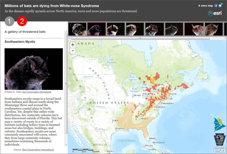
Coming up with the application design and layout was another step that needed to be tackled. An early and easy decision was to portray two themes in the app: the animation showing the spread of WNS over time and the habitat ranges for each species on top of the affected counties. Several templates were used in idea prototypes. The final application was a custom app created so that the two halves of the app would dovetail nicely, with the time slider in the first half being replaced by the species photos in the second half. The final app used ArcGIS Online basemaps and the hosted services from the Amazon and ArcGIS Online clouds.
The day the story map was released, Butchkoski sent word that two new counties needed to be added to the map, as cases had been confirmed there. A quick update on the back-end services kept the app up-to-date with the results for winter 2011/2012. The story map will be updated with data from winter 2012/2013 later this year.
The application was well received and remains among the most popular in the Esri Story Maps collection. It has also generated some controversy and proved to be a catalyst for debate. But that’s what good story maps are meant to do—present authoritative information in a compelling way to showcase an important topic and facilitate awareness and discussion.

