Awareness of GIS outside the geospatial community has grown—slowly, perhaps, but steadily. Access to spatial information has vastly increased because millions of us walk around with powerful computers—mobile phones in our pockets or laptops in our backpacks. Many of us have broadband Internet connectivity in our homes and offices.
We know that communicating the results of our work—simply and compellingly—has become a key part of our work. If we fail to communicate our results, to tell our stories, we fail as professionals. Our managers and stakeholders are continually trying to navigate a blizzard of information. Spreadsheets no longer convince. Plots of complex, multilayered GIS data are not effective for non-GIS audiences. Communication has become as essential to GIS work as more traditional activities such as data management and spatial analysis. We’re all now storytellers, whether we want to be or not.
As these changes have expanded our roles, additional capabilities in GIS have been developed that help tell our stories. This began when ArcGIS started incorporating enhanced cartographic tools that help GIS users produce maps that are more attractive and effective as information products. This trend has continued as web services enable GIS users—and, increasingly, everyone else—to create mashups from multiple sources and enliven maps with pop-ups and interactive functionality.

Most recently, web and native apps let people incorporate spatial data into a variety of user experiences. People can follow audio tours on their cell phones; they can ask their devices to inform them when they’re close to points or areas of interest; they follow spatial narratives; they can vote and Tweet on maps; and they can compare changes to an area by swiping between two maps.
Meanwhile, the proliferation of connected devices has (belatedly) helped spur the mass emancipation of data. For many years, spatial data largely resided inside the organizations that created it. In its slave state, the data served those host organizations reasonably well. By emancipating this data, it can serve vastly broader audiences and diverse purposes. Data can be manipulated by many more users and combined and integrated with other data to serve new, and sometimes unanticipated, uses.
But the key and sometimes unrecognized aspect of making specialized geospatial data accessible to new audiences is that it must be presented and interpreted in new ways. Cartography needs to be simplified. Technical terms need to be eliminated from legends. Text summaries need to be written in accessible language. User experiences need to be developed to facilitate easy navigation and use of the data.

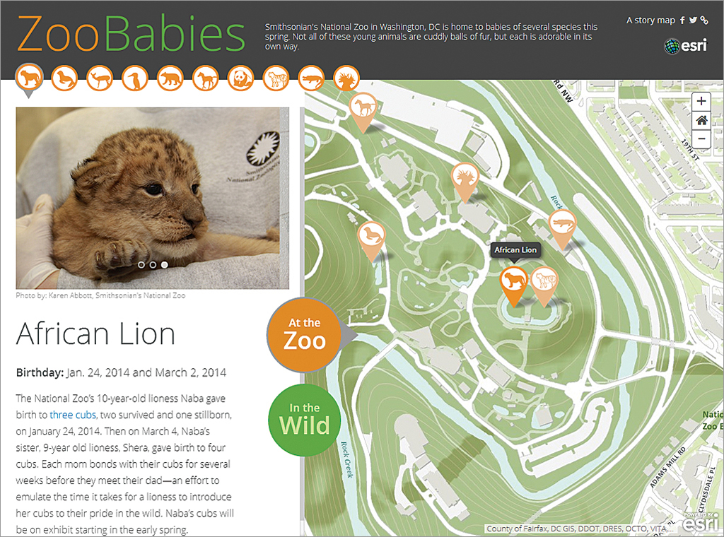
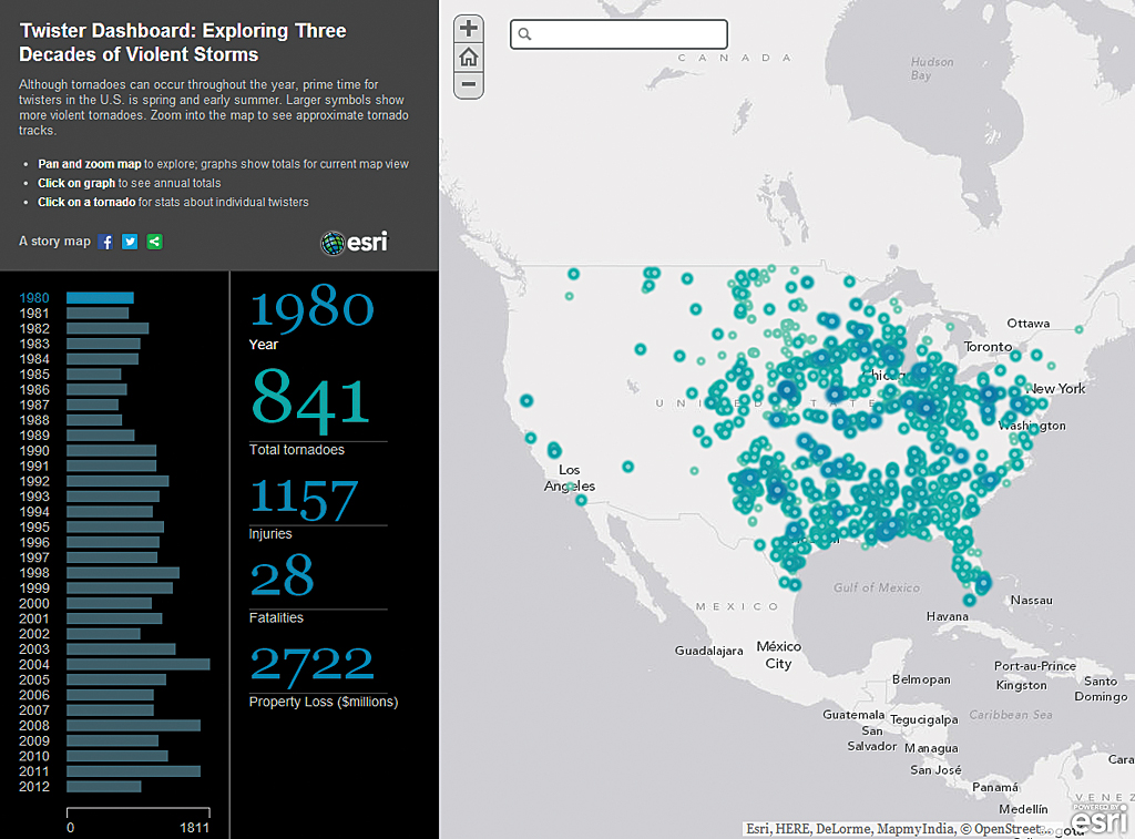
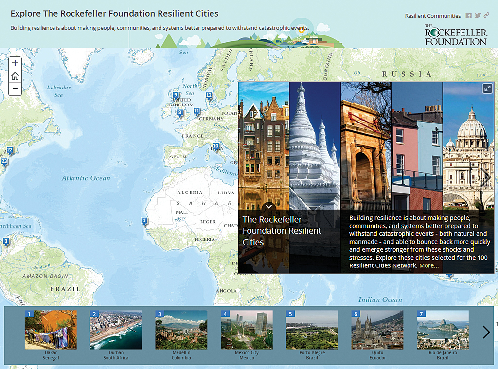
Esri Story Map apps and a variety of other apps by Esri and its partners have been developed for just this purpose. By stripping away unnecessary technical detail and presenting data in accessible, intuitive user experiences, these apps help GIS professionals present data to managers and colleagues within their organizations. These same apps can help organizations tell their stories to customers and constituents. These maps can describe an organization’s work, increase public understanding of trends and phenomena, and recruit audiences to help enrich data with their observations.
It’s tempting to think of storytelling platforms—web and mobile apps—as novelties or extras that don’t really do the core business of GIS. This is not the case. GIS cannot be fully effective if it doesn’t communicate, convince, educate, and inform.
As GIS professionals, we want to help make our companies more profitable or our agencies more effective. We want to make human society more healthy, affluent, and sustainable. We will not achieve these goals if we don’t communicate our insights. Storytelling is key to our success.


