Applying media queries to ArcGIS API for JavaScript applications
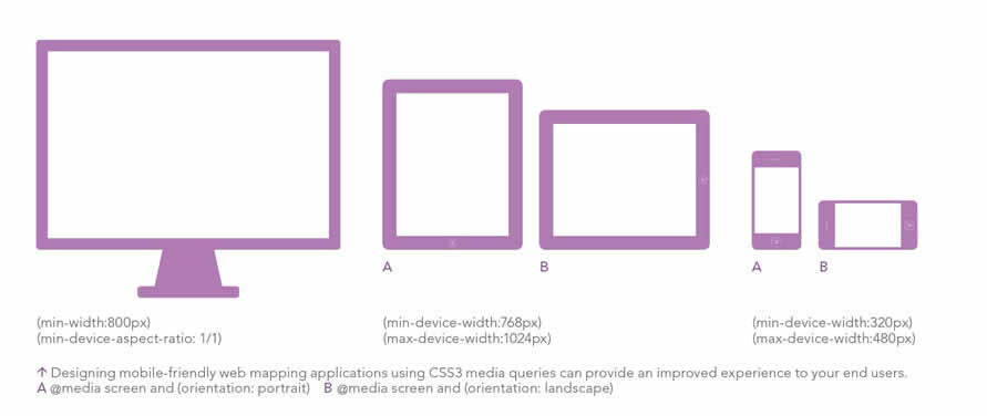
Smartphone and tablet usage is quickly usurping the desktop. Targeting the dizzying array of browsers, screen sizes, and devices in a market experiencing hardware fragmentation is one of the challenges that developers encounter. Although responsive web design does not offer a panacea for all scenarios, designing your web mapping applications to be mobile-friendly using CSS3 media queries can provide an improved experience to your end users.
This technique enables developers to selectively style pages based on properties such as width or height, resolution, or orientation to better suit the browser rendering on the page. You can now style a page differently for the small screen of a smartphone, the slightly larger screen of a tablet, and a desktop screen.

Using the Legend Widget sample [ZIP] from the Help on the ArcGIS Resource Center as a starting point, I will show you how I modified an ArcGIS API for JavaScript application to support a smartphone (320 by 480 pixels) and a tablet (768 by 1024 pixels). Download the Responsive Web Design Sample Code from ArcGIS Resource Center so you can explore the sample application as you read along.

Device orientation and the ability to adjust the viewport zoom level make styling browser-based mobile applications significantly more complicated. Mobile browsers introduce two issues not encountered on desktop browsers: the user’s ability to alter the screen orientation between portrait and landscape mode and the fact that the viewport does not display all sites at their native resolution.
Handling Device Resolution and Rotation
A media query can expand on the media type syntax, providing additional options to further enhance web pages to accommodate different display devices. For instance, a media query can be appended to a media type declaration screen by adding the media query in parentheses as shown in this following example:
This media query targets devices that have a minimum device width of 768 pixels and a maximum device width of 1024 pixels. Media query can also be used to adjust styling based on device orientation. To take advantage of this type of media query, use the orientation parameter. To apply styles to devices in landscape mode, use the following media query:
Styling can also be adjusted based on the device’s resolution. To target iPhone 4 and other devices with higher-density screens while ignoring lower-density screens on older devices, use the webkit-device-pixel-ratio.
Note that the vendor prefix is required. This code snippet uses the webkit vendor prefix. To target the Motorola Droid, which has a pixel density of 1.5, you would write the following:
The viewport controls how much mobile browsers zoom in to a web page. I modified the sample’s viewport tag to include a width attribute:
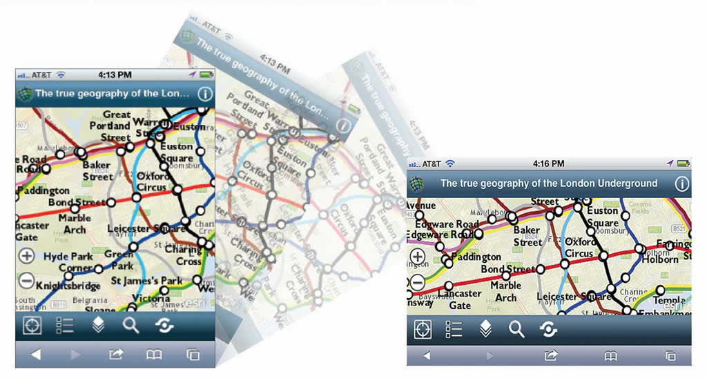
Instead of hard coding the width attribute to a specific resolution (such as 320 pixels), use device-width to ensure there is a one-to-one relationship between the target device and the screen resolution. The width attribute and media queries let you tweak the layout of the application’s user interface (UI) components as the device is rotated. For instance, on a device in portrait mode, the legend is not visible. However, when rotated to landscape mode, the toolbar disappears and the legend becomes visible.

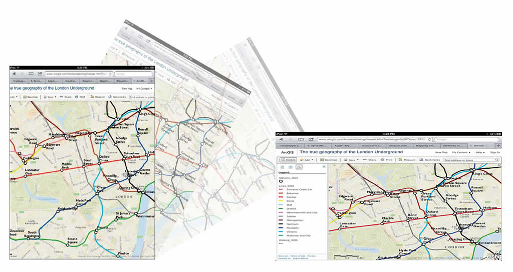
On larger devices such as the iPad, Apple’s iOS Human Interface Guidelines (HIG) recommend using a Split View Controller. In portrait mode, per the HIG specification, a toolbar button is provided for displaying the left pane as a popover. In landscape orientation, the smaller pane on the left side of the SplitView contains the legend, and the larger pane on the right displays the map.
Handling Variations in Screen Real Estate
Maps occupy a large amount of screen real estate, leaving little room for additional UI components. For this reason, the mobile version of the application does not include a zoom slider because users can use the pinch gesture to zoom in and out. However, the slider is included in the desktop version.
The CSS3 Working Group has proposed an extension to media query support in CSS3. JavaScript developers can evaluate media queries at run time and listen for updates in certain media query conditions. For example, the matchMedia method can be used to check for a certain device aspect ratio or width.
The returned object contains two properties: matches (a Boolean value indicating if the media query parameter matches the current state) and media (a serialized form of the associated media request). If the browser is 800 pixels or greater, this code adds the slider control. Otherwise, the slider is removed.
The call to matchMedia also checks for min-device-aspect-ratio: 1/1 to detect whether the application is being viewed on a tablet in landscape mode or on a desktop. Because a 1024 pixel width is common resolution on desktops, excluding the min-device-aspect-ratio causes desktop style sheets to be applied to a tablet in landscape orientation.

