Organizations worldwide are working to eliminate inequities, and mapping is a big part of that work.
This article describes some mapping techniques that show how to work with health or economic data and address the differences by characteristics, such as occupation, age group, or race/ethnicity, without making a separate map for each group. Instead, you can present breakdowns of this data in a single map.
This minimizes work for you. It also helps your audience more easily digest the information by preventing users from being overwhelmed by multiple maps. Here are a few techniques for incorporating and presenting breakdowns by different groups:
- Configuring the pop-up to show breakdowns
- Using different mapping styles
- Labeling the map to indicate breakdowns
These techniques result in fewer but more informative maps that can help identify opportunities to address inequalities.
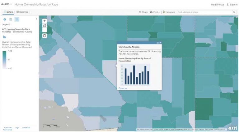
Presenting Breakdowns in Pop-Ups
Configure the pop-up to show a custom attribute display by adding media and using ArcGIS Arcade expressions. The sky is the limit for crafting a pop-up that conveys breakdowns by an aspect of the overall attributes being mapped such as race/ethnicity. Pop-ups can use a simple chart or list to do this.
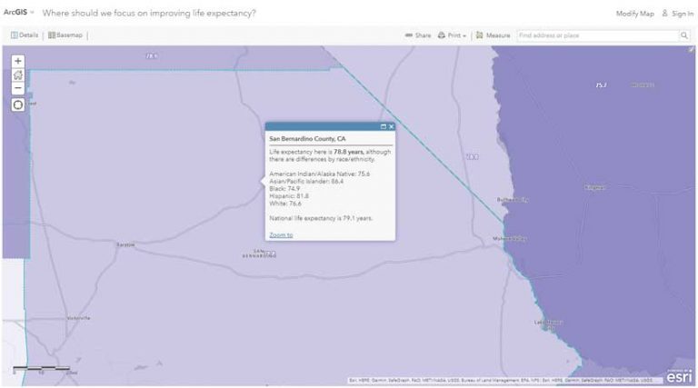
Display a simple chart. Map the overall attribute of interest, such as homeownership, and then present different categories of that attribute in the pop-up, using a column chart. A column chart is just one type of chart you might want to use. The ArcGIS Blog post “Pop-ups: adding charts” provides an overview of the different chart options available.
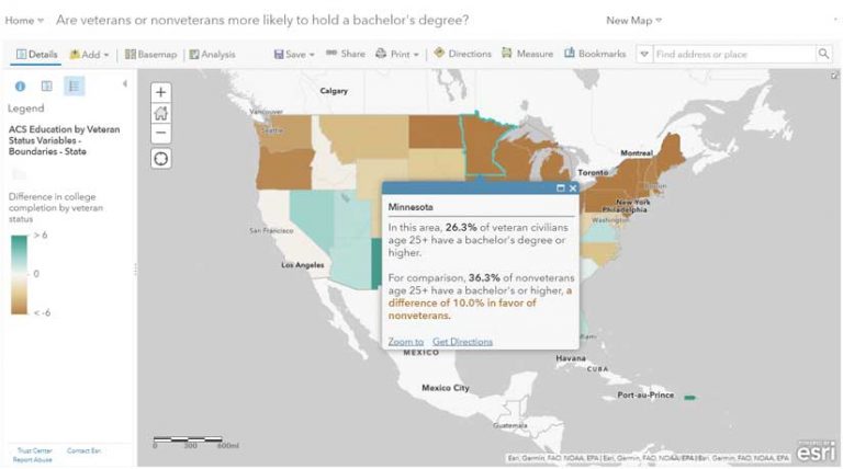

Mapping Styles to Display Differences
Mapping the differences with the Above-and-Below theme, predominance mapping, and dot density mapping are all styles that can be effective for breaking down data.
Map the difference itself with above-and-below mapping. This works well when there are only two groups of interest such as men and women or owners and renters or veterans and nonveterans. One approach is to calculate x–y, and then use the Above-and-Below theme centered at zero. This helps illuminate the magnitude of the difference between the two groups. In the lighter areas, the difference isn’t so great, but in the darker areas, it is. To achieve this, open the Change Style panel and select the attribute for the difference itself, then choose the Above-and-Below theme.
Another approach is to map the difference as a percentage. When mapping differences, make sure you are comparing “apples to apples” as much as possible. For example, when mapping women’s earnings as a percentage of men’s earnings, take into account the fact that women are more likely than men to work part-time, so limit the data considered to reflect only full-time workers to accurately portray the wage gap between these two groups.
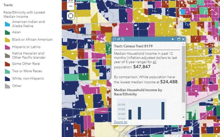
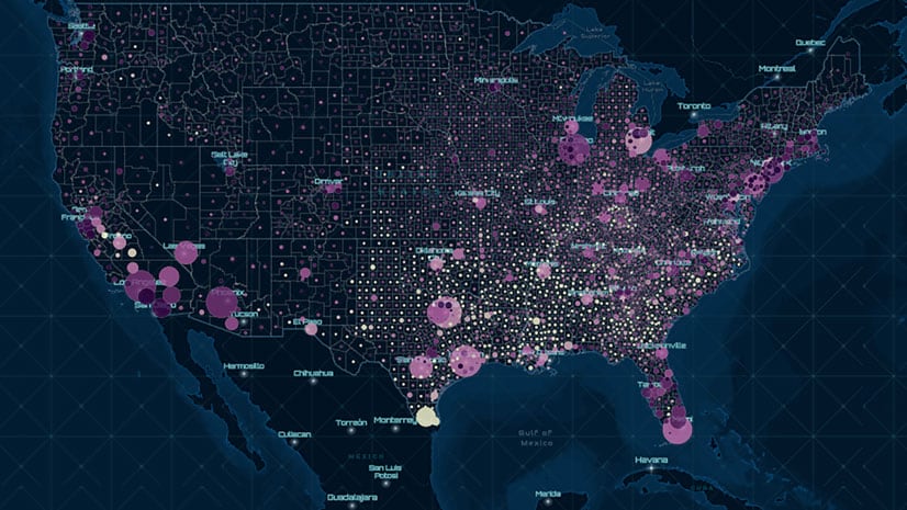
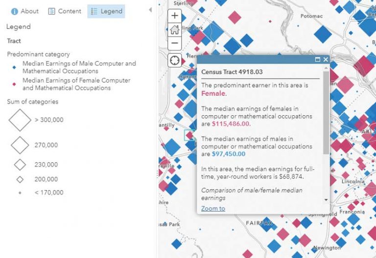
Map the most frequent group with predominance mapping. A predominance map considers multiple attributes in the data and displays the most common or highest value. Predominance mapping is a great choice when there are more than two groups, as in the case when mapping the race/ethnicity, educational attainment, or occupations of a population. This technique can also be used when there are only two categories.
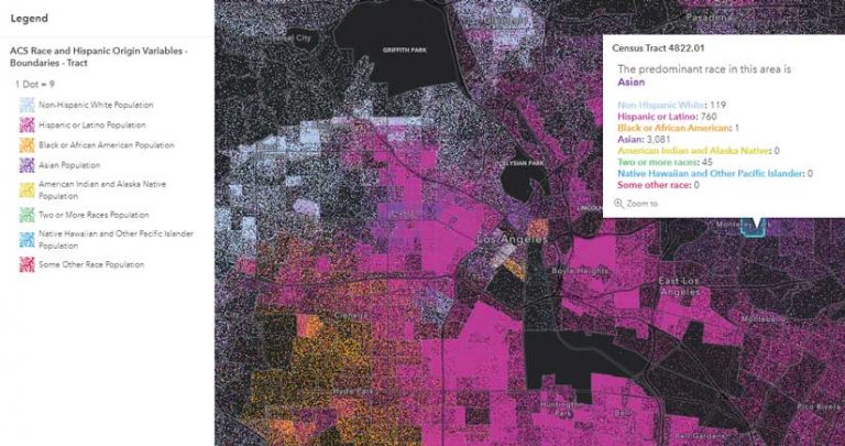
Show concentrated and mixed areas with dot density mapping. The new Map Viewer allows dot density mapping and takes predominance mapping even further by showing both concentrated and mixed areas through blending. Dot density works when you want to display multiple count or integer values inside a polygon. Areas that display a mix of two or more colors reflect a more mixed community.
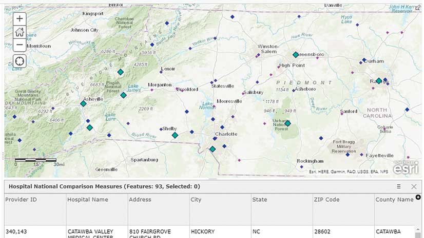
Use labels to present breakdowns. Improvements in labeling in Map Viewer Beta can be used to highlight data breakdowns. Labels work well when the extent is zoomed in to an area. By setting labels to turn on when someone viewing the map zooms in to an area, you can convey breakdowns of the data.
These Maps Are Just the Start
Creating these types of maps is often only the first step in a much larger project for implementing and strengthening intervention programs. Differences will most likely be greater in some areas than in others, which will help in allocating scarce resources. Identifying where underrepresented groups have had better outcomes than other groups is also valuable information.
Maps that show breakdowns by race/ethnicity often provide information that is valuable in decision-support discussions—discussions that GIS analysts are well-positioned to contribute to.
All the maps in this article and others can be found at Esri Maps for Public Policy. Contribute to the conversation in the GIS for Equity & Social Justice space on GeoNet.
