The information and data conveyed in GIS maps and apps should be accessible to everyone. Implementing digital accessibility in GIS and mapping helps reduce barriers for people with disabilities and ensures the widespread availability of information. However, digital accessibility in GIS and mapping can pose several challenges due to the inherently visual nature of the data. By utilizing some practical guidance to enhance maps and apps, accessibility can be improved using any application across the ArcGIS system.
Basemap Selection
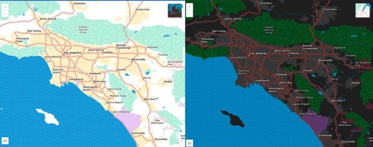
Choosing an appropriate basemap is important to showcase the data in the most accessible way possible. If the data featured uses lots of symbols and colors, consider exploring options for a more muted basemap such as the Light Gray Canvas or Human Geography Map. However, if detailed street data is needed for better context, consider the Enhanced Contrast Map and Enhanced Contrast Dark Map basemaps.
After choosing the basemap, consider if there are aspects of the basemap that need to be edited to ensure a clean, clear, and concise application. Using the Vector Style Editor to edit or remove certain characteristics can support an uncluttered basemap for the data.
Color Scheme Selection
Selecting, managing, and editing the colors that are used throughout the map or app is a significant part of ensuring accessibility. Choosing a good color scheme and deciding which colors should be used in symbology and labels is critical to contrast and a more accessible map.
When selecting a color scheme to represent continuous data, it is important to consider how the data is being displayed. The thematic set of colors chosen should have good contrast within the data’s variation, order, sequential values, or categories on the map. Better contrast between colors supports those with low vision or color vision deficiency (CVD) and can provide interest and depth to the data.
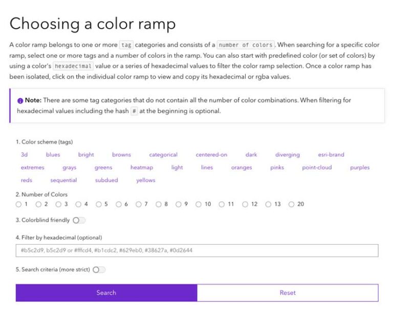
There are several options throughout the ArcGIS system for choosing color schemes. In ArcGIS Pro, the map can be changed to use either the RGB or CMYK color model and the default ColorBrewer Schemes provide an assortment of color-blind-safe color schemes. In ArcGIS Online and ArcGIS Enterprise, there are multiple color ramp options to choose from the drop-down menus and categories that show the best options for color-blind-friendly color ramps. Additionally, the ArcGIS Developers site has a tool, the Esri Color Ramps guide (links.esri.com/ColorRampGuide), that helps you create a color-blind-friendly color ramp using a variety of choices and filters.
Testing for Color Vision Deficiency
CVD affects about 300 million people worldwide, which includes approximately 8 percent of men. Testing color contrast supports a design process for creating any map, website, or application that is inclusive of individuals with CVD. Color contrast testing is essential in GIS and mapping due to the frequent use of multiple adjacent colors.

In ArcGIS Pro on the View tab in the Accessibility group, select the Color Vision Simulator drop-down list to utilize filters for testing your map. The options in the Color Vision Deficiency tool can show how the colors on the map would be viewed by someone with CVD. These filters can aid in determining how to adjust the color ramps to support better contrast. For additional information on using the Color Vision Deficiency simulator in ArcGIS Pro, see the documentation at links.esri.com/CVDsim.
If working in ArcGIS Online or another web application, a color filter app can be downloaded as a web browser extension. These browser extensions filter the view to show how colors might be interpreted by someone with CVD.
Colors in Symbology
When choosing a color scheme for discrete data in a map that may be represented in points or lines, the same color contrast and use of CVD filters applies. However, it is important to recognize the additional factor of not letting color be the only representation of the data. If a map is created with only color to differentiate between various data points, the understanding of the data could become challenging not only for those with CVD, but also for those with other neurodivergent disabilities. As a best practice, in addition to color, choose symbols, icons, patterns, and/or point sizes that can make it easy to distinguish data points.
Labels and Areas of Interest
Ensuring good contrast and clarity in labels on the maps can add to better understanding of the data and good accessibility for all audiences. To ensure readability of the labels, authors can edit the size, color, and font to enhance the understanding of the data. Labels can be edited in the basemap or as a new layer. Halos can be used on the labels to increase contrast between the underlying basemap or the data.
It may also be beneficial to emphasize an area of interest by adding further contrast and reducing visual clutter. This strategy can keep the map clear of distractions and emphasize the data that you want to highlight.
Alternative Text and Map Descriptions
Ensuring that all non-text content has a text alternative that serves the equivalent purpose of the visual is an accessibility best practice. Alternative text is meant to provide a programmatic description for the image or map that a screen reader can announce. A caption should provide the context for the image or map as it pertains to the placement of that image in the text.
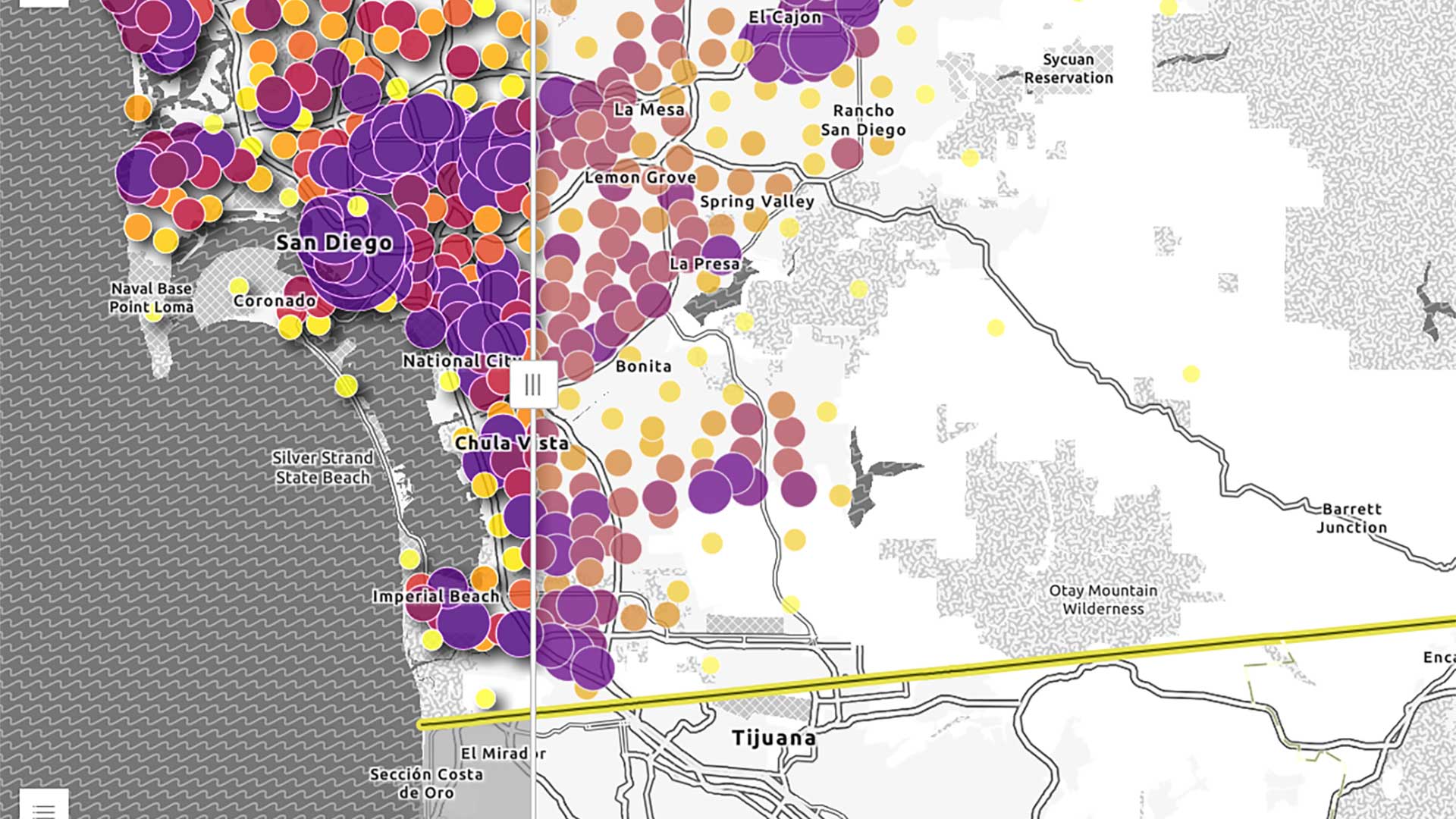
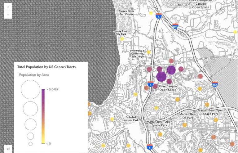
For example, the alternative text for a map of San Diego County, California, that illustrates the value of simplifying a map might be “Map of San Diego, California, showing population information and how it can be enhanced for improved contrast,” while the caption could be, “By using effects in a map, visual clutter can be reduced to support better visibility of the map.”
In GIS and mapping, the amount of information that needs to be represented can be significant and variable depending on the interactivity of the map. However, by providing some descriptive details in a narrative, the map author can help provide others with more comprehensive context about the map.
Provide Different Ways to Access Data
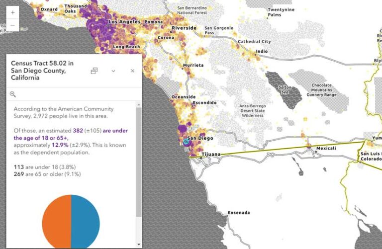
Offering data in different formats supports accessibility by allowing individuals to choose how to interact with the data. This strategy can be employed in a variety of ways across the ArcGIS system. Often data can be displayed as a table or exported to another format. While a data table might work for some data, long lists of data and values can be challenging to interpret. Formatting pop-ups to include the most essential information can boost understanding and clarity.
Conclusion
Accessible design in maps helps everyone better understand the data displayed and improves the experience for all. With a little planning and consideration of the design throughout the development cycle, map authors can take steps to ensure the accessibility of their content and data.
More Resources
Designing Web Maps for Accessibility (links.esri.com/AccesibilityDesign) is an ArcGIS Instant Apps portfolio that demonstrates accessibility in action. Explore these examples to learn where accessibility was prioritized and what product features best support inclusive access.
Read the following blog posts to learn more about accessibility features and strategies:
“Working with Enhanced Contrast basemaps to improve accessibility” (links.esri.com/ContrastBasemaps)
“Red…Green…What?” (links.esri.com/RedGreen)
“Accessible Labels with ArcGIS Web Apps” (links.esri.com/AccessibleLabels)
“Designing and testing for accessibility in GIS and mapping” (links.esri.com/AccessiblityTesting)
About the authors

Jessica McCall