Web accessibility techniques remove the barriers in web apps that can prevent people from fully experiencing content and supports the inclusion of individuals with disabilities.
Creating fully accessible web solutions can be a complex process because the way individuals interact with the web can vary greatly. However, the Web Content Accessibility Guidelines (WCAG) is a guide for improving accessibility on the web. WCAG is an internationally recognized coding standard that was developed to meet the varying needs of individuals, organizations, and government agencies when implementing web accessibility. Its success criterion provides standards for developers of web and mobile content when publishing web content or apps.
Building Accessibility into Web Maps
The accessible components in ArcGIS Maps SDK for JavaScript (JavaScript Maps SDK) and Calcite Design System demonstrate Esri’s commitment to accessibility. These components provide the building blocks to design an accessible UI. This article includes some ways accessible and inclusive apps can be built with JavaScript Maps SDK and Calcite.
Improve Color Contrast
Color contrast is key for individuals who have low vision, macular degeneration due to age, color vision deficiency (color blindness), or other vision-related impairments.
Being aware of the contrast of colors or specific combinations of colors is a key aspect when creating an accessible web app. WCAG Success Criterion 1.4.3: Contrast (Minimum) aims for a 4.5 to 1 ratio when visually presenting text and images.
Color contrast can be enhanced with Calcite’s web components to support WCAG Success Criterion 1.4.3: Contrast (Minimum), or level AA. [WCAG has three levels of conformance: A is minimum, AA is midrange and widely accessible, and AAA is the most optimal accessibility rating.] You can also add support for WCAG Success Criterion 1.4.6: Contrast (Enhanced), or level AAA, by updating the CSS variable of calcite-ui-danger. It provides a contrast ratio greater than 7 to 1, when the background color is white or #FFF.
Using High-Contrast Mode
High-contrast modes increase the contrast of elements, making it easier to read text and distinguish individual elements. When these modes are enabled for an operating system (OS), colors are forced, visual elements are simplified, and browser-specific values are selected from a set of system colors that ensures consistent contrast. High-contrast mode supports individuals who have low vision or who are unable to distinguish shapes or details in objects.
Add Contrast to Maps
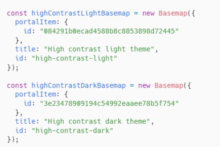
There are several ways you can improve the contrast of maps to showcase solutions to a wider audience while supporting the success criterion. One method is to toggle between high-contrast basemaps. Switch between high-contrast light and dark basemaps using the BasemapToggle widget. To do this, add high-contrast basemaps as objects, as shown in Listing 1. Next, set the map’s basemap property to the light basemap, as shown in Listing 2.

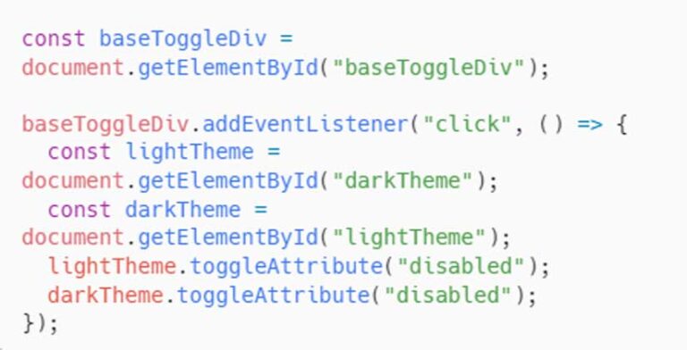
Then add the BasemapToggle widget with the nextBasemap set to the dark basemap, as shown in Listing 3.You can also toggle the JavaScript Maps SDK theme for additional contrast on the controls. For instance, when the high-contrast light basemap is active, the JavaScript Maps SDK theme is dark, as shown in Listing 4.

Customize Graphics by Basemap Theme
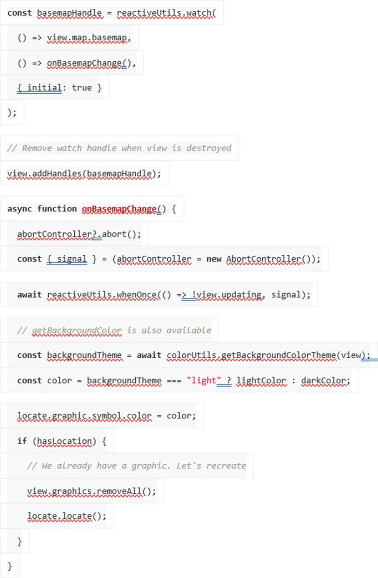
To style graphics added to the map with an appropriate color contrast ratio for the basemap, first obtain the basemap background color using getBasemapBackground and getBasemapColor and use that value.
Use reactiveUtils to watch when the basemap’s background theme color changes from light to dark, or vice versa. An AbortController signal can be used to communicate, or abort a request in the document object model (DOM) when the view is no longer updating. Once the view has finished updating, use getBackgroundColorTheme to update the graphic’s symbol color, based on the light or dark value. See Listing 5.
n access web maps.
Navigating through Content
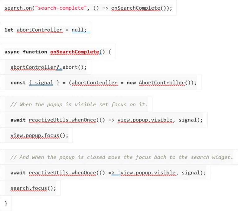
Focus attributes are important to accessibility because they help show people where they are on the screen and provide context for navigating through the screen as well as supporting better keyboard navigation. Setting focus attributes to underline, highlight, or place a shape around an active element ensures users can navigate sequentially through content when using a keyboard to meet WCAG Success Criterion 2.4.3: Focus Order. When using the open method for a pop-up, employ the shouldFocus option to shift focus to the pop-up when it is opened, as shown in Listing 6.
Search Widget Focus
Shift focus between the search widget and the search results pop-up with reactiveUtils. Upon closing the results pop-up, focus will shift back to the search widget so users can navigate sequentially while searching the map’s content.
When the pop-up is visible, set focus to the pop-up from the search widget using the search-complete event. First, create a promise with the reactiveUtils whenOnce() method and an AbortController signal when the pop-up is visible. Once visible, shift focus to the pop-up. A second promise waits for the pop-up to no longer be visible so that the focus will be set back to the search widget, as shown in Listing 6.
Animations
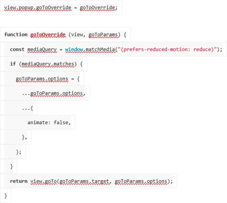
People who suffer from disorders of the vestibular system (which affects balance) or who have suffered traumatic brain injury can experience headaches, nausea, seizures, or other symptoms that are triggered by animations. Those users may consider choosing OS and browser settings to reduce animations and other interactive elements. WCAG Success Criterion 2.3.3: Animation from Interaction recommends allowing users to disable interactions unless animation is essential for conveying information.
Calcite minimizes animation when system animations are turned off or reduced. When animations are enabled, animations are executed in Calcite’s loader component.
With JavaScript Maps SDK, animation on the map can be reduced when animations are not shown or reduced with prefers-reduced-motion. When animations are enabled, some of the map’s functions—such as zooming to a feature—include basemap tile animations. When animations are turned off or reduced, a function can be added to reduce map animations. Add the goToOverride function to the pop-up’s goTo method, as shown in Listing 7.
Explore Further
This article summarizes Building Accessible Web Apps with ArcGIS Maps SDK for JavaScript and Calcite Design System, a session presented at the 2023 Esri Developer Summit in Palm Springs, California.
The code and full demonstrations are available on GitHub (https://github.com/kellyhutchins/DevSummit2023-A11y). Subscribe to the Accessibility Community (community.esri.com/t5/accessibility/ct-p/accessibility) on Esri Community.
Some Final Thoughts
Esri supports the successful implementation of accessible mapping apps. Accessibility should not be an afterthought. It is more efficient for developers and designers to include accessibility rather than reworking published apps. Accessibility should be a part of the development process throughout the app design and development workflow so that anyone can access web maps.


