Application Features Global Cities of 21st Century
For the first time ever, more than half the world’s population lives in cities. By the year 2050, that figure will rise to nearly 70 percent. What does this mean for individuals living in cities? And what does this mean for the government agencies, private businesses, and community institutions serving those populations?
A groundbreaking, immersive exhibit and ArcGIS software-based website was launched to directly compare cities on numerous subjects, such as demographics, land use, infrastructure, and transportation. The Urban Observatory exhibit and web application seeks to provide understanding through comparison and contrast to these and other complex questions facing modern life in the 21st century. Created by Richard Saul Wurman; Jon Kamen of @radical.media; and Jack Dangermond, president of Esri, it provides visual context that gives way to meaning.
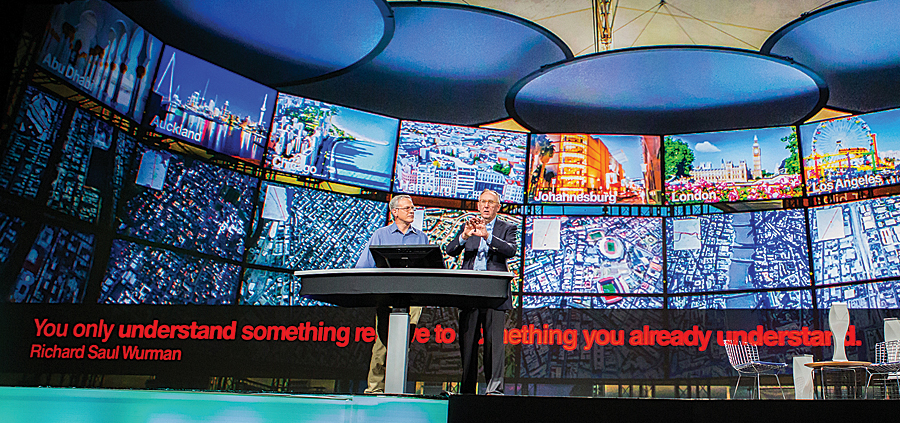
“A map is a pattern made understandable, and you must be able to compare patterns to identify and comprehend successes, failures, and opportunities cities have with each other,” says Wurman. “Urban Observatory demonstrates this new paradigm by creating comparative cartography. You only understand something relative to something you already understand.”
“The Urban Observatory tells the story of the global community through analysis of our largest, most unique cities,” says Dangermond. “Interactive maps and standardized information let you investigate every aspect of life. It establishes a common language for cities to share and learn.”
The Urban Observatory made its landmark debut at the 2013 Esri International User Conference (Esri UC). The physical exhibit and the cloud-based web application were unveiled July 8. Attendees and online visitors explored simultaneous views of major cities located around the world. Both the exhibit and application provided dynamic, flowing content organized around the themes of work, people, places, movement, and systems.
An Idea Decades in the Making
The vision for Urban Observatory has its roots extended to decades past—in 1971 when Wurman was the guest editor and designer of the no. 80 issue of the Walker Art Design Quarterly. The issue was titled “Making the City Observable.” In it, Wurman makes first mention of an Urban Observatory that compares cities in 100 different ways. It then became an exhibition that traveled to 15 different cities.
Fast-forward to 2010. Wurman gave a keynote speech at the Esri UC, where he proposed studying 19 cities that will reach 20 million inhabitants in the 21st century. That idea became the seed for Wurman’s 19.20.21 project, which seeks to grow to 100 cities and 100 layers of comparative information. That project laid the foundation for what is now the Urban Observatory.
From then to today, new challenges for modern life have risen, and continuing issues have only become more complex as populations swell and resources subside. Wurman collaborated with Dangermond, each possessed by the singular idea that maps and geography provide a unifying language of understanding.
They recognized that no two cities in the world—from Asia to Africa to the Americas—collect information in the same way. Questions are not asked the same way. Maps are drawn to different scales or use different symbology. There are no consistent, shareable plans illustrating streets, electric grids, water supply, buildings, and more. Population, health care, income, cost of living, or quality of life cannot be viewed in a comparative format.
In spite of tremendous effort and success capturing data and quantifying the results, limited knowledge and understanding exist from the private citizen to the businessperson to the government official.
The Urban Observatory tackles these issues head-on by addressing the need for a systematic method of data visualization and cohesion. It empowers the individual to examine, compare, and contrast the global cities of the 21st century and thereby creates understanding for people with the use of common maps and data that speak a unifying language. According to Wurman, an overarching theme of the Urban Observatory is MAP: Mankind’s Ability to Perceive. As he explains, “Understanding precedes action. That’s why we built the Urban Observatory. To provide greater understanding.”
The Exhibit and Application
After months of preparation and organization, Esri UC attendees were witness to the worldwide unveiling of the Urban Observatory exhibit, which featured large digital displays of maps, images, videos, and authoritative data for cities around the world. It stood in a half-circle of 16 pylons—each representing a city—in the center of the Esri Map Gallery, the annual popular Esri UC showcase for exciting maps created by the Esri GIS community. On each Urban Observatory display were HD screens continuously rotating authoritative city maps and recognizable images. Anyone could stand and easily compare and contrast complex systems using visualized map information.
Several cities contributed data. The creative and technical forces at @radical.media and Esri built the first iteration of the exhibit with state-of-the-art software, hardware, fiber optics, kiosks, and high-quality monitors.
As a new thematic map displayed on one city pylon, similar themes appeared for each of the featured cities. For instance, a map showing housing density or urban footprints appeared simultaneously for each of the participating cities. Many different types of map datasets enriched the exhibit and website, including imagery, weather information, and population data. In addition, aerial fly-through videos for each city were displayed on top monitors, while eye-level monitors below showcased specific maps—the combination created a unified experience that continually looped within the interior of the exhibit.
The Urban Observatory organizes maps into five major categories:
- Work
- Movement
- People
- Public
- Systems
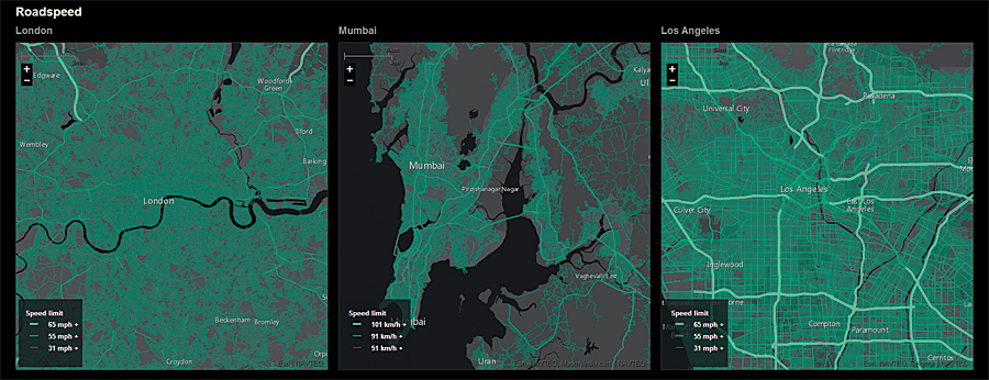
Each category includes a number of subcategories organized into “nouns or subject,” representing more specific map themes relating to one of the five categories. In addition to the nouns, more precise thematic subcategories organized by “verbs or magnitude” provide the capability to drill down into additional specific issues and city phenomena. For example, people may be interested in understanding more about the noun “movement” in a city. They can then drill down to view “verbs or magnitude” including road speed, traffic, or airport locations.
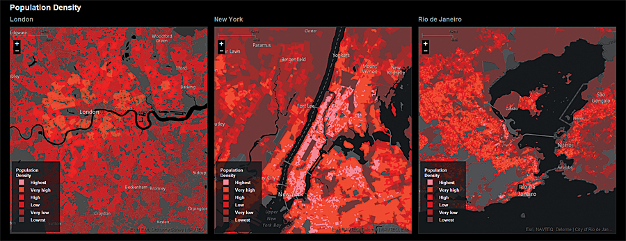
The ArcGIS Online web application allows people to directly interact with rich datasets for each city participating in the Urban Observatory experience. The application, available to the public, allows anyone to zoom in to one digital city map while two other city maps simultaneously zoom in parallel, revealing differences and commonalities in density and distribution. For instance, a person can simultaneously view new developments for Abu Dhabi, Tokyo, and Hamburg or simultaneously view open spaces for London, Mumbai, and Rio de Janeiro.
“Think of the Urban Observatory as a 21st-century live museum,” says Wurman. “It’s not static and stagnant. It’s dynamic and living through constantly updated information from the cloud.”
The Urban Observatory application and exhibit will continue to evolve. Future iterations will include more content and cities. The Urban Observatory will supply extensive benefits for government agencies and private businesses. For example, governments can view commercial, residential, and park land use for one city and compare it to another, making discoveries along the way that have implications ranging from attracting business to planning new communities. Businesses can also greatly benefit. By comparing and contrasting population data, infrastructure, and traffic, better decisions can be made about expanding assets and offices. Anyone with a free ArcGIS Online account can access the web application, which lets people explore mapped information by theme or city.
For more information about the Urban Observatory, visit www.urbanobservatory.org. To learn more about the 19.20.21 initiative, visit www.192021.org.
