The Relevance of Cartography, A Cartographer’s Perspective
Maps are magic. I am enchanted by maps.
It might sound strange for an academic, generally deemed more rational than quixotic, to be so mesmerized by maps. But think about it: Maps raise all kinds of interesting thoughts and questions.
This year, during International Map Year, global attention is being paid to the unique role maps play in our world. At such a moment, it is good to wonder what makes a map special—what is the magic of the map—because, somehow, maps enchant everyone.
Ask around if people like maps. I guarantee that a clear majority will say yes. But then I wonder, what do they like about maps?
Do maps signify beauty, when their colors match the wall or a historical map looks sophisticated? Or do they represent an escape, since they can give people a view into an unknown world, show locations visited, or offer dreams of new places to go? Maybe maps are just handy because they help us avoid getting lost? Or is it all about information, given that maps reveal spatiotemporal patterns and trends about both tangible and nontangible phenomena in the world?
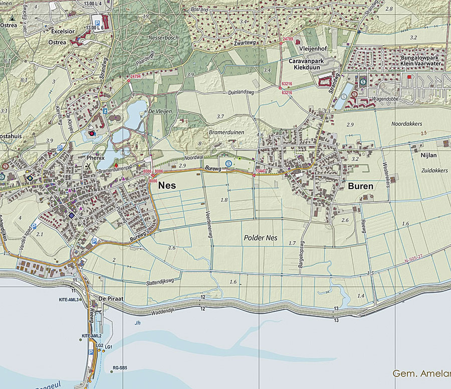
Some maps can play all these roles at the same time. Think about a topographic map. Isn’t that wonderful? Even if we limit ourselves to the informative role of the topographic map, we can witness many different kinds of uses. A geologist will concentrate on the contour lines and be able to point to fault lines. A geomorphologist will observe the different parcel sizes and land uses and will be able to tell something about the origin of the landscape. A trail runner will plan an attractive route. And a soldier will look for a spot to hide or a point from which the surroundings can be observed.

There are many more examples of special uses. But be reminded that topographic maps were designed to give a generic representation of the landscape. Isn’t it magic, then, that a topographic map can do all these things at once? It might seem so, but we can rationally explain that the content of the topographic map is being enhanced with specific knowledge from each map reader—the geologist, the geomorphologist, the trail runner, and the soldier.
Not all maps have these expanding characteristics. Some thematic maps, such as a dot map showing all the Starbucks in Manhattan, have been designed with very specific and limited goals in mind.
Isn’t it extraordinary, then, that, despite there being a scientific approach to map design, 10 different professional cartographers working with the same data can come up with 10 different solutions—all of which can be qualified as good? And most users have no problem with this.
It can be explained if we look at the definition of cartography: the art, science, and technology of making and using maps. Happily, creativity still does play an important role in map design. In the past, the tools used to create maps would have limited this; but today, software allows for automated creativity. Going back to our topographic map, even though some of its content, such as the scale, is standardized, creativity is visible if we put the maps of different countries next to each other. Despite all kinds of conventions and international agreements, such as making water blue and forests green, each country reveals its own style. One may use the color red to depict main highways, while another uses black. This might be a bit bothersome when crossing a border, but magically, it works.
For today’s youth, traveling from point A to point B with just a paper map is a kind of magic. There is no GPS telling you where you are and where to go, so how is it possible? In the same vein, it might be difficult for us to understand how explorers in the sixteenth century could have navigated the world’s seas with their faulty maps. Was it a miracle? Yes and no, if we follow this line of thought: Today we can easily navigate the subways of London, Paris, or Tokyo with very schematic maps just by sticking to colored lines—both on the maps and on the platforms. And what about cartograms in news articles about, for instance, the US presidential elections, where each state is just a blue or red square of some size? We understand all of this because well-designed maps are powerful and our minds are flexible enough to cope with different graphic representations and link them to tangible (subway lines) and nontangible (election results) reality.
The cartographic community observes all this map magic. In their scientific research, cartographers try to unmask the magic and look for rational explanations for how to make even better maps. In the case of topographic maps, cartographers try to understand the relationship between the map and the viewer’s perception of the map content and reality based on how he or she plans to use the map.
This, undoubtedly, will still keep the next generation of cartographers busy.
About the Author
Menno–Jan Kraak is professor of geovisual analytics and cartography at the University of Twente in the Netherlands, where he has been teaching since 1996. He has a degree in cartography from the Faculty of Geographical Sciences at Utrecht University and received his PhD in cartography from Delft Technical University. Kraak has written extensively on cartography and GIS. His book Cartography: Visualization of Spatial Data, written with Ferjan Ormeling, has been translated into five languages. He also wrote Mapping Time: Illustrated by Minard’s Map of Napoleon’s Russian Campaign of 1812, published by Esri Press in 2014. Kraak is a member of the editorial boards of several cartography journals, including the International Journal of Cartography. He currently serves as president of the International Cartographic Association.
Read other articles in “The Relevance of Cartography” series.

