The Massachusetts Institute of Technology’s (MIT) Online Science, Technology, and Engineering Community (MOSTEC) is a free, six-month program for rising high school seniors from across the United States to get hands-on experience in science and engineering. And thanks to one former participant who is now an instructor, current MOSTEC students have the opportunity to learn GIS with a social justice slant.
“Whether or not they’re going [to work in] tech [or] business or [at] a local community organization, I think this education is needed,” said Nick Okafor, the creator of MOSTEC’s Mapping Justice: Designing Geospatial Tools for Social Change course. “I want them to be mindful of the implicit biases that are present and the role we can play in making an impact.”
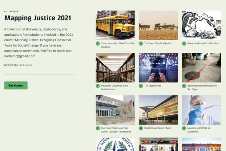
Students in MOSTEC take a variety of courses that equip them with skills and contacts in science, technology, and engineering. They generally do not have experience using GIS, according to Okafor. But within the six weeks that they’re in his course, students learn to employ ArcGIS Online, ArcGIS StoryMaps, ArcGIS Dashboards, and other ArcGIS products to build interactive maps and apps that address topics they’re interested in.
The students in MOSTEC today have grown up in a world that’s saturated with technology, data, and analysis. Now, they are using this almost innate knowledge to shape their own narratives for how to effect change.
Teaching the Geographic Approach for Solving Big Problems
Okafor has a special connection with MOSTEC. He was a student in the inaugural MOSTEC class in 2011 and, since then, has maintained involvement by being a mentor and now an instructor.
He got the idea for developing a course focused on GIS and spatial analytics when, as an associate at the Boston Consulting Group, he did an externship at Planned Parenthood. While there, he used the technology to help Planned Parenthood embed market analytics into its strategy and operations by creating internal tools and leading capacity-building efforts. This allowed him to see the power of GIS and the role it has in telling stories and creating solutions to big problems.
For all students, I work to make sure they have a baseline understanding of how to find data and how to use the ArcGIS tools in front of them.
At MOSTEC, Okafor likes to have his students work on projects they care about. He believes that teaching really begins when students get excited about a subject area. In his course, Okafor encourages students to take stock of things they see that need to change and then figure out how that change can happen. He stresses the importance of spatial data and how the geographic approach—essentially, integrating geographic data into problem-solving—can be used for just about everything.
“An assignment they do in the first week is called everyday spatial analysis, where they just try and figure out [questions like], Where do I see [spatial analysis] coming up? Is it a map that I saw on the news around [COVID-19] rates in my area? Is it an infographic? [Is it] clickbait on Instagram?” Okafor explained. The point is to have students see where data and space are connected and what the implications are.
Okafor, who is Black and Nigerian, said that his overarching goal at MOSTEC is to have his students—many of whom are also Black or from other typically underrepresented communities—carry the work they do in his course with them to college and beyond.
“Representation, especially within STEM [science, technology, engineering, and mathematics], is key. Students can go far in their educational journeys without seeing someone who looks like them as a teacher,” he said. “I make it a point to bring in peers from diverse backgrounds—people of color (POC) and people from the femme and queer communities—for our speaker series to touch on elements critical to the class, like data science, policy, and design, hoping the students can see a future in those fields themselves.”
Going from Nothing to Web Apps in Six Weeks
At the beginning of the Mapping Justice course, Okafor encourages students to think about a big idea that impacts their communities.
“Their first assignment [asks], ‘What’s your big idea?’ to get them thinking about what social issues are important to them and how they would go about solving them,” said Okafor.
Topics have included transportation inequities, climate change, discrepancies in food access, gentrification, the digital divide, and disparities in education. Okafor then pairs students up based on their ideas so they can work together on their projects.
“STEM is extremely collaborative, so I want them to start building these skills early,” he said.
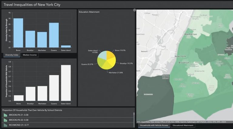
Throughout the course, students learn how to use a variety of Esri products to discover and analyze data and present their creative solutions in compelling ways. They employ ArcGIS Online and ArcGIS Living Atlas of the World to find and pull census and other open data and then map it. When they figure out what story they want to tell, they use apps such as ArcGIS StoryMaps and Dashboards to create interactive displays that explain the problem and demonstrate their proposed plan of action.
As the course progresses, Okafor enjoys seeing his students make strides in GIS.
“When you think about [them] starting from zero [and having] dashboards, maps, and web apps in less than six weeks, they’re researching what is GIS,” he said. “Suddenly, they have a dashboard that talks about gentrification in San Diego, showing historical elements, or they’re pulling up historical maps about redlining in North Carolina.”
Okafor said that he is inspired by his students’ use of GIS technology and that he never stops learning from the teens.
“This year, one of my students was able to really put forward the data she found in this tool that was honestly beyond me,” he said, referring to ArcGIS Insights, which was new to him. “I didn’t include [Insights] in our lessons because I hadn’t used it before, but when she asked if she could, I said any Esri tool is open for use. She then showed some great data science visualizations using Insights—something she must have taught herself.”
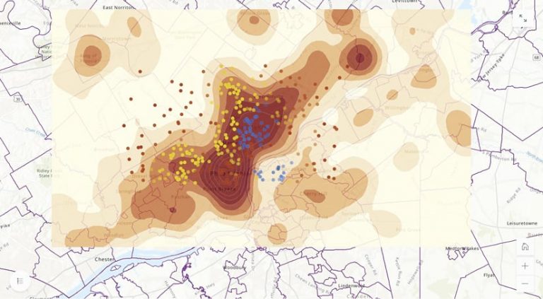
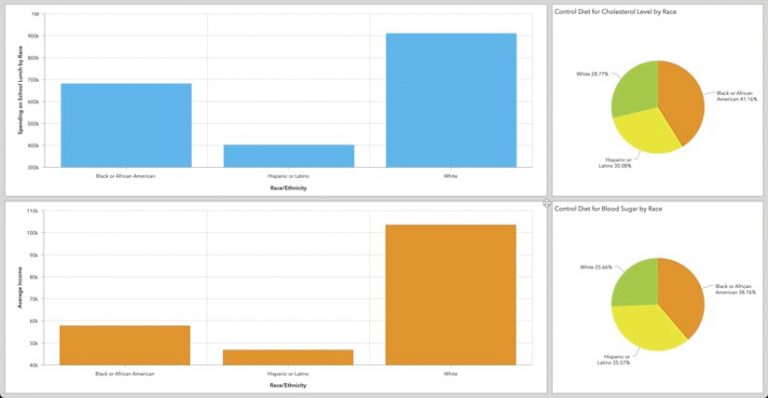
Two other students in the 2021 cohort, Oluwaseun Ogundimu and Ruhe Solomon, used ArcGIS StoryMaps to create an interactive narrative that evaluates where fast-food restaurants in Philadelphia are located relative to schools that enroll largely communities of color versus schools that enroll primarily white students. Their research—presented via maps, charts, graphs, and text blocks—shows that schools with large populations of African American/Black and Hispanic/Latinx students are in areas with a high density of fast-food restaurants compared to schools with large populations of white students. In addition, Ogundimu and Solomon found that Hispanic/Latinx students in Philadelphia are more affected by the presence of fast-food culture around their schools than any other racial or ethnic group they analyzed. The two students’ solution is to have nonprofits that promote healthy eating focus their efforts in these areas of the city.
“For all students, I work to make sure they have a baseline understanding of how to find data and how to use the ArcGIS tools in front of them. But there are additional ‘soft’ skills that are harder to learn in such a short time,” said Okafor. “Oluwaseun and Ruhe not only did well in creating a clear story line around their issue, but they also weaved in data points that successfully supported their argument.”
Encouraging Students to Lean into Their Experiences
Okafor has found that an effective way to teach students about GIS and the powerful analytical tools that come with it is to encourage them to lean into their own experiences and cultural backgrounds. This gets them interested in their research so they become serious about finding authoritative data to support their work. And when combined with project-based learning, this method of teaching gives students the space they need to draw their own conclusions about how to apply the geographic approach to solving problems.
“I got into STEM because I like math, science, and building things,” Okafor said. “But what kept me in it was the fact that I saw the power I could have in fixing issues that were important to me.”
Okafor believes that the diversity of the students in his course gives them all an advantage, since each person’s ethnic and geographic background influences what they are exposed to and, ultimately, what they’re interested in.
“We’re born into identities, into networks, into communities that will shape us,” he said. “How we continue to present to the world is always going to be affected by that.”
Beyond teaching students spatial awareness, Okafor’s Mapping Justice course “brings that quantitative nature to social problems that sometimes can be missing from leaders’ decision-making,” he said.
It sure sounds like he’s setting his students up for long-term success, whether they pursue professions in the field of GIS or take another route.
Learn more about Mapping Justice and how Okafor is planning to scale the course up.

