Online Exclusive

To navigate safely in polar regions, ship commanders operating near, through, and beneath sea ice rely on data supplied by the National Ice Center (NIC), an organization that uses Esri ArcGIS software to produce sea-ice and iceberg maps. Ice analysts process satellite imagery in GIS to study the condition of the ice and map it.
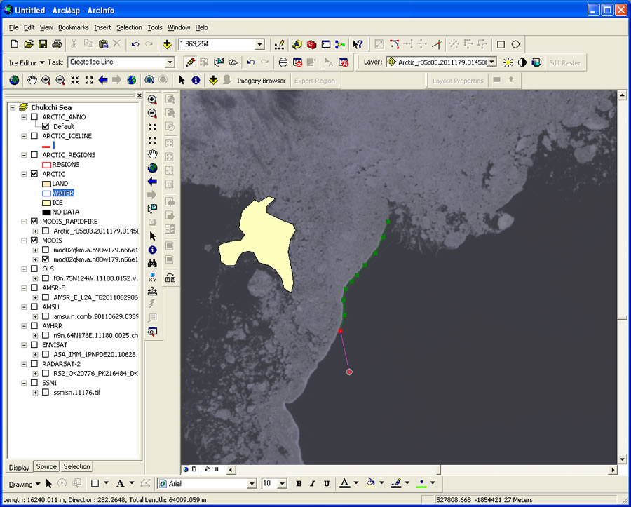
They use the Satellite Image Processing and Analysis System (SIPAS), an extension to ArcGIS.
“A great majority of NIC ice information products are created using the SIPAS editor,” explained Mark Denil, a GIS analyst for NIC. “This editing environment handles most of the data shuffling, processing, and housekeeping operations for ice analysts, allowing editors to concentrate on interpreting ice conditions. The majority of ice data products are generated out of the enterprise geodatabase.”
On Thin Ice
The Arctic polar ice cap is thinning and shrinking. This results in longer navigation seasons, which keeps routes open for commerce; makes natural resources more accessible for drilling; and provides opportunities for shorter, more efficient voyage routing. But with increased ship traffic in icy waters, conditions can be dangerous. Ice and iceberg maps become essential navigation tools.
So ships’ crews rely on NIC, a cooperative partnership that includes the US Navy, the US Coast Guard, and the National Oceanic and Atmospheric Administration (NOAA). Residing in the NOAA Satellite Operations Facility in Suitland, Maryland, NIC is tucked in a corner of a striking postmodern structure bedecked with satellite dishes. In an operations room, a staff of 15 to 18 ice analysts (most of whom have a background in meteorology) study and interpret ice images. They are supported by small teams of cryogenics scientists and GIS/IT technicians.
On a daily, weekly, and biweekly basis, NIC experts analyze data from satellite imagery and other sources to assess sea ice conditions in the Arctic, the Antarctic, the Great Lakes, and Chesapeake Bay. They decipher the various types of ice at the poles based primarily on images from a diverse number of satellites, such as Canadian Space Agency’s (CSA) RADARSAT-1 and 2, the European Space Agency’s Envisat, and NASA’s Terra and Aqua.
Making sense of ice data is very different from deciphering land use data because images of sea ice do not have the same types of recognizable features, so interpretation requires different skills. Rather than exploring vegetation, rivers, and human development, the ice analyst looks for visual clues indicating characteristics such as ice concentration, stage of development (age), and ice form (is it the size of a floe, a sheet of floating ice?).
The Role of GIS
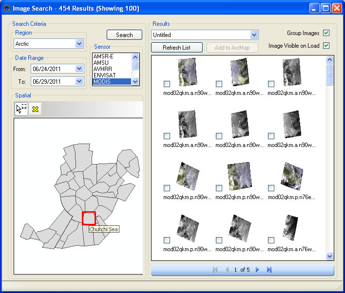
More than 95 percent of the data used in sea ice analyses is derived from polar orbiting satellites. Every day, the center receives approximately 6,000 images, or roughly 160 gigabytes of data, which automated routines turn into GIS-ready files. These images are cataloged and made available to individual analysts through a custom imagery browser application. They load their imagery selections into SIPAS. The majority of the analysts’ work takes place in this environment.
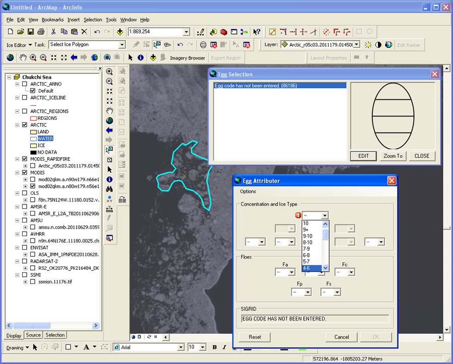
This extension makes the workflow more efficient. The analyst opens SIPAS, zooms to a polar sector, selects imagery from Image Browser, and gets to work. The analyst examines and compares images and then selects the most appropriate source for determining the significant characteristics of the ice for that particular location. Next, the analyst carefully digitizes the edges of each of the various ice types (defined by thickness; floe size; and age—first year, second year, or older) to delineate them from the different types of ice nearby and from the open sea.
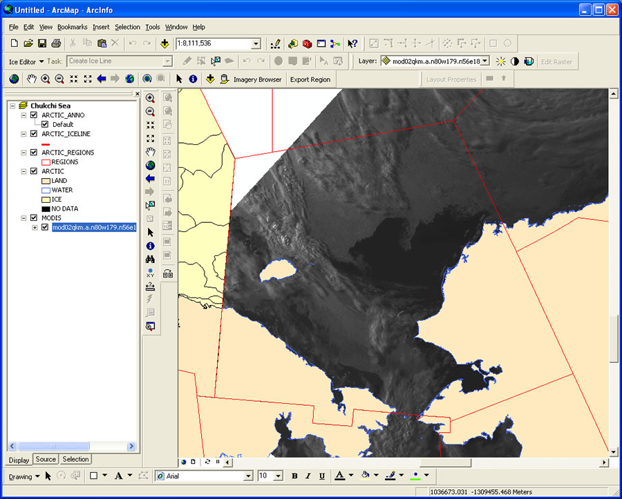
Features such as fractures, leads, and polynyas (FLAP) are also captured. A fracture is a break or rupture in close-packed ice, a lead is a fracture or passageway through sea ice that is navigable by surface vessels, and a polynya is a nonlinear area of open water enclosed by ice. All these descriptors characterize the ice and surrounding waters. With this information, the ship’s master knows about conditions and risks that lie ahead and can make informed decisions about how, or if, to proceed.
By freeing them from other concerns, SIPAS lets analysts focus on the critical and difficult task of understanding the ice conditions they see. For example, preconfigured constraints built into the attribute coding tools help ensure quality of the data. Map topology rules are in place so that splinters or overlapping polygons aren’t created. Additional quality checks verify that an area’s delineated regional boundary edges and attributes match polygons already created in neighboring regions. Digitized polygons are directly input to NIC’s enterprise geodatabase.
In addition to mapping sea ice, NIC names, tracks, and reports weekly on large icebergs in the Southern Hemisphere. An iceberg must be at least 10 nautical miles across to receive this attention, so these are really more ice islands than bergs. Still, NIC tracked 41 of these through 2011 and has tracked 223 since 1973. Today, analysts use ArcGIS for Desktop for this task.
NIC usually generates between 70 and 80 standard GIS maps each week, which are used by the US Navy, shipping enterprises, petroleum companies, fisheries, and ocean scientists. Almost all these products are made available to the public via the NIC website.
NIC also creates ice analysis maps and reports upon request in support of an array of special operations, and these products are made available directly to the requesting customer in various formats.
Technology has enabled NIC to generate high-quality products on demand and get them out quickly. A consumer visiting the NIC website can, with a few clicks, access maps and data through interactive map interfaces and/or download data in formats such as shapefile, geodatabase feature class, raster layer, PDF, KML, and movie loop. Since many NIC data consumers operate in remote regions with very low bandwidth capabilities, the website provides options for selecting high- or low-bandwidth interfaces. With either option, the user can search and query the data by date and area of interest. A calendar tool facilitates access to historical data, so users can see how the ice has changed during the last 40 years. The site also has interactive user help and allows the user to provide feedback.
Because NIC has been keeping track of polar ice since 1972, it has built a baseline for evaluating change. In the early days, NIC produced all its global ice condition charts using hard-copy cartography techniques for dissemination by fax. Starting in 1996, however, NIC began making its historical data more useful for environmental research and studying ice-related climatology by digitizing the archive of older, paper-based charts, reconfiguring its data so it could be used for digital analysis.
ArcGIS Speeds the Workflow
In 1999, Semeon Sertsu, the center’s director of information technology, committed NIC to using GIS because it had the greatest capacity to meet the center’s needs. “It was worth the effort, because today, ArcGIS is providing us with wonderful data management, image analysis, output, and dissemination capabilities,” Sertsu said. “It is delivering more than I had originally imagined. For instance, we have a GIS tool that can perform a routine in about 30 seconds that once took us a week to do.”
The analyst team includes US Navy civilian employees and enlisted men and women. Most come to NIC with no previous GIS experience, but they find they can easily step up to the workflow requirements because imagery handling and data generation are integrated in a unified and accessible ArcGIS software environment. This means users no longer need to learn to use and integrate multiple types of imagery viewing and data generation software and tools.
Professionals such as ice analyst Brian Jackson are assigned to analyze a specific area. Using the graphic, menu-driven Image Browser, Jackson selects the best satellite imagery and brings it into the SIPAS work environment. He then manually analyzes the images using heads-up digitizing to draw boundaries of specific ice types. “It easily manages the data,” said Jackson. “I don’t have to transfer data between systems. I can draw a line in ArcGIS and share it in the exact same file so there is no loss of clarity. One aspect of the software that I particularly find amazing is that I can be working on an Arctic polar section, click an icon, and within 20 seconds access Antarctic real-time satellite data within the same desktop environment.”
A Call for Sharing Polar Data
Although Jackson sees polar regions changing, he will not venture an opinion as to whether this is caused by climate change, nor will anyone else at NIC. The analysts leave this issue to the scientific community. However, they said that there are notable changes in the northern sea route (along the Asian coast north of Siberia), which in 2011 was open for four weeks—the longest period in NIC’s 40 years of analysis. This creates opportunity for surrounding nations to develop shipping, fishing, and natural resource enterprises.
Sertsu has been working with a committee to get nations located around the poles to share their polar data for collaboration. “Nobody knows their own backyard better,” he said. “If nations agree to this idea, they will have a comprehensive polar map. Working together on such a map may well lead them to work together as a global community to address polar ice cap concerns.”
For more information, contact Semeon Sertsu, director of IT, National Ice Center.

