I am very excited by this opportunity to have a regular column in ArcNews to further inform the Esri user community about how Esri actively supports and participates in science. Yes, science—that wonderful endeavor in which someone investigates a question or problem using reliable, verifiable methods and shares the results broadly.
Science has always been about increasing our understanding of the world around us. And did you know that science is part of our DNA at Esri? The Science of Where is not just a tagline. Scientific endeavor and expression are part of our passion and part of Esri’s toolset.
In what is now a transdisciplinary, interdisciplinary world, we at Esri seek to communicate to scientists and nonscientists alike that geography and location are two sides of the same coin. In the 21st century, the science of digital geography is one key to changing and saving our planet. Indeed, what the world needs now is the power of deep, integrative geographic science.
The coronavirus disease 2019 (COVID-19) pandemic is one compelling example of this. A digital geographic lens—powered by dashboards, story maps, and other tools—has brought into clearer focus the complex spatial interactions that have been spreading and aggravating the virus. These tools have also been able to show the geographic implications of the first responses to it.

I think there are no better ways to bring nonspecialists into the field of geographic science than by way of dashboards and stories. Dashboards are easy yet powerful information displays that employ multiple visualization elements—including maps, graphs, and pie charts—on a single screen. Viewers don’t have to be scientific experts to immediately get the picture of what’s going on. For experts, dashboards have the additional advantage of providing near real-time displays for monitoring instruments, events, or activities, which can enhance at-a-glance decision-making.
No doubt the dashboard from associate professor Lauren Gardner’s team at the Johns Hopkins University Center for System Science and Engineering has made a considerable impact on the world. The dashboard has been particularly effective at pulling together several sources of open data to convey a real-time, map-based understanding of the spreading disease. Authorities from local to national levels have been using similar dashboards and maps to display data at different scales.
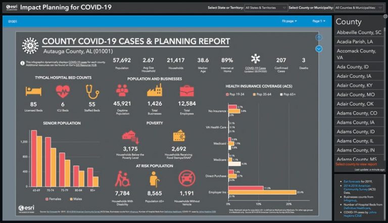
At Esri, the global marketing strategy and business analytics teams built on this by putting together the Impact Planning for COVID-19 dashboard. Combining the real-time global feed from Johns Hopkins with county-level data on COVID-19 cases and deaths, it shows how each of the 3,220 counties and municipalities in the United States and Puerto Rico has been affected and where planning efforts should be targeted. This app has been continuously updated, as has the “Mapping the novel coronavirus pandemic” story from Esri’s StoryMaps team.
In addition, several of Esri’s leaders—including chief medical officer Este Geraghty and director of public safety solutions and the Disaster Response Program (DRP) Ryan Lanclos—have written a steady stream of articles and blog posts about COVID-19. These include “To Balance Priorities in a COVID-19 World, Geography Matters;” “Mapping Epidemics: From SARS, Zika, and Ebola to the Pandemic of COVID-19;” and “Smart Maps Guide COVID-19 Investigations and Actions, and Monitor Effectiveness.”
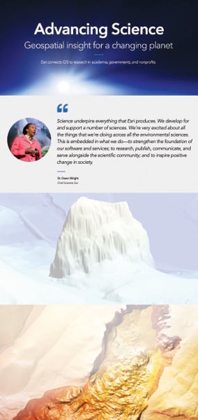
All these examples show how ArcGIS brings clarity, rigor, and storytelling to—in this case—health and human science. I would now like to introduce another place where these examples—and more—appear. I hope you will bookmark this link and continue to visit the site repeatedly. It is Esri’s new online science portfolio.

This is the one place where users can discover how Esri supports and actively participates in the scientific community. Esri connects GIS and spatial data science to research at universities, independent research institutes, government agencies, the United Nations, the World Health Organization, nongovernmental organizations (NGOs), and nonprofits. In turn, Esri uses these connections to further evolve ArcGIS into a comprehensive geospatial platform for science.
In addition to featuring COVID-19 resources specifically for scientists, Esri’s science portfolio has six enduring categories to explore. They each have their own featured projects; user stories; detailed resources to empower related scientific exploration; links to relevant Esri collaborators; and prompts to learn more about specific ArcGIS capabilities, apply for Esri programs, and connect with Esri teams. These sections consist of the following:
- Open Science: See how Esri’s interoperable, standards-compliant platform is essential for advancing science.
- Weather and Climate Science: Explore geospatial resources for forecasting, preparedness, and adaptation.
- Ocean Science: Witness Esri’s continued commitment to exploring, mapping, visualizing, analyzing, and protecting the earth’s last frontier.
- Solid Earth Science: See how geospatial technology is a force multiplier for the science of the earth’s surface and subsurface. Explore how this relates to hydrology, geology and geophysics, agricultural science, ecology, conservation biology, polar science, and hazard science.
- Geographic Information Science: Discover more about the original “science behind the systems,” now also known as spatial data science.
- Social Science: Learn about how GIS can be used to understand how the earth looks and how humans change its appearance and function—for better and for worse.
The website has pages dedicated to additional resources. The Maps and Apps tab leads visitors to free, geoenabled maps and apps that can help accelerate scientific data exploration, interpretation, and communication. The Events tab lists events, conferences, trainings, and workshops happening throughout the scientific community for the current year that Esri attends, hosts, or sponsors. The News tab features the latest books, articles, and scientific papers from Esri and its partners, including GIS for Science: Mapping and Spatial Analytics from Esri Press. Finally, the Resources button points to a comprehensive catalog of Esri science resources aimed at helping users accelerate their science and science communication; update and extend their GIS skills; engage in citizen science; and explore the many advisory boards, editorial boards, councils, and high-level committees to which Esri contributes as a member of the scientific community rather than as a vendor.
Underpinning all Esri’s science initiatives is ArcGIS Living Atlas of the World, a premier compilation of government and commercial geographic information that has a growing academic catalog. This resource enables great mapping and analytics for science, secure sharing and collaboration, compelling science communication via storytelling, and an ecosystem where users can share models and beautiful maps to further the understanding of virtually any topic.
At Esri, we are so excited about all the things we’re doing across the sciences. There are so many great things happening that we are currently updating the science portfolio website about every two to four weeks. I am encouraging Esri users and staff members alike to engage with the site as an ongoing record of what Esri is doing to strengthen the foundation of its software and services for science; to research, publish, communicate, and serve alongside the scientific community; and to inspire positive change in society.
Explore the site, enjoy it, and do let me know how you would like to be involved and how we can serve you and science better!


