When organizations outgrow their existing IT infrastructures, workflows tend to slow substantially. Recently, that was happening to the Washington, DC, Department of Transportation (DDOT).
“We have numerous systems, but at the time, we had no sensible way to share data or monitor operations,” said DDOT’s chief information officer, José Colón. “For any staff to generate a report, they needed to drill down into each individual DDOT system to extract the data, run it through business intelligence software, and create the report.”
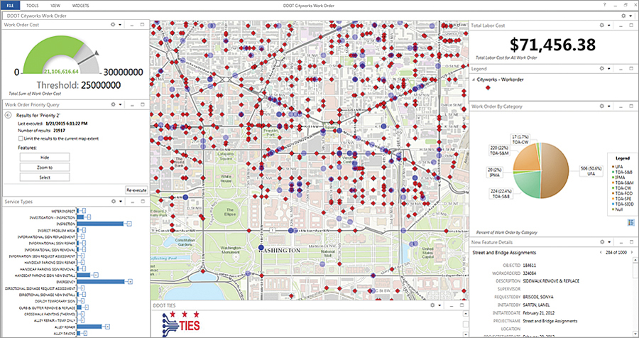
DDOT decided to improve interdepartmental communication by upgrading information access and increasing transparency. It created an internal, map-based website on the ArcGIS platform called the Transportation Integrated Enterprise Solution (TIES), which ties all its divisions together, reinvigorating workflows.
Envisioning Automated Processes
In 2012, Colón and a former GIS colleague had an idea for how to fix the problem but had no way to execute it. They dreamed of a platform that would automatically process DDOT’s operational data at the end of each day and then load it into a central repository for enterprise-wide access. Executives and other staff would then be able to retrieve that pool of resources and create reports full of timely information to distribute at meetings and include in presentations.
DDOT didn’t have the in-house resources to build its own application, so it hired GIS consultants and Esri partners Prime Source Technologies and JMT Engineering to create the blueprint of a solution.

A Data-Fed Dashboard
To realize that blueprint, DDOT identified potential data sources for initial inclusion in TIES. These included systems for permit tracking, work order management, project coordination, and pavement management, along with the department’s own Street Spatial Database, which models roadways and intersections. Prime Source and JMT helped DDOT configure the back-end processes to extract, transform, and load the data into TIES. They also helped create the database pathways that would populate the maps with data. But the most visible piece of the project—the operational dashboard—hadn’t even been designed when Colón and one of JMT’s GIS experts attended the Esri User Conference together in 2012.
“The first day, one of the Plenary [Session] speakers showcased Operations Dashboard for ArcGIS, and our jaws just dropped,” said Colón. “That was the application we needed.”
Though JMT no longer needed to design an operational dashboard from scratch, the company still had to complete the critical side of the solution that would feed data to the dashboard and optimize the creation of reports.
Monitoring Incidents and Performance
Using the dashboard and mobile tools, team leads and executives at DDOT can now target resources where needed. For instance, maps show DDOT where there’s a high volume of construction in public spaces or where the bulk of potholes is throughout the city. In TIES, those activities and problems are expressed as reporting layers with pop-ups that give more detail when the features are clicked.
“This year, we had over 30 snowstorms that created over 40,000 potholes that needed to be recorded in our database,” said Colón. “The map tells that story better than 311 calls on an Excel spreadsheet, visually showing senior management exactly where to send crews. They can also see . . . key performance indicators to chart the progress of repairs and so forth.”
Additionally, Washington, DC, has 1 million traffic signs, so detailed monitoring of these signs, traffic lights, and even urban forestry is both crucial and traditionally expensive. Instead of using PDAs or creating a mobile field collection app from scratch, DDOT field crews use Esri’s Collector for ArcGIS mobile app on their iPhones and Android devices to gather information about everything from trees to traffic signage. They take pictures of each asset and fill out a custom form describing its condition and identifying details, then upload it to the database. The app far surpasses the ability of dedicated hardware devices that can’t report live updates the way Collector does.
Tying the Department Together
TIES now serves as the operational barometer for DDOT, gauging the department’s performance (how many work orders have been fulfilled, for example) while also delivering transparency and detailed oversight. Operations Dashboard for ArcGIS created an easy report-making workflow, enabling senior management to see key performance indicators, documentation, and resource allocation details from a simple map-based interface that has tied a formerly disconnected department together.
“Being able to view an aggregation of information from multiple sources was critical for DDOT executives to oversee Washington’s transportation infrastructure and plan response,” said Colón. “It was the perfect tool to [integrate] information throughout the department and put everyone on the same page.”

