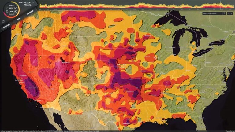
The Drought Aware app, available in ArcGIS Living Atlas of the World, provides information about drought-affected areas in the United States over various time intervals from 2000 to today and across different drought intensities.
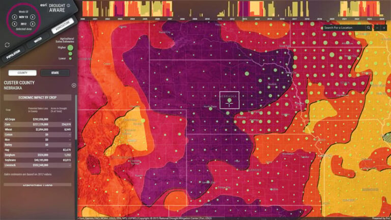
After a recent enhancement to the app, Drought Aware integrates critical information from additional data layers, including population, housing, river flow, reservoirs, crops, and agricultural labor. Now, users can engage with the app to gain comprehensive insight into the impacts that droughts have on communities across the United States.

Three Categories of Information
The Drought Aware app summarizes information in the following three main categories:
- Population: This displays the estimated number of people and households affected by drought at each intensity level. It also describes some vulnerable populations and lists the related drought risk indexes. The data is available at both county and state levels.
- Water: This depicts major local rivers, the average interannual river flow, and relevant local reservoirs. The data is available at the subregion hydrologic unit code level 4 (HUC4), which encompasses the areas river systems drain into, the reach of rivers and their tributaries, closed basins, and groups of streams that form coastal drainage areas.
- Agriculture: This shows the potential economic effects of droughts according to major crops, the affected labor, and the amount of agriculture that gets exposed to dry conditions.
Several Ways to Explore Drought
There are many ways to explore the phenomenon of drought in this app.
The topmost timeline shows categories of drought severity since the year 2000 as a proportion of the total amount of land in the United States. Users can choose a point in time to see that week’s geographic ranges of drought.

The sector chart in the top-left corner of the screen provides a detailed breakdown of the proportion of the nation experiencing drought at that time. Users can hover over any portion of the chart to see which areas of the country experienced various drought severities. Buttons indicating the week and the year let users go chronologically backward or forward by week or by year to get a comparative sense for drought in different areas of the country.
When no location is selected, the timeline and drought intensity class represent the extent of drought for the full area of the United States. When a state, county, or watershed is selected, these areas update to represent that more specific locale.
Automatic Data Updates
The data layers used in the app are drawn from sources ranging from the American Community Survey and the Federal Emergency Management Agency’s National Risk Index to the National Water Model and the National Hydrography Dataset. All the data from these sources is available in ArcGIS Living Atlas.
The data in the Drought Aware app is updated every week after the US Drought Monitor map is released. A live feed routine automatically downloads and processes the source data and then updates it in Drought Aware. The population, water, and agriculture summaries in the app are calculated by the live feed routine using the US Drought Monitor map and data source layers in ArcGIS Living Atlas.

