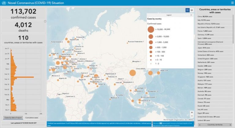
As the new coronavirus (COVID-19) began to spread in the first few months of 2020—initially in Wuhan, China, and then quickly to other countries around the world—the health-care community rushed to understand how the disease was advancing. This potentially lifesaving information was changing fast, so many Esri users, including local and global authorities, built maps and dashboards to display data about the virus.
At Johns Hopkins University in Baltimore, Maryland, a team consolidated data from authoritative sources, such as the World Health Organization (WHO) and the Centers for Disease Control and Prevention (CDC), in a dashboard that shows where the disease is cropping up around the world. The dashboard—which has an interactive map that displays the number of confirmed infections, fatalities, and recoveries in each location—went viral.

Other organizations have been using GIS to address similar needs. WHO, which maintains a near real-time dashboard of all global health-related events, has created a derivative dashboard that tracks confirmed cases of COVID-19. GIS specialists from Esri China produced a dashboard that also includes suspected but unconfirmed reports of the disease, complete with links to related news stories about those cases. Another interactive dashboard tracks confirmed coronavirus cases in Hong Kong down to the building level. And the International Civil Aviation Organization put together an animated dashboard that displays how typical air traffic compares to where cases of COVID-19 are occurring. It’s a strong visual of how quickly the virus can spread in our hypermobile world.
All this data taken together is giving the best possible picture of where—and how—the new coronavirus is spreading in near real time. This geographic perspective is invaluable for trying to manage the disease.

