Cartographers and artists are visual storytellers, striving to convey messages that audiences can easily interpret. Despite the disparate mediums that they use, students of geography and illustration can benefit when principles from both fields are incorporated into their work.
At Jacksonville University in Jacksonville, Florida, the Sustainability, Geography, and Environmental Planning Department and the visual arts programs co-developed Beautiful Maps, an interdisciplinary course uniting students in geography and illustration. During the spring 2023 semester, students explored technical and stylistic elements of cartography, experimenting with GIS and hand-painting maps. The course fostered exploration, collaboration, and innovation as students learned to create accurate and visually captivating thematic maps.
Three Jacksonville University professors created and taught Beautiful Maps. Each led a four-week block of the curriculum in their area of expertise. One of the instructors, geography professor Dr. Ray Oldakowski, said he has embraced digital transformation. Since the 1990s, he has moved from hand-drawing maps on acetate sheets to deploying ArcGIS Pro. He noted that while today’s GIS-powered maps serve as powerful, dynamic analytical tools, many illustration students were unfamiliar with these advances.
“They had no idea that maps were used for anything besides showing location,” Oldakowski said. “We showed them the concept of a thematic map, and they learned how we can use maps to portray information.”
Similarly, the geography students had little insight into how art students applied their degrees and skill sets professionally. The geography students learned that illustrators work in fields such as advertising, marketing, filmmaking, and creating artwork for children’s books and comics. Artists in these fields create specialized visuals that engage and motivate intended audiences.
Thinking Outside the Map
The inspiration for the course came from an interaction between Dr. Ashley Johnson (one of Oldakowski’s colleagues), and one of her students. An associate professor of geography, Johnson had been approached by a student with color vision deficiency. The student explained that they often had trouble distinguishing data points and other features on maps.
Johnson “started thinking about how we’re often so obsessed with the technical issues on a map that we don’t really look at the art components of it,” recalled Oldakowski. “So, she got in touch with a colleague of ours in the illustration department, Nicholas McNally.” As an associate professor of art in illustration, McNally had the expertise to make the new course a reality. The trio soon began to collect ideas and resources from their own courses to build the Beautiful Maps curriculum.
The final course focused on interactive learning and promoted collective feedback and constructive criticism. During the fine art portion, McNally introduced basic principles of color, which were illuminating to Oldakowski.
“I’d never heard of the color wheel,” he said. “We learned about the primary colors, and then how to strategically choose colors instead of just saying ‘Oh, that looks nice.’”
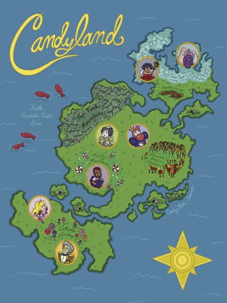
As students made their first maps in the art lab, illustration majors often strayed from the standard conventions of mapmaking. Many painted maps that gave shape to imaginary or historic places. Oldakowski was impressed by their creativity.
“They didn’t feel restricted to it being the creation or portrayal of real-world information, whereas sometimes as geographers, we’re just thinking of maps as being there to portray data,” he said.
Early in the semester, the class traveled to the University of Florida Map and Imagery Library. One of the largest academic map libraries in the United States, it houses about 500,000 maps and 300,000 aerial images.
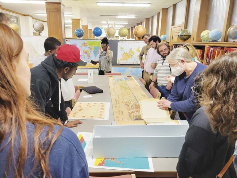
“We brought the students there so that they could see how cartography has changed over the decades,” Oldakowski said. Students were asked to document their trip using ArcGIS StoryMaps. It was the first time the illustration students had used the application.
Using GIS to Build New Perspectives
During the four-week instructional blocks led by Oldakowski and Johnson, coursework focused on principles of geography and geospatial technology. While geography majors had been introduced to GIS technology in previous courses, the art majors were unfamiliar with it. As the students explored thematic maps and watched ArcGIS demonstrations, new connections began to form—and new perspectives.
Oldakowski “gave me the inspiration to look at the world in a different way,” said Erik Henderson, a Jacksonville University graduate who credits Oldakowski with inciting his own passion for GIS.
Henderson has spent 20 years in the geospatial technology field, forging a career that led him to his current role as director of rail and transit markets at Esri. He believes that Oldakowski’s ability to apply geography to any industry allows the professor to connect with students, no matter what career they choose to pursue. “He’s really good at making those connections for people to understand the power of geography,” Henderson said.
Another perspective was described by Johnson. Halfway through the course, Johnson organized a special remote session featuring her friend, Jason Treat. Treat has been a senior graphics editor for National Geographic since 2012. Johnson felt that Treat’s exceptional career and award-winning graphics capture the essence of beautiful mapping.
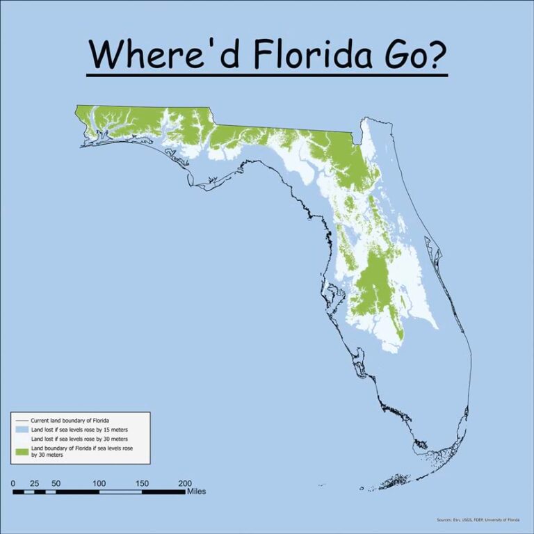
Treat explained that when someone has large amounts of data they’d like to present, each artistic choice is critical. Cartographers must find ways to convey information without overwhelming or confusing the audience. For example, his five-panel perforated poster and interactive graphic for the September 2013 National Geographic magazine illustrated how Earth would appear if its icecaps melted, telling a story that is striking and alarming. This map inspired two of the students to create their own map, titled Where’d Florida Go?, which depicts the projected effects of sea level rise on the Florida peninsula.
National Geographic uses symbology in its maps that even children can understand. To reinforce this concept, students in Beautiful Maps created their own wildfire symbols. The art majors delivered unique representations and inspired their science-focused peers to test their own creativity.
In the same vein of experimentation, students tried an application that blends photographs and ArcGIS basemaps. Results varied, but the inventiveness of students from both disciplines impressed Oldakowski. Students also used drones to capture imagery, then added their images into ArcGIS Pro to build maps.
Showcasing Talents, Embracing Room to Grow
At the end of the semester, students and faculty put together an art exhibit. It was a novel idea for Oldakowski.
“We hadn’t thought of doing an exhibit with maps,” Oldakowski said. “Students showed their painted maps…their drone imagery…their ArcGIS Pro maps. All the displays were framed…and students stood by their work and talked about it.”
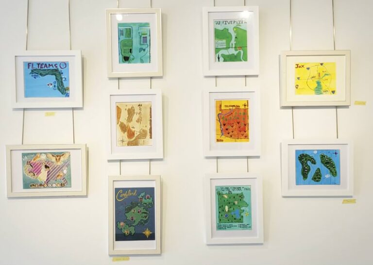
Students gave positive feedback about the course. Some art students decided to pursue additional classes in geography, and vice versa. Oldakowski said Jacksonville University will probably offer the course again starting in 2025, alternating between Beautiful Maps and a GIS conference hosted by his department. As Oldakowski demonstrated when he presented on the course at the 2023 Education Summit @ Esri UC, future students will hopefully learn that compelling maps can be both beautiful and true.

