The New Interactive Atlas Uses GIS Throughout, from Data to Presentation
Does whether you have a heart attack or stroke have more to do with your ZIP code than your genetic code?
The Interactive Atlas of Heart Disease and Stroke application built for the Centers for Disease Control and Prevention (CDC) could help answer this question and others related to cardiovascular conditions.
Cardiovascular disease, including heart attacks and strokes, is the leading cause of death each year in the United States for both men and women. According to a report recently released by the CDC, more than 800,000 people die from cardiovascular disease each year—that’s one in every three deaths. Many of these deaths, especially those of people under age 75, could be prevented.

The report says that cardiovascular disease deaths among those younger than age 75 vary by geography. Rates of preventable death from cardiovascular disease were the highest in the South. To view and analyze this data more closely, the CDC knew that a GIS component was necessary. Through a competitive quotation process, it chose Esri Platinum Tier Partner Geographic Information Services, Inc. (GISi), headquartered in Birmingham, Alabama. Together they built the interactive atlas application using the Esri ArcGIS platform. Information about cardiovascular health can be viewed and queried on a map.
The CDC developed the atlas to give US residents and public health officials at the state, county, and local levels the tools they need to investigate where high rates of heart disease and stroke exist and who is mainly at risk. This is particularly important because the CDC report found that as many as 200,000 deaths that were attributed to cardiovascular disease could have been prevented.
“Too many lives are being cut short due to heart disease and stroke,” says Linda Schieb, an epidemiologist at the CDC and lead author of the report. “Many of these deaths could be prevented by improving health care systems, creating healthy places to live and play, and supporting healthy lifestyle choices.”
The hope is that by providing this data in an easy-to-use format—through a map that can be explored—it will be clearer to see where cardiovascular disease is more prevalent and which population groups are at high risk for problems such as hypertension, coronary heart disease, acute myocardial infarction (heart attack), heart failure, and ischemic or hemorrhagic stroke. The overarching goal? To help doctors, health administrators, and public health officials, as well as the general public, better focus preventive education and programs in these areas.
“We are quite proud of the work we have done with the CDC team,” says Dan Levine, chief technology officer and federal program manager for GISi. “Not only are we helping make this data widely available and understandable by using the mapping medium, we have also simplified the back-end administration so that the CDC scientists can manage the site themselves by adding new data, changing map content and display, and adding user tips and tricks.”

Flexing Health Data
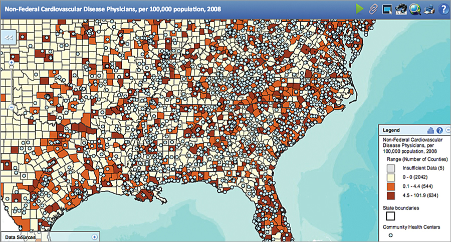
Built using Esri ArcGIS for Server and ArcGIS API for Flex, the atlas provides a map-based view of where cardiovascular disease is occurring. The data comes from the United States Census Bureau, the National Center for Health Statistics, the Centers for Medicare and Medicaid Services, and other sources and is stored in Microsoft SQL Server. Geospatial data includes state and county boundaries; roads and streets; health care centers and hospitals; and retail outlets, such as grocery and convenience stores and fast-food restaurants.
To start using the atlas, select a geographic area to view, either at the state or county level. Next, choose a health indicator from a list of different types of heart and coronary diseases and strokes or preventable/avoidable death. Then select an outcome from the indicator: mortality, hospitalizations, or hospital discharge status.
Apply sociodemographic filters, including race or ethnicity, such as all race, white (non-Hispanic), black (non-Hispanic), Hispanic, American Indian and Alaskan Native, or Asian and Pacific Islander; gender; age; and a time period, such as 2005–2007, 2006–2008, 2007–2009, and 2008–2010. Age ranges to select from include all, 35 and older, 65 and older, and premature. Premature deaths are defined as deaths of people aged 75 years or less.
Other options that can be selected to visualize on a map include determinants of health and health services and aspects of the community that may affect health, such as poverty, education, or the percent of the population aged 65 or older. Health services include the number and location of hospitals with services related to cardiovascular disease and the number of pharmacies in a county.
Mapping the State of Heart Health
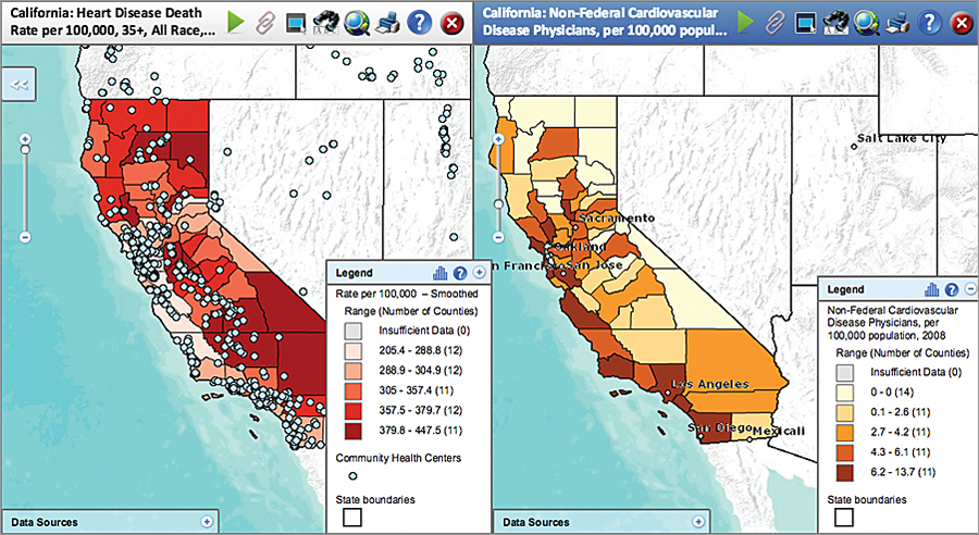
Here’s an example of how the application works. Perhaps you want to find out the death rate for all heart disease by state in the United States. You can view a national map and select the death rate for all heart disease for both men and women of all races, 35 years of age. The map shows that the death rate is highest in the Southern states of Arkansas, Oklahoma, Louisiana, Mississippi, Alabama, Tennessee, Kentucky, and West Virginia. But check out states like New York, too, where the death rate also is high.
Now look more closely at the same data but focus on counties in the state of Oregon. Yamhill, Washington, and Clackamas Counties—all located near the major metropolitan area of Portland, Oregon, in the northwest corner of the state—have a low death rate from heart disease. On the other hand, Harney and Malheur Counties—located in the opposite corner of the state from Portland, in southeastern Oregon—have some of the highest death rates in the state. Is there a reason for these variations in death rates from heart disease? This atlas can display different variables so that users can explore these types of questions.
One way to compare data between two different locations is to split the screen into two maps. With a push of a button, you can view different factors, such as heart disease mortality and a determinant of health such as a social environment, race/ethnicity, or physical environmental factors. For example, a map of Oregon counties and death rates from heart disease can be viewed next to a map of Oregon counties and the percentage of people living in poverty for all ages. It appears that the counties that have the lowest percentage of deaths from heart disease also have the lowest percentage of people living in poverty. Is there a correlation? The atlas helps people to find out if there is a possible relationship between health indicators and other characteristics in the community.
Give Your Neighborhood a Health Check
After selecting health information, that information can be overlaid with major highways, large cities, congressional districts, hospital referral regions, and state boundaries. This map can be viewed again at a later time, including setting the national map to a predefined location for easier viewing.
Clicking the Maps Over Time button provides an animated time series for the map so users can view the change in data over time for three-year periods from 2005 to 2010. The change in data can be viewed for a quick, holistic understanding of how disease and disease factors have changed in certain areas. And when you are finished, you can print a report directly from the map.
Global Access and Recognition
People in all 50 states and more than 100 countries have used the Interactive Atlas of Heart Disease and Strokeapplication since January 2013. With this innovative application, the CDC garnered Esri’s 2013 Special Achievement in GIS Award at the Esri International User Conference in San Diego, California, July 2013.
For more information, contact Linda Schieb, CDC/ONDIEH/NCCDPHP; Dan Levine, chief technology officer/federal program manager, GISi; or Rachel Ankersen, marketing coordinator, GISi, or visit nccd.cdc.gov/DHDSPAtlas.

