The best way to learn about mapping is to spend as much time as possible looking at maps. All map lovers have dedicated many hours to developing and refining their interests while gazing at maps. Some maps are simple and require little effort to understand. Others—with more detail or that include additional information, such as textual descriptions or graphs—necessitate more careful study.

Maps invite people to be inquisitive and indulge their curiosity. For some, map exploration begins with a place they’re familiar with. Others search for a theme to explore, while still others seek to discover patterns of activity. Map viewers see beyond the points, lines, areas, colors, textures, sizes, and other cartographic variables. (In fact, if the building blocks of the map are visible first, the cartographer may need a bit more training in communicating the intent of the map.)
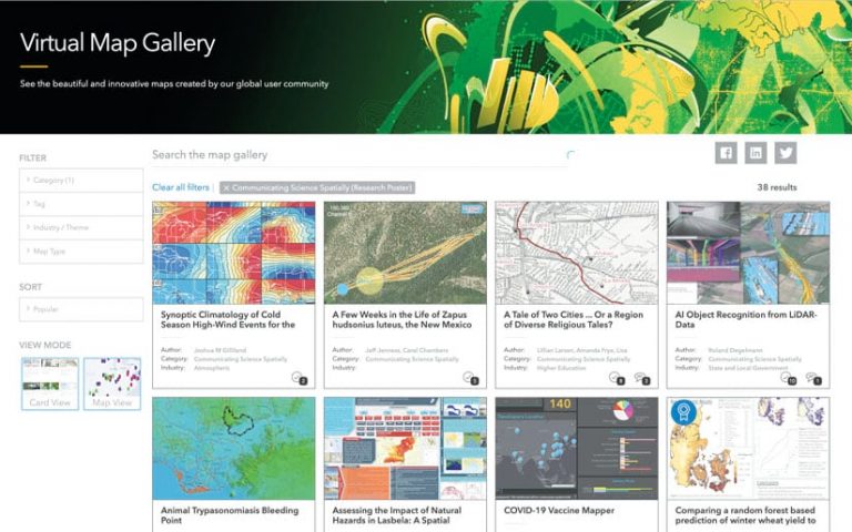
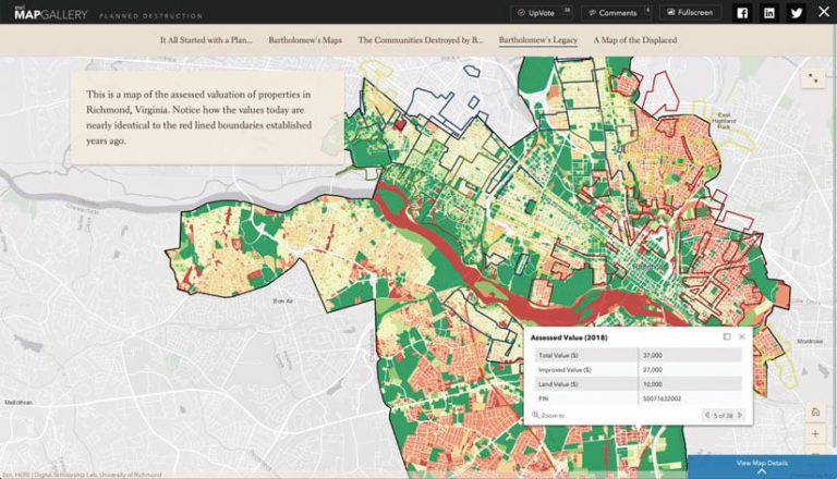
In times when travel is simpler than it is now, there are two excellent venues for map displays. The first is the biennial International Cartographic Conference (ICC), which includes the International Cartographic Exhibition as one of its highlights. The second is the Map Gallery at the Esri User Conference (Esri UC). Anyone who has had the good fortune of attending the Esri UC begins the week in the Sails Pavilion of the San Diego Convention Center marveling at an assortment of creative cartography—as Esri UC attendees were able to do virtually this year.
The ICC’s exhibition is a competition among national and affiliate members of the International Cartographic Association (ICA) in which contestants submit map products to reflect their country or organization. There are seven general categories: maps, charts, atlases, digital cartographic products, digital services, educational cartographic products, and an “other” category that includes unique products like globes and tactile maps. The Barbara Petchenik Competition, which accompanies the program, is a map drawing contest for children aimed at encouraging kids to make creative renditions of the world in graphic form. Seeing how children from around the world depict a common theme always draws the attention and curiosity of adults.

Esri’s Map Gallery is also presented via themes and categories, many of which are similar to those in the ICA competition. The themes are usually based on changing trends. Recently, the Map Gallery has incorporated new categories as well, such as Communicating Science Spatially, Most Innovative, and Story Maps.
Of course, map displays are offered in many different venues beyond the ICA and Esri UC. But these two events are well-known competitions where organizations and cartographers can show off their fine works to international audiences.
Similar to exploring an art gallery, map exhibits draw attention in different ways. Visitors wander through the displays—some looking for specific themes, others more interested in which country or organization produced the work. People always seek out the high-quality National Geographic maps at map exhibits, not unlike the art admirer setting out to see the Mona Lisa at the Louvre.
In the end, each map or cartographic product stands on its own merit. What is it that draws a visitor to explore that particular map? Is it the title—either one that’s familiar to the visitor or something that provokes the viewer’s attention? Is the map type a source of interest—a topographic map, perhaps, that calls to the outdoor nature in each of us, or a map image of Mars that shows geographic characteristics largely unknown to humans? Or maybe it’s a port chart displaying the mooring of boats and ships that we long to experience. A thematic map might catch our interest, with lines and arrows swirling about or different-sized, graduated pinwheels showing comparative values between one location and another. A different enticement might be the innocence of a child’s work that conjures what is important to them without the encumbrance of formal training.

Maps have a way of reaching out to us, whether it’s through cartographic design or some other factor. Color is an attention-getter, often bringing us forward for a closer look. Map symbols, both familiar and unfamiliar, beckon our visual senses and interests. We might be attracted to locations we recognize. Or sometimes it’s the combination of art and map or that old-world appearance, most common in historical maps, that draws us closer.
Every viewer of a map is a judge. When many maps are brought together in an array of themes as part of a map exhibition, viewers make choices about what to see. Depending on their level of interest, they might study their selection in detail, moving closer to the map to probe its content along with its design, or move on quickly.
Each map is made for an audience, someone other than the map creator. Recognizing the creativity, artistic design, and scholarship displayed in a map is important for giving credit to the map author’s skills, talent, and accomplishments, as well as the original sources of the map’s content.
In the map competitions presented by both the ICA and Esri, committees of expert cartographers judge the submissions based on criteria such as theme and map design. The winning mapmakers are recognized based not only on the judges’ artistic and technical specifications but also, for some categories, on preferences indicated by the public.
The excerpts below (which have been lightly edited for clarity) are some judges’ observations made during a recent map exhibition. They show how map readers can learn about cartography as they explore maps in a display.
As the judges describe, there is an incredible amount of variety, creativity, scholarship, and fun in maps and apps. And map exhibitions manifest the art, science, and technology of cartography in a panoply of forms, dimensions, and perspectives.
In a map gallery, viewers can learn many cartographic principles just by observing the creativity and ingenuity of the visualizations on display. So the next opportunity you get, make it a point to wander through a map display to enjoy very different views of your world.


